> ## Documentation Index
> Fetch the complete documentation index at: https://cometchat-22654f5b-docs-rn-guide-message-privately.mintlify.site/llms.txt
> Use this file to discover all available pages before exploring further.

# Message Header

> Message Header — CometChat documentation.

## Overview

`MessageHeader` is a Component that showcases the [User](/sdk/javascript/users-overview) or [Group](/sdk/javascript/groups-overview) details in the toolbar. Furthermore, it also presents a typing indicator and a back navigation button for ease of use.

<Frame>
  <img src="https://mintcdn.com/cometchat-22654f5b-docs-rn-guide-message-privately/21UBnagXOw-XG0Sv/images/af3844a0-messages_header_overview_web_screens-e2e210ec4afa809b4d4dd038df2b4073.png?fit=max&auto=format&n=21UBnagXOw-XG0Sv&q=85&s=6710301e9d9cdb1b56634ec884398df9" width="1080" height="124" data-path="images/af3844a0-messages_header_overview_web_screens-e2e210ec4afa809b4d4dd038df2b4073.png" />
</Frame>

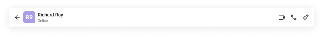
The `MessageHeader` is comprised of the following components:

| Component         | Description                                                                                                                                    |
| ----------------- | ---------------------------------------------------------------------------------------------------------------------------------------------- |
| CometChatListItem | This component’s view consists of avatar, status indicator , title, and subtitle. The fields are then mapped with the SDK’s user, group class. |
| Back Button       | BackButton that allows users to navigate back from the current activity or screen to the previous one.                                         |

## Usage

### Integration

<Tabs>
  <Tab title="MessageHeaderDemo.tsx">
    ```tsx theme={null}
    import React from "react";
    import { CometChat } from "@cometchat/chat-sdk-javascript";
    import { CometChatMessageHeader } from "@cometchat/chat-uikit-react";

    export function MessageHeaderDemo() {
      const [chatUser, setChatUser] = React.useState<CometChat.User>();
      React.useEffect(() => {
        CometChat.getUser("uid").then((user) => {
          setChatUser(user);
        });
      }, []);

      return chatUser ? (
        <div>{chatUser && <CometChatMessageHeader user={chatUser} />}</div>
      ) : null;
    }
    ```
  </Tab>

  <Tab title="App.tsx">
    ```tsx theme={null}
    import { MessageHeaderDemo } from "./MessageHeaderDemo";

    export default function App() {
      return (
        <div className="App">
          <div>
            <MessageHeaderDemo />
          </div>
        </div>
      );
    }
    ```
  </Tab>
</Tabs>

### Actions

[Actions](/ui-kit/react/v5/components-overview#actions) dictate how a component functions. They are divided into two types: Predefined and User-defined. You can override either type, allowing you to tailor the behavior of the component to fit your specific needs.

#### 1. OnBack

`OnBack` is triggered when you click on the back button of the Message Header component. You can override this action using the following code snippet.

**Example**

In this example, we are employing the `onBack` action.

<Tabs>
  <Tab title="MessageHeaderDemo.tsx">
    ```tsx theme={null}
    import React from "react";
    import { CometChat } from "@cometchat/chat-sdk-javascript";
    import { CometChatMessageHeader } from "@cometchat/chat-uikit-react";

    export function MessageHeaderDemo() {
      const [chatUser, setChatUser] = React.useState<CometChat.User>();
      React.useEffect(() => {
        CometChat.getUser("uid").then((user) => {
          setChatUser(user);
        });
      }, []);

      function handleOnBack() {
        console.log("your custom on back action");
      }

      return chatUser ? (
        <div>
          {chatUser && (
            <CometChatMessageHeader user={chatUser} onBack={handleOnBack} />
          )}
        </div>
      ) : null;
    }
    ```
  </Tab>

  <Tab title="MessageHeaderDemo.jsx">
    ```jsx theme={null}
    import React, { useState, useEffect } from "react";
    import { CometChat } from "@cometchat/chat-sdk-javascript";
    import { CometChatMessageHeader } from "@cometchat/chat-uikit-react";

    function MessageHeaderDemo() {
      const [chatUser, setChatUser] = useState(null);

      useEffect(() => {
        CometChat.getUser("uid").then((user) => {
          setChatUser(user);
        });
      }, []);

      function handleOnBack() {
        console.log("your custom on back action");
      }

      return chatUser ? (
        <div>
          <CometChatMessageHeader user={chatUser} onBack={handleOnBack} />
        </div>
      ) : null;
    }

    export default MessageHeaderDemo;
    ```
  </Tab>
</Tabs>

***

#### 2. OnError

This action doesn't change the behavior of the component but rather listens for any errors that occur in the Message Header component.

**Example**

In this example, we are employing the `onError` action.

<Tabs>
  <Tab title="MessageHeaderDemo.tsx">
    ```tsx theme={null}
    import React from "react";
    import { CometChat } from "@cometchat/chat-sdk-javascript";
    import { CometChatMessageHeader } from "@cometchat/chat-uikit-react";

    export function MessageHeaderDemo() {
      const [chatUser, setChatUser] = React.useState<CometChat.User>();
      React.useEffect(() => {
        CometChat.getUser("uid").then((user) => {
          setChatUser(user);
        });
      }, []);

      function handleError(error: CometChat.CometChatException) {
        throw new Error("your custom error action");
      }
      return chatUser ? (
        <div>
          {chatUser && (
            <CometChatMessageHeader user={chatUser} onError={handleError} />
          )}
        </div>
      ) : null;
    }
    ```
  </Tab>

  <Tab title="MessageHeaderDemo.jsx">
    ```jsx theme={null}
    import React, { useState, useEffect } from "react";
    import { CometChat } from "@cometchat/chat-sdk-javascript";
    import { CometChatMessageHeader } from "@cometchat/chat-uikit-react";

    export function MessageHeaderDemo() {
      const [chatUser, setChatUser] = useState(null);

      useEffect(() => {
        CometChat.getUser("uid").then((user) => {
          setChatUser(user);
        });
      }, []);

      function handleError(error) {
        throw new Error("your custom error action");
      }
      return chatUser ? (
        <div>
          {chatUser && (
            <CometChatMessageHeader user={chatUser} onError={handleError} />
          )}
        </div>
      ) : null;
    }
    ```
  </Tab>
</Tabs>

***

### Filters

**Filters** allow you to customize the data displayed in a list within a `Component`. You can filter the list based on your specific criteria, allowing for a more customized. Filters can be applied using `RequestBuilders` of Chat SDK.

The `MessageHeader` component does not have any exposed filters.

### Events

[Events](/ui-kit/react/v5/components-overview#events) are emitted by a `Component`. By using event you can extend existing functionality. Being global events, they can be applied in Multiple Locations and are capable of being Added or Removed.

The `MessageHeader` component does not produce any events.

## Customization

To fit your app's design requirements, you can customize the appearance of the Message Header component. We provide exposed methods that allow you to modify the experience and behavior according to your specific needs.

### Style

To customize the appearance, you can customise css of `CometChatMessageHeader`

**Example**

<Frame>
  <img src="https://mintcdn.com/cometchat-22654f5b-docs-rn-guide-message-privately/TO10Bmu50bb5qPTI/images/2a21baeb-messages_header_style_web_screens-f4b1c171012576f4fb7fc25cf02f92d5.png?fit=max&auto=format&n=TO10Bmu50bb5qPTI&q=85&s=fe434d7f1a4f0f6925a341d70502889b" width="1080" height="124" data-path="images/2a21baeb-messages_header_style_web_screens-f4b1c171012576f4fb7fc25cf02f92d5.png" />
</Frame>

<Tabs>
  <Tab title="TypeScript">
    ```ts theme={null}
    import React from "react";
    import { CometChat } from "@cometchat/chat-sdk-javascript";
    import { CometChatMessageHeader } from "@cometchat/chat-uikit-react";

    // Assuming groupObj is defined elsewhere in your code
    <CometChatMessageHeader group={groupObj} />;
    ```
  </Tab>

  <Tab title="CSS">
    ```css theme={null}
    .cometchat-message-header .cometchat-list-item .cometchat-avatar {
      background: #f0999b;
      border-radius: 8px;
    }
    .cometchat-message-header .cometchat-avatar__text {
      font-family: "SF Pro";
    }
    ```
  </Tab>
</Tabs>

### Functionality

These are a set of small functional customizations that allow you to fine-tune the overall experience of the component. With these, you can change text, set custom icons, and toggle the visibility of UI elements.

Here is a code snippet demonstrating how you can customize the functionality of the Message Header component.

<Tabs>
  <Tab title="TypeScript">
    ```ts theme={null}
    import { CometChatMessageHeader } from "@cometchat/chat-uikit-react";

    <CometChatMessageHeader user={chatUser} showBackButton={true} />;
    ```
  </Tab>
</Tabs>

Following is a list of customizations along with their corresponding code snippets:

| Property                             | Description                                                                                         | Code                                   |
| ------------------------------------ | --------------------------------------------------------------------------------------------------- | -------------------------------------- |
| **Show Back Button**                 | Shows the back button in the header in mobile view.                                                 | `showBackButton={true}`                |
| **Hide Video Call Button**           | Hides the video call button.                                                                        | `hideVideoCallButton={true}`           |
| **Hide Voice Call Button**           | Hides the voice call button.                                                                        | `hideVoiceCallButton={true}`           |
| **Show Conversation Summary Button** | Hides the conversation summary button.                                                              | `showConversationSummaryButton={true}` |
| **Hide User Status**                 | Hides the user's online/offline status indicator.                                                   | `hideUserStatus={true}`                |
| **User**                             | A `CometChat.User` object representing the user whose information (e.g., status) is displayed.      | `user={chatUser}`                      |
| **Group**                            | A `CometChat.Group` object representing the group whose details (e.g., member count) are displayed. | `group={chatGroup}`                    |
| **Summary Generation Message Count** | Number of messages for which the summary should be shown.                                           | `summaryGenerationMessageCount={1000}` |
| **Disable Auto Summary Generation**  | Disables the auto generation of conversation summary.                                               | `disableAutoSummaryGeneration={true}`  |

### Advanced

For advanced-level customization, you can set custom views to the component. This lets you tailor each aspect of the component to fit your exact needs and application aesthetics. You can create and define your views, layouts, and UI elements and then incorporate those into the component.

#### ItemView

The customized chat interface is displayed below.

<Frame>
  <img src="https://mintcdn.com/cometchat-22654f5b-docs-rn-guide-message-privately/NN4EdpOU3viwWMb_/images/0a3d38de-messages_header_list_item_view_web_screens-024979a70f09486b76e913633bfc9e81.png?fit=max&auto=format&n=NN4EdpOU3viwWMb_&q=85&s=8b981228dce57e1acb219ede9b1e1fe7" width="1080" height="124" data-path="images/0a3d38de-messages_header_list_item_view_web_screens-024979a70f09486b76e913633bfc9e81.png" />
</Frame>

Use the following code to achieve the customization shown above.

<Tabs>
  <Tab title="TypeScript">
    ```ts theme={null}
    import React from "react";
    import { CometChat } from "@cometchat/chat-sdk-javascript";
    import {
      CometChatMessageHeader,
      CometChatListItem,
    } from "@cometchat/chat-uikit-react";

    // Custom list item view definition
    const CustomItemView = (
      <>
        <CometChatListItem
          avatarName={chatUser?.getName()}
          avatarURL={chatUser?.getAvatar()}
          title={chatUser?.getName()}
          subtitleView={chatUser?.getStatus()}
        />
      </>
    );

    <CometChatMessageHeader
      user={chatUser}
      itemView={CustomItemView}
      showBackButton={true}
    />;
    ```
  </Tab>

  <Tab title="CSS">
    ```css theme={null}
    .cometchat-message-header .cometchat-list-item .cometchat-avatar {
      border-radius: 8px;
    }
    ```
  </Tab>
</Tabs>

***

#### TitleView

The customized chat interface is displayed below.

<Frame>
  <img src="https://mintcdn.com/cometchat-22654f5b-docs-rn-guide-message-privately/7emVxEQ5MCxvzC60/images/1ee88b50-message_header_custom_title_web_screens-d8b5c4b4ef21f6ea1e5e87c536ddfbd6.png?fit=max&auto=format&n=7emVxEQ5MCxvzC60&q=85&s=82813efc5de4d986e81840d543f7edf6" width="1080" height="124" data-path="images/1ee88b50-message_header_custom_title_web_screens-d8b5c4b4ef21f6ea1e5e87c536ddfbd6.png" />
</Frame>

Use the following code to achieve the customization shown above.

<Tabs>
  <Tab title="TypeScript">
    ```ts theme={null}
    import React from "react";
    import { CometChat } from "@cometchat/chat-sdk-javascript";
    import { CometChatMessageHeader } from "@cometchat/chat-uikit-react";

    // Custom title view component
    function CustomTitleView() {
      return  <div className="message-header__title-view">
    <span className="message-header__title-view-name">{userObj.getName() + " • "}</span>
    <span className="message-header__title-view-status">{userObj.getStatusMessage()}</span>
       </div>;
    }

    <CometChatMessageHeader user={userObj} titleView={CustomTitleView()} />;
    ```
  </Tab>

  <Tab title="CSS">
    ```css theme={null}
    .cometchat-message-header .message-header__title-view{
        display: flex;
        gap: 4px;
        width: 100%;
    }

    .cometchat-message-header .message-header__title-view .message-header__title-view-name{
        color: #141414;
        font: 500 16px/19.2px Roboto;
        text-align: left;
    }
    .cometchat-message-header .message-header__title-view .message-header__title-view-status{
        color: #6852D6;
        font: 400 16px/19.2px Roboto;
        text-align: left;
    }
    ```
  </Tab>
</Tabs>

***

#### SubtitleView

The customized chat interface is displayed below.

<Frame>
  <img src="https://mintcdn.com/cometchat-22654f5b-docs-rn-guide-message-privately/Gp90C5sdVtuRR4t7/images/7f5924bc-messages_header_subtitle_view_web_screens-2b9e776b10d555785c6cdcc224433167.png?fit=max&auto=format&n=Gp90C5sdVtuRR4t7&q=85&s=057f78a9685dc0e302b7eefab5ad17e2" width="1080" height="124" data-path="images/7f5924bc-messages_header_subtitle_view_web_screens-2b9e776b10d555785c6cdcc224433167.png" />
</Frame>

Use the following code to achieve the customization shown above.

<Tabs>
  <Tab title="TypeScript">
    ```ts theme={null}
    import React from "react";
    import { CometChat } from "@cometchat/chat-sdk-javascript";
    import { CometChatMessageHeader } from "@cometchat/chat-uikit-react";

    // Custom subtitle view component
    function CustomSubtitleView() {
      return <>{group?.getMembersCount() + " • " + group?.getDescription()}</>;
    }

    <CometChatMessageHeader group={groupObj} subtitleView={CustomSubtitleView()} />;
    ```
  </Tab>
</Tabs>

***

#### LeadingView

The customized chat interface is displayed below.

<Frame>
  <img src="https://mintcdn.com/cometchat-22654f5b-docs-rn-guide-message-privately/ugckbRl5Q-H7t8X2/images/e084dde6-message_header_custom_leading_web_screens-fd38a005ae8bfcce9e2310031b1a90e5.png?fit=max&auto=format&n=ugckbRl5Q-H7t8X2&q=85&s=3959dcdd753fc0dc069e3c14a240e5e0" width="1080" height="124" data-path="images/e084dde6-message_header_custom_leading_web_screens-fd38a005ae8bfcce9e2310031b1a90e5.png" />
</Frame>

Use the following code to achieve the customization shown above.

<Tabs>
  <Tab title="TypeScript">
    ```ts theme={null}
    import React from "react";
    import { CometChat } from "@cometchat/chat-sdk-javascript";
    import { CometChatMessageHeader,CometChatAvatar } from "@cometchat/chat-uikit-react";

    // Custom title view component
    function CustomLeadingView() {
      return  <div className="message-header__leading-view">
            <CometChatAvatar
                image={userObj?.getAvatar()}
                name={userObj?.getName()}
            />
            <span className="message-header__leading-view-role">⭐ {userObj?.getRole()}</span>


        </div>;
    }

    <CometChatMessageHeader user={userObj} leadingView={CustomLeadingView()} />;
    ```
  </Tab>

  <Tab title="CSS">
    ```css theme={null}
    .cometchat-message-header .cometchat-list-item .message-header__leading-view .cometchat-avatar__image, .cometchat-message-header .cometchat-list-item .message-header__leading-view .cometchat-avatar{
      border-radius: 8px;
      height: 48px ;
      width: 48px ;
    }

    .message-header__leading-view-role{
      display: flex;
      width: 48px;
      height: 15px;
      padding: 1px 3px;
      justify-content: center;
      align-items: center;
      color:#FFF;
      font:600 8px/9.6px Roboto;
      background:#0B7BEA;
      position:absolute;
      bottom:-2px;
    }
    .message-header__leading-view{
      position: relative;
    }
    ```
  </Tab>
</Tabs>

***

#### TrailingView

The customized chat interface is displayed below.

<Frame>
  <img src="https://mintcdn.com/cometchat-22654f5b-docs-rn-guide-message-privately/fxK75AS6FzDL1Oqo/images/b640e72a-message_header_custom_trailing_web_screens-4961a5bdae2839b245b87f641a6c9c2f.png?fit=max&auto=format&n=fxK75AS6FzDL1Oqo&q=85&s=19bff267af76b3d24457249a3ab68663" width="1080" height="124" data-path="images/b640e72a-message_header_custom_trailing_web_screens-4961a5bdae2839b245b87f641a6c9c2f.png" />
</Frame>

Use the following code to achieve the customization shown above.

<Tabs>
  <Tab title="TypeScript">
    ```ts theme={null}
    import React from "react";
    import { CometChat } from "@cometchat/chat-sdk-javascript";
    import {
      CometChatMessageHeader,
      CometChatButton,
    } from "@cometchat/chat-uikit-react";

    // Custom trailing view component
    function CustomTrailingButtonView() {
      return (
        <>
          <CometChatButton
            onClick={() => {
              // Your logic here
            }}
            iconURL={icon} // Ensure `icon` is defined or passed as a prop
          />
        </>
      );
    }

    <CometChatMessageHeader user={userObj} trailingView={CustomTrailingButtonView()} />;
    ```
  </Tab>

  <Tab title="CSS">
    ```css theme={null}
    .cometchat-message-header .cometchat-list-item__trailing-view .cometchat-button {
      background: transparent;
      height: 24px;
      width: 24px;
      padding: 0;
    }

    .cometchat-message-header
      .cometchat-list-item__trailing-view
      .cometchat-button__icon {
      background: black;
    }
    ```
  </Tab>
</Tabs>

***

#### AuxiliaryButtonView

The customized chat interface is displayed below.

<Frame>
  <img src="https://mintcdn.com/cometchat-22654f5b-docs-rn-guide-message-privately/7emVxEQ5MCxvzC60/images/1ab8252d-messages_header_menu_web_screens-5d6e2d212881585e5761e1f53e328ea4.png?fit=max&auto=format&n=7emVxEQ5MCxvzC60&q=85&s=4361dfe69130b4dbce6d58440681e5fb" width="1080" height="124" data-path="images/1ab8252d-messages_header_menu_web_screens-5d6e2d212881585e5761e1f53e328ea4.png" />
</Frame>

Use the following code to achieve the customization shown above.

<Tabs>
  <Tab title="TypeScript">
    ```ts theme={null}
    import React from "react";
    import { CometChat } from "@cometchat/chat-sdk-javascript";
    import {
      CometChatMessageHeader,
      CometChatButton,
    } from "@cometchat/chat-uikit-react";

    // Custom auxiliary view component
    function CustomAuxiliaryButtonView() {
      return (
        <>
          <CometChatButton
            onClick={() => {
              // Your logic here
            }}
            iconURL={icon} // Ensure `icon` is defined or passed as a prop
          />
        </>
      );
    }

    <CometChatMessageHeader group={groupObj} auxiliaryButtonView={CustomAuxiliaryButtonView()} />;
    ```
  </Tab>

  <Tab title="CSS">
    ```css theme={null}
    .cometchat-message-header .cometchat-message-header__auxiliary-view .cometchat-button {
      background: transparent;
      height: 24px;
      width: 24px;
      padding: 0;
    }

    .cometchat-message-header
      .cometchat-message-header__auxiliary-view
      .cometchat-button__icon {
      background: black;
    }
    ```
  </Tab>
</Tabs>
