 ## Usage
### Integration
## Usage
### Integration
 **Custom**
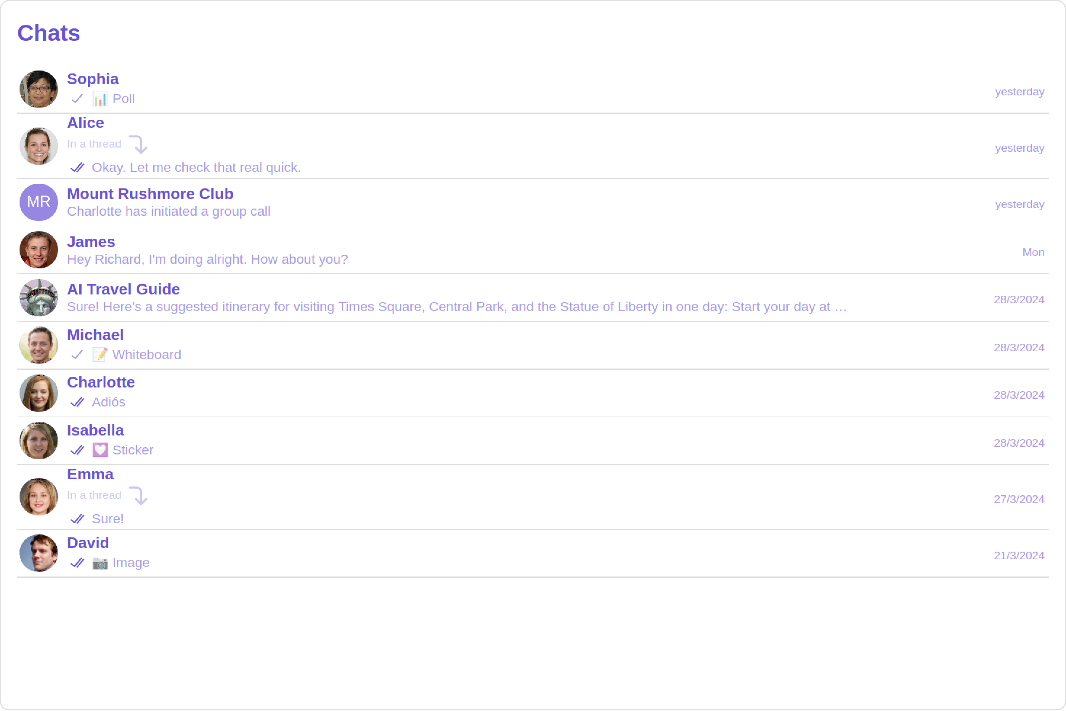
 You can customize the appearance of each list item by modifying the `getListItemView` function as follows:
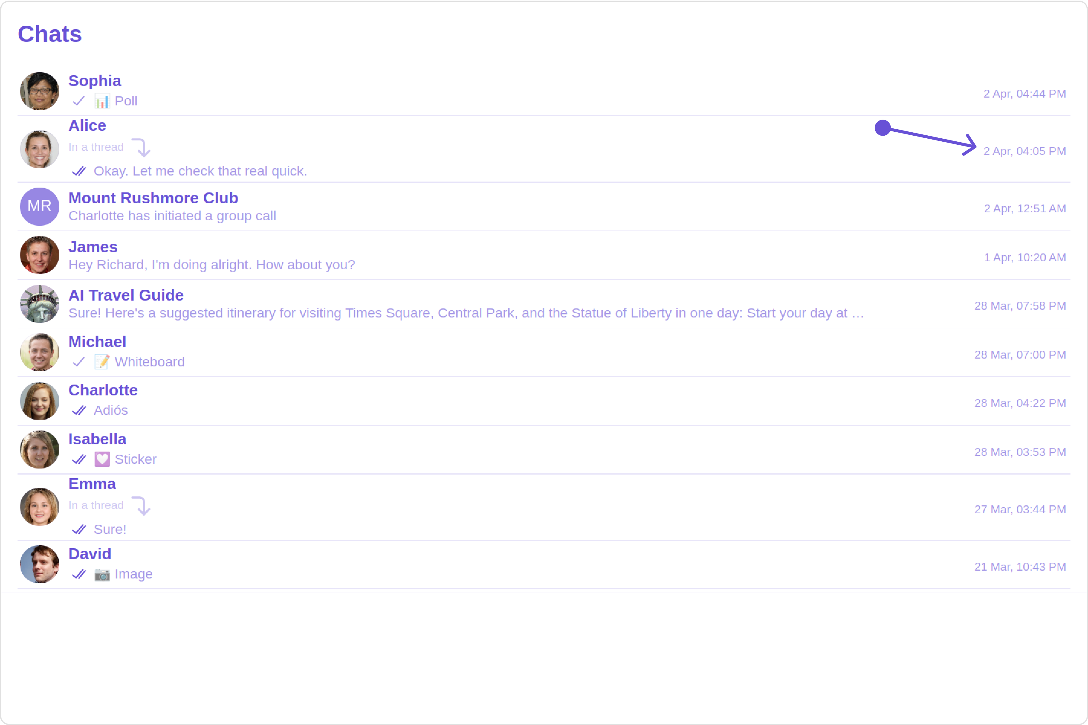
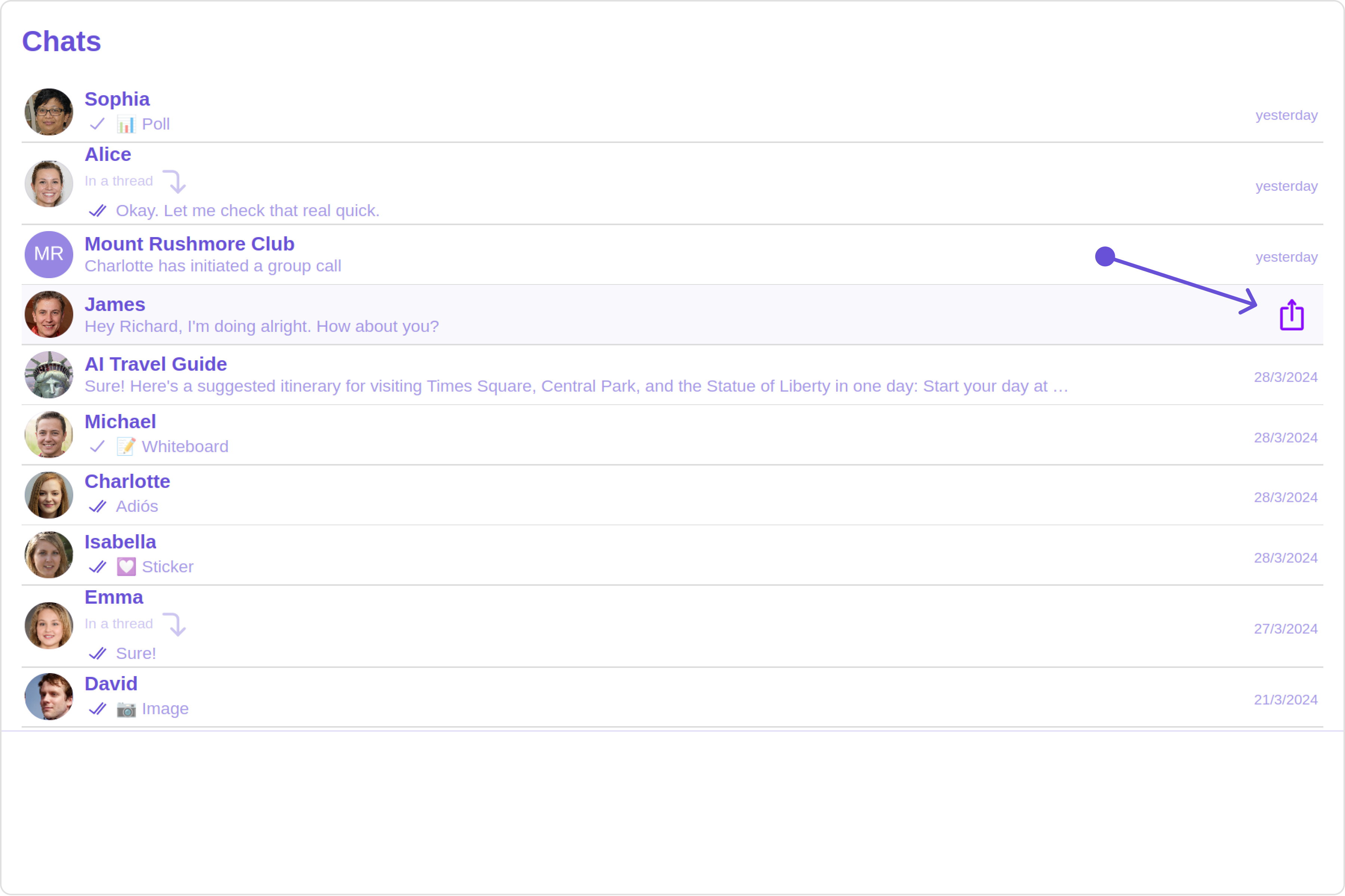
 You can customize the menu by modifying the `getMenus` function as follows:
 **Custom**
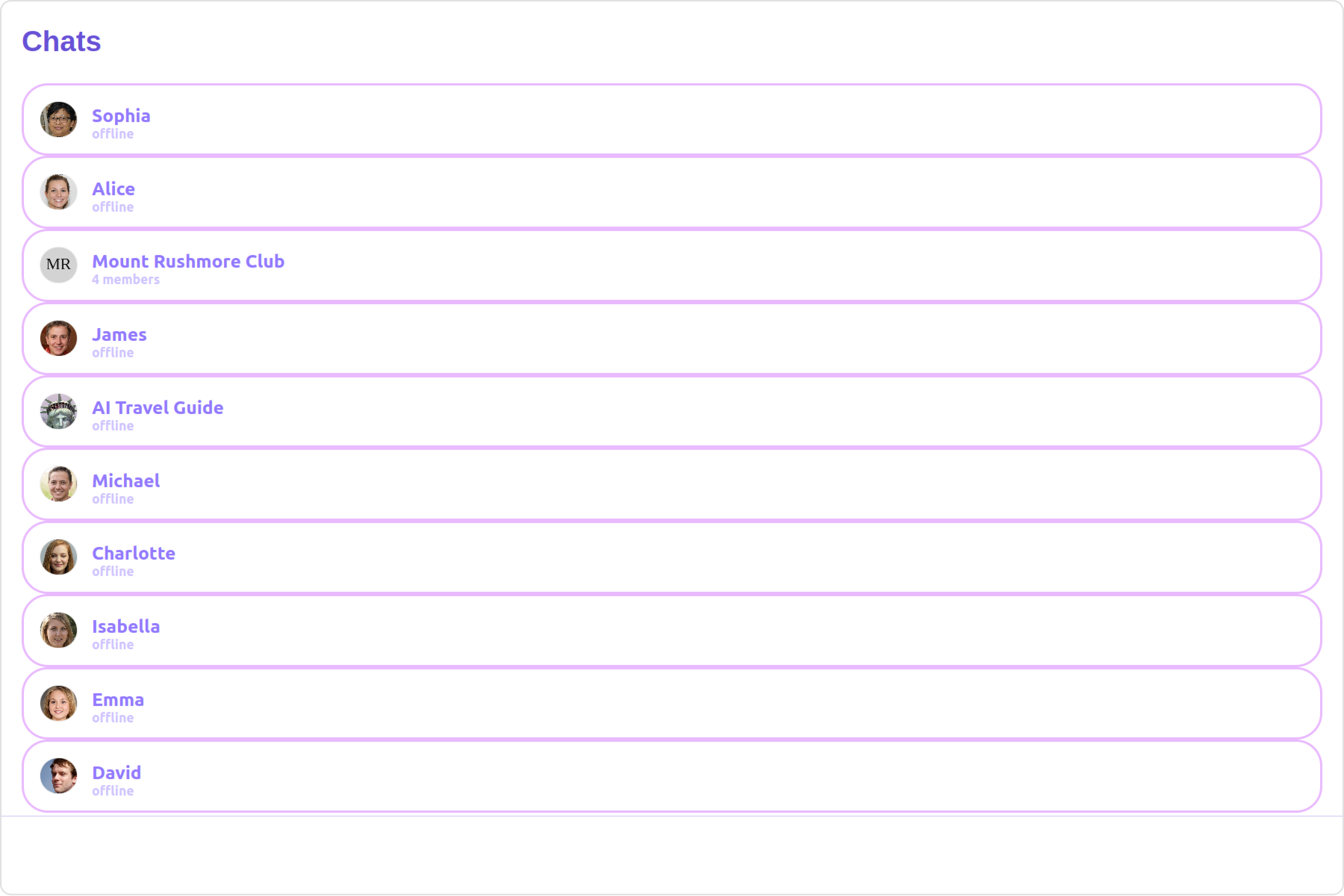
 #### SubtitleView
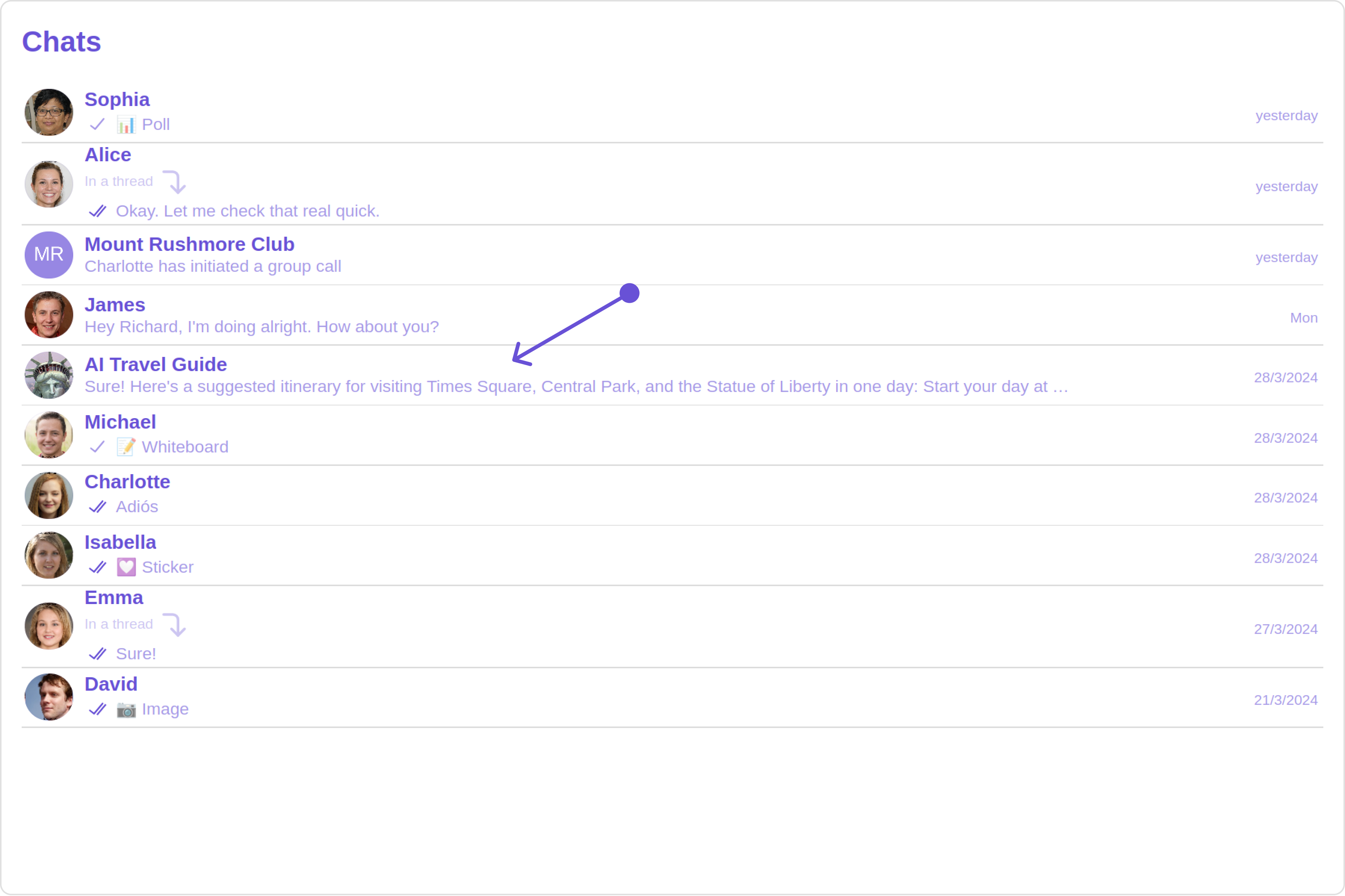
You can customize the subtitle view for each conversation item to meet your requirements
#### SubtitleView
You can customize the subtitle view for each conversation item to meet your requirements
 **Custom**
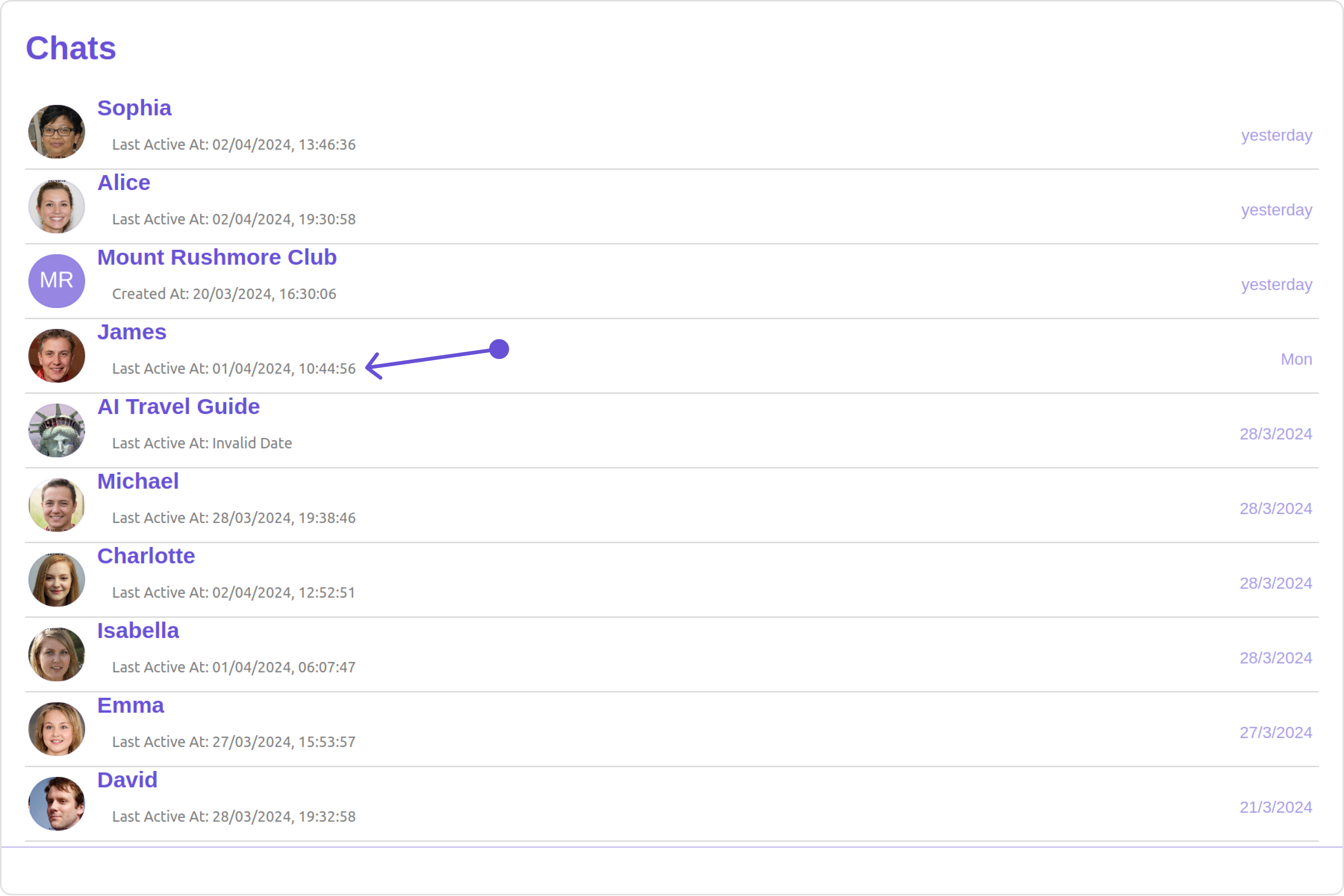 You can customize the subtitle view by modifying the `getSubtitleView` function as follows:
 **Custom**
 **Custom**
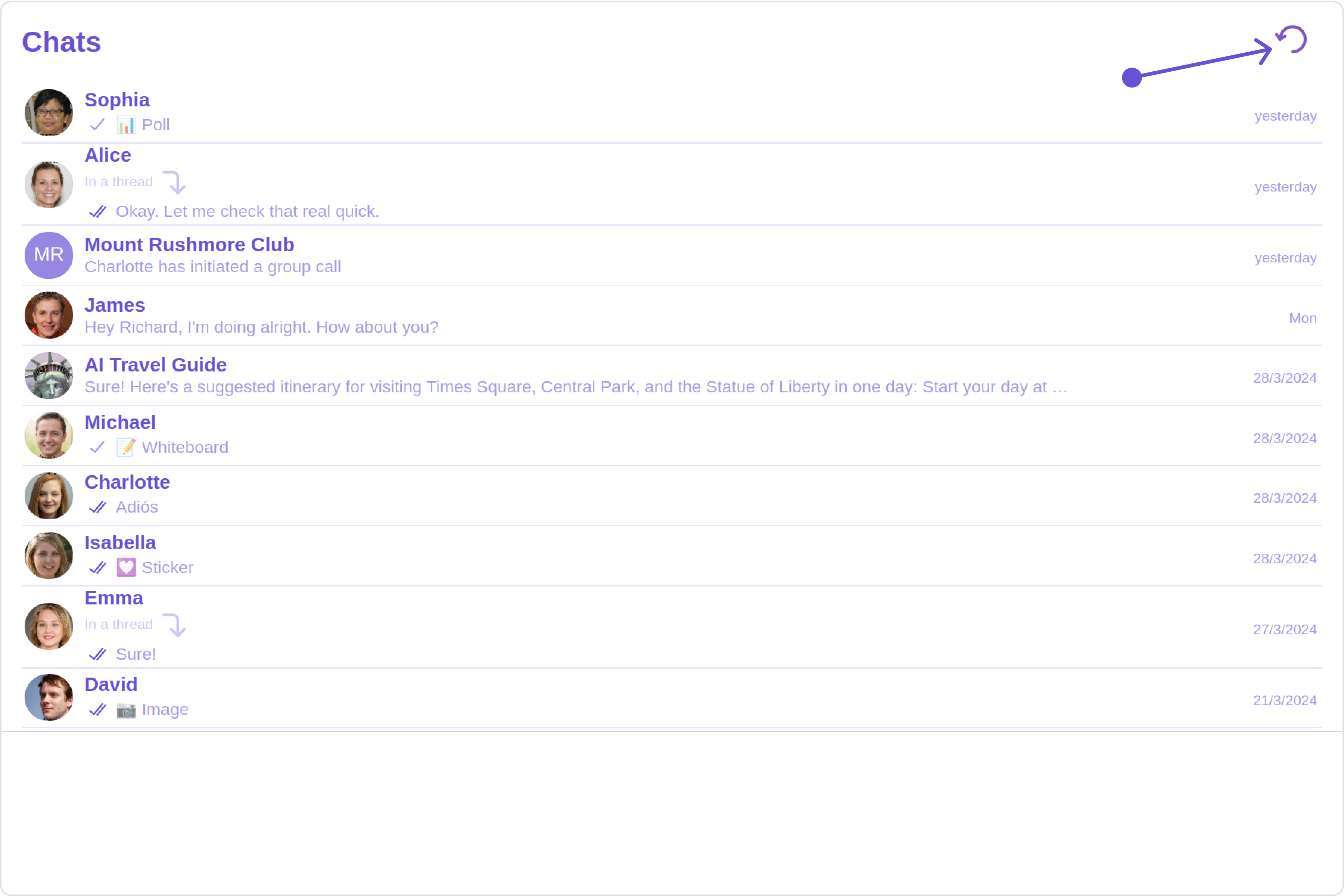
 You can customize the loading state view by modifying the `getLoadingStateView` function as follows:
 **Custom**
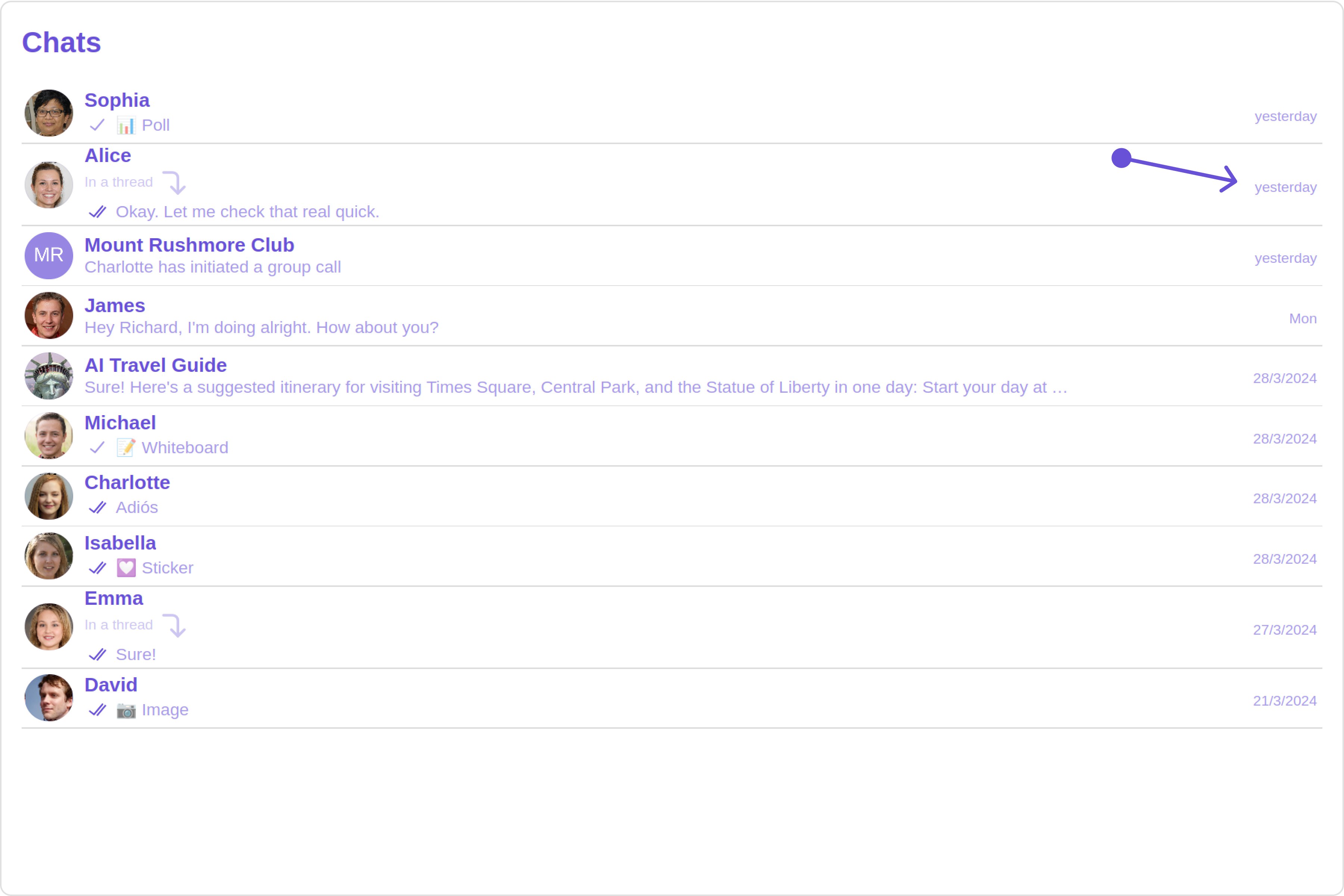
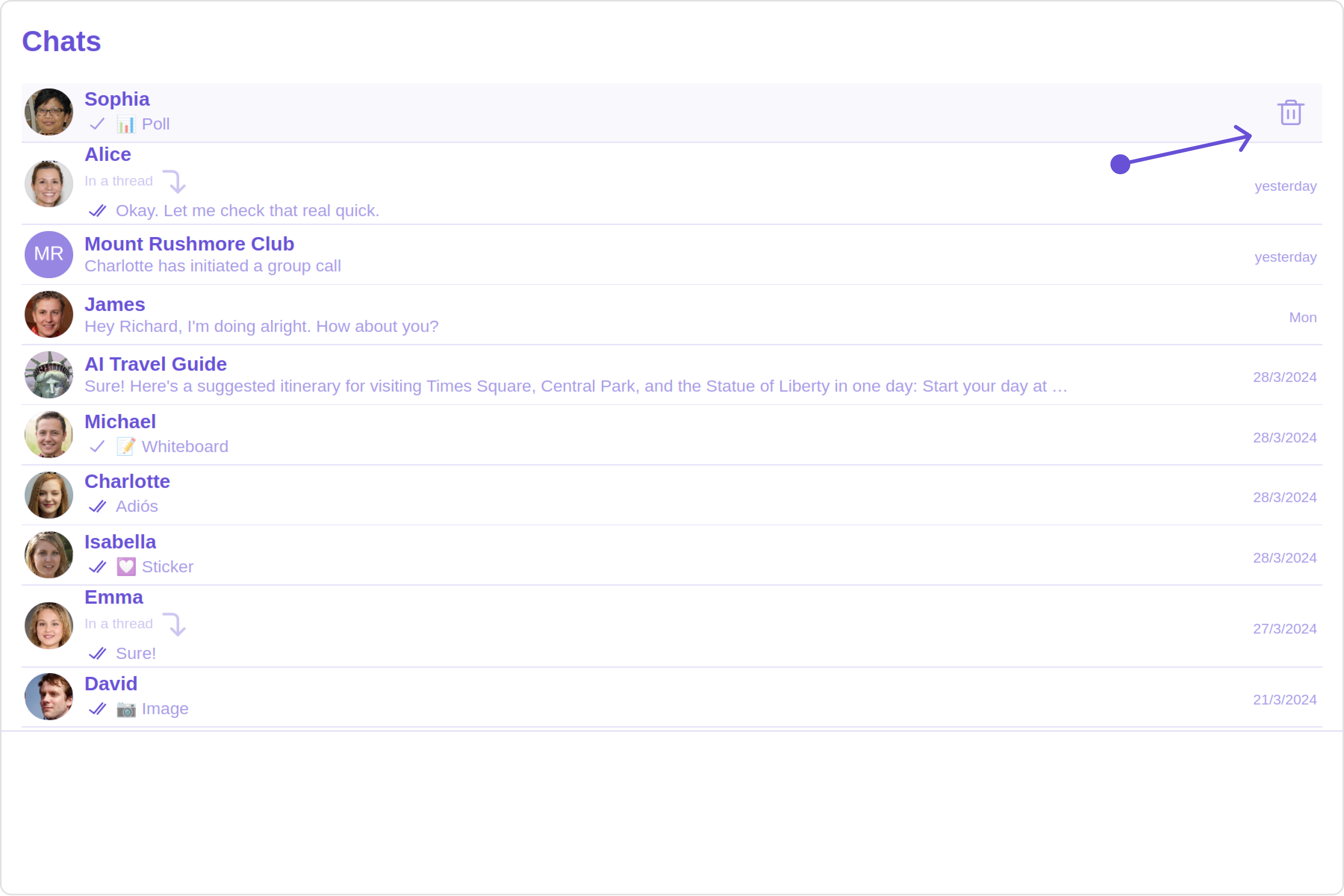
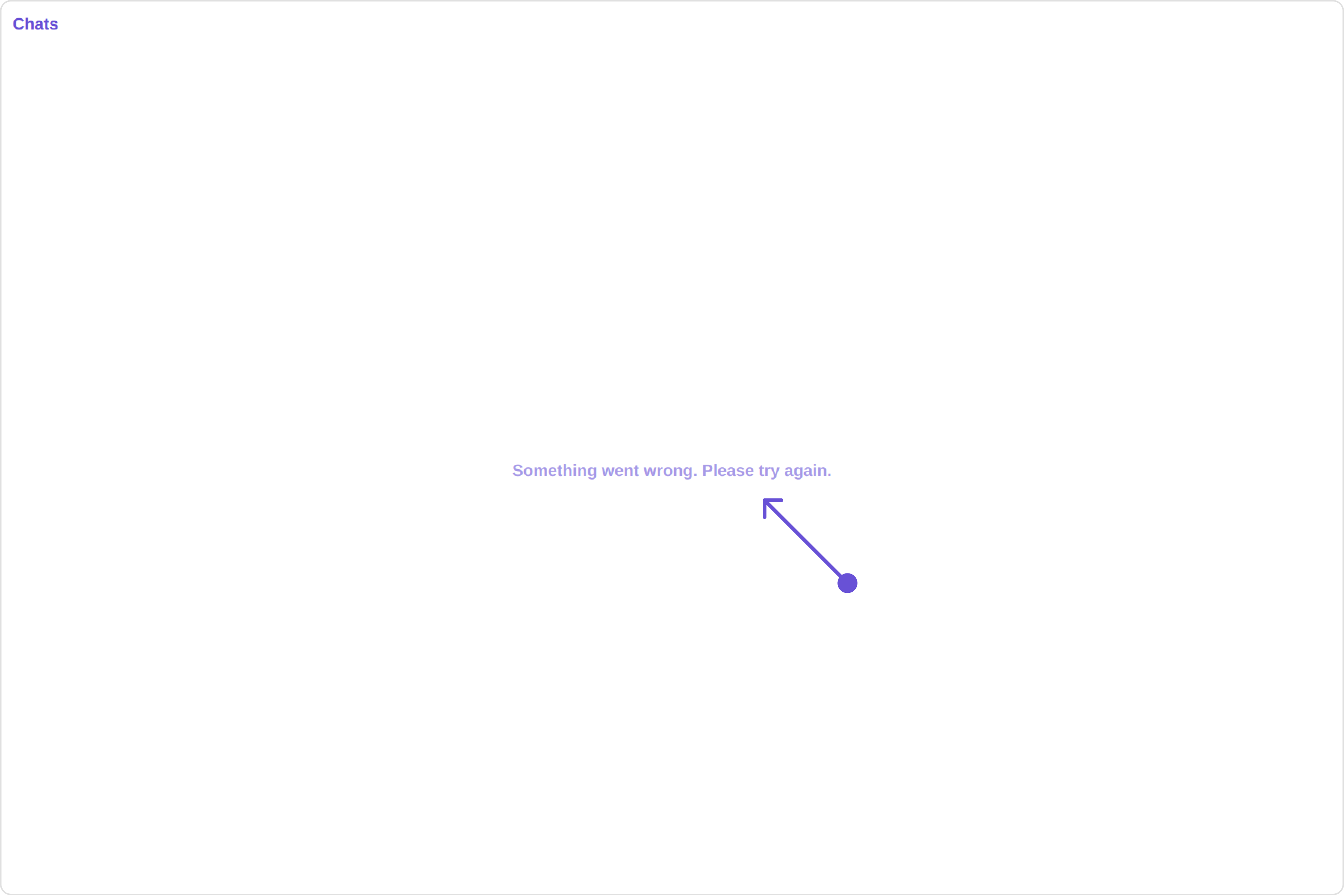
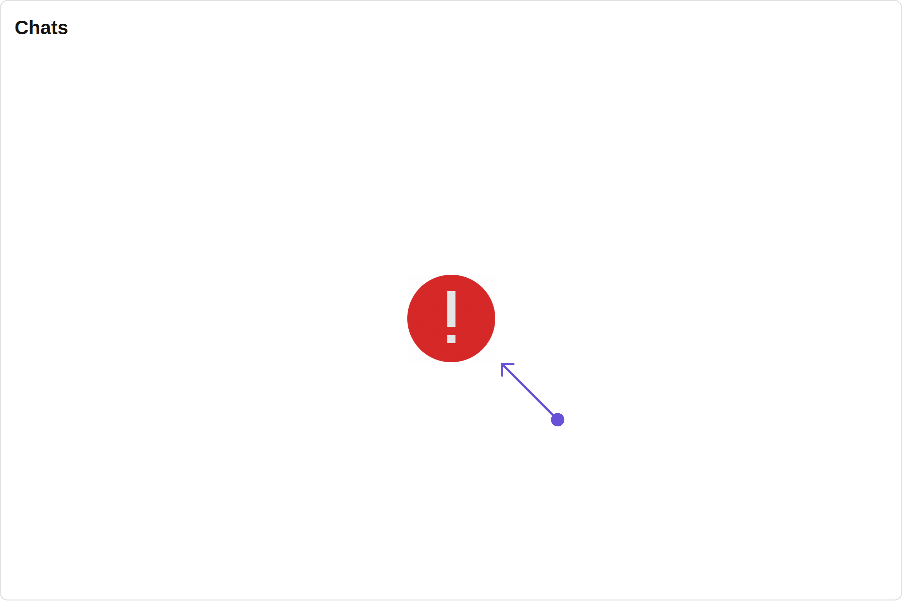 You can customize the empty state view by modifying the `getErrorStateView` function as follows: