> ## Documentation Index
> Fetch the complete documentation index at: https://cometchat-22654f5b-docs-rn-guide-message-privately.mintlify.site/llms.txt
> Use this file to discover all available pages before exploring further.
# Message Header
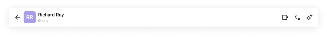
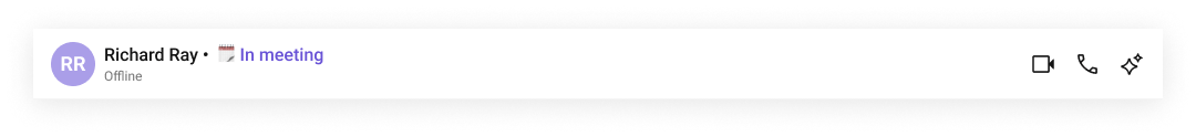
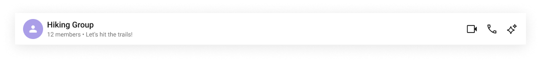
> Toolbar displaying conversation details with avatar, name, presence status, typing indicator, and call buttons.
```json theme={null}
{
"component": "CometChatMessageHeader",
"package": "@cometchat/chat-uikit-react",
"import": "import { CometChatMessageHeader } from \"@cometchat/chat-uikit-react\";",
"description": "Toolbar displaying conversation details with avatar, name, presence status, typing indicator, and call buttons.",
"cssRootClass": ".cometchat-message-header",
"primaryOutput": {
"prop": "onItemClick",
"type": "(entity: CometChat.User | CometChat.Group) => void"
},
"props": {
"data": {
"user": {
"type": "CometChat.User",
"default": "undefined",
"note": "For 1-on-1 conversations. Mutually exclusive with group."
},
"group": {
"type": "CometChat.Group",
"default": "undefined",
"note": "For group conversations. Mutually exclusive with user."
},
"callSettingsBuilder": {
"type": "any",
"default": "GlobalConfig.callSettingsBuilder or built-in default",
"note": "Custom call settings builder for ongoing call sessions."
},
"lastActiveAtDateTimeFormat": {
"type": "CometChatDateFormatConfig",
"default": "relative time format"
},
"summaryGenerationMessageCount": {
"type": "number",
"default": 1000
}
},
"callbacks": {
"onBack": "() => void",
"onItemClick": "(entity: CometChat.User | CometChat.Group) => void",
"onSearchOptionClicked": "() => void",
"onSummaryClick": "() => void",
"onVoiceCallClick": "(entity: CometChat.User | CometChat.Group) => void",
"onVideoCallClick": "(entity: CometChat.User | CometChat.Group) => void",
"onError": "((error: CometChat.CometChatException) => void) | null"
},
"visibility": {
"hideUserStatus": { "type": "boolean", "default": false },
"hideBackButton": { "type": "boolean", "default": false },
"showSearchOption": { "type": "boolean", "default": true },
"showConversationSummaryButton": { "type": "boolean", "default": false },
"enableAutoSummaryGeneration": { "type": "boolean", "default": false },
"hideVoiceCallButton": { "type": "boolean", "default": false },
"hideVideoCallButton": { "type": "boolean", "default": false }
},
"viewSlots": {
"leadingView": "ReactNode",
"titleView": "ReactNode",
"subtitleView": "ReactNode",
"trailingView": "ReactNode",
"auxiliaryButtonView": "ReactNode"
}
},
"eventsEmitted": [],
"eventsReceived": [
{
"name": "ui:call/rejected",
"payload": "{ call }",
"description": "Re-enables call buttons after incoming call rejection"
},
{
"name": "ui:call/ended",
"payload": "{}",
"description": "Resets all call state (re-enables buttons, hides call screens)"
},
{
"name": "ui:call/join",
"payload": "{ sessionId, isAudioOnly, group }",
"description": "Starts a direct call (user clicked Join on meeting bubble)"
},
{
"name": "ui:active-chat/changed",
"payload": "{ unreadCount, ... }",
"description": "Auto-triggers summary when unread >= 15 (if enabled)"
},
{
"name": "ui:group/member-added",
"payload": "{ group, members, messages }",
"description": "Updates group member count"
},
{
"name": "ui:group/member-kicked",
"payload": "{ group, user, message }",
"description": "Updates group member count"
},
{
"name": "ui:group/member-banned",
"payload": "{ group, user, message }",
"description": "Updates group member count"
},
{
"name": "ui:group/left",
"payload": "{ group }",
"description": "Updates group member count"
},
{
"name": "ui:group/member-joined",
"payload": "{ joinedGroup }",
"description": "Updates group member count"
},
{
"name": "ui:group/ownership-changed",
"payload": "{ group: CometChat.Group, newOwner: CometChat.User, previousOwnerUid: string }",
"description": "Updates group member count"
},
{
"name": "ui:group/member-scope-changed",
"payload": "{ group, user, newScope }",
"description": "Updates group member count"
}
],
"sdkListeners": [
"onUserOnline",
"onUserOffline",
"onTypingStarted",
"onTypingEnded",
"onGroupMemberJoined",
"onGroupMemberLeft",
"onGroupMemberKicked",
"onGroupMemberBanned",
"onMemberAddedToGroup",
"onIncomingCallReceived",
"onOutgoingCallAccepted",
"onOutgoingCallRejected",
"onIncomingCallCancelled"
],
"types": {
"CometChatDateFormatConfig": {
"today": "string | undefined",
"yesterday": "string | undefined",
"lastWeek": "string | undefined",
"otherDays": "string | undefined",
"relativeTime": {
"minute": "string | undefined",
"minutes": "string | undefined",
"hour": "string | undefined",
"hours": "string | undefined"
}
}
}
}
```
## Overview
`CometChatMessageHeader` is a toolbar component that sits at the top of the message panel. It displays the avatar, name, online status (for users), member count (for groups), typing indicator, and call buttons for the active conversation. Wire it with `CometChatMessageList` and `CometChatMessageComposer` to build a complete messaging experience.
**Live Preview** — interact with the default message header.
[Open in Storybook ↗](https://storybook.cometchat.io/react/?path=/story/components-messages-cometchat-message-header--user-chat-header)
The component handles:
* Displaying user avatar and name
* Online/offline presence status (for 1-on-1 conversations)
* Group member count (for group conversations)
* Real-time typing indicators
* Voice and video call buttons with call state management
* Back navigation for mobile layouts
* AI conversation summary trigger
* Search option for in-conversation search
> **Note:** `user` and `group` are mutually exclusive. Pass one or the other — not both. The component requires at least one to display anything.
***
## Usage
### Flat API (User Conversation)
```tsx theme={null}
import { CometChatMessageHeader } from "@cometchat/chat-uikit-react";
function MessagePanel({ user }: { user: CometChat.User }) {
return (
openDetails(entity)}
onBack={() => navigateBack()}
/>
);
}
```
### Flat API (Group Conversation)
```tsx theme={null}
import { CometChatMessageHeader } from "@cometchat/chat-uikit-react";
function MessagePanel({ group }: { group: CometChat.Group }) {
return (
openDetails(entity)}
hideVoiceCallButton={true}
/>
);
}
```
### Compound Composition
```tsx theme={null}
import { CometChatMessageHeader } from "@cometchat/chat-uikit-react";
function CustomHeader({ user }: { user: CometChat.User }) {
return (
navigateBack()}>
);
}
```
### Full Layout Example
```tsx theme={null}
import { useState } from "react";
import { CometChat } from "@cometchat/chat-sdk-javascript";
import {
CometChatConversations,
CometChatMessageHeader,
CometChatMessageList,
CometChatMessageComposer,
} from "@cometchat/chat-uikit-react";
function ChatApp() {
const [user, setUser] = useState();
const [group, setGroup] = useState();
const handleConversationClick = (conversation: CometChat.Conversation) => {
const entity = conversation.getConversationWith();
if (conversation.getConversationType() === "user") {
setUser(entity as CometChat.User);
setGroup(undefined);
} else {
setGroup(entity as CometChat.Group);
setUser(undefined);
}
};
return (
);
}
```
***
## Actions and Events
### Callback Props
| Prop | Signature | Fires when |
| ----------------------- | --------------------------------------------------------- | --------------------------------- |
| `onBack` | `() => void` | User clicks the back button |
| `onItemClick` | `(entity: CometChat.User \| CometChat.Group) => void` | User clicks the avatar/name area |
| `onSearchOptionClicked` | `() => void` | User clicks the search button |
| `onSummaryClick` | `() => void` | User clicks the AI summary button |
| `onVoiceCallClick` | `(entity: CometChat.User \| CometChat.Group) => void` | User clicks the voice call button |
| `onVideoCallClick` | `(entity: CometChat.User \| CometChat.Group) => void` | User clicks the video call button |
| `onError` | `((error: CometChat.CometChatException) => void) \| null` | SDK error occurs |
### Events Emitted
This component does not emit any UI events directly. Call initiation publishes call events internally via the SDK.
### Events Received
UI events this component subscribes to (published by other components):
| Event | Payload | Behavior |
| ------------------------------- | --------------------------------------- | -------------------------------------------------------------- |
| `ui:call/rejected` | `{ call }` | Re-enables call buttons after incoming call rejection |
| `ui:call/ended` | `{}` | Resets all call state (re-enables buttons, hides call screens) |
| `ui:call/join` | `{ sessionId, isAudioOnly, group }` | Starts a direct call (user clicked Join on meeting bubble) |
| `ui:active-chat/changed` | `{ unreadCount, ... }` | Auto-triggers summary when unread >= 15 (if enabled) |
| `ui:group/member-added` | `{ group, members, messages }` | Updates group member count |
| `ui:group/member-kicked` | `{ group, user, message }` | Updates group member count |
| `ui:group/member-banned` | `{ group, user, message }` | Updates group member count |
| `ui:group/left` | `{ group }` | Updates group member count |
| `ui:group/member-joined` | `{ joinedGroup }` | Updates group member count |
| `ui:group/ownership-changed` | `{ group, newOwner, previousOwnerUid }` | Updates group member count |
| `ui:group/member-scope-changed` | `{ group, user, newScope }` | Updates group member count |
### SDK Listeners (Automatic)
These SDK listeners are attached internally. The component updates its state automatically — no manual subscription needed:
* Presence: `onUserOnline`, `onUserOffline`
* Typing: `onTypingStarted`, `onTypingEnded`
* Groups: `onGroupMemberJoined`, `onGroupMemberLeft`, `onGroupMemberKicked`, `onGroupMemberBanned`, `onMemberAddedToGroup`
* Calls: `onIncomingCallReceived`, `onOutgoingCallAccepted`, `onOutgoingCallRejected`, `onIncomingCallCancelled`
***
## Customization
### View Props
Use view props to replace sections of the default UI while keeping the component's behavior intact:
```tsx theme={null}
}
subtitleView={}
trailingView={}
/>
```
| Slot | Type | Replaces |
| --------------------- | ----------- | ---------------------------- |
| `leadingView` | `ReactNode` | Avatar area |
| `titleView` | `ReactNode` | Display name |
| `subtitleView` | `ReactNode` | Status / typing indicator |
| `trailingView` | `ReactNode` | Call buttons + overflow menu |
| `auxiliaryButtonView` | `ReactNode` | Auxiliary button area |
#### Custom item layout
Combine `leadingView`, `titleView`, and `subtitleView` to fully replace the header's item area.
 ```tsx theme={null}
import { CometChat } from "@cometchat/chat-sdk-javascript";
import { CometChatMessageHeader, CometChatAvatar } from "@cometchat/chat-uikit-react";
function CustomItemViewHeader({ user }: { user: CometChat.User }) {
return (
}
titleView={{user.getName()}}
subtitleView={{user.getStatus()}}
/>
);
}
```
#### titleView
```tsx theme={null}
import { CometChat } from "@cometchat/chat-sdk-javascript";
import { CometChatMessageHeader, CometChatAvatar } from "@cometchat/chat-uikit-react";
function CustomItemViewHeader({ user }: { user: CometChat.User }) {
return (
}
titleView={{user.getName()}}
subtitleView={{user.getStatus()}}
/>
);
}
```
#### titleView
 ```tsx theme={null}
import { CometChat } from "@cometchat/chat-sdk-javascript";
import { CometChatMessageHeader } from "@cometchat/chat-uikit-react";
function CustomTitleHeader({ user }: { user: CometChat.User }) {
return (
{user.getName() + " • "}
{user.getStatusMessage()}
}
/>
);
}
```
```css theme={null}
.cometchat-message-header .message-header__title-view {
display: flex;
gap: 4px;
width: 100%;
}
.message-header__title-view-name {
color: #141414;
font: 500 16px/19.2px Roboto;
}
.message-header__title-view-status {
color: #6852d6;
font: 400 16px/19.2px Roboto;
}
```
#### subtitleView
```tsx theme={null}
import { CometChat } from "@cometchat/chat-sdk-javascript";
import { CometChatMessageHeader } from "@cometchat/chat-uikit-react";
function CustomTitleHeader({ user }: { user: CometChat.User }) {
return (
{user.getName() + " • "}
{user.getStatusMessage()}
}
/>
);
}
```
```css theme={null}
.cometchat-message-header .message-header__title-view {
display: flex;
gap: 4px;
width: 100%;
}
.message-header__title-view-name {
color: #141414;
font: 500 16px/19.2px Roboto;
}
.message-header__title-view-status {
color: #6852d6;
font: 400 16px/19.2px Roboto;
}
```
#### subtitleView
 ```tsx theme={null}
import { CometChat } from "@cometchat/chat-sdk-javascript";
import { CometChatMessageHeader } from "@cometchat/chat-uikit-react";
function CustomSubtitleHeader({ group }: { group: CometChat.Group }) {
return (
{group.getMembersCount() + " • " + group.getDescription()}
}
/>
);
}
```
#### leadingView
```tsx theme={null}
import { CometChat } from "@cometchat/chat-sdk-javascript";
import { CometChatMessageHeader } from "@cometchat/chat-uikit-react";
function CustomSubtitleHeader({ group }: { group: CometChat.Group }) {
return (
{group.getMembersCount() + " • " + group.getDescription()}
}
/>
);
}
```
#### leadingView
 ```tsx theme={null}
import { CometChat } from "@cometchat/chat-sdk-javascript";
import { CometChatMessageHeader, CometChatAvatar } from "@cometchat/chat-uikit-react";
function CustomLeadingHeader({ user }: { user: CometChat.User }) {
return (
{user.getRole()}
}
/>
);
}
```
```css theme={null}
.message-header__leading-view {
display: flex;
flex-direction: column;
align-items: center;
gap: 4px;
}
.message-header__leading-view-role {
color: #6852d6;
font: 600 8px Roboto;
}
```
### Compound Composition
For full layout control, use sub-components. Omit any sub-component to hide it:
```tsx theme={null}
{/* No BackButton — it won't render */}
{/* No CallButtons — they won't render */}
```
Available sub-components:
| Sub-component | Description | Props | Flat API equivalent |
| ------------------ | ------------------------------ | --------------------------- | --------------------- |
| `Root` | Context provider and container | All Root props + `children` | — |
| `BackButton` | Back navigation button | `className` | — |
| `Avatar` | User/group avatar | `className` | `leadingView` |
| `Title` | Display name | `className` | `titleView` |
| `Subtitle` | Status / typing indicator | `className` | `subtitleView` |
| `CallButtons` | Voice and video call buttons | `className` | — |
| `SearchButton` | Search trigger | `onClick`, `className` | — |
| `SummaryButton` | AI summary trigger | `onClick`, `className` | — |
| `OverflowMenu` | Additional actions | `className` | — |
| `AuxiliaryButtons` | Custom auxiliary buttons | `children`, `className` | `auxiliaryButtonView` |
### CSS Styling
Override design tokens on the component selector:
```css theme={null}
.cometchat-message-header {
--cometchat-background-color-01: #1a1a2e;
--cometchat-text-color-primary: #ffffff;
}
.cometchat-message-header__call-buttons {
gap: 12px;
}
```
***
## Props
All props are optional (but you need either `user` or `group` for the component to display anything).
View slot props (`leadingView`, `titleView`, `subtitleView`, `trailingView`, `auxiliaryButtonView`) are convenience props available only on the flat API. In compound composition mode, use the corresponding sub-components directly.
***
### user
The user to display in the header. Use for 1-on-1 conversations. Mutually exclusive with `group`.
| | |
| ------- | ---------------- |
| Type | `CometChat.User` |
| Default | `undefined` |
***
### group
The group to display in the header. Use for group conversations. Mutually exclusive with `user`.
| | |
| ------- | ----------------- |
| Type | `CometChat.Group` |
| Default | `undefined` |
***
### hideUserStatus
Hide the online/offline status indicator in the subtitle.
| | |
| ------- | --------- |
| Type | `boolean` |
| Default | `false` |
***
### hideBackButton
Hide the back navigation button. Useful on desktop layouts where back navigation is unnecessary.
| | |
| ------- | --------- |
| Type | `boolean` |
| Default | `false` |
***
### showSearchOption
Whether to show the search button in the header toolbar.
| | |
| ------- | --------- |
| Type | `boolean` |
| Default | `true` |
***
### showConversationSummaryButton
Whether to show the AI conversation summary button.
| | |
| ------- | --------- |
| Type | `boolean` |
| Default | `false` |
***
### enableAutoSummaryGeneration
Auto-trigger conversation summary when unread message count >= 15. Requires `showConversationSummaryButton` to be `true` and `onSummaryClick` to be provided.
| | |
| ------- | --------- |
| Type | `boolean` |
| Default | `false` |
***
### summaryGenerationMessageCount
Number of last messages to include in the summary request. Passed to the `onSummaryClick` callback via context.
| | |
| ------- | -------- |
| Type | `number` |
| Default | `1000` |
***
### hideVoiceCallButton
Hide the voice call button.
| | |
| ------- | --------- |
| Type | `boolean` |
| Default | `false` |
***
### hideVideoCallButton
Hide the video call button.
| | |
| ------- | --------- |
| Type | `boolean` |
| Default | `false` |
***
### callSettingsBuilder
Custom call settings builder for ongoing call sessions. Passed to the OngoingCall component when a call is started. Falls back to `GlobalConfig.callSettingsBuilder`, then the built-in default.
| | |
| ------- | ------------------------------------------------------ |
| Type | `any` |
| Default | `GlobalConfig.callSettingsBuilder` or built-in default |
***
### lastActiveAtDateTimeFormat
Custom date/time format for the "last active" timestamp shown in the subtitle when the user is offline.
| | |
| ------- | --------------------------- |
| Type | `CometChatDateFormatConfig` |
| Default | Relative time format |
***
### onBack
Callback when the back button is clicked.
| | |
| ------- | ------------ |
| Type | `() => void` |
| Default | `undefined` |
***
### onItemClick
Callback when the header item (avatar/name area) is clicked. Typically used to open a details panel.
| | |
| ------- | ----------------------------------------------------- |
| Type | `(entity: CometChat.User \| CometChat.Group) => void` |
| Default | `undefined` |
***
### onSearchOptionClicked
Callback when the search button is clicked.
| | |
| ------- | ------------ |
| Type | `() => void` |
| Default | `undefined` |
***
### onSummaryClick
Callback when the AI conversation summary button is clicked.
| | |
| ------- | ------------ |
| Type | `() => void` |
| Default | `undefined` |
***
### onVoiceCallClick
Callback when the voice call button is clicked. When provided, overrides the default call initiation behavior.
| | |
| ------- | ----------------------------------------------------- |
| Type | `(entity: CometChat.User \| CometChat.Group) => void` |
| Default | `undefined` (uses built-in call initiation) |
***
### onVideoCallClick
Callback when the video call button is clicked. When provided, overrides the default call initiation behavior.
| | |
| ------- | ----------------------------------------------------- |
| Type | `(entity: CometChat.User \| CometChat.Group) => void` |
| Default | `undefined` (uses built-in call initiation) |
***
### onError
Callback when an SDK error occurs during call operations or other internal processes.
| | |
| ------- | --------------------------------------------------------- |
| Type | `((error: CometChat.CometChatException) => void) \| null` |
| Default | `null` |
***
## CSS Selectors
| Target | Selector |
| -------------- | ------------------------------------------- |
| Root container | `.cometchat-message-header` |
| Back button | `.cometchat-message-header__back-button` |
| Avatar | `.cometchat-message-header__avatar` |
| Content area | `.cometchat-message-header__content` |
| Title | `.cometchat-message-header__title` |
| Subtitle | `.cometchat-message-header__subtitle` |
| Trailing area | `.cometchat-message-header__trailing` |
| Call buttons | `.cometchat-message-header__call-buttons` |
| Search button | `.cometchat-message-header__search-button` |
| Summary button | `.cometchat-message-header__summary-button` |
***
## Next Steps
Display messages for the active conversation
Compose and send messages
Header for threaded message views
Customize colors, fonts, and spacing
```tsx theme={null}
import { CometChat } from "@cometchat/chat-sdk-javascript";
import { CometChatMessageHeader, CometChatAvatar } from "@cometchat/chat-uikit-react";
function CustomLeadingHeader({ user }: { user: CometChat.User }) {
return (
{user.getRole()}
}
/>
);
}
```
```css theme={null}
.message-header__leading-view {
display: flex;
flex-direction: column;
align-items: center;
gap: 4px;
}
.message-header__leading-view-role {
color: #6852d6;
font: 600 8px Roboto;
}
```
### Compound Composition
For full layout control, use sub-components. Omit any sub-component to hide it:
```tsx theme={null}
{/* No BackButton — it won't render */}
{/* No CallButtons — they won't render */}
```
Available sub-components:
| Sub-component | Description | Props | Flat API equivalent |
| ------------------ | ------------------------------ | --------------------------- | --------------------- |
| `Root` | Context provider and container | All Root props + `children` | — |
| `BackButton` | Back navigation button | `className` | — |
| `Avatar` | User/group avatar | `className` | `leadingView` |
| `Title` | Display name | `className` | `titleView` |
| `Subtitle` | Status / typing indicator | `className` | `subtitleView` |
| `CallButtons` | Voice and video call buttons | `className` | — |
| `SearchButton` | Search trigger | `onClick`, `className` | — |
| `SummaryButton` | AI summary trigger | `onClick`, `className` | — |
| `OverflowMenu` | Additional actions | `className` | — |
| `AuxiliaryButtons` | Custom auxiliary buttons | `children`, `className` | `auxiliaryButtonView` |
### CSS Styling
Override design tokens on the component selector:
```css theme={null}
.cometchat-message-header {
--cometchat-background-color-01: #1a1a2e;
--cometchat-text-color-primary: #ffffff;
}
.cometchat-message-header__call-buttons {
gap: 12px;
}
```
***
## Props
All props are optional (but you need either `user` or `group` for the component to display anything).
View slot props (`leadingView`, `titleView`, `subtitleView`, `trailingView`, `auxiliaryButtonView`) are convenience props available only on the flat API. In compound composition mode, use the corresponding sub-components directly.
***
### user
The user to display in the header. Use for 1-on-1 conversations. Mutually exclusive with `group`.
| | |
| ------- | ---------------- |
| Type | `CometChat.User` |
| Default | `undefined` |
***
### group
The group to display in the header. Use for group conversations. Mutually exclusive with `user`.
| | |
| ------- | ----------------- |
| Type | `CometChat.Group` |
| Default | `undefined` |
***
### hideUserStatus
Hide the online/offline status indicator in the subtitle.
| | |
| ------- | --------- |
| Type | `boolean` |
| Default | `false` |
***
### hideBackButton
Hide the back navigation button. Useful on desktop layouts where back navigation is unnecessary.
| | |
| ------- | --------- |
| Type | `boolean` |
| Default | `false` |
***
### showSearchOption
Whether to show the search button in the header toolbar.
| | |
| ------- | --------- |
| Type | `boolean` |
| Default | `true` |
***
### showConversationSummaryButton
Whether to show the AI conversation summary button.
| | |
| ------- | --------- |
| Type | `boolean` |
| Default | `false` |
***
### enableAutoSummaryGeneration
Auto-trigger conversation summary when unread message count >= 15. Requires `showConversationSummaryButton` to be `true` and `onSummaryClick` to be provided.
| | |
| ------- | --------- |
| Type | `boolean` |
| Default | `false` |
***
### summaryGenerationMessageCount
Number of last messages to include in the summary request. Passed to the `onSummaryClick` callback via context.
| | |
| ------- | -------- |
| Type | `number` |
| Default | `1000` |
***
### hideVoiceCallButton
Hide the voice call button.
| | |
| ------- | --------- |
| Type | `boolean` |
| Default | `false` |
***
### hideVideoCallButton
Hide the video call button.
| | |
| ------- | --------- |
| Type | `boolean` |
| Default | `false` |
***
### callSettingsBuilder
Custom call settings builder for ongoing call sessions. Passed to the OngoingCall component when a call is started. Falls back to `GlobalConfig.callSettingsBuilder`, then the built-in default.
| | |
| ------- | ------------------------------------------------------ |
| Type | `any` |
| Default | `GlobalConfig.callSettingsBuilder` or built-in default |
***
### lastActiveAtDateTimeFormat
Custom date/time format for the "last active" timestamp shown in the subtitle when the user is offline.
| | |
| ------- | --------------------------- |
| Type | `CometChatDateFormatConfig` |
| Default | Relative time format |
***
### onBack
Callback when the back button is clicked.
| | |
| ------- | ------------ |
| Type | `() => void` |
| Default | `undefined` |
***
### onItemClick
Callback when the header item (avatar/name area) is clicked. Typically used to open a details panel.
| | |
| ------- | ----------------------------------------------------- |
| Type | `(entity: CometChat.User \| CometChat.Group) => void` |
| Default | `undefined` |
***
### onSearchOptionClicked
Callback when the search button is clicked.
| | |
| ------- | ------------ |
| Type | `() => void` |
| Default | `undefined` |
***
### onSummaryClick
Callback when the AI conversation summary button is clicked.
| | |
| ------- | ------------ |
| Type | `() => void` |
| Default | `undefined` |
***
### onVoiceCallClick
Callback when the voice call button is clicked. When provided, overrides the default call initiation behavior.
| | |
| ------- | ----------------------------------------------------- |
| Type | `(entity: CometChat.User \| CometChat.Group) => void` |
| Default | `undefined` (uses built-in call initiation) |
***
### onVideoCallClick
Callback when the video call button is clicked. When provided, overrides the default call initiation behavior.
| | |
| ------- | ----------------------------------------------------- |
| Type | `(entity: CometChat.User \| CometChat.Group) => void` |
| Default | `undefined` (uses built-in call initiation) |
***
### onError
Callback when an SDK error occurs during call operations or other internal processes.
| | |
| ------- | --------------------------------------------------------- |
| Type | `((error: CometChat.CometChatException) => void) \| null` |
| Default | `null` |
***
## CSS Selectors
| Target | Selector |
| -------------- | ------------------------------------------- |
| Root container | `.cometchat-message-header` |
| Back button | `.cometchat-message-header__back-button` |
| Avatar | `.cometchat-message-header__avatar` |
| Content area | `.cometchat-message-header__content` |
| Title | `.cometchat-message-header__title` |
| Subtitle | `.cometchat-message-header__subtitle` |
| Trailing area | `.cometchat-message-header__trailing` |
| Call buttons | `.cometchat-message-header__call-buttons` |
| Search button | `.cometchat-message-header__search-button` |
| Summary button | `.cometchat-message-header__summary-button` |
***
## Next Steps
Display messages for the active conversation
Compose and send messages
Header for threaded message views
Customize colors, fonts, and spacing