> ## Documentation Index
> Fetch the complete documentation index at: https://cometchat-22654f5b-docs-rn-guide-message-privately.mintlify.site/llms.txt
> Use this file to discover all available pages before exploring further.
# Reactions
> Reactions — CometChat documentation.
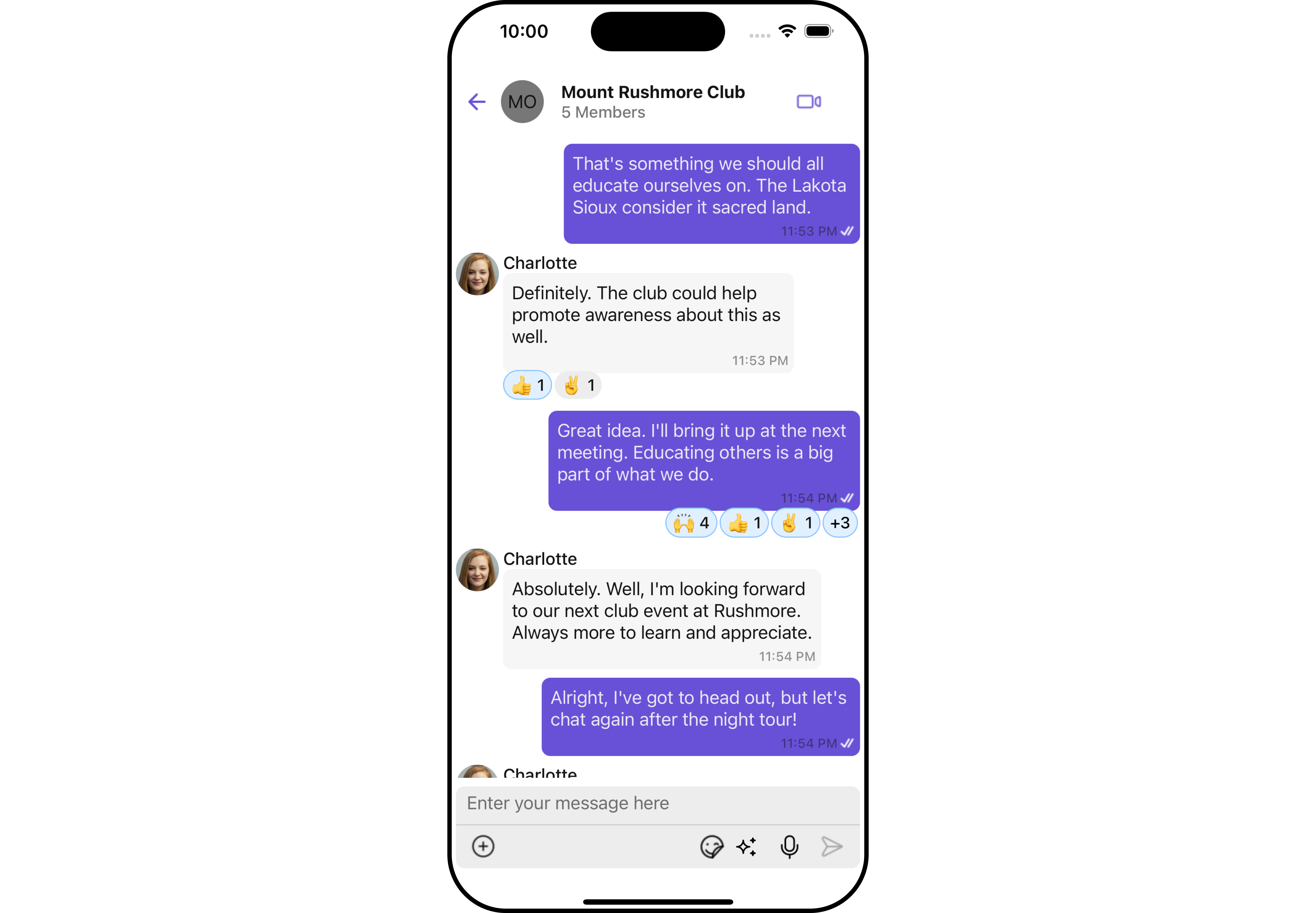
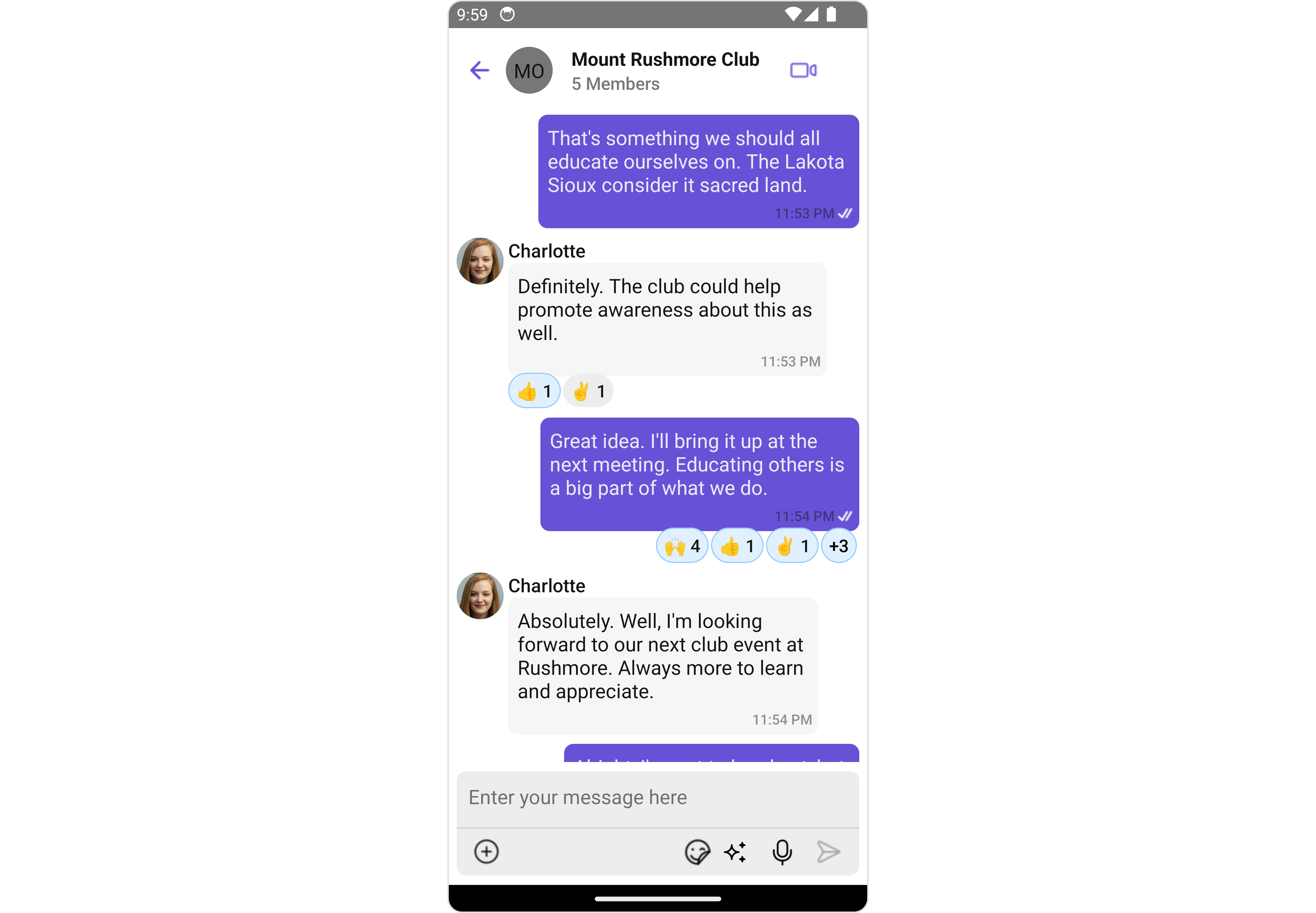
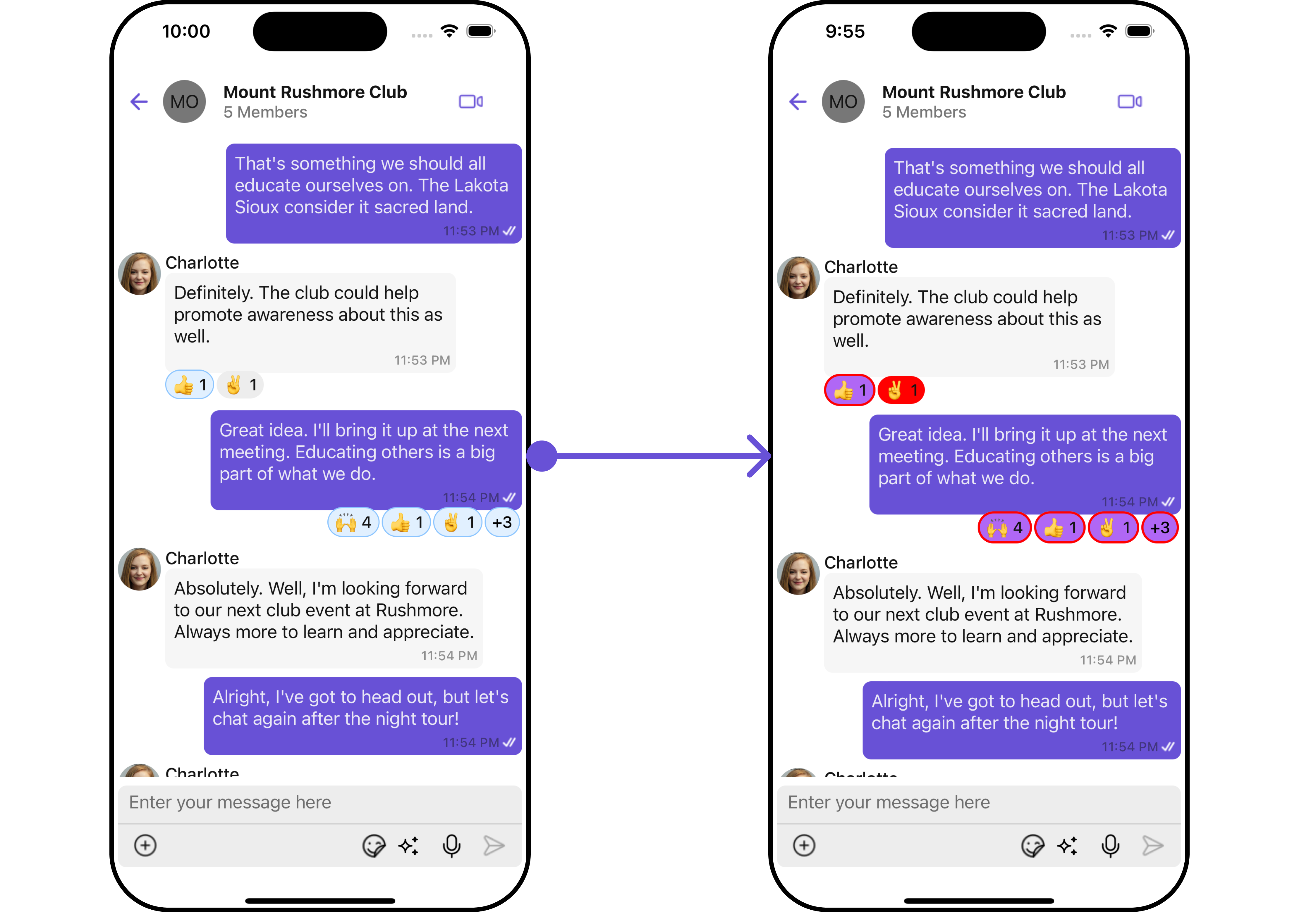
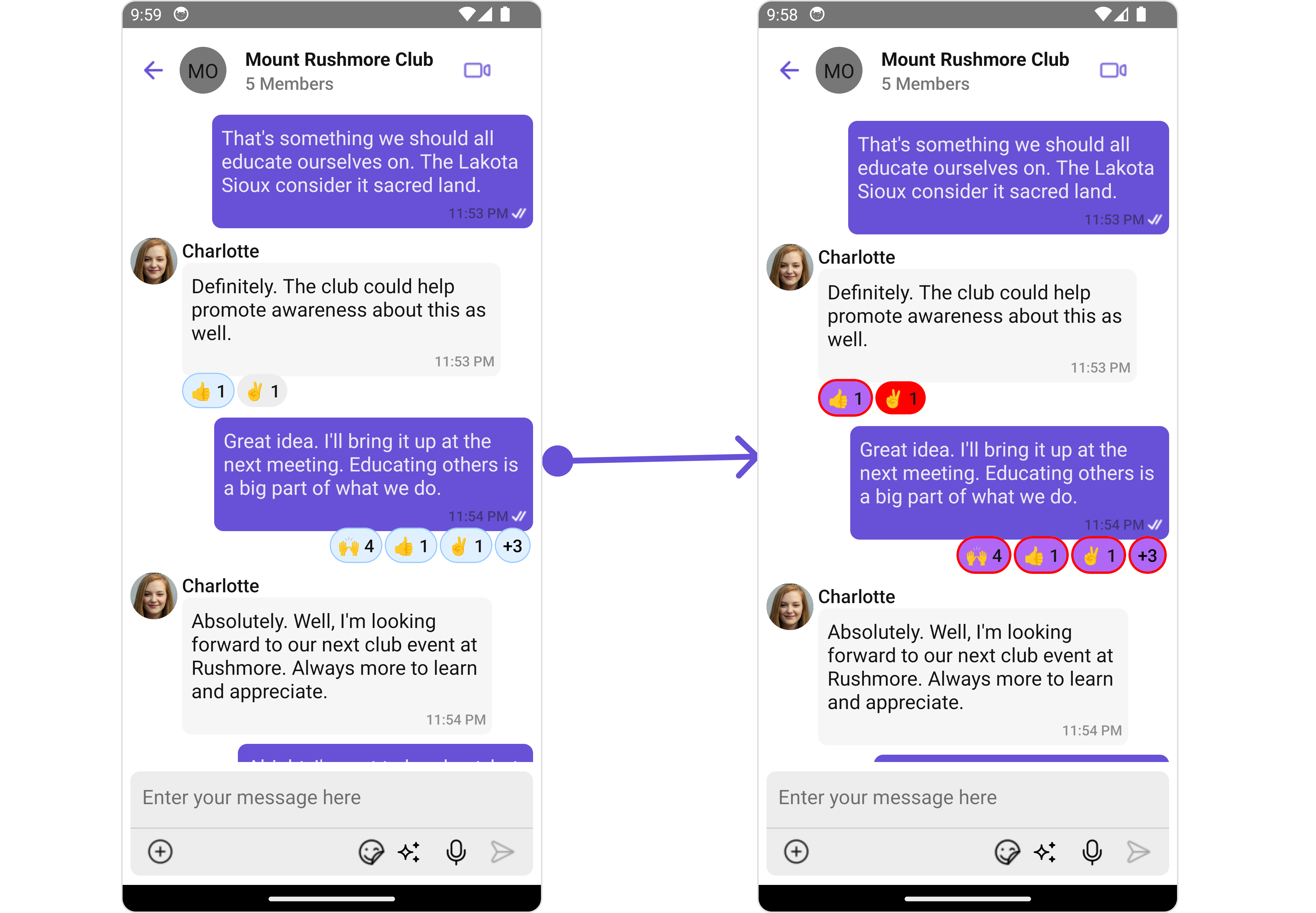
The `CometChatReactions` component provides a visual representation of emoji reactions associated with a specific message. It enables users to quickly identify which emojis were used to react to the message and by whom.
 ## Usage
### Integration
The following code snippet illustrates how you can directly incorporate the Reactions component into your app.
```tsx theme={null}
import React from "react";
import { CometChat } from '@cometchat/chat-sdk-react-native';
import { CometChatMessages, CometChatReactions, ReactionsStyleInterface } from '@cometchat/chat-uikit-react-native';
function App(): React.JSX.Element {
const [chatUser, setChatUser] = React.useState();
const [message, setMessage] = React.useState(undefined);
React.useEffect(() => {
CometChat.getUser("uid").then((user) => {
setChatUser(user);
})
CometChat.getMessageDetails(messageId).then((message: any) => {
setMessage(message);
});
}, []);
return (
<>
{message &&
}
);
}
```
### Actions
[Actions](/ui-kit/react-native/v4/components-overview#actions) dictate how a component functions. They are divided into two types: Predefined and User-defined. You can override either type, allowing you to tailor the behavior of the component to fit your specific needs.
##### 1. onReactionPress
`ReactionPress` is triggered when you press on each Reaction in the footer view of message bubble. You can override this action using the following code snippet.
```tsx theme={null}
onReactionPress = { onReactionPressHandler };
```
**Example**
In this example, we are employing the `onReactionPress` action.
```tsx App.tsx theme={null}
import React from "react";
import { CometChat } from '@cometchat/chat-sdk-react-native';
import { CometChatMessages, CometChatReactions, ReactionsStyleInterface } from '@cometchat/chat-uikit-react-native';
function App(): React.JSX.Element {
const [chatUser, setChatUser] = React.useState();
const [message, setMessage] = React.useState(undefined);
React.useEffect(() => {
CometChat.getUser("uid").then((user) => {
setChatUser(user);
})
CometChat.getMessageDetails(messageId).then((message: any) => {
setMessage(message);
});
}, []);
const reactionsStyle : ReactionsStyleInterface = {
backgroundColor:'red',
primaryBackgroundColor: "#b067f5",
primaryBorder: {
borderWidth: 2,
borderStyle: 'solid',
borderColor: 'red'
}
};
const onReactionPressHandler = (reaction: CometChat.ReactionCount, messageObject: CometChat.BaseMessage) => {
//code
}
return (
<>
{message &&
}
);
}
```
##### 2. onReactionLongPress
`ReactionLongPress` is triggered when you press on each Reaction in the footer view of message bubble. You can override this action using the following code snippet.
```tsx theme={null}
onReactionLongPress = { onReactionLongPressHandler };
```
**Example**
In this example, we are employing the `onReactionLongPress` action.
```tsx App.tsx theme={null}
import React from "react";
import { CometChat } from '@cometchat/chat-sdk-react-native';
import { CometChatMessages, CometChatReactions, ReactionsStyleInterface } from '@cometchat/chat-uikit-react-native';
function App(): React.JSX.Element {
const [chatUser, setChatUser] = React.useState();
const [message, setMessage] = React.useState(undefined);
React.useEffect(() => {
CometChat.getUser("uid").then((user) => {
setChatUser(user);
})
CometChat.getMessageDetails(messageId).then((message: any) => {
setMessage(message);
});
}, []);
const reactionsStyle : ReactionsStyleInterface = {
backgroundColor:'red',
primaryBackgroundColor: "#b067f5",
primaryBorder: {
borderWidth: 2,
borderStyle: 'solid',
borderColor: 'red'
}
};
const onReactionLongPressHandler = (reaction: CometChat.ReactionCount, messageObject: CometChat.BaseMessage) => {
//long
}
return (
<>
{message &&
}
);
}
```
***
### Filters
**Filters** allow you to customize the data displayed in a list within a `Component`. You can filter the list based on your specific criteria, allowing for a more customized. Filters can be applied using `RequestBuilders` of Chat SDK.
The `Reactions` component does not have any exposed filters.
### Events
[Events](/ui-kit/react-native/v4/components-overview#events) are emitted by a `Component`. By using event you can extend existing functionality. Being global events, they can be applied in Multiple Locations and are capable of being Added or Removed.
The `Reactions` component does not produce any events.
## Customization
To fit your app's design requirements, you can customize the appearance of the Reaction component. We provide exposed methods that allow you to modify the experience and behavior according to your specific needs.
### Style
Using Style you can customize the look and feel of the component in your app, These parameters typically control elements such as the color, size, shape, and fonts used within the component.
##### 1. reactionsStyle
To customize the appearance, you can assign a `reactionsStyle` object to the `Reactions` component.
**Example**
In this example, we are employing the `reactionsStyle`.
```tsx App.tsx theme={null}
import React from "react";
import { CometChat } from '@cometchat/chat-sdk-react-native';
import { CometChatMessages, CometChatReactions, ReactionsStyleInterface } from '@cometchat/chat-uikit-react-native';
function App(): React.JSX.Element {
const [chatUser, setChatUser] = React.useState();
const [message, setMessage] = React.useState(undefined);
React.useEffect(() => {
CometChat.getUser("uid").then((user) => {
setChatUser(user);
})
CometChat.getMessageDetails(messageId).then((message: any) => {
setMessage(message);
});
}, []);
const reactionsStyle : ReactionsStyleInterface = {
backgroundColor:'red',
primaryBackgroundColor: "#b067f5",
primaryBorder: {
borderWidth: 2,
borderStyle: 'solid',
borderColor: 'red'
}
};
return (
<>
{message &&
}
);
}
```
## Usage
### Integration
The following code snippet illustrates how you can directly incorporate the Reactions component into your app.
```tsx theme={null}
import React from "react";
import { CometChat } from '@cometchat/chat-sdk-react-native';
import { CometChatMessages, CometChatReactions, ReactionsStyleInterface } from '@cometchat/chat-uikit-react-native';
function App(): React.JSX.Element {
const [chatUser, setChatUser] = React.useState();
const [message, setMessage] = React.useState(undefined);
React.useEffect(() => {
CometChat.getUser("uid").then((user) => {
setChatUser(user);
})
CometChat.getMessageDetails(messageId).then((message: any) => {
setMessage(message);
});
}, []);
return (
<>
{message &&
}
);
}
```
### Actions
[Actions](/ui-kit/react-native/v4/components-overview#actions) dictate how a component functions. They are divided into two types: Predefined and User-defined. You can override either type, allowing you to tailor the behavior of the component to fit your specific needs.
##### 1. onReactionPress
`ReactionPress` is triggered when you press on each Reaction in the footer view of message bubble. You can override this action using the following code snippet.
```tsx theme={null}
onReactionPress = { onReactionPressHandler };
```
**Example**
In this example, we are employing the `onReactionPress` action.
```tsx App.tsx theme={null}
import React from "react";
import { CometChat } from '@cometchat/chat-sdk-react-native';
import { CometChatMessages, CometChatReactions, ReactionsStyleInterface } from '@cometchat/chat-uikit-react-native';
function App(): React.JSX.Element {
const [chatUser, setChatUser] = React.useState();
const [message, setMessage] = React.useState(undefined);
React.useEffect(() => {
CometChat.getUser("uid").then((user) => {
setChatUser(user);
})
CometChat.getMessageDetails(messageId).then((message: any) => {
setMessage(message);
});
}, []);
const reactionsStyle : ReactionsStyleInterface = {
backgroundColor:'red',
primaryBackgroundColor: "#b067f5",
primaryBorder: {
borderWidth: 2,
borderStyle: 'solid',
borderColor: 'red'
}
};
const onReactionPressHandler = (reaction: CometChat.ReactionCount, messageObject: CometChat.BaseMessage) => {
//code
}
return (
<>
{message &&
}
);
}
```
##### 2. onReactionLongPress
`ReactionLongPress` is triggered when you press on each Reaction in the footer view of message bubble. You can override this action using the following code snippet.
```tsx theme={null}
onReactionLongPress = { onReactionLongPressHandler };
```
**Example**
In this example, we are employing the `onReactionLongPress` action.
```tsx App.tsx theme={null}
import React from "react";
import { CometChat } from '@cometchat/chat-sdk-react-native';
import { CometChatMessages, CometChatReactions, ReactionsStyleInterface } from '@cometchat/chat-uikit-react-native';
function App(): React.JSX.Element {
const [chatUser, setChatUser] = React.useState();
const [message, setMessage] = React.useState(undefined);
React.useEffect(() => {
CometChat.getUser("uid").then((user) => {
setChatUser(user);
})
CometChat.getMessageDetails(messageId).then((message: any) => {
setMessage(message);
});
}, []);
const reactionsStyle : ReactionsStyleInterface = {
backgroundColor:'red',
primaryBackgroundColor: "#b067f5",
primaryBorder: {
borderWidth: 2,
borderStyle: 'solid',
borderColor: 'red'
}
};
const onReactionLongPressHandler = (reaction: CometChat.ReactionCount, messageObject: CometChat.BaseMessage) => {
//long
}
return (
<>
{message &&
}
);
}
```
***
### Filters
**Filters** allow you to customize the data displayed in a list within a `Component`. You can filter the list based on your specific criteria, allowing for a more customized. Filters can be applied using `RequestBuilders` of Chat SDK.
The `Reactions` component does not have any exposed filters.
### Events
[Events](/ui-kit/react-native/v4/components-overview#events) are emitted by a `Component`. By using event you can extend existing functionality. Being global events, they can be applied in Multiple Locations and are capable of being Added or Removed.
The `Reactions` component does not produce any events.
## Customization
To fit your app's design requirements, you can customize the appearance of the Reaction component. We provide exposed methods that allow you to modify the experience and behavior according to your specific needs.
### Style
Using Style you can customize the look and feel of the component in your app, These parameters typically control elements such as the color, size, shape, and fonts used within the component.
##### 1. reactionsStyle
To customize the appearance, you can assign a `reactionsStyle` object to the `Reactions` component.
**Example**
In this example, we are employing the `reactionsStyle`.
```tsx App.tsx theme={null}
import React from "react";
import { CometChat } from '@cometchat/chat-sdk-react-native';
import { CometChatMessages, CometChatReactions, ReactionsStyleInterface } from '@cometchat/chat-uikit-react-native';
function App(): React.JSX.Element {
const [chatUser, setChatUser] = React.useState();
const [message, setMessage] = React.useState(undefined);
React.useEffect(() => {
CometChat.getUser("uid").then((user) => {
setChatUser(user);
})
CometChat.getMessageDetails(messageId).then((message: any) => {
setMessage(message);
});
}, []);
const reactionsStyle : ReactionsStyleInterface = {
backgroundColor:'red',
primaryBackgroundColor: "#b067f5",
primaryBorder: {
borderWidth: 2,
borderStyle: 'solid',
borderColor: 'red'
}
};
return (
<>
{message &&
}
);
}
```
 List of properties exposed by ReactionsStyle
| Property | Description | Code | |
| -------------------------- | -------------------------------------------------- | --------------------------------------- | --------- |
| **border** | Used to set border | `border?: BorderStyleInterface` | |
| **borderRadius** | Used to set border radius | `borderRadius?: number;` | |
| **backgroundColor** | Used to set background colour | `background?: string;` | |
| **height** | Used to set height | \`height?: number | string;\` |
| **width** | Used to set width | \`width?: number | string;\` |
| **emojiFont** | Used to set the Emoji Font | `emojiFont?: FontStyle` | |
| **countColor** | Used to set the reactions count color | `countColor?: string;` | |
| **countFont** | Used to set the reactions count font | `countFont?: FontStyle;` | |
| **primaryBackgroundColor** | Used to set the reactions primary background color | `primaryBorder?: BorderStyleInterface;` | |
| **primaryBorder** | Used to set the primary border | `reactionBackground?: string;` | |
***
### Functionality
These are a set of small functional customizations that allow you to fine-tune the overall experience of the component. With these, you can change text, set custom icons, and toggle the visibility of UI elements.
```tsx App.tsx theme={null}
import React from "react";
import { CometChat } from "@cometchat/chat-sdk-react-native";
import {
CometChatMessages,
CometChatReactions,
} from "@cometchat/chat-uikit-react-native";
function App(): React.JSX.Element {
const [chatUser, setChatUser] = React.useState();
const [message, setMessage] = React.useState<
CometChat.TextMessage | undefined
>(undefined);
React.useEffect(() => {
CometChat.getUser("uid").then((user) => {
setChatUser(user);
});
CometChat.getMessageDetails(messageId).then((message: any) => {
setMessage(message);
});
}, []);
return (
<>
{message && (
)}
);
}
```
***
Below is a customizations list along with corresponding code snippets
| Property | Description | Code |
| ------------------------------------------------------- | ----------------------------------------------------------------------------------------------- | ------------------- |
| **alignment** 🛑 | Used to set the allignment of the reactions. it can be either **left**, **right** or **center** | `alignment="right"` |
List of properties exposed by ReactionsStyle
| Property | Description | Code | |
| -------------------------- | -------------------------------------------------- | --------------------------------------- | --------- |
| **border** | Used to set border | `border?: BorderStyleInterface` | |
| **borderRadius** | Used to set border radius | `borderRadius?: number;` | |
| **backgroundColor** | Used to set background colour | `background?: string;` | |
| **height** | Used to set height | \`height?: number | string;\` |
| **width** | Used to set width | \`width?: number | string;\` |
| **emojiFont** | Used to set the Emoji Font | `emojiFont?: FontStyle` | |
| **countColor** | Used to set the reactions count color | `countColor?: string;` | |
| **countFont** | Used to set the reactions count font | `countFont?: FontStyle;` | |
| **primaryBackgroundColor** | Used to set the reactions primary background color | `primaryBorder?: BorderStyleInterface;` | |
| **primaryBorder** | Used to set the primary border | `reactionBackground?: string;` | |
***
### Functionality
These are a set of small functional customizations that allow you to fine-tune the overall experience of the component. With these, you can change text, set custom icons, and toggle the visibility of UI elements.
```tsx App.tsx theme={null}
import React from "react";
import { CometChat } from "@cometchat/chat-sdk-react-native";
import {
CometChatMessages,
CometChatReactions,
} from "@cometchat/chat-uikit-react-native";
function App(): React.JSX.Element {
const [chatUser, setChatUser] = React.useState();
const [message, setMessage] = React.useState<
CometChat.TextMessage | undefined
>(undefined);
React.useEffect(() => {
CometChat.getUser("uid").then((user) => {
setChatUser(user);
});
CometChat.getMessageDetails(messageId).then((message: any) => {
setMessage(message);
});
}, []);
return (
<>
{message && (
)}
);
}
```
***
Below is a customizations list along with corresponding code snippets
| Property | Description | Code |
| ------------------------------------------------------- | ----------------------------------------------------------------------------------------------- | ------------------- |
| **alignment** 🛑 | Used to set the allignment of the reactions. it can be either **left**, **right** or **center** | `alignment="right"` |