> ## Documentation Index
> Fetch the complete documentation index at: https://cometchat-22654f5b-docs-rn-guide-message-privately.mintlify.site/llms.txt
> Use this file to discover all available pages before exploring further.
# Message List
> Message List — CometChat documentation.
## Overview
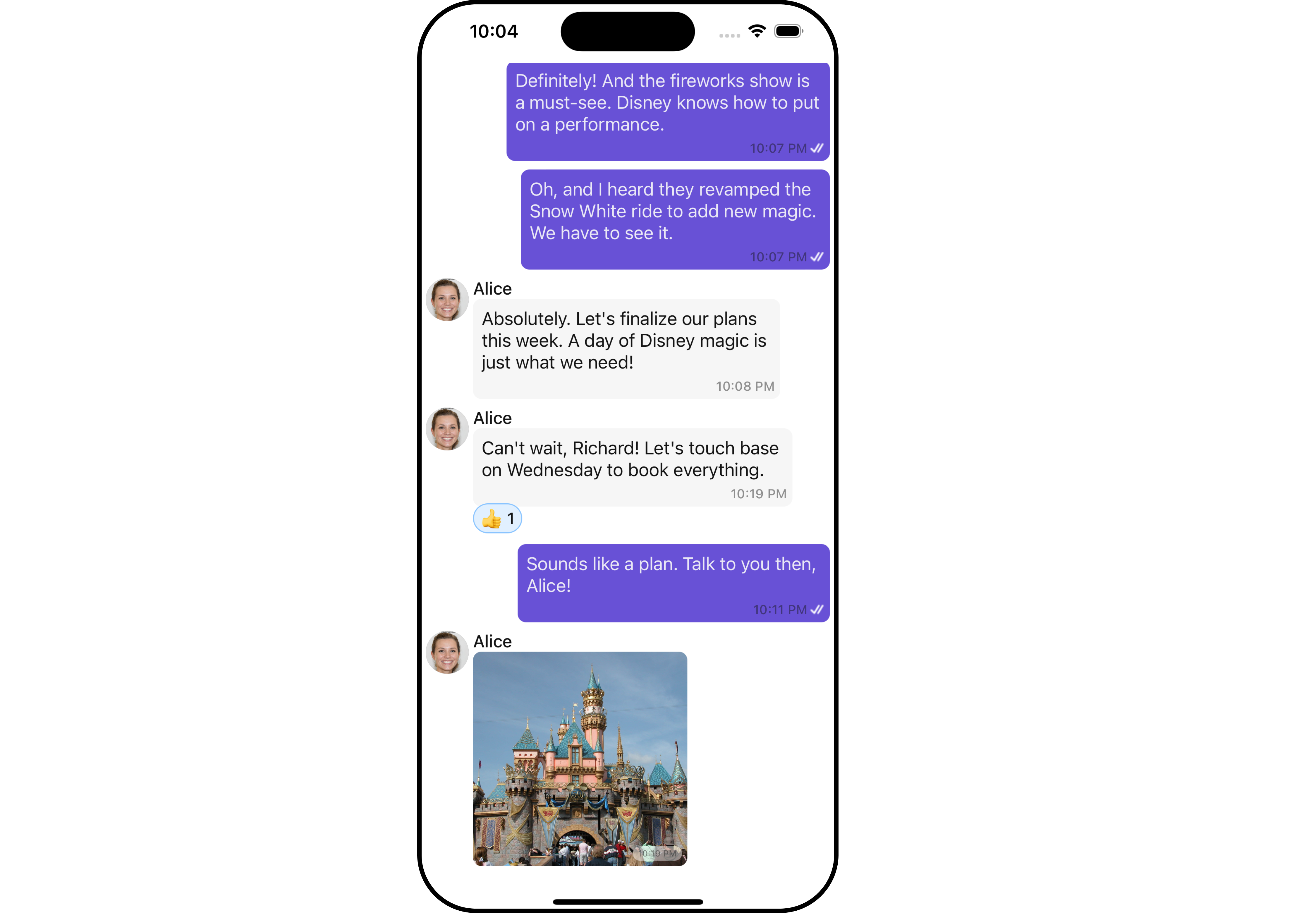
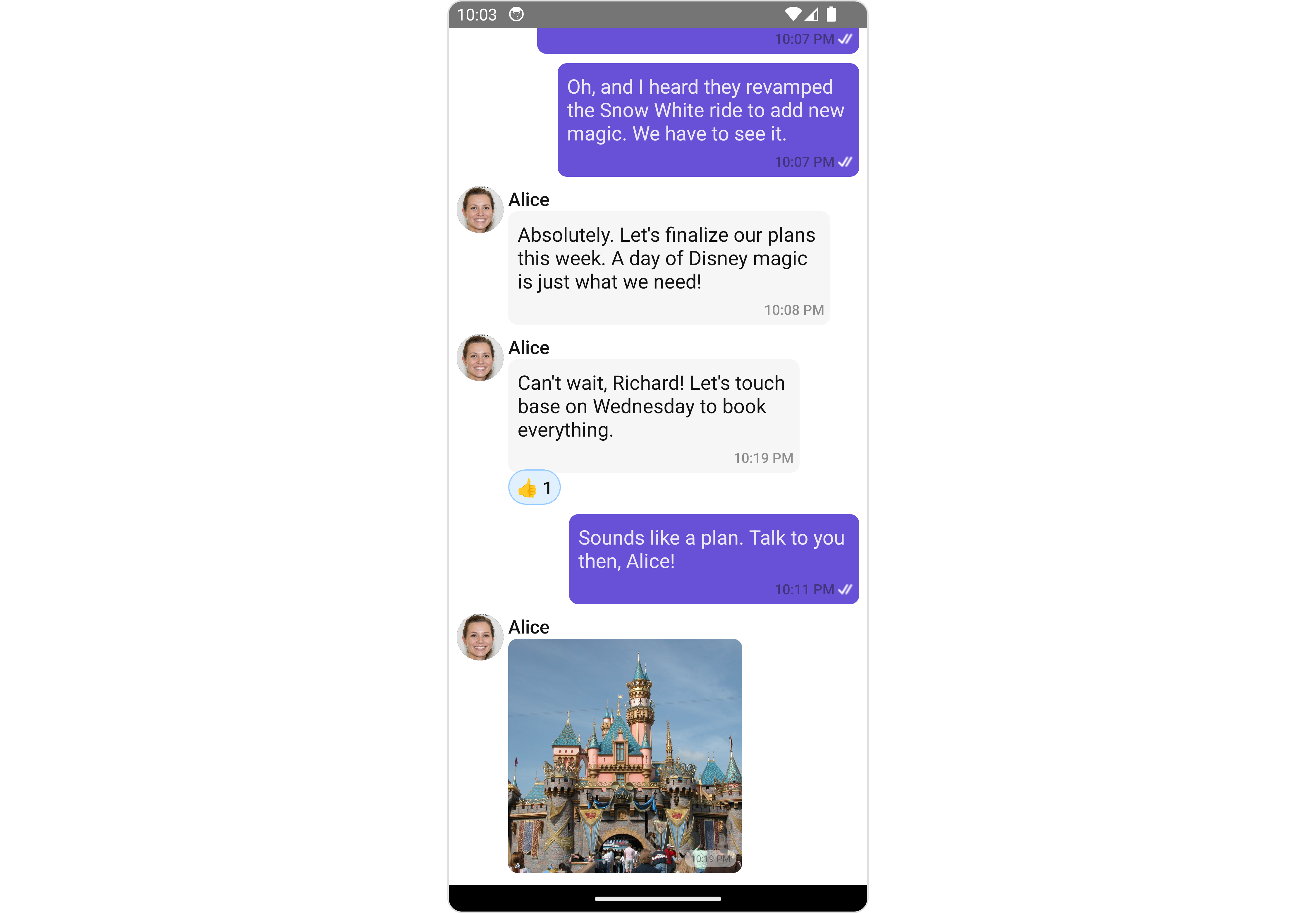
`MessageList` is a [Composite Component](/ui-kit/react-native/v4/components-overview#composite-components) that displays a list of messages and effectively manages real-time operations. It includes various types of messages such as Text Messages, Media Messages, Stickers, and more.
`MessageList` is primarily a list of the base component [MessageBubble](/ui-kit/react-native/v4/message-bubble). The MessageBubble Component is utilized to create different types of chat bubbles depending on the message type.
 ***
## Usage
### Integration
The following code snippet illustrates how you can directly incorporate the MessageList component into your Application.
```tsx theme={null}
import { CometChat } from "@cometchat/chat-sdk-react-native";
import { CometChatMessageList } from "@cometchat/chat-uikit-react-native";
function App(): React.JSX.Element {
const [chatUser, setChatUser] = React.useState();
React.useEffect(() => {
CometChat.getUser("uid").then((user) => {
setChatUser(user);
});
}, []);
return <>{chatUser && };
}
```
***
### Actions
[Actions](/ui-kit/react-native/v4/components-overview#actions) dictate how a component functions. They are divided into two types: Predefined and User-defined. You can override either type, allowing you to tailor the behavior of the component to fit your specific needs.
##### 1. onThreadRepliesPress
`onThreadRepliesPress` is triggered when you click on the threaded message bubble. The `onThreadRepliesPress` action doesn't have a predefined behavior. You can override this action using the following code snippet.
```tsx theme={null}
import { CometChat } from '@cometchat/chat-sdk-react-native';
import { CometChatMessageList } from '@cometchat/chat-uikit-react-native';
function App(): React.JSX.Element {
const [chatUser, setChatUser] = React.useState();
React.useEffect(() => {
CometChat.getUser("uid").then((user) => {
setChatUser(user);
})
}, []);
const onThreadRepliesPressHandler = (messageObject: CometChat.BaseMessage, messageBubbleView: () => JSX.Element) => {
//code
}
return (
<>
{ chatUser &&
}
);
}
```
##### 2. onError
This action doesn't change the behavior of the component but rather listens for any errors that occur in the MessageList component.
```tsx theme={null}
import { CometChat } from '@cometchat/chat-sdk-react-native';
import { CometChatMessageList } from '@cometchat/chat-uikit-react-native';
function App(): React.JSX.Element {
const [chatUser, setChatUser] = React.useState();
React.useEffect(() => {
CometChat.getUser("uid").then((user) => {
setChatUser(user);
})
}, []);
const onErrorHandler = (error: CometChat.CometChatException) => {
//code
}
return (
<>
{ chatUser &&
}
);
}
```
### Filters
You can adjust the `MessagesRequestBuilder` in the MessageList Component to customize your message list. Numerous options are available to alter the builder to meet your specific needs. For additional details on `MessagesRequestBuilder`, please visit [MessagesRequestBuilder](/sdk/react-native/additional-message-filtering).
In the example below, we are applying a filter to the messages based on a search substring and for a specific user. This means that only messages that contain the search term and are associated with the specified user will be displayed
```tsx theme={null}
import { CometChat } from '@cometchat/chat-sdk-react-native';
import { CometChatMessageList } from '@cometchat/chat-uikit-react-native';
function App(): React.JSX.Element {
const [chatUser, setChatUser] = React.useState();
React.useEffect(() => {
CometChat.getUser("uid").then((user) => {
setChatUser(user);
})
}, []);
const messageRequestBuilder = new CometChat.MessagesRequestBuilder().setLimit(5);
return (
<>
{ chatUser &&
}
);
}
```
info
The following parameters in messageRequestBuilder will always be altered inside the message list
1. UID
2. GUID
### Events
[Events](/ui-kit/react-native/v4/components-overview#events) are emitted by a `Component`. By using event you can extend existing functionality. Being global events, they can be applied in Multiple Locations and are capable of being Added or Removed.
The list of events emitted by the Message List component is as follows.
| Event | Description |
| ----------------------- | --------------------------------------------------------------------------------------------------------------------------------- |
| **openChat** | this event alerts the listeners if the logged-in user has opened a user or a group chat |
| **ccMessageEdited** | Triggers whenever a loggedIn user edits any message from the list of messages. It will have two states such as: inProgress & sent |
| **ccMessageDeleted** | Triggers whenever a loggedIn user deletes any message from the list of messages |
| **ccActiveChatChanged** | This event is triggered when the user navigates to a particular chat window. |
| **ccMessageRead** | Triggers whenever a loggedIn user reads any message. |
| **ccMessageDelivered** | Triggers whenever messages are marked as delivered for the loggedIn user |
Adding `CometChatMessageEvents` Listener's
```js theme={null}
import { CometChatUIEventHandler } from "@cometchat/chat-uikit-react-native";
CometChatUIEventHandler.addUIListener("UI_LISTENER_ID", {
openChat: ({ user, group }) => {
//code
},
});
CometChatUIEventHandler.addMessageListener("MESSAGE_LISTENER_ID", {
ccMessageEdited: ({ message }) => {
//code
},
});
CometChatUIEventHandler.addMessageListener("MESSAGE_LISTENER_ID", {
ccMessageDeleted: ({ message }) => {
//code
},
});
CometChatUIEventHandler.addMessageListener("MESSAGE_LISTENER_ID", {
ccMessageDelivered: ({ message }) => {
//code
},
});
CometChatUIEventHandler.addMessageListener("MESSAGE_LISTENER_ID", {
ccMessageRead: ({ message }) => {
//code
},
});
CometChatUIEventHandler.addMessageListener("MESSAGE_LISTENER_ID", {
addMessageListener: ({ message, user, group, theme, parentMessageId }) => {
//code
},
});
```
***
Removing Listeners
```js theme={null}
import { CometChatUIEventHandler } from "@cometchat/chat-uikit-react-native";
CometChatUIEventHandler.removeUIListener("UI_LISTENER_ID");
CometChatUIEventHandler.removeMessageListener("MESSAGE_LISTENER_ID");
```
***
## Customization
To fit your app's design requirements, you can customize the appearance of the conversation component. We provide exposed methods that allow you to modify the experience and behavior according to your specific needs.
### Style
Using Style you can customize the look and feel of the component in your app, These parameters typically control elements such as the color, size, shape, and fonts used within the component.
##### 1. MessageList Style
You can set the MessageListStyle to the MessageList Component Component to customize the styling.
```tsx theme={null}
import { CometChat } from '@cometchat/chat-sdk-react-native';
import { CometChatMessageList, MessageListStyleInterface, FontStyleInterface } from '@cometchat/chat-uikit-react-native';
function App(): React.JSX.Element {
const [chatUser, setChatUser] = React.useState();
React.useEffect(() => {
CometChat.getUser("uid").then((user) => {
setChatUser(user);
})
}, []);
const fontStyle: FontStyleInterface = {
fontFamily: 'Arial',
fontWeight: 'bold',
fontSize: 15,
}
const messageListStyle : MessageListStyleInterface = {
backgroundColor: "#fff5fd",
nameTextColor: "#0532e8",
nameTextFont: fontStyle
}
return (
<>
{ chatUser &&
}
);
}
```
List of properties exposed by MessageListStyle
| Property | Type | Description |
| ------------------------- | -------------------- | --------------------------------------------------------- |
| height | number \| string | Sets the height for message list |
| width | number \| string | Sets the width colour for message list |
| backgroundColor | string | Sets the background colour for message list |
| border | BorderStyleInterface | Sets the corner radius for message list |
| borderRadius | number | Sets the border radius for message list |
| nameTextColor | string | Sets sender/receiver name text color on a message bubble. |
| nameTextFont | FontStyleInterface | Sets sender/receiver name text font on a message bubble |
| emptyStateTextColor | string | Sets the empty text colour for message list |
| emptyStateTextFont | FontStyleInterface | Sets the empty text font for message list |
| errorStateTextColor | string | Sets the error text colour for message list |
| errorStateTextFont | FontStyleInterface | Sets the error text font for message list |
| timestampTextFont | FontStyleInterface | Sets the timestamp text font for message list |
| timestampTextColor | string | Sets the timestamp text colour for message list |
| threadReplyTextColor | string | Sets the thread reply text colour for message list |
| threadReplyTextFont | FontStyleInterface | Sets the thread reply text font for message list |
| threadReplySeparatorColor | string | Sets the thread reply saperator colour for message list |
| threadReplyIconTint | string | Sets thread reply icon tint |
| loadingIconTint | string | Sets the loading icon tint for message list |
##### 2. Avatar Style
To apply customized styles to the `Avatar` component in the `Conversations` Component, you can use the following code snippet. For further insights on `Avatar` Styles [refer](/ui-kit/react-native/v4/avatar)
```tsx theme={null}
import { CometChat } from '@cometchat/chat-sdk-react-native';
import { CometChatMessageList, BorderStyleInterface, AvatarStyleInterface } from '@cometchat/chat-uikit-react-native';
function App(): React.JSX.Element {
const [chatUser, setChatUser] = React.useState();
React.useEffect(() => {
CometChat.getUser("uid").then((user) => {
setChatUser(user);
})
}, []);
const borderStyle : BorderStyleInterface = {
borderWidth: 1,
borderStyle: 'solid',
borderColor: 'red',
}
const avatarStyle : AvatarStyleInterface = {
border: borderStyle
}
return (
<>
{ chatUser &&
}
);
}
```
***
### Functionality
These are a set of small functional customizations that allow you to fine-tune the overall experience of the component. With these, you can change text, set custom icons, and toggle the visibility of UI elements.
```tsx theme={null}
import { CometChat } from '@cometchat/chat-sdk-react-native';
import { CometChatMessageList, BorderStyleInterface, AvatarStyleInterface } from '@cometchat/chat-uikit-react-native';
function App(): React.JSX.Element {
const [chatUser, setChatUser] = React.useState();
React.useEffect(() => {
CometChat.getUser("uid").then((user) => {
setChatUser(user);
})
}, []);
return (
<>
{ chatUser &&
}
);
}
```
***
Below is a list of customizations along with corresponding code snippets
| Property | Description | Code |
| --------------------------------------------------------------------- | ----------------------------------------------------------------------------------------------------------------------------------------------------------------------------------------------------------------------------------------------- | -------------------------------------------------------------------------------------------------------------------------------------------- |
| **user** 🛑 | Used to pass user object of which header specific details will be shown | `user={chatUser}` |
| **group** 🛑 | Used to pass group object of which header specific details will be shown | `group={chatGroup}` |
| **alignment** | used to set the alignmet of messages in CometChatMessageList. It can be either **leftAligned** or **standard**. Type: **MessageListAlignmentType** | `alignment={"standard"}` |
| **emptyStateText** | used to set text which will be visible when no messages are available | `emptyStateText="Your Custom Empty State text"` |
| **errorStateText** | used to set text which will be visible when error in messages retrieval | `errorStateText="Your Custom Error State text"` |
| **disableSoundForMessages** 🛑 | used to enable/disable sound for incoming/outgoing messages , default false | `disableSoundForMessages={true}` |
| **customSoundForMessages** 🛑 | used to set custom sound for outgoing message | `customSoundForMessages="your custom sound for messages"` |
| **readIcon** | used to set custom read icon visible at read receipt. Type: **ImageType** | `readIcon={{uri: }}` OR `import customReadIcon from "./customReadIcon.svg"; ``readIcon={customReadIcon}` |
| **deliveredIcon** | used to set custom delivered icon visible at read receipt. Type: **ImageType** | `deliveredIcon={{uri: }}` OR `import customDeliveredIcon from "./customDeliveredIcon.svg"; ``deliveredIcon={customDeliveredIcon}` |
| **sentIcon** | used to set custom sent icon visible at read receipt. Type: **ImageType** | `sentIcon={{uri: }}` OR `import customSentIcon from "./customSentIcon.svg"; ``sentIcon={customSentIcon}` |
| **waitIcon** | used to set custom wait icon visible at read receipt. Type: **ImageType** | `waitIcon={{uri: }}` OR `import customWaitIcon from "./customWaitIcon.svg"; ``waitIcon={customWaitIcon}` |
| **showAvatar** | used to toggle visibility for avatar | `showAvatar={true}` |
| **hideActionSheetHeader** | used to hides the header of the action sheet | `hideActionSheetHeader={true}` |
| **timestampAlignment** | used to set receipt's time stamp alignment. It can be either **top** or **bottom**. Type: MessageTimeAlignmentType | `timestampAlignment={"top"}` |
| **newMessageIndicatorText** 🛑 | used to set new message indicator text | `newMessageIndicatorText="Custom Indicator text"` |
| **scrollToBottomOnNewMessage** | should scroll to bottom on new message? , by default false | `scrollToBottomOnNewMessages={true}` |
| **disableMentions** | Sets whether mentions in text should be disabled. Processes the text formatters If there are text formatters available and the disableMentions flag is set to true, it removes any formatters that are instances of CometChatMentionsFormatter. | `disableMentions={true}` |
| **hideReceipt** | Used to control the visibility of read receipts without affecting the functionality of marking messages as read and delivered. | `hideReceipt={true}` |
| **disableReactions** | Used to disable Reactions | `disableReactions={true}` |
***
### Advanced
For advanced-level customization, you can set custom views to the component. This lets you tailor each aspect of the component to fit your exact needs and application aesthetics. You can create and define your views, layouts, and UI elements and then incorporate those into the component.
#### Templates
[CometChatMessageTemplate](/ui-kit/react-native/v4/message-template) is a pre-defined structure for creating message views that can be used as a starting point or blueprint for creating message views often known as message bubbles. For more information, you can refer to [CometChatMessageTemplate](/ui-kit/react-native/v4/message-template).
You can set message Templates to MessageList by using the following code snippet
```tsx theme={null}
import { CometChat } from '@cometchat/chat-sdk-react-native';
import { CometChatMessageList, BorderStyleInterface, AvatarStyleInterface } from '@cometchat/chat-uikit-react-native';
function App(): React.JSX.Element {
const [chatUser, setChatUser] = React.useState();
React.useEffect(() => {
CometChat.getUser("uid").then((user) => {
setChatUser(user);
})
}, []);
const getTemplates = () => {
let templates : CometChatMessageTemplate[] = ChatConfigurator.getDataSource().getAllMessageTemplates(theme);
templates.map((data) => {
if(data.type == "text") {
data.ContentView = (messageObject: CometChat.BaseMessage, alignment: MessageBubbleAlignmentType) => {
const textMessage : CometChat.TextMessage = (messageObject as CometChat.TextMessage);
return {textMessage.getText()}
}
}
});
return templates;
};
return (
<>
{ chatUser &&
}
);
}
```
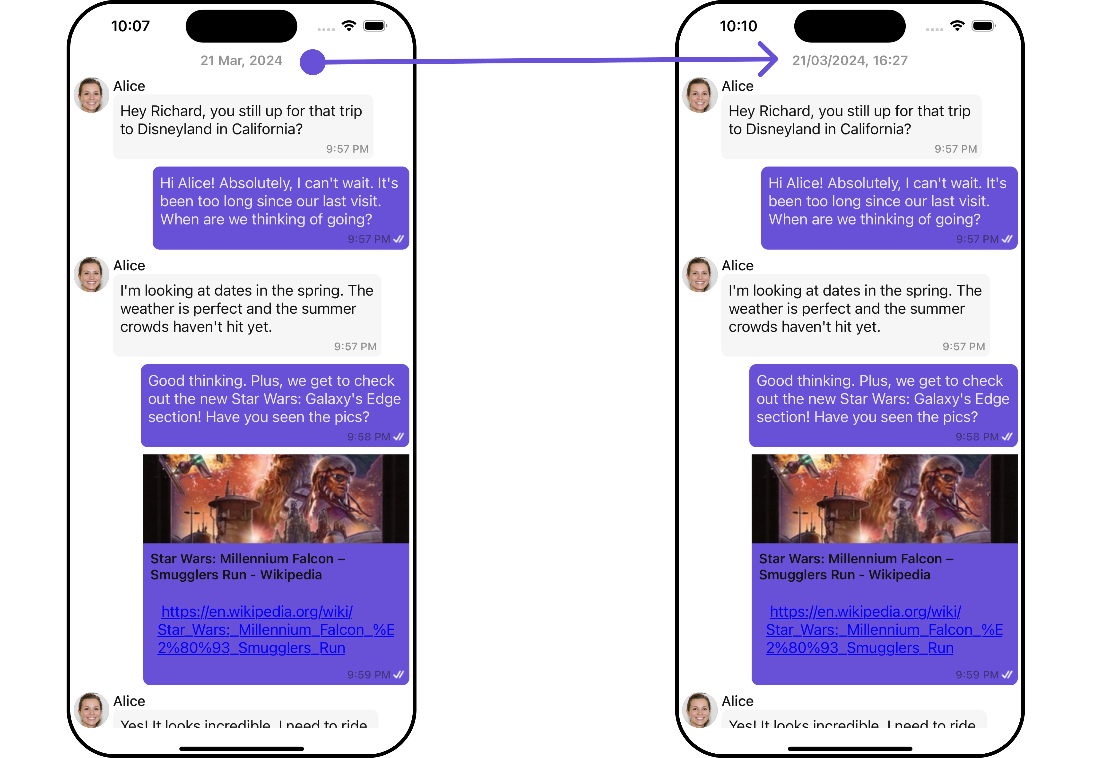
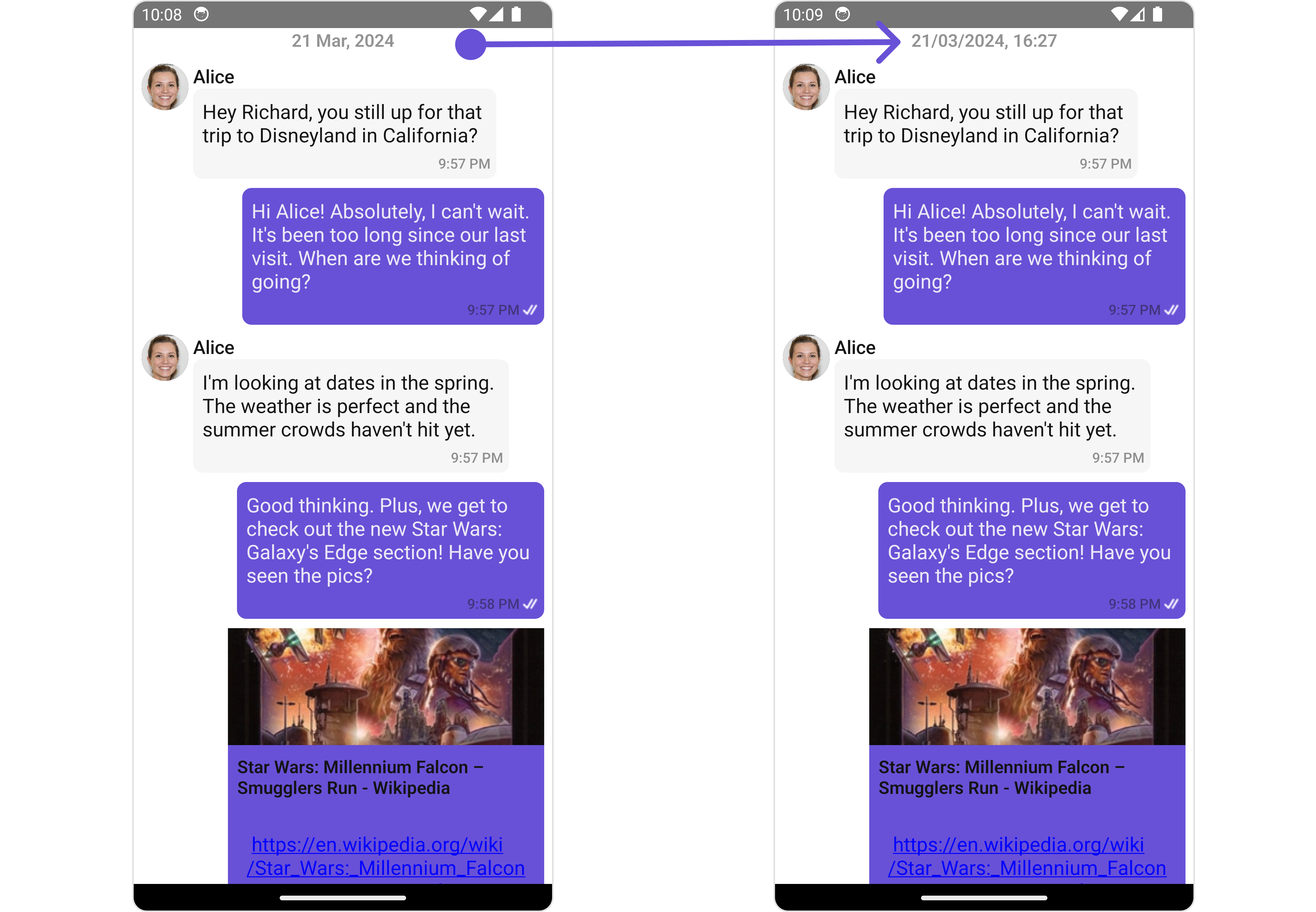
#### DateSeperatorPattern
You can customize the date pattern of the message list separator using the `DateSeparatorPattern` prop. Pass a custom function to use your own pattern.
```tsx theme={null}
import React from "react";
import { CometChat } from '@cometchat/chat-sdk-react-native';
import { CometChatMessageList, BorderStyleInterface, AvatarStyleInterface } from '@cometchat/chat-uikit-react-native';
function App(): React.JSX.Element {
const [chatUser, setChatUser] = React.useState();
React.useEffect(() => {
CometChat.getUser("uid").then((user) => {
setChatUser(user);
})
}, []);
const customDateSeparatorPattern = (date: number) => {
const timeStampInSeconds = new Date(date * 1000);
const day = String(timeStampInSeconds.getUTCDate()).padStart(2, '0');
const month = String(timeStampInSeconds.getUTCMonth() + 1).padStart(2, '0'); // Months are 0-indexed
const year = timeStampInSeconds.getUTCFullYear();
const hours = String(timeStampInSeconds.getUTCHours()).padStart(2, '0');
const minutes = String(timeStampInSeconds.getUTCMinutes()).padStart(2, '0');
return `${day}/${month}/${year}, ${hours}:${minutes}`;
}
return (
<>
{ chatUser &&
}
);
}
```
**Example**
***
## Usage
### Integration
The following code snippet illustrates how you can directly incorporate the MessageList component into your Application.
```tsx theme={null}
import { CometChat } from "@cometchat/chat-sdk-react-native";
import { CometChatMessageList } from "@cometchat/chat-uikit-react-native";
function App(): React.JSX.Element {
const [chatUser, setChatUser] = React.useState();
React.useEffect(() => {
CometChat.getUser("uid").then((user) => {
setChatUser(user);
});
}, []);
return <>{chatUser && };
}
```
***
### Actions
[Actions](/ui-kit/react-native/v4/components-overview#actions) dictate how a component functions. They are divided into two types: Predefined and User-defined. You can override either type, allowing you to tailor the behavior of the component to fit your specific needs.
##### 1. onThreadRepliesPress
`onThreadRepliesPress` is triggered when you click on the threaded message bubble. The `onThreadRepliesPress` action doesn't have a predefined behavior. You can override this action using the following code snippet.
```tsx theme={null}
import { CometChat } from '@cometchat/chat-sdk-react-native';
import { CometChatMessageList } from '@cometchat/chat-uikit-react-native';
function App(): React.JSX.Element {
const [chatUser, setChatUser] = React.useState();
React.useEffect(() => {
CometChat.getUser("uid").then((user) => {
setChatUser(user);
})
}, []);
const onThreadRepliesPressHandler = (messageObject: CometChat.BaseMessage, messageBubbleView: () => JSX.Element) => {
//code
}
return (
<>
{ chatUser &&
}
);
}
```
##### 2. onError
This action doesn't change the behavior of the component but rather listens for any errors that occur in the MessageList component.
```tsx theme={null}
import { CometChat } from '@cometchat/chat-sdk-react-native';
import { CometChatMessageList } from '@cometchat/chat-uikit-react-native';
function App(): React.JSX.Element {
const [chatUser, setChatUser] = React.useState();
React.useEffect(() => {
CometChat.getUser("uid").then((user) => {
setChatUser(user);
})
}, []);
const onErrorHandler = (error: CometChat.CometChatException) => {
//code
}
return (
<>
{ chatUser &&
}
);
}
```
### Filters
You can adjust the `MessagesRequestBuilder` in the MessageList Component to customize your message list. Numerous options are available to alter the builder to meet your specific needs. For additional details on `MessagesRequestBuilder`, please visit [MessagesRequestBuilder](/sdk/react-native/additional-message-filtering).
In the example below, we are applying a filter to the messages based on a search substring and for a specific user. This means that only messages that contain the search term and are associated with the specified user will be displayed
```tsx theme={null}
import { CometChat } from '@cometchat/chat-sdk-react-native';
import { CometChatMessageList } from '@cometchat/chat-uikit-react-native';
function App(): React.JSX.Element {
const [chatUser, setChatUser] = React.useState();
React.useEffect(() => {
CometChat.getUser("uid").then((user) => {
setChatUser(user);
})
}, []);
const messageRequestBuilder = new CometChat.MessagesRequestBuilder().setLimit(5);
return (
<>
{ chatUser &&
}
);
}
```
info
The following parameters in messageRequestBuilder will always be altered inside the message list
1. UID
2. GUID
### Events
[Events](/ui-kit/react-native/v4/components-overview#events) are emitted by a `Component`. By using event you can extend existing functionality. Being global events, they can be applied in Multiple Locations and are capable of being Added or Removed.
The list of events emitted by the Message List component is as follows.
| Event | Description |
| ----------------------- | --------------------------------------------------------------------------------------------------------------------------------- |
| **openChat** | this event alerts the listeners if the logged-in user has opened a user or a group chat |
| **ccMessageEdited** | Triggers whenever a loggedIn user edits any message from the list of messages. It will have two states such as: inProgress & sent |
| **ccMessageDeleted** | Triggers whenever a loggedIn user deletes any message from the list of messages |
| **ccActiveChatChanged** | This event is triggered when the user navigates to a particular chat window. |
| **ccMessageRead** | Triggers whenever a loggedIn user reads any message. |
| **ccMessageDelivered** | Triggers whenever messages are marked as delivered for the loggedIn user |
Adding `CometChatMessageEvents` Listener's
```js theme={null}
import { CometChatUIEventHandler } from "@cometchat/chat-uikit-react-native";
CometChatUIEventHandler.addUIListener("UI_LISTENER_ID", {
openChat: ({ user, group }) => {
//code
},
});
CometChatUIEventHandler.addMessageListener("MESSAGE_LISTENER_ID", {
ccMessageEdited: ({ message }) => {
//code
},
});
CometChatUIEventHandler.addMessageListener("MESSAGE_LISTENER_ID", {
ccMessageDeleted: ({ message }) => {
//code
},
});
CometChatUIEventHandler.addMessageListener("MESSAGE_LISTENER_ID", {
ccMessageDelivered: ({ message }) => {
//code
},
});
CometChatUIEventHandler.addMessageListener("MESSAGE_LISTENER_ID", {
ccMessageRead: ({ message }) => {
//code
},
});
CometChatUIEventHandler.addMessageListener("MESSAGE_LISTENER_ID", {
addMessageListener: ({ message, user, group, theme, parentMessageId }) => {
//code
},
});
```
***
Removing Listeners
```js theme={null}
import { CometChatUIEventHandler } from "@cometchat/chat-uikit-react-native";
CometChatUIEventHandler.removeUIListener("UI_LISTENER_ID");
CometChatUIEventHandler.removeMessageListener("MESSAGE_LISTENER_ID");
```
***
## Customization
To fit your app's design requirements, you can customize the appearance of the conversation component. We provide exposed methods that allow you to modify the experience and behavior according to your specific needs.
### Style
Using Style you can customize the look and feel of the component in your app, These parameters typically control elements such as the color, size, shape, and fonts used within the component.
##### 1. MessageList Style
You can set the MessageListStyle to the MessageList Component Component to customize the styling.
```tsx theme={null}
import { CometChat } from '@cometchat/chat-sdk-react-native';
import { CometChatMessageList, MessageListStyleInterface, FontStyleInterface } from '@cometchat/chat-uikit-react-native';
function App(): React.JSX.Element {
const [chatUser, setChatUser] = React.useState();
React.useEffect(() => {
CometChat.getUser("uid").then((user) => {
setChatUser(user);
})
}, []);
const fontStyle: FontStyleInterface = {
fontFamily: 'Arial',
fontWeight: 'bold',
fontSize: 15,
}
const messageListStyle : MessageListStyleInterface = {
backgroundColor: "#fff5fd",
nameTextColor: "#0532e8",
nameTextFont: fontStyle
}
return (
<>
{ chatUser &&
}
);
}
```
List of properties exposed by MessageListStyle
| Property | Type | Description |
| ------------------------- | -------------------- | --------------------------------------------------------- |
| height | number \| string | Sets the height for message list |
| width | number \| string | Sets the width colour for message list |
| backgroundColor | string | Sets the background colour for message list |
| border | BorderStyleInterface | Sets the corner radius for message list |
| borderRadius | number | Sets the border radius for message list |
| nameTextColor | string | Sets sender/receiver name text color on a message bubble. |
| nameTextFont | FontStyleInterface | Sets sender/receiver name text font on a message bubble |
| emptyStateTextColor | string | Sets the empty text colour for message list |
| emptyStateTextFont | FontStyleInterface | Sets the empty text font for message list |
| errorStateTextColor | string | Sets the error text colour for message list |
| errorStateTextFont | FontStyleInterface | Sets the error text font for message list |
| timestampTextFont | FontStyleInterface | Sets the timestamp text font for message list |
| timestampTextColor | string | Sets the timestamp text colour for message list |
| threadReplyTextColor | string | Sets the thread reply text colour for message list |
| threadReplyTextFont | FontStyleInterface | Sets the thread reply text font for message list |
| threadReplySeparatorColor | string | Sets the thread reply saperator colour for message list |
| threadReplyIconTint | string | Sets thread reply icon tint |
| loadingIconTint | string | Sets the loading icon tint for message list |
##### 2. Avatar Style
To apply customized styles to the `Avatar` component in the `Conversations` Component, you can use the following code snippet. For further insights on `Avatar` Styles [refer](/ui-kit/react-native/v4/avatar)
```tsx theme={null}
import { CometChat } from '@cometchat/chat-sdk-react-native';
import { CometChatMessageList, BorderStyleInterface, AvatarStyleInterface } from '@cometchat/chat-uikit-react-native';
function App(): React.JSX.Element {
const [chatUser, setChatUser] = React.useState();
React.useEffect(() => {
CometChat.getUser("uid").then((user) => {
setChatUser(user);
})
}, []);
const borderStyle : BorderStyleInterface = {
borderWidth: 1,
borderStyle: 'solid',
borderColor: 'red',
}
const avatarStyle : AvatarStyleInterface = {
border: borderStyle
}
return (
<>
{ chatUser &&
}
);
}
```
***
### Functionality
These are a set of small functional customizations that allow you to fine-tune the overall experience of the component. With these, you can change text, set custom icons, and toggle the visibility of UI elements.
```tsx theme={null}
import { CometChat } from '@cometchat/chat-sdk-react-native';
import { CometChatMessageList, BorderStyleInterface, AvatarStyleInterface } from '@cometchat/chat-uikit-react-native';
function App(): React.JSX.Element {
const [chatUser, setChatUser] = React.useState();
React.useEffect(() => {
CometChat.getUser("uid").then((user) => {
setChatUser(user);
})
}, []);
return (
<>
{ chatUser &&
}
);
}
```
***
Below is a list of customizations along with corresponding code snippets
| Property | Description | Code |
| --------------------------------------------------------------------- | ----------------------------------------------------------------------------------------------------------------------------------------------------------------------------------------------------------------------------------------------- | -------------------------------------------------------------------------------------------------------------------------------------------- |
| **user** 🛑 | Used to pass user object of which header specific details will be shown | `user={chatUser}` |
| **group** 🛑 | Used to pass group object of which header specific details will be shown | `group={chatGroup}` |
| **alignment** | used to set the alignmet of messages in CometChatMessageList. It can be either **leftAligned** or **standard**. Type: **MessageListAlignmentType** | `alignment={"standard"}` |
| **emptyStateText** | used to set text which will be visible when no messages are available | `emptyStateText="Your Custom Empty State text"` |
| **errorStateText** | used to set text which will be visible when error in messages retrieval | `errorStateText="Your Custom Error State text"` |
| **disableSoundForMessages** 🛑 | used to enable/disable sound for incoming/outgoing messages , default false | `disableSoundForMessages={true}` |
| **customSoundForMessages** 🛑 | used to set custom sound for outgoing message | `customSoundForMessages="your custom sound for messages"` |
| **readIcon** | used to set custom read icon visible at read receipt. Type: **ImageType** | `readIcon={{uri: }}` OR `import customReadIcon from "./customReadIcon.svg"; ``readIcon={customReadIcon}` |
| **deliveredIcon** | used to set custom delivered icon visible at read receipt. Type: **ImageType** | `deliveredIcon={{uri: }}` OR `import customDeliveredIcon from "./customDeliveredIcon.svg"; ``deliveredIcon={customDeliveredIcon}` |
| **sentIcon** | used to set custom sent icon visible at read receipt. Type: **ImageType** | `sentIcon={{uri: }}` OR `import customSentIcon from "./customSentIcon.svg"; ``sentIcon={customSentIcon}` |
| **waitIcon** | used to set custom wait icon visible at read receipt. Type: **ImageType** | `waitIcon={{uri: }}` OR `import customWaitIcon from "./customWaitIcon.svg"; ``waitIcon={customWaitIcon}` |
| **showAvatar** | used to toggle visibility for avatar | `showAvatar={true}` |
| **hideActionSheetHeader** | used to hides the header of the action sheet | `hideActionSheetHeader={true}` |
| **timestampAlignment** | used to set receipt's time stamp alignment. It can be either **top** or **bottom**. Type: MessageTimeAlignmentType | `timestampAlignment={"top"}` |
| **newMessageIndicatorText** 🛑 | used to set new message indicator text | `newMessageIndicatorText="Custom Indicator text"` |
| **scrollToBottomOnNewMessage** | should scroll to bottom on new message? , by default false | `scrollToBottomOnNewMessages={true}` |
| **disableMentions** | Sets whether mentions in text should be disabled. Processes the text formatters If there are text formatters available and the disableMentions flag is set to true, it removes any formatters that are instances of CometChatMentionsFormatter. | `disableMentions={true}` |
| **hideReceipt** | Used to control the visibility of read receipts without affecting the functionality of marking messages as read and delivered. | `hideReceipt={true}` |
| **disableReactions** | Used to disable Reactions | `disableReactions={true}` |
***
### Advanced
For advanced-level customization, you can set custom views to the component. This lets you tailor each aspect of the component to fit your exact needs and application aesthetics. You can create and define your views, layouts, and UI elements and then incorporate those into the component.
#### Templates
[CometChatMessageTemplate](/ui-kit/react-native/v4/message-template) is a pre-defined structure for creating message views that can be used as a starting point or blueprint for creating message views often known as message bubbles. For more information, you can refer to [CometChatMessageTemplate](/ui-kit/react-native/v4/message-template).
You can set message Templates to MessageList by using the following code snippet
```tsx theme={null}
import { CometChat } from '@cometchat/chat-sdk-react-native';
import { CometChatMessageList, BorderStyleInterface, AvatarStyleInterface } from '@cometchat/chat-uikit-react-native';
function App(): React.JSX.Element {
const [chatUser, setChatUser] = React.useState();
React.useEffect(() => {
CometChat.getUser("uid").then((user) => {
setChatUser(user);
})
}, []);
const getTemplates = () => {
let templates : CometChatMessageTemplate[] = ChatConfigurator.getDataSource().getAllMessageTemplates(theme);
templates.map((data) => {
if(data.type == "text") {
data.ContentView = (messageObject: CometChat.BaseMessage, alignment: MessageBubbleAlignmentType) => {
const textMessage : CometChat.TextMessage = (messageObject as CometChat.TextMessage);
return {textMessage.getText()}
}
}
});
return templates;
};
return (
<>
{ chatUser &&
}
);
}
```
#### DateSeperatorPattern
You can customize the date pattern of the message list separator using the `DateSeparatorPattern` prop. Pass a custom function to use your own pattern.
```tsx theme={null}
import React from "react";
import { CometChat } from '@cometchat/chat-sdk-react-native';
import { CometChatMessageList, BorderStyleInterface, AvatarStyleInterface } from '@cometchat/chat-uikit-react-native';
function App(): React.JSX.Element {
const [chatUser, setChatUser] = React.useState();
React.useEffect(() => {
CometChat.getUser("uid").then((user) => {
setChatUser(user);
})
}, []);
const customDateSeparatorPattern = (date: number) => {
const timeStampInSeconds = new Date(date * 1000);
const day = String(timeStampInSeconds.getUTCDate()).padStart(2, '0');
const month = String(timeStampInSeconds.getUTCMonth() + 1).padStart(2, '0'); // Months are 0-indexed
const year = timeStampInSeconds.getUTCFullYear();
const hours = String(timeStampInSeconds.getUTCHours()).padStart(2, '0');
const minutes = String(timeStampInSeconds.getUTCMinutes()).padStart(2, '0');
return `${day}/${month}/${year}, ${hours}:${minutes}`;
}
return (
<>
{ chatUser &&
}
);
}
```
**Example**
 #### DatePattern
You can modify the date pattern to your requirement using the `datePattern` prop. Pass a custom function to use your own pattern.
```tsx theme={null}
import React from "react";
import { CometChat } from '@cometchat/chat-sdk-react-native';
import { CometChatMessageList, BorderStyleInterface, AvatarStyleInterface } from '@cometchat/chat-uikit-react-native';
function App(): React.JSX.Element {
const [chatUser, setChatUser] = React.useState();
React.useEffect(() => {
CometChat.getUser("uid").then((user) => {
setChatUser(user);
})
}, []);
const generateDateString = (message: CometChat.BaseMessage) : any => {
const days = [
'Sunday',
'Monday',
'Tuesday',
'Wednesday',
'Thursday',
'Friday',
'Saturday',
];
const timeStamp = message['sentAt'];
if(timeStamp) {
const timeStampInSeconds = new Date(timeStamp * 1000);
const day = days[timeStampInSeconds.getUTCDay()].substring(0, 3);
const hours = timeStampInSeconds.getUTCHours();
const minutes = String(timeStampInSeconds.getUTCMinutes()).padStart(2, '0');
return `${day}, ${hours}:${minutes}`;
}
return `---, --:--`;
};
return (
<>
{ chatUser &&
}
);
}
```
***
#### HeaderView
You can set custom headerView to the Message List component using the following method.
```tsx theme={null}
import React from "react";
import { CometChat } from '@cometchat/chat-sdk-react-native';
import { CometChatMessageList, BorderStyleInterface, AvatarStyleInterface } from '@cometchat/chat-uikit-react-native';
import { StyleProp } from 'react-native';
import bot from './bot.png';
function App(): React.JSX.Element {
const [chatUser, setChatUser] = React.useState();
React.useEffect(() => {
CometChat.getUser("uid").then((user) => {
setChatUser(user);
})
}, []);
const headerViewStyle: StyleProp = {
flexDirection: 'row',
alignItems: 'center',
justifyContent: 'center',
paddingVertical: 5,
backgroundColor: 'white',
height: 50,
width: '120%',
left:-25,
borderBottomWidth:2,
borderBottomColor:'#6851D6'
};
const getHeaderView = () => {
return (
Chat Bot
);
};
return (
<>
{ chatUser && }
);
}
```
**Example**
#### DatePattern
You can modify the date pattern to your requirement using the `datePattern` prop. Pass a custom function to use your own pattern.
```tsx theme={null}
import React from "react";
import { CometChat } from '@cometchat/chat-sdk-react-native';
import { CometChatMessageList, BorderStyleInterface, AvatarStyleInterface } from '@cometchat/chat-uikit-react-native';
function App(): React.JSX.Element {
const [chatUser, setChatUser] = React.useState();
React.useEffect(() => {
CometChat.getUser("uid").then((user) => {
setChatUser(user);
})
}, []);
const generateDateString = (message: CometChat.BaseMessage) : any => {
const days = [
'Sunday',
'Monday',
'Tuesday',
'Wednesday',
'Thursday',
'Friday',
'Saturday',
];
const timeStamp = message['sentAt'];
if(timeStamp) {
const timeStampInSeconds = new Date(timeStamp * 1000);
const day = days[timeStampInSeconds.getUTCDay()].substring(0, 3);
const hours = timeStampInSeconds.getUTCHours();
const minutes = String(timeStampInSeconds.getUTCMinutes()).padStart(2, '0');
return `${day}, ${hours}:${minutes}`;
}
return `---, --:--`;
};
return (
<>
{ chatUser &&
}
);
}
```
***
#### HeaderView
You can set custom headerView to the Message List component using the following method.
```tsx theme={null}
import React from "react";
import { CometChat } from '@cometchat/chat-sdk-react-native';
import { CometChatMessageList, BorderStyleInterface, AvatarStyleInterface } from '@cometchat/chat-uikit-react-native';
import { StyleProp } from 'react-native';
import bot from './bot.png';
function App(): React.JSX.Element {
const [chatUser, setChatUser] = React.useState();
React.useEffect(() => {
CometChat.getUser("uid").then((user) => {
setChatUser(user);
})
}, []);
const headerViewStyle: StyleProp = {
flexDirection: 'row',
alignItems: 'center',
justifyContent: 'center',
paddingVertical: 5,
backgroundColor: 'white',
height: 50,
width: '120%',
left:-25,
borderBottomWidth:2,
borderBottomColor:'#6851D6'
};
const getHeaderView = () => {
return (
Chat Bot
);
};
return (
<>
{ chatUser && }
);
}
```
**Example**
 ***
#### FooterView
You can set custom footerView to the Message List component using the following method.
```tsx theme={null}
import React from "react";
import { CometChat } from '@cometchat/chat-sdk-react-native';
import { CometChatMessageList, BorderStyleInterface, AvatarStyleInterface } from '@cometchat/chat-uikit-react-native';
import { StyleProp } from 'react-native';
import bot from './bot.png';
function App(): React.JSX.Element {
const [chatUser, setChatUser] = React.useState();
React.useEffect(() => {
CometChat.getUser("uid").then((user) => {
setChatUser(user);
})
}, []);
const footerViewStyle: StyleProp = {
flexDirection: 'row',
alignItems: 'center',
justifyContent: 'center',
paddingVertical: 5,
backgroundColor: 'white',
height: 50,
width: '120%',
left:-25,
borderBottomWidth:2,
borderBottomColor:'#6851D6'
};
const getFooterView = () => {
return (
Chat Bot
);
};
return (
<>
{ chatUser && }
);
}
```
**Example**
***
#### FooterView
You can set custom footerView to the Message List component using the following method.
```tsx theme={null}
import React from "react";
import { CometChat } from '@cometchat/chat-sdk-react-native';
import { CometChatMessageList, BorderStyleInterface, AvatarStyleInterface } from '@cometchat/chat-uikit-react-native';
import { StyleProp } from 'react-native';
import bot from './bot.png';
function App(): React.JSX.Element {
const [chatUser, setChatUser] = React.useState();
React.useEffect(() => {
CometChat.getUser("uid").then((user) => {
setChatUser(user);
})
}, []);
const footerViewStyle: StyleProp = {
flexDirection: 'row',
alignItems: 'center',
justifyContent: 'center',
paddingVertical: 5,
backgroundColor: 'white',
height: 50,
width: '120%',
left:-25,
borderBottomWidth:2,
borderBottomColor:'#6851D6'
};
const getFooterView = () => {
return (
Chat Bot
);
};
return (
<>
{ chatUser && }
);
}
```
**Example**
 ***
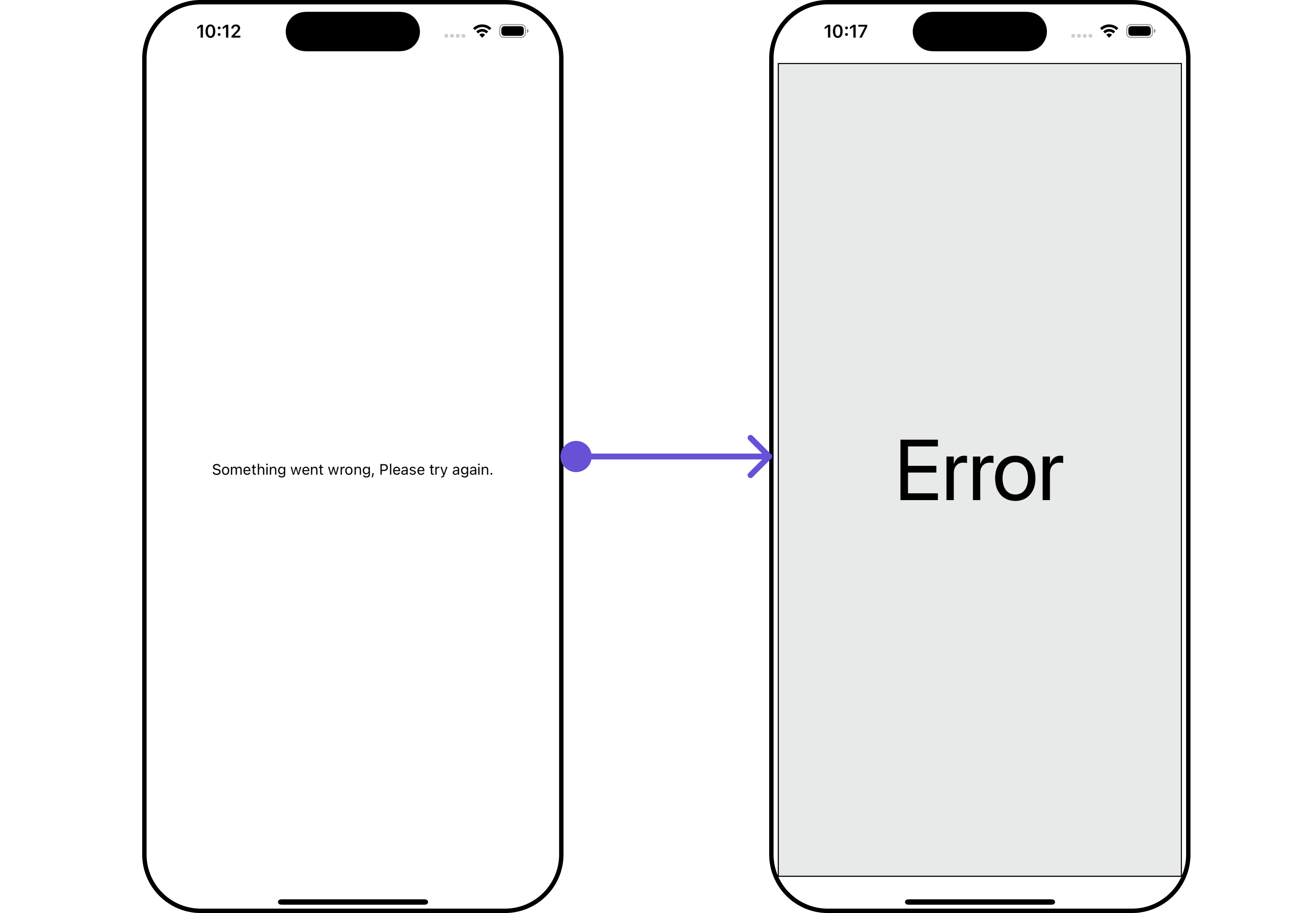
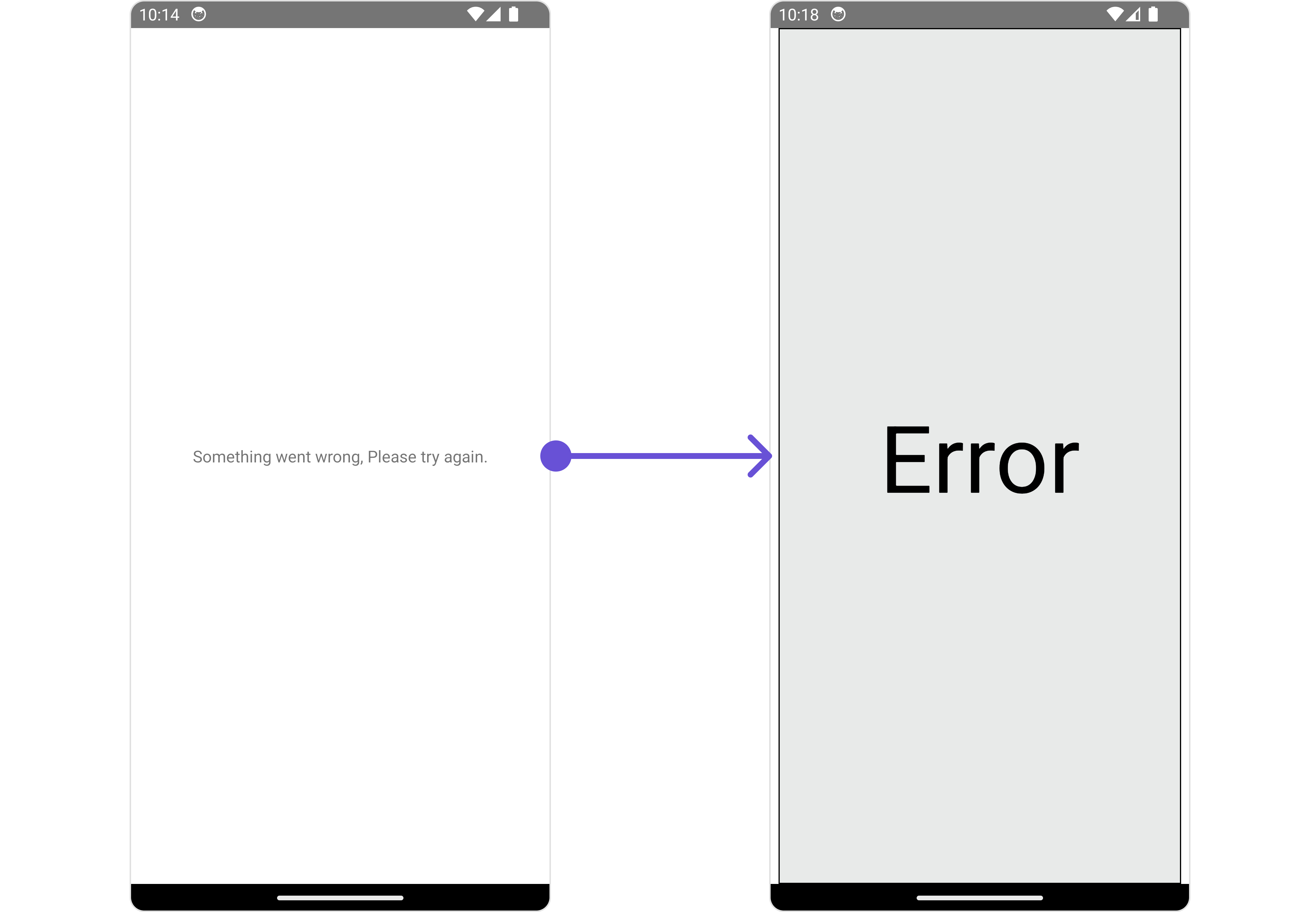
#### ErrorStateView
You can set a custom `ErrorStateView` to match the error view of your app.
```tsx theme={null}
import React from "react";
import { CometChat } from '@cometchat/chat-sdk-react-native';
import { CometChatMessageList, BorderStyleInterface, AvatarStyleInterface } from '@cometchat/chat-uikit-react-native';
function App(): React.JSX.Element {
const [chatUser, setChatUser] = React.useState();
React.useEffect(() => {
CometChat.getUser("uid").then((user) => {
setChatUser(user);
})
}, []);
const errorViewStyle: StyleProp = {
flex: 1,
alignItems: 'center',
justifyContent: 'center',
padding: 10,
borderColor: 'black',
borderWidth: 1,
backgroundColor: '#E8EAE9',
};
const getErrorStateView = () => {
return (
Error
);
};
return (
<>
{ chatUser && }
);
}
```
**Example**
***
#### ErrorStateView
You can set a custom `ErrorStateView` to match the error view of your app.
```tsx theme={null}
import React from "react";
import { CometChat } from '@cometchat/chat-sdk-react-native';
import { CometChatMessageList, BorderStyleInterface, AvatarStyleInterface } from '@cometchat/chat-uikit-react-native';
function App(): React.JSX.Element {
const [chatUser, setChatUser] = React.useState();
React.useEffect(() => {
CometChat.getUser("uid").then((user) => {
setChatUser(user);
})
}, []);
const errorViewStyle: StyleProp = {
flex: 1,
alignItems: 'center',
justifyContent: 'center',
padding: 10,
borderColor: 'black',
borderWidth: 1,
backgroundColor: '#E8EAE9',
};
const getErrorStateView = () => {
return (
Error
);
};
return (
<>
{ chatUser && }
);
}
```
**Example**
 ***
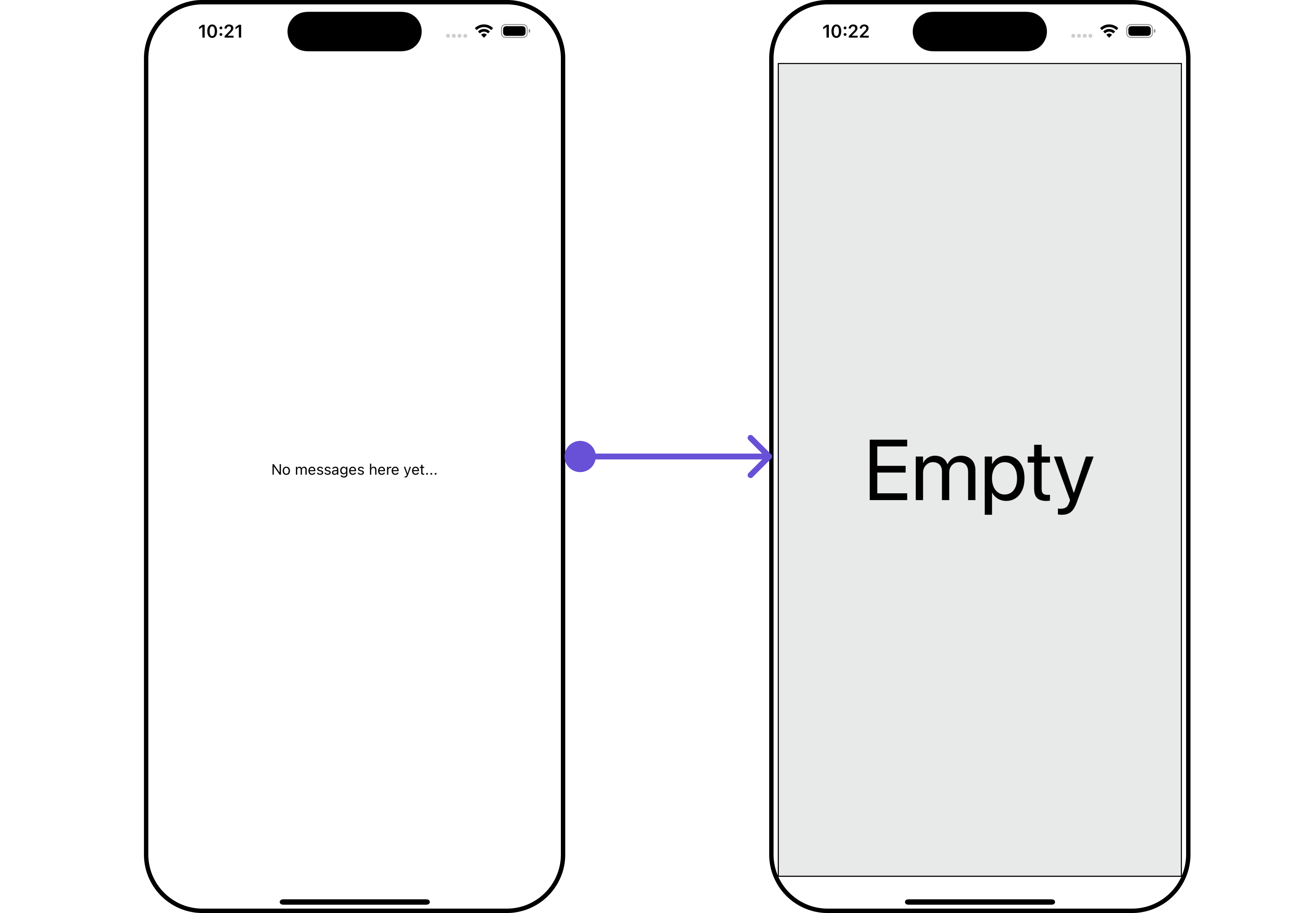
#### EmptyStateView
The `EmptyStateView` method provides the ability to set a custom empty state view in your app. An empty state view is displayed when there are no messages for a particular user.
```tsx theme={null}
import React from "react";
import { CometChat } from '@cometchat/chat-sdk-react-native';
import { CometChatMessageList, BorderStyleInterface, AvatarStyleInterface } from '@cometchat/chat-uikit-react-native';
function App(): React.JSX.Element {
const [chatUser, setChatUser] = React.useState();
React.useEffect(() => {
CometChat.getUser("uid").then((user) => {
setChatUser(user);
})
}, []);
const emptyViewStyle: StyleProp = {
flex: 1,
alignItems: 'center',
justifyContent: 'center',
padding: 10,
borderColor: 'black',
borderWidth: 1,
backgroundColor: '#E8EAE9',
};
const getEmptyStateView = () => {
return (
Empty
);
};
return (
<>
{ chatUser && }
);
}
```
**Example**
***
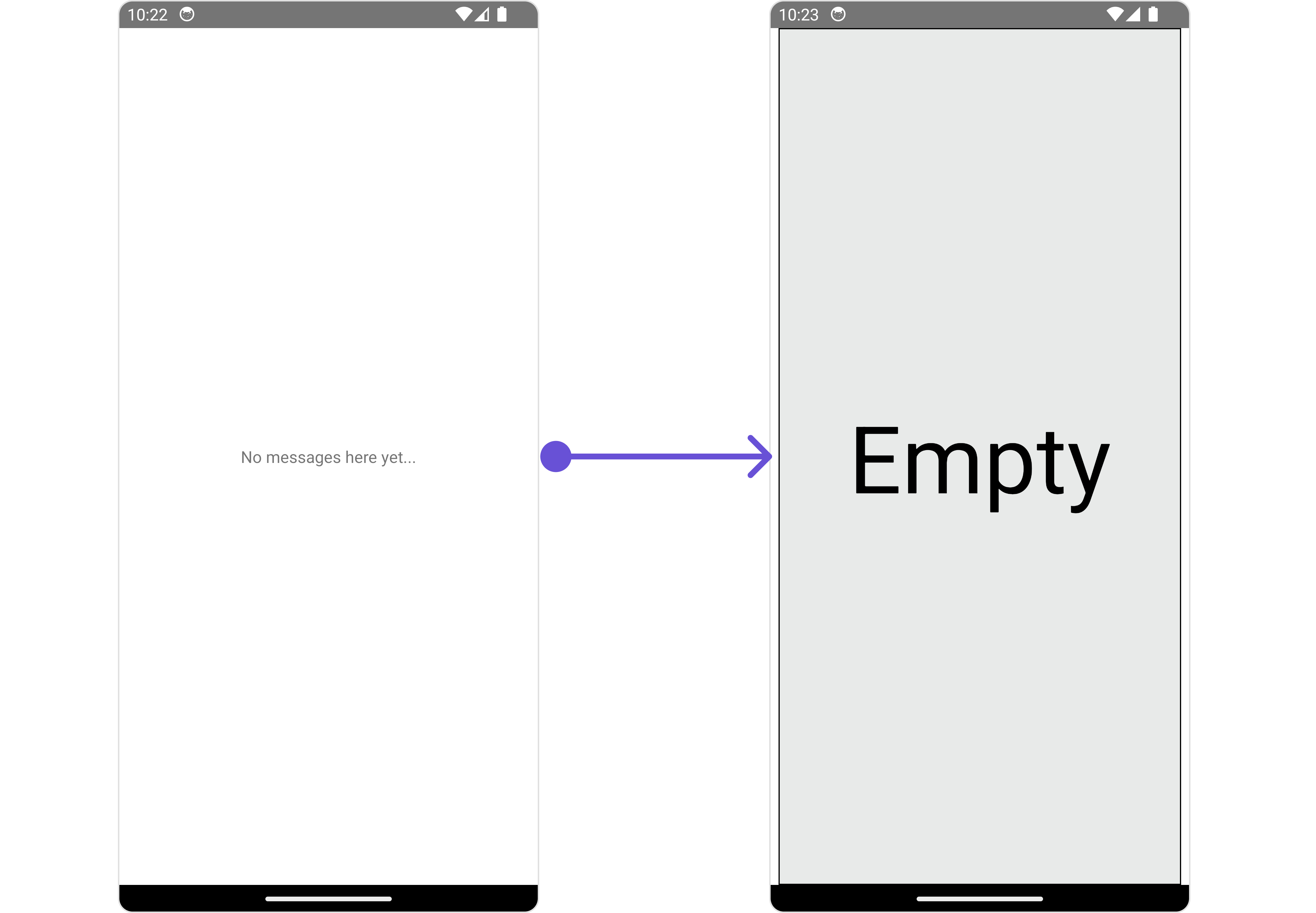
#### EmptyStateView
The `EmptyStateView` method provides the ability to set a custom empty state view in your app. An empty state view is displayed when there are no messages for a particular user.
```tsx theme={null}
import React from "react";
import { CometChat } from '@cometchat/chat-sdk-react-native';
import { CometChatMessageList, BorderStyleInterface, AvatarStyleInterface } from '@cometchat/chat-uikit-react-native';
function App(): React.JSX.Element {
const [chatUser, setChatUser] = React.useState();
React.useEffect(() => {
CometChat.getUser("uid").then((user) => {
setChatUser(user);
})
}, []);
const emptyViewStyle: StyleProp = {
flex: 1,
alignItems: 'center',
justifyContent: 'center',
padding: 10,
borderColor: 'black',
borderWidth: 1,
backgroundColor: '#E8EAE9',
};
const getEmptyStateView = () => {
return (
Empty
);
};
return (
<>
{ chatUser && }
);
}
```
**Example**
 ***
#### TextFormatters
Assigns the list of text formatters. If the provided list is not null, it sets the list. Otherwise, it assigns the default text formatters retrieved from the data source. To configure the existing Mentions look and feel check out [CometChatMentionsFormatter](/ui-kit/react-native/v4/mentions-formatter-guide)
```ts theme={null}
import { CometChat } from "@cometchat/chat-sdk-react-native";
import {
CometChatTextFormatter,
SuggestionItem,
} from "@cometchat/chat-uikit-react-native";
export class ShortCutFormatter extends CometChatTextFormatter {
constructor() {
super();
this.trackCharacter = "!";
}
search = (searchKey: string) => {
let data: Array = [];
CometChat.callExtension("message-shortcuts", "GET", "v1/fetch", undefined)
.then((data: any) => {
if (data && data?.shortcuts) {
let suggestionData = Object.keys(data.shortcuts).map((key) => {
return new SuggestionItem({
id: key,
name: data.shortcuts[key],
promptText: data.shortcuts[key],
trackingCharacter: "!",
underlyingText: data.shortcuts[key],
});
});
this.setSearchData(suggestionData); // setting data in setSearchData();
}
})
.catch((error) => {
// Some error occured
});
this.setSearchData(data);
};
// return null in fetchNext, if there's no pagination.
fetchNext = () => {
return null;
};
}
```
```tsx theme={null}
import React from "react";
import { CometChat } from "@cometchat/chat-sdk-react-native";
import { CometChatMessageList } from "@cometchat/chat-uikit-react-native";
import { ShortCutFormatter } from "./ShortcutsTextFormatter";
function App(): React.JSX.Element {
const [chatUser, setChatUser] = React.useState();
React.useEffect(() => {
CometChat.getUser("uid").then((user) => {
setChatUser(user);
});
}, []);
const shortcutFormatter = new ShortCutFormatter();
return ;
}
```
***
## Configuration
[Configurations](/ui-kit/react-native/v4/components-overview#configurations) offer the ability to customize the properties of each component within a Composite Component.
### MessageInformation
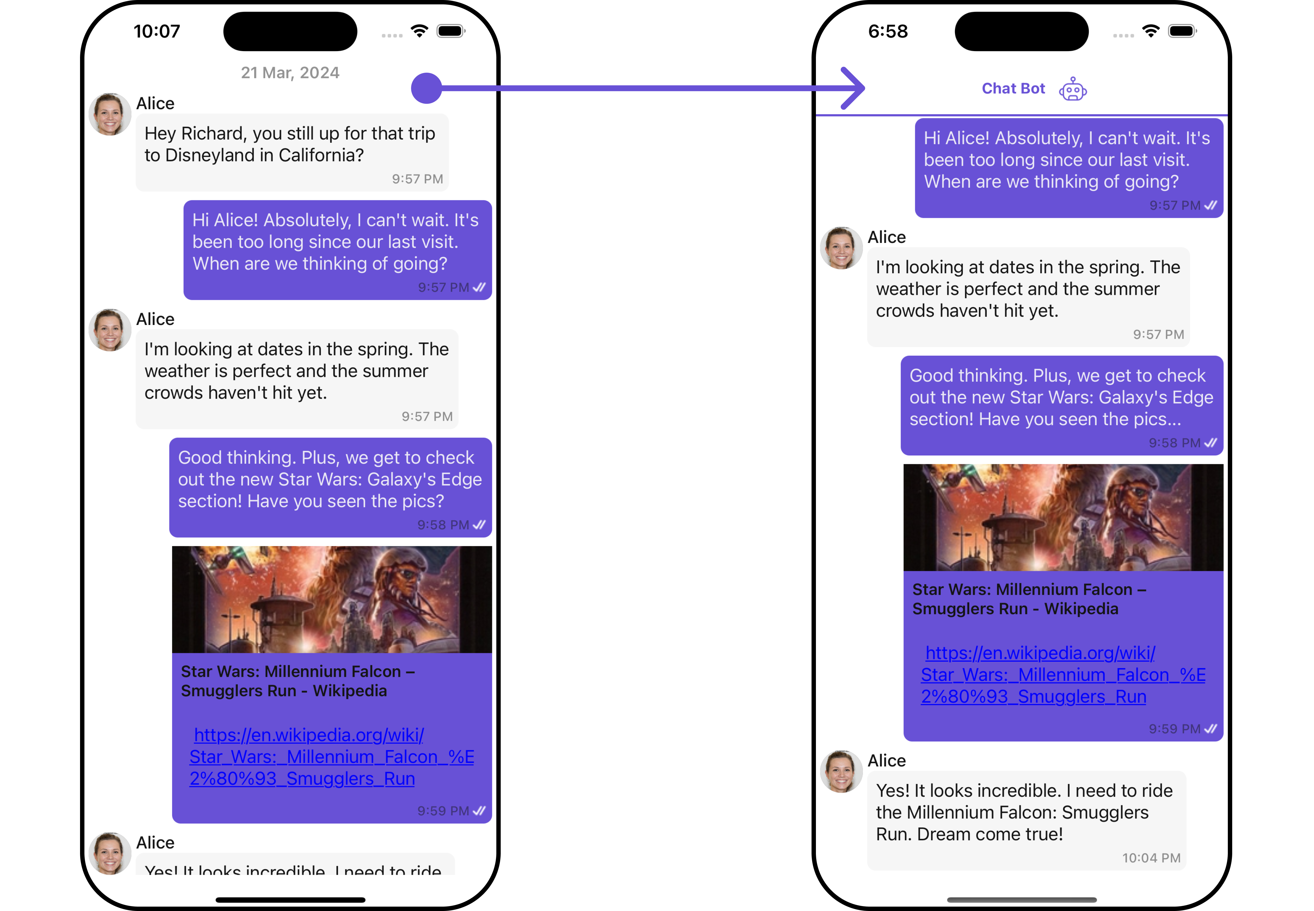
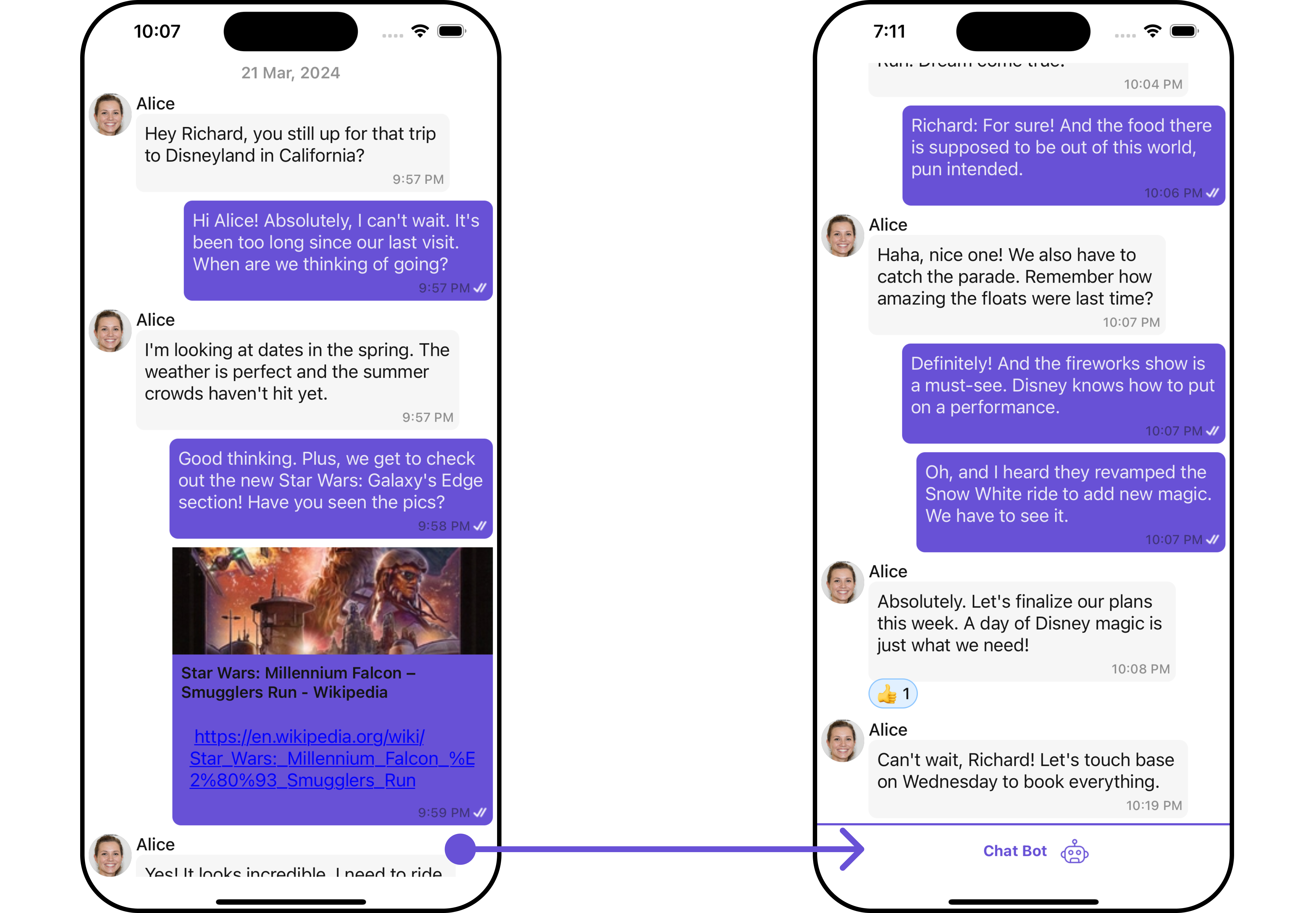
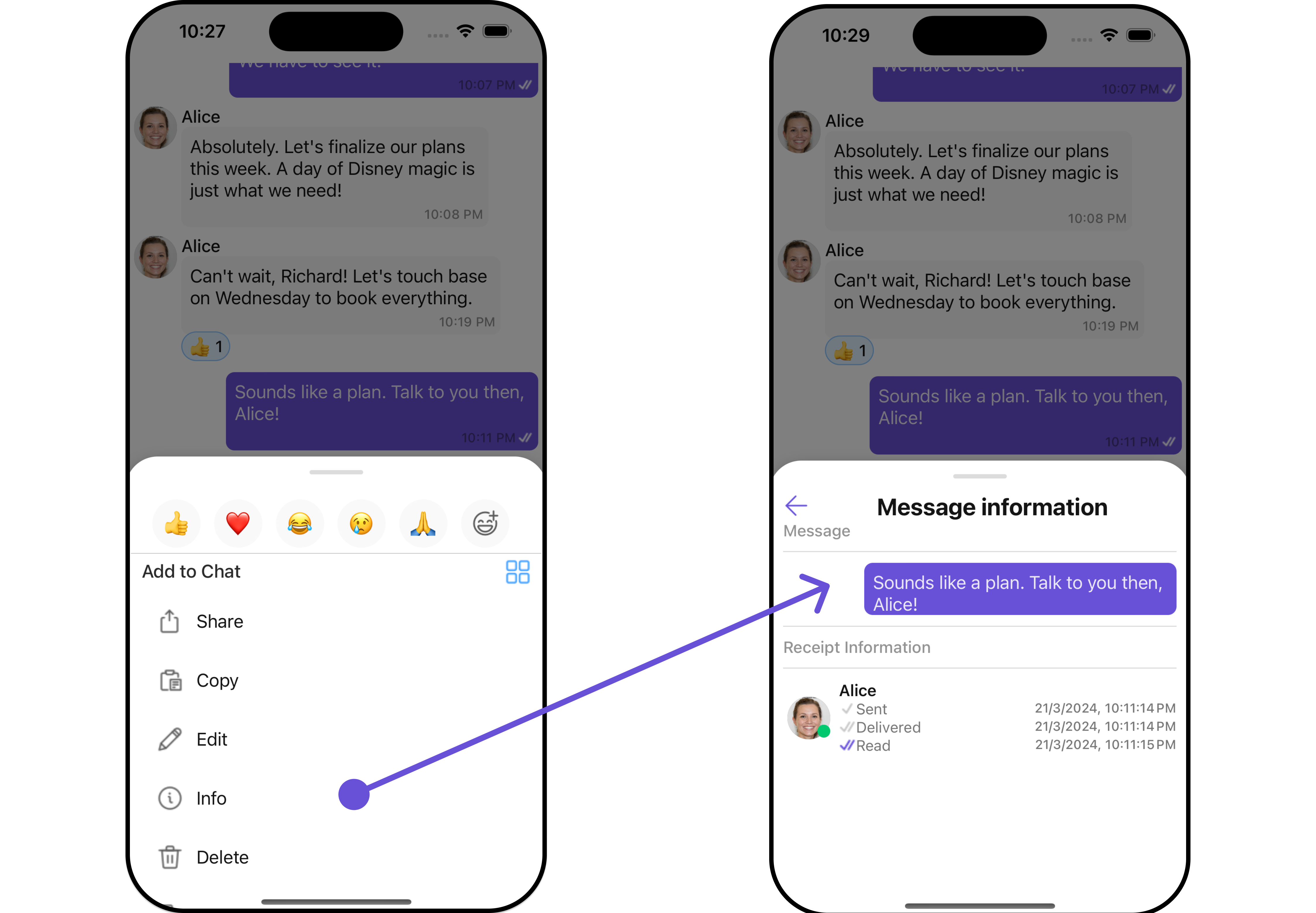
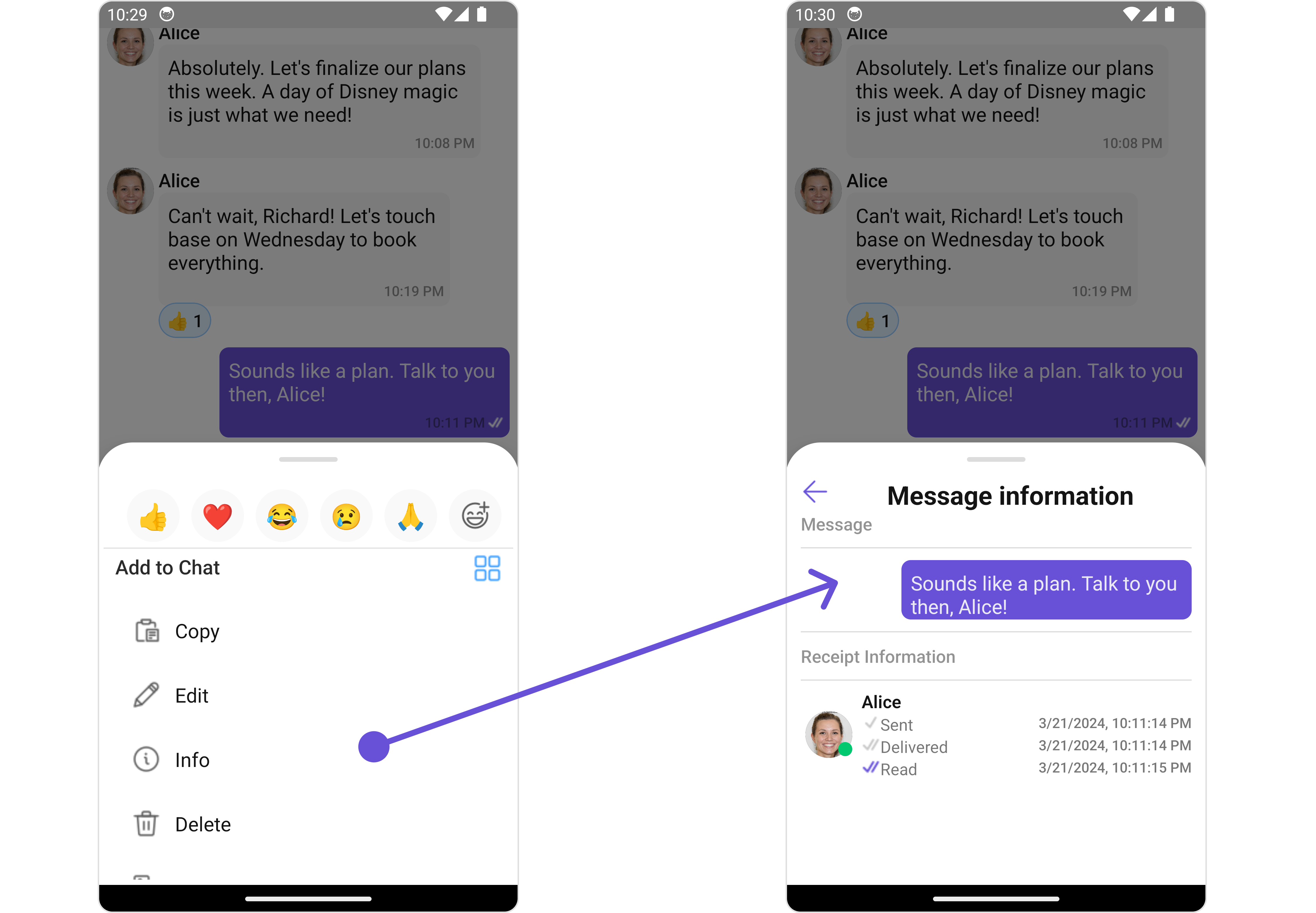
From the MessageList, you can navigate to the [MesssageInformation](/ui-kit/react-native/v4/message-information) component as shown in the image.
***
#### TextFormatters
Assigns the list of text formatters. If the provided list is not null, it sets the list. Otherwise, it assigns the default text formatters retrieved from the data source. To configure the existing Mentions look and feel check out [CometChatMentionsFormatter](/ui-kit/react-native/v4/mentions-formatter-guide)
```ts theme={null}
import { CometChat } from "@cometchat/chat-sdk-react-native";
import {
CometChatTextFormatter,
SuggestionItem,
} from "@cometchat/chat-uikit-react-native";
export class ShortCutFormatter extends CometChatTextFormatter {
constructor() {
super();
this.trackCharacter = "!";
}
search = (searchKey: string) => {
let data: Array = [];
CometChat.callExtension("message-shortcuts", "GET", "v1/fetch", undefined)
.then((data: any) => {
if (data && data?.shortcuts) {
let suggestionData = Object.keys(data.shortcuts).map((key) => {
return new SuggestionItem({
id: key,
name: data.shortcuts[key],
promptText: data.shortcuts[key],
trackingCharacter: "!",
underlyingText: data.shortcuts[key],
});
});
this.setSearchData(suggestionData); // setting data in setSearchData();
}
})
.catch((error) => {
// Some error occured
});
this.setSearchData(data);
};
// return null in fetchNext, if there's no pagination.
fetchNext = () => {
return null;
};
}
```
```tsx theme={null}
import React from "react";
import { CometChat } from "@cometchat/chat-sdk-react-native";
import { CometChatMessageList } from "@cometchat/chat-uikit-react-native";
import { ShortCutFormatter } from "./ShortcutsTextFormatter";
function App(): React.JSX.Element {
const [chatUser, setChatUser] = React.useState();
React.useEffect(() => {
CometChat.getUser("uid").then((user) => {
setChatUser(user);
});
}, []);
const shortcutFormatter = new ShortCutFormatter();
return ;
}
```
***
## Configuration
[Configurations](/ui-kit/react-native/v4/components-overview#configurations) offer the ability to customize the properties of each component within a Composite Component.
### MessageInformation
From the MessageList, you can navigate to the [MesssageInformation](/ui-kit/react-native/v4/message-information) component as shown in the image.
 If you wish to modify the properties of the [MesssageInformation](/ui-kit/react-native/v4/message-information) Component, you can use the `MessageInformationConfiguration` object.
```tsx theme={null}
import React from "react";
import { CometChat } from '@cometchat/chat-sdk-react-native';
import { CometChatMessageList, MessageInformationStyleInterface, MessageInformationConfigurationInterface } from '@cometchat/chat-uikit-react-native';
function App(): React.JSX.Element {
const [chatUser, setChatUser] = React.useState();
React.useEffect(() => {
CometChat.getUser("uid").then((user) => {
setChatUser(user);
})
}, []);
const messageInformationStyle : MessageInformationStyleInterface = {
titleTextColor: "#6851D6",
subtitleTextColor: "red",
}
const messageInformationConfiguration : MessageInformationConfigurationInterface = {
messageInformationStyle: messageInformationStyle
}
return (
<>
{ chatUser && }
);
}
```
The `MessageInformationConfiguration` indeed provides access to all the [Action](/ui-kit/react-native/v4/message-information#style), [Filters](/ui-kit/react-native/v4/message-information#filters), [Styles](#style), [Functionality](/ui-kit/react-native/v4/message-information#functionality), and [Advanced](/ui-kit/react-native/v4/message-information#advanced) properties of the [MesssageInformation](/ui-kit/react-native/v4/message-information) component.
Please note that the 🛑 symbol are not accessible within the Configuration Object.
**Example**
If you wish to modify the properties of the [MesssageInformation](/ui-kit/react-native/v4/message-information) Component, you can use the `MessageInformationConfiguration` object.
```tsx theme={null}
import React from "react";
import { CometChat } from '@cometchat/chat-sdk-react-native';
import { CometChatMessageList, MessageInformationStyleInterface, MessageInformationConfigurationInterface } from '@cometchat/chat-uikit-react-native';
function App(): React.JSX.Element {
const [chatUser, setChatUser] = React.useState();
React.useEffect(() => {
CometChat.getUser("uid").then((user) => {
setChatUser(user);
})
}, []);
const messageInformationStyle : MessageInformationStyleInterface = {
titleTextColor: "#6851D6",
subtitleTextColor: "red",
}
const messageInformationConfiguration : MessageInformationConfigurationInterface = {
messageInformationStyle: messageInformationStyle
}
return (
<>
{ chatUser && }
);
}
```
The `MessageInformationConfiguration` indeed provides access to all the [Action](/ui-kit/react-native/v4/message-information#style), [Filters](/ui-kit/react-native/v4/message-information#filters), [Styles](#style), [Functionality](/ui-kit/react-native/v4/message-information#functionality), and [Advanced](/ui-kit/react-native/v4/message-information#advanced) properties of the [MesssageInformation](/ui-kit/react-native/v4/message-information) component.
Please note that the 🛑 symbol are not accessible within the Configuration Object.
**Example**
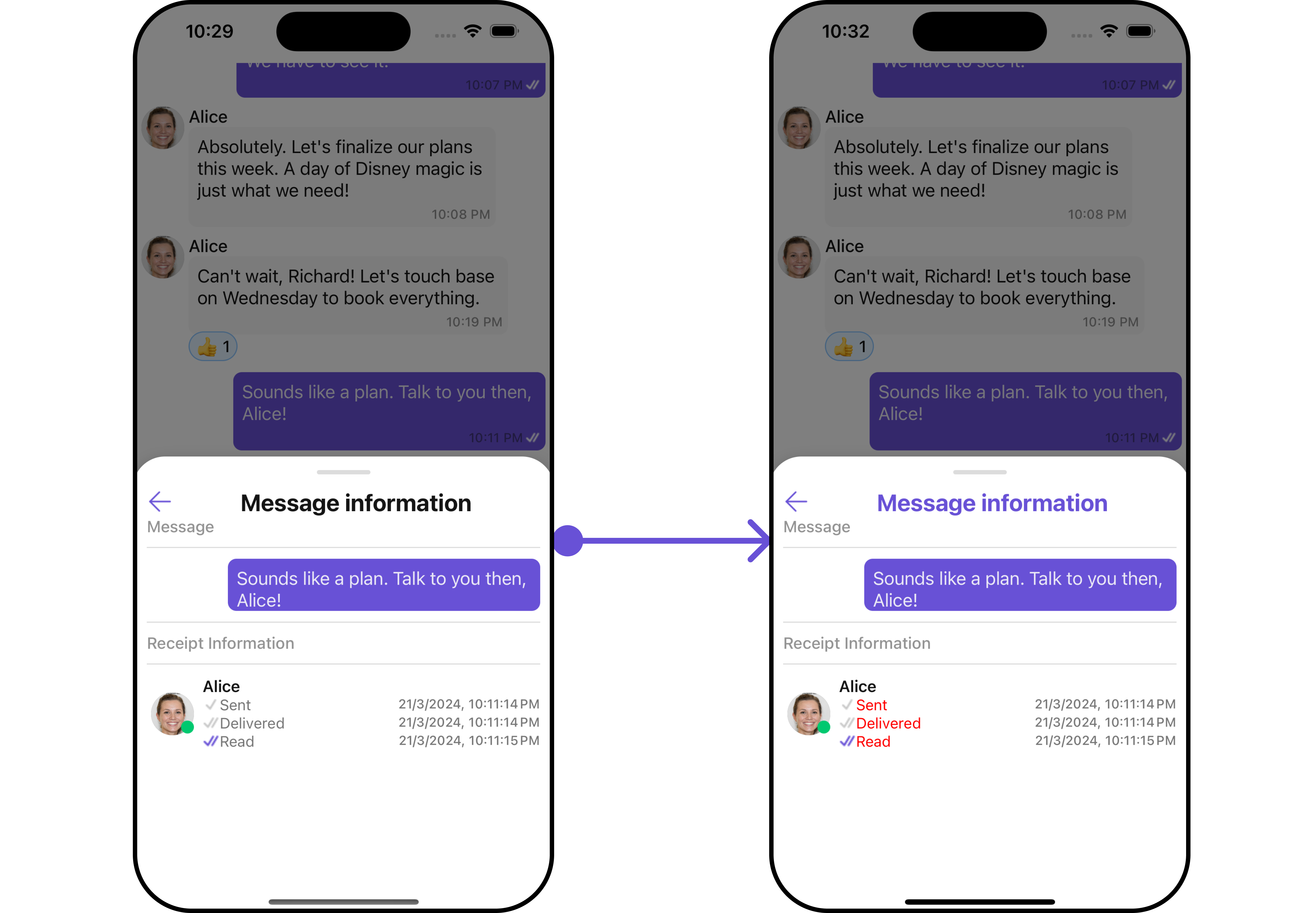
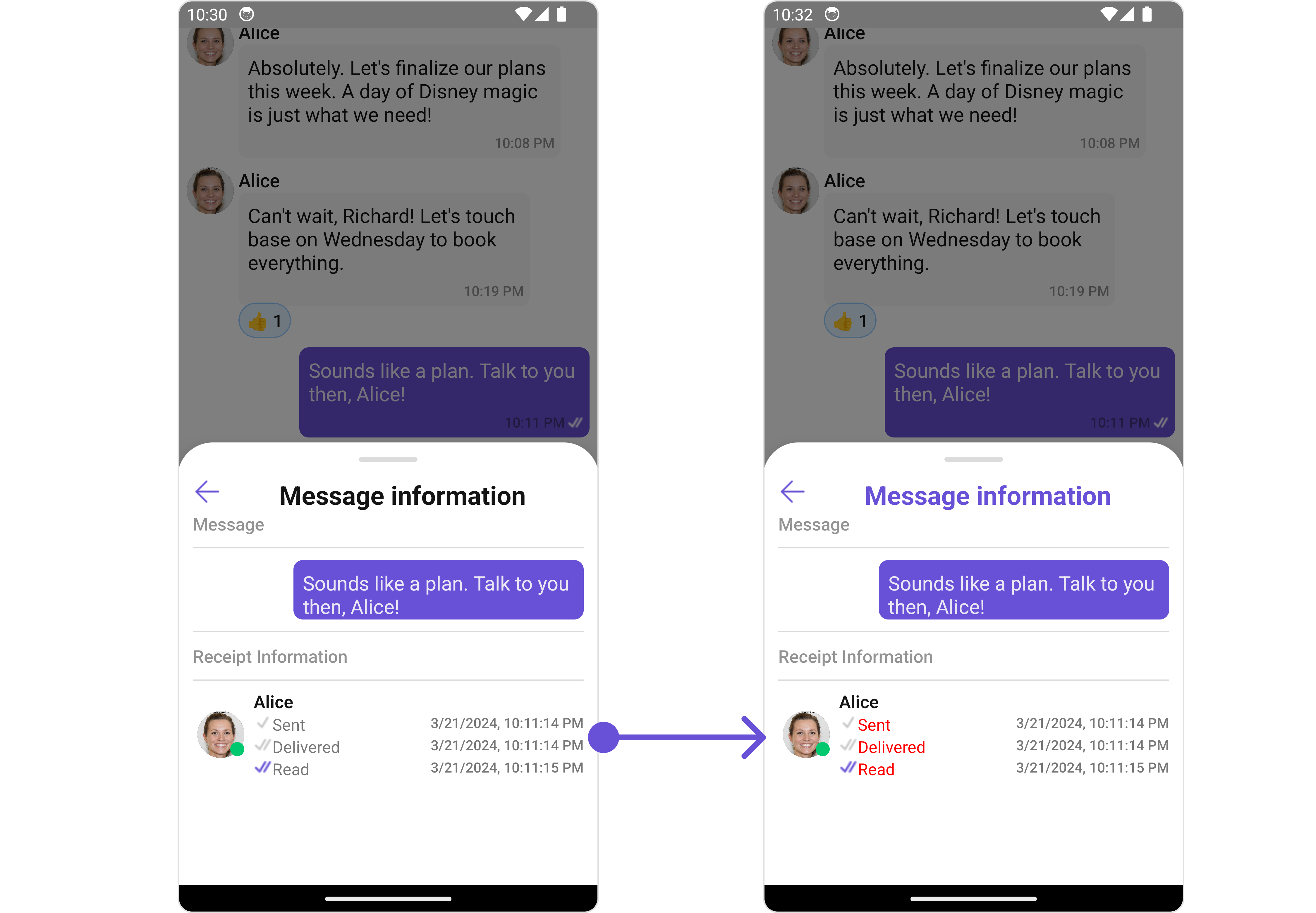 In the above example, we are styling a few properties of the [MesssageInformation](/ui-kit/react-native/v4/message-information) component using `MessageInformationConfiguration`.
### QuickReactions
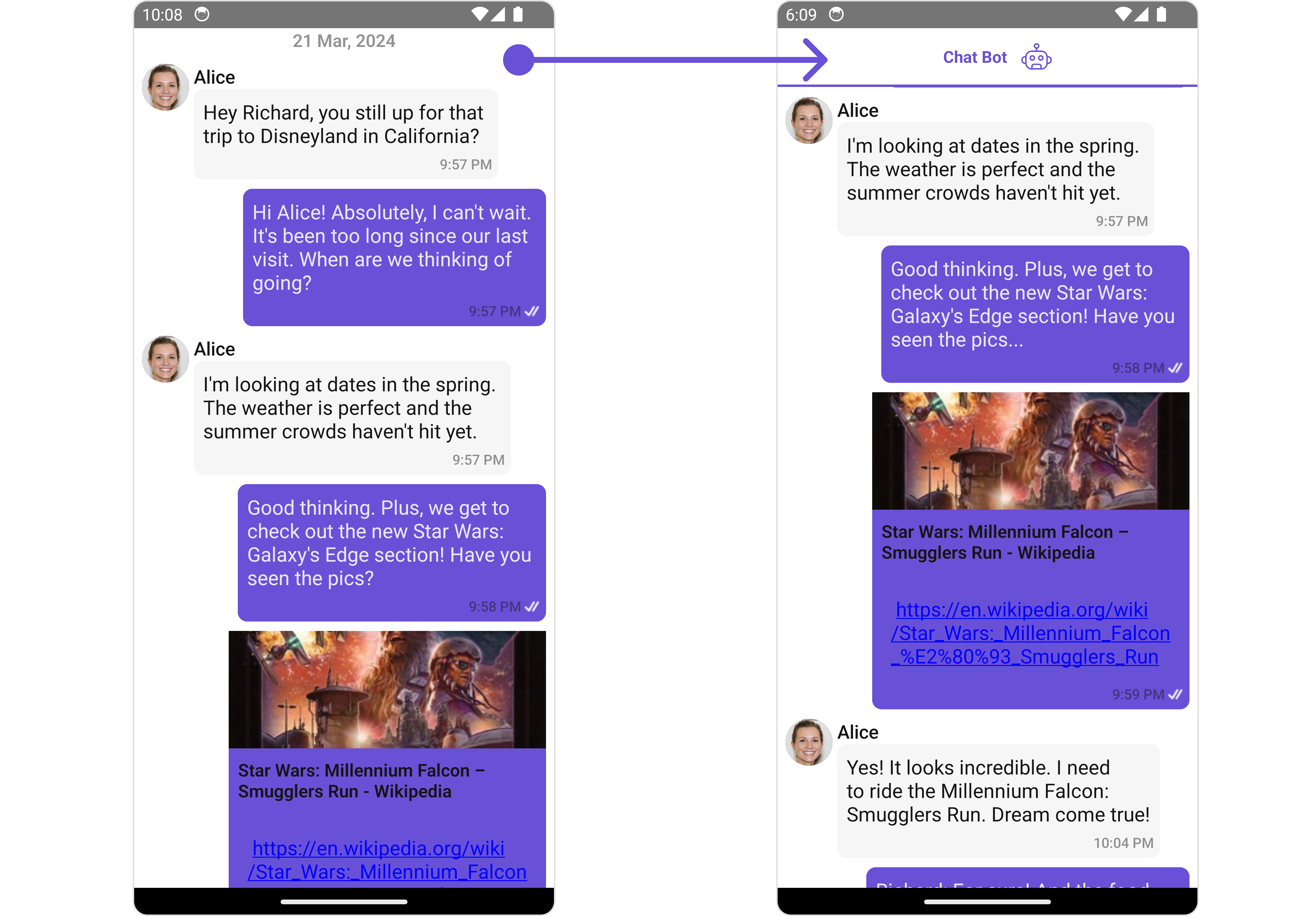
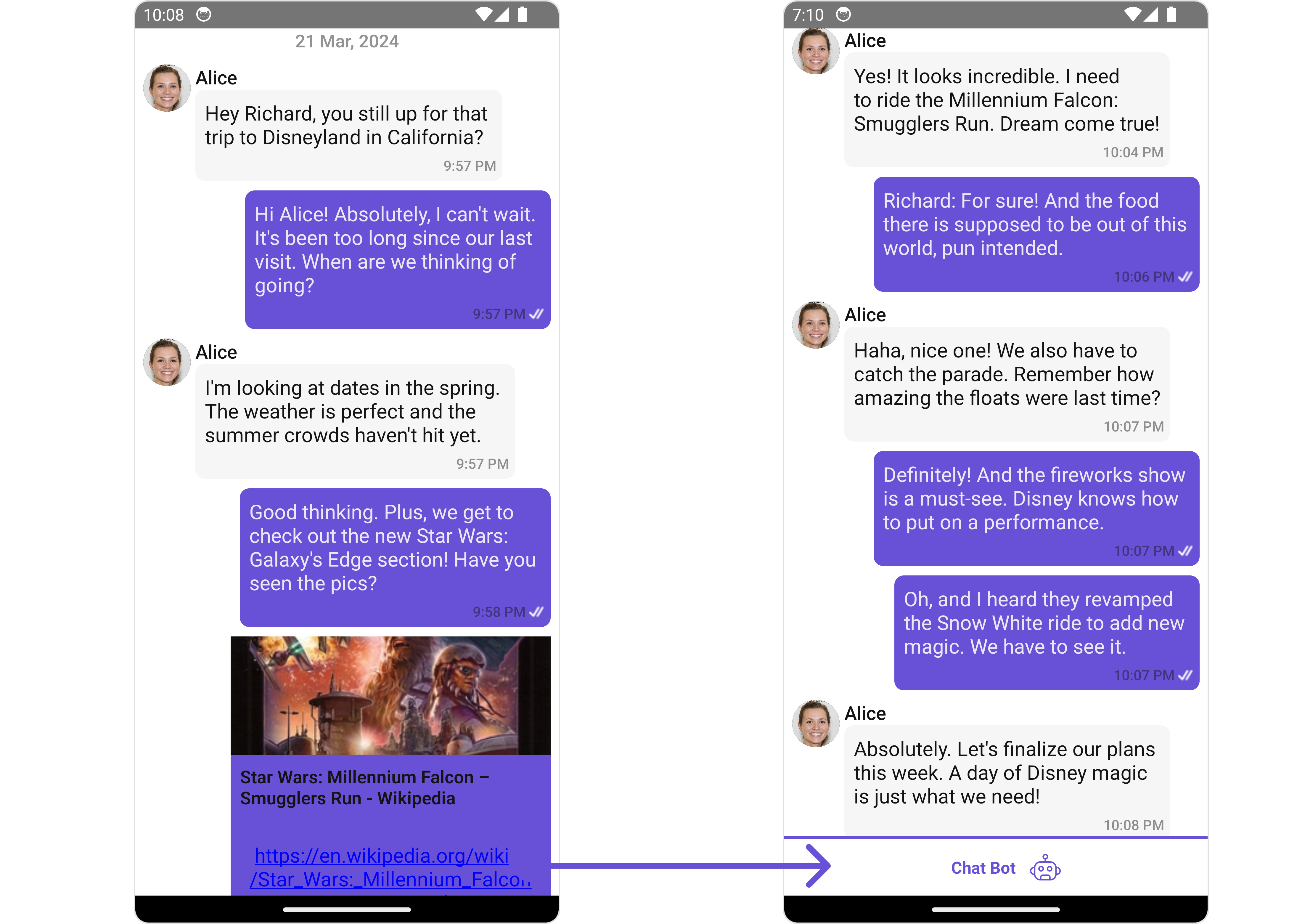
From the MessageList, you can navigate to the [QuickReactions](/ui-kit/react-native/v4/quick-reactions) component as shown in the image.
If you wish to modify the properties of the [QuickReactions](/ui-kit/react-native/v4/quick-reactions) Component, you can use the [QuickReactionConfiguration](/ui-kit/react-native/v4/quick-reactions#functionality) object.
In the above example, we are styling a few properties of the [MesssageInformation](/ui-kit/react-native/v4/message-information) component using `MessageInformationConfiguration`.
### QuickReactions
From the MessageList, you can navigate to the [QuickReactions](/ui-kit/react-native/v4/quick-reactions) component as shown in the image.
If you wish to modify the properties of the [QuickReactions](/ui-kit/react-native/v4/quick-reactions) Component, you can use the [QuickReactionConfiguration](/ui-kit/react-native/v4/quick-reactions#functionality) object.