> ## Documentation Index
> Fetch the complete documentation index at: https://cometchat-22654f5b-docs-rn-guide-message-privately.mintlify.site/llms.txt
> Use this file to discover all available pages before exploring further.
# Message Header
> Message Header — CometChat documentation.
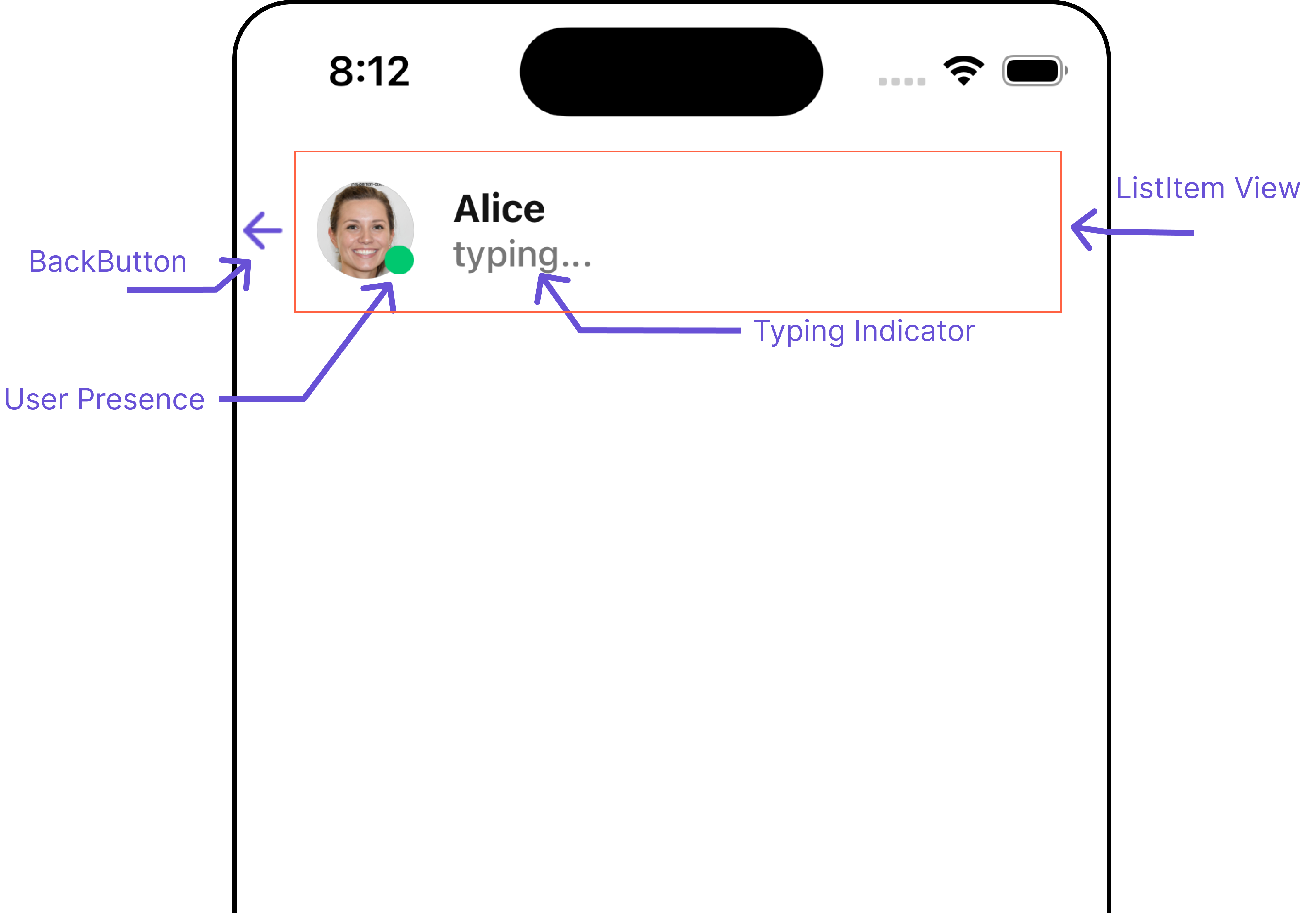
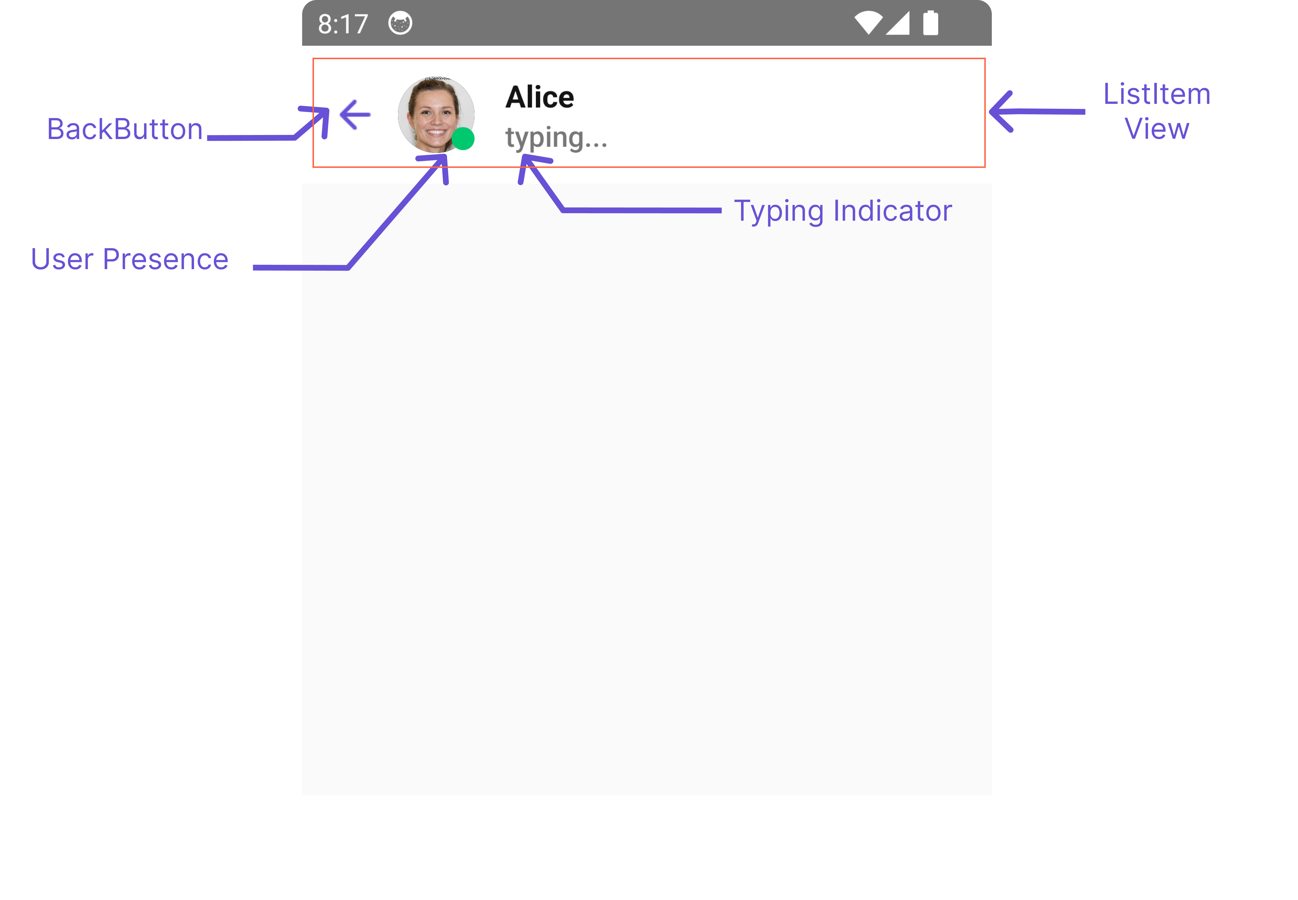
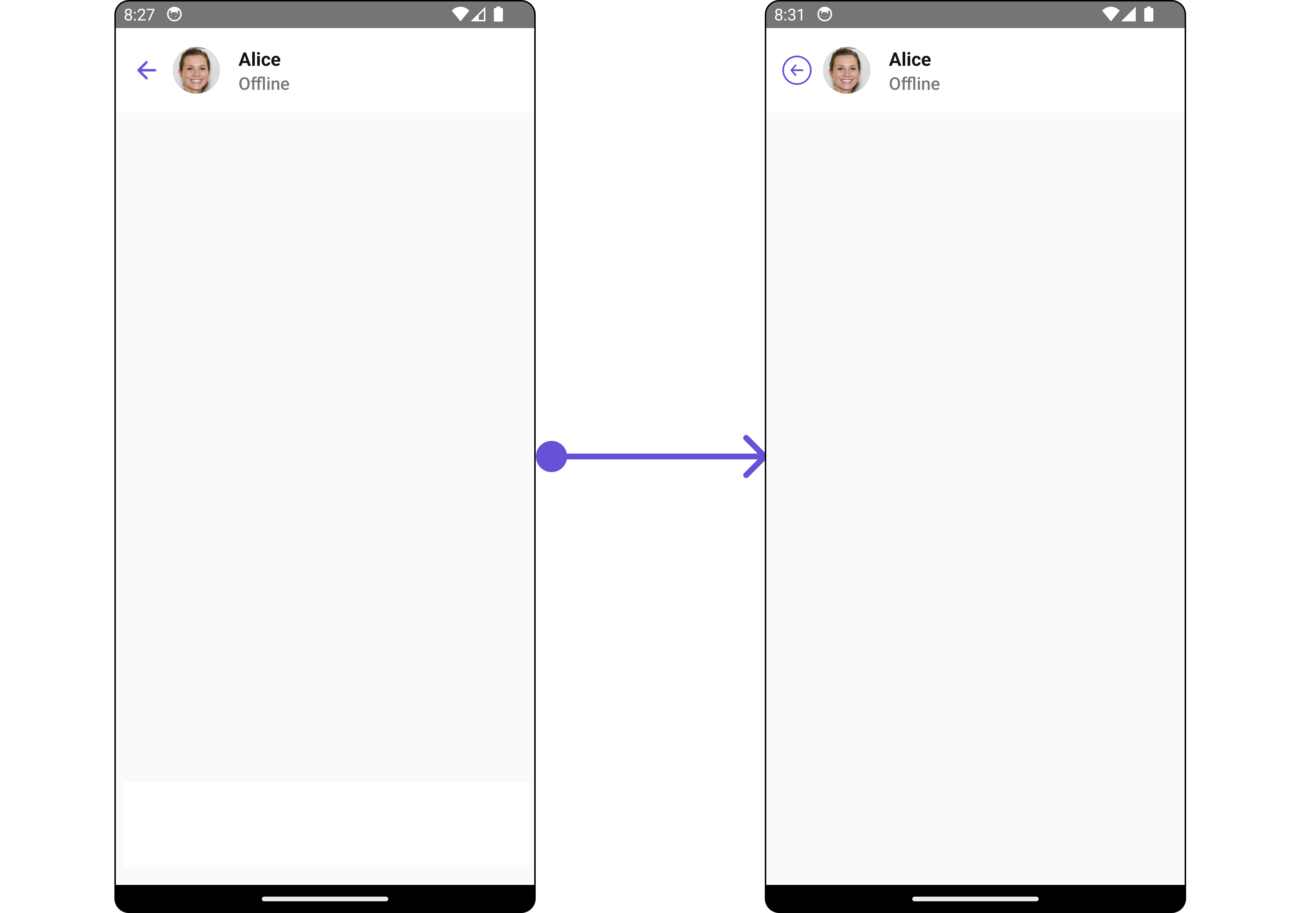
`MessageHeader` is a [Component](/ui-kit/react-native/v4/components-overview#components) that showcases the [User](/sdk/react-native/users-overview) or [Group](/sdk/react-native/groups-overview) details in the toolbar. Furthermore, it also presents a typing indicator and a back navigation button for ease of use.
 The `MessageHeader` is comprised of the following components:
| Components | Description |
| ------------------------------------------------------- | ---------------------------------------------------------------------------------------------------------------------------------------------- |
| [ListItem Component](/ui-kit/react-native/v4/list-item) | This component’s view consists of avatar, status indicator , title, and subtitle. The fields are then mapped with the SDK’s user, group class. |
| Back Button | BackButton that allows users to navigate back from the current activity or screen to the previous one |
## Usage
### Integration
```tsx theme={null}
import { CometChat } from '@cometchat/chat-sdk-react-native';
import { CometChatMessageHeader, MessageHeaderStyleInterface } from '@cometchat/chat-uikit-react-native';
import React from 'react';
function App(): React.JSX.Element {
const [chatUser, setChatUser] = React.useState();
React.useEffect(() => {
CometChat.getUser("uid").then((user) => {
setChatUser(user);
})
}, []);
const messageHeaderStyle : MessageHeaderStyleInterface = {
backgroundColor: "#c7caed"
}
return (
<>
{ chatUser &&
}
);
}
```
### Actions
[Actions](/ui-kit/react-native/v4/components-overview#actions) dictate how a component functions. They are divided into two types: Predefined and User-defined. You can override either type, allowing you to tailor the behavior of the component to fit your specific needs.
##### 1. OnBack
`OnBack` is triggered when you click on the back button of the Message Header component. You can override this action using the following code snippet.
```tsx theme={null}
import { CometChat } from '@cometchat/chat-sdk-react-native';
import { CometChatMessageHeader, MessageHeaderStyleInterface } from '@cometchat/chat-uikit-react-native';
import React from 'react';
function App(): React.JSX.Element {
const [chatUser, setChatUser] = React.useState();
React.useEffect(() => {
CometChat.getUser("uid").then((user) => {
setChatUser(user);
})
}, []);
let messageHeaderStyle : MessageHeaderStyleInterface = {
backgroundColor: "#c7caed"
}
const onBackHandler = () => {
//code
}
return (
<>
{ chatUser &&
}
);
}
```
***
### Filters
**Filters** allow you to customize the data displayed in a list within a `Component`. You can filter the list based on your specific criteria, allowing for a more customized. Filters can be applied using `RequestBuilders` of Chat SDK.
The `MessageHeader` component does not have any exposed filters.
### Events
[Events](/ui-kit/react-native/v4/components-overview#events) are emitted by a `Component`. By using event you can extend existing functionality. Being global events, they can be applied in Multiple Locations and are capable of being Added or Removed.
The `MessageHeader` component does not produce any events.
## Customization
To fit your app's design requirements, you can customize the appearance of the conversation component. We provide exposed methods that allow you to modify the experience and behavior according to your specific needs.
### Style
Using Style you can customize the look and feel of the component in your app, These parameters typically control elements such as the color, size, shape, and fonts used within the component.
##### 1. MessageHeader Style
To customize the appearance, you can assign a `MessageHeaderStyle` object to the `MessageHeader` component.
```tsx theme={null}
import { CometChat } from '@cometchat/chat-sdk-react-native';
import { CometChatMessageHeader, MessageHeaderStyleInterface } from '@cometchat/chat-uikit-react-native';
import React from 'react';
function App(): React.JSX.Element {
const [chatUser, setChatUser] = React.useState();
React.useEffect(() => {
CometChat.getUser("uid").then((user) => {
setChatUser(user);
})
}, []);
const messageHeaderStyle : MessageHeaderStyleInterface = {
backgroundColor: "#c7caed"
}
return (
<>
{ chatUser &&
}
);
}
```
The properties exposed by `MessageHeaderStyle` are as follows:
| Property | Type | Description |
| ------------------------ | -------------------- | -------------------------------------------------------- |
| backgroundColor | string | Sets the background colour for message header |
| width | string \| number | Sets the width for message header |
| height | string \| number | Sets the height for message header |
| border | BorderStyleInterface | Sets the border colour for message header |
| borderRadius | number | sets the border radius for message header |
| backIconTint | string | Sets the tint colour for back icon for message header |
| typingIndicatorTextColor | string | Sets the typing indicator text colour for message header |
| typingIndicatorTextFont | FontStyleInterface | Sets the typing indicator text font for message header |
| onlineStatusColor | string | Sets the online status colour for message header |
| subtitleTextColor | string | Sets the subtitle colour for message header |
| subtitleTextFont | FontStyleInterface | Sets the subtitle font for message header |
##### 2. Avatar Style
If you want to apply customized styles to the `Avatar` component within the `MessageHeader` Component, you can use the following code snippet. For more information you can refer [Avatar Styles](/ui-kit/react-native/v4/avatar#avatarstyleinterface).
```tsx theme={null}
import { CometChat } from '@cometchat/chat-sdk-react-native';
import { CometChatMessageHeader, BorderStyleInterface, AvatarStyleInterface } from '@cometchat/chat-uikit-react-native';
import React from 'react';
function App(): React.JSX.Element {
const [chatUser, setChatUser] = React.useState();
React.useEffect(() => {
CometChat.getUser("uid").then((user) => {
setChatUser(user);
})
}, []);
const messageHeaderStyle : MessageHeaderStyleInterface = {
backgroundColor: "#c7caed"
}
const borderStyle : BorderStyleInterface = {
borderStyle: "solid",
borderColor: "#6851D6",
borderWidth: 1
}
const avatarStyle : AvatarStyleInterface = {
border: borderStyle
}
return (
<>
{ chatUser &&
}
);
}
```
##### 3. ListItem Style
If you want to apply customized styles to the `ListItemStyle` component within the `MessageHeader` Component, you can use the following code snippet. For more information, you can refer [ListItem Styles](/ui-kit/react-native/v4/list-item#listitemstyle).
```tsx theme={null}
import { CometChat } from '@cometchat/chat-sdk-react-native';
import { CometChatMessageHeader, MessageHeaderStyleInterface } from '@cometchat/chat-uikit-react-native';
import React from 'react';
function App(): React.JSX.Element {
const [chatUser, setChatUser] = React.useState();
React.useEffect(() => {
CometChat.getUser("uid").then((user) => {
setChatUser(user);
})
}, []);
const messageHeaderStyle : MessageHeaderStyleInterface = {
backgroundColor: "#c7caed"
}
const listItemStyle : ListItemStyleInterface = {
backgroundColor: "transparent",
titleColor:"#6851D6",
};
return (
<>
{ chatUser &&
}
);
}
```
##### 4. StatusIndicator Style
If you want to apply customized styles to the `Status Indicator` component within the `MessageHeader` Component, you can use the following code snippet. For more information you can refer [StatusIndicator Styles](/ui-kit/react-native/v4/status-indicator).
```tsx theme={null}
import { CometChat } from '@cometchat/chat-sdk-react-native';
import { CometChatMessageHeader, MessageHeaderStyleInterface, StatusIndicatorStyleInterface } from '@cometchat/chat-uikit-react-native';
import React from 'react';
function App(): React.JSX.Element {
const [chatUser, setChatUser] = React.useState();
React.useEffect(() => {
CometChat.getUser("uid").then((user) => {
setChatUser(user);
})
}, []);
const messageHeaderStyle : MessageHeaderStyleInterface = {
backgroundColor: "#c7caed"
}
const statusIndicatorStyle : StatusIndicatorStyleInterface= {
backgroundColor: "red",
height: 15,
width: 15,
border: borderStyle,
borderRadius: 100,
};
return (
<>
{ chatUser &&
}
);
}
```
### Functionality
These are a set of small functional customizations that allow you to fine-tune the overall experience of the component. With these, you can change text, set custom icons, and toggle the visibility of UI elements.
Here is a code snippet demonstrating how you can customize the functionality of the Message Header component.
The `MessageHeader` is comprised of the following components:
| Components | Description |
| ------------------------------------------------------- | ---------------------------------------------------------------------------------------------------------------------------------------------- |
| [ListItem Component](/ui-kit/react-native/v4/list-item) | This component’s view consists of avatar, status indicator , title, and subtitle. The fields are then mapped with the SDK’s user, group class. |
| Back Button | BackButton that allows users to navigate back from the current activity or screen to the previous one |
## Usage
### Integration
```tsx theme={null}
import { CometChat } from '@cometchat/chat-sdk-react-native';
import { CometChatMessageHeader, MessageHeaderStyleInterface } from '@cometchat/chat-uikit-react-native';
import React from 'react';
function App(): React.JSX.Element {
const [chatUser, setChatUser] = React.useState();
React.useEffect(() => {
CometChat.getUser("uid").then((user) => {
setChatUser(user);
})
}, []);
const messageHeaderStyle : MessageHeaderStyleInterface = {
backgroundColor: "#c7caed"
}
return (
<>
{ chatUser &&
}
);
}
```
### Actions
[Actions](/ui-kit/react-native/v4/components-overview#actions) dictate how a component functions. They are divided into two types: Predefined and User-defined. You can override either type, allowing you to tailor the behavior of the component to fit your specific needs.
##### 1. OnBack
`OnBack` is triggered when you click on the back button of the Message Header component. You can override this action using the following code snippet.
```tsx theme={null}
import { CometChat } from '@cometchat/chat-sdk-react-native';
import { CometChatMessageHeader, MessageHeaderStyleInterface } from '@cometchat/chat-uikit-react-native';
import React from 'react';
function App(): React.JSX.Element {
const [chatUser, setChatUser] = React.useState();
React.useEffect(() => {
CometChat.getUser("uid").then((user) => {
setChatUser(user);
})
}, []);
let messageHeaderStyle : MessageHeaderStyleInterface = {
backgroundColor: "#c7caed"
}
const onBackHandler = () => {
//code
}
return (
<>
{ chatUser &&
}
);
}
```
***
### Filters
**Filters** allow you to customize the data displayed in a list within a `Component`. You can filter the list based on your specific criteria, allowing for a more customized. Filters can be applied using `RequestBuilders` of Chat SDK.
The `MessageHeader` component does not have any exposed filters.
### Events
[Events](/ui-kit/react-native/v4/components-overview#events) are emitted by a `Component`. By using event you can extend existing functionality. Being global events, they can be applied in Multiple Locations and are capable of being Added or Removed.
The `MessageHeader` component does not produce any events.
## Customization
To fit your app's design requirements, you can customize the appearance of the conversation component. We provide exposed methods that allow you to modify the experience and behavior according to your specific needs.
### Style
Using Style you can customize the look and feel of the component in your app, These parameters typically control elements such as the color, size, shape, and fonts used within the component.
##### 1. MessageHeader Style
To customize the appearance, you can assign a `MessageHeaderStyle` object to the `MessageHeader` component.
```tsx theme={null}
import { CometChat } from '@cometchat/chat-sdk-react-native';
import { CometChatMessageHeader, MessageHeaderStyleInterface } from '@cometchat/chat-uikit-react-native';
import React from 'react';
function App(): React.JSX.Element {
const [chatUser, setChatUser] = React.useState();
React.useEffect(() => {
CometChat.getUser("uid").then((user) => {
setChatUser(user);
})
}, []);
const messageHeaderStyle : MessageHeaderStyleInterface = {
backgroundColor: "#c7caed"
}
return (
<>
{ chatUser &&
}
);
}
```
The properties exposed by `MessageHeaderStyle` are as follows:
| Property | Type | Description |
| ------------------------ | -------------------- | -------------------------------------------------------- |
| backgroundColor | string | Sets the background colour for message header |
| width | string \| number | Sets the width for message header |
| height | string \| number | Sets the height for message header |
| border | BorderStyleInterface | Sets the border colour for message header |
| borderRadius | number | sets the border radius for message header |
| backIconTint | string | Sets the tint colour for back icon for message header |
| typingIndicatorTextColor | string | Sets the typing indicator text colour for message header |
| typingIndicatorTextFont | FontStyleInterface | Sets the typing indicator text font for message header |
| onlineStatusColor | string | Sets the online status colour for message header |
| subtitleTextColor | string | Sets the subtitle colour for message header |
| subtitleTextFont | FontStyleInterface | Sets the subtitle font for message header |
##### 2. Avatar Style
If you want to apply customized styles to the `Avatar` component within the `MessageHeader` Component, you can use the following code snippet. For more information you can refer [Avatar Styles](/ui-kit/react-native/v4/avatar#avatarstyleinterface).
```tsx theme={null}
import { CometChat } from '@cometchat/chat-sdk-react-native';
import { CometChatMessageHeader, BorderStyleInterface, AvatarStyleInterface } from '@cometchat/chat-uikit-react-native';
import React from 'react';
function App(): React.JSX.Element {
const [chatUser, setChatUser] = React.useState();
React.useEffect(() => {
CometChat.getUser("uid").then((user) => {
setChatUser(user);
})
}, []);
const messageHeaderStyle : MessageHeaderStyleInterface = {
backgroundColor: "#c7caed"
}
const borderStyle : BorderStyleInterface = {
borderStyle: "solid",
borderColor: "#6851D6",
borderWidth: 1
}
const avatarStyle : AvatarStyleInterface = {
border: borderStyle
}
return (
<>
{ chatUser &&
}
);
}
```
##### 3. ListItem Style
If you want to apply customized styles to the `ListItemStyle` component within the `MessageHeader` Component, you can use the following code snippet. For more information, you can refer [ListItem Styles](/ui-kit/react-native/v4/list-item#listitemstyle).
```tsx theme={null}
import { CometChat } from '@cometchat/chat-sdk-react-native';
import { CometChatMessageHeader, MessageHeaderStyleInterface } from '@cometchat/chat-uikit-react-native';
import React from 'react';
function App(): React.JSX.Element {
const [chatUser, setChatUser] = React.useState();
React.useEffect(() => {
CometChat.getUser("uid").then((user) => {
setChatUser(user);
})
}, []);
const messageHeaderStyle : MessageHeaderStyleInterface = {
backgroundColor: "#c7caed"
}
const listItemStyle : ListItemStyleInterface = {
backgroundColor: "transparent",
titleColor:"#6851D6",
};
return (
<>
{ chatUser &&
}
);
}
```
##### 4. StatusIndicator Style
If you want to apply customized styles to the `Status Indicator` component within the `MessageHeader` Component, you can use the following code snippet. For more information you can refer [StatusIndicator Styles](/ui-kit/react-native/v4/status-indicator).
```tsx theme={null}
import { CometChat } from '@cometchat/chat-sdk-react-native';
import { CometChatMessageHeader, MessageHeaderStyleInterface, StatusIndicatorStyleInterface } from '@cometchat/chat-uikit-react-native';
import React from 'react';
function App(): React.JSX.Element {
const [chatUser, setChatUser] = React.useState();
React.useEffect(() => {
CometChat.getUser("uid").then((user) => {
setChatUser(user);
})
}, []);
const messageHeaderStyle : MessageHeaderStyleInterface = {
backgroundColor: "#c7caed"
}
const statusIndicatorStyle : StatusIndicatorStyleInterface= {
backgroundColor: "red",
height: 15,
width: 15,
border: borderStyle,
borderRadius: 100,
};
return (
<>
{ chatUser &&
}
);
}
```
### Functionality
These are a set of small functional customizations that allow you to fine-tune the overall experience of the component. With these, you can change text, set custom icons, and toggle the visibility of UI elements.
Here is a code snippet demonstrating how you can customize the functionality of the Message Header component.
 ```tsx theme={null}
import { CometChat } from "@cometchat/chat-sdk-react-native";
import {
CometChatMessageHeader,
MessageHeaderStyleInterface,
} from "@cometchat/chat-uikit-react-native";
import React from "react";
function App(): React.JSX.Element {
const [chatUser, setChatUser] = React.useState();
React.useEffect(() => {
CometChat.getUser("uid").then((user) => {
setChatUser(user);
});
}, []);
const messageHeaderStyle: MessageHeaderStyleInterface = {
backgroundColor: "#c7caed",
};
return (
<>
{chatUser && (
)}
);
}
```
Following is a list of customizations along with their corresponding code snippets:
| Property | Description | Code |
| ------------------------ | ------------------------------------------------------------------------ | --------------------------------------------------------------------------------------------------------------------------------------------------------------------- |
| **user** | Used to pass user object of which header specific details will be shown | `user={chatUser}` |
| **group** | Used to pass group object of which header specific details will be shown | `group={chatGroup}` |
| **protectedGroupIcon** | Used to set custom protected group icon | `protectedGroupIcon={{uri: }}` OR `import customProtectedGroupIcon from "./customProtectedGroupIcon.svg"; ``protectedGroupIcon={customProtectedGroupIcon}` |
| **privateGroupIcon** | Used to set custom private group icon | `privateGroupIcon={{uri: }}` OR `import customPrivateGroupIcon from "./customPrivateGroupIcon.svg"; ``privateGroupIcon={customPrivateGroupIcon}` |
| **hideBackIcon** | Used to toggle back button visibility | `hideBackhideBackIconButton={true}` |
| **disableTyping** | Used to enable disable typing indicators | `disableTyping={true}` |
| **disableUsersPresence** | Used to toggle functionality to show user's presence | `disableUsersPresence={true` |
### Advanced
For advanced-level customization, you can set custom views to the component. This lets you tailor each aspect of the component to fit your exact needs and application aesthetics. You can create and define your views, layouts, and UI elements and then incorporate those into the component.
***
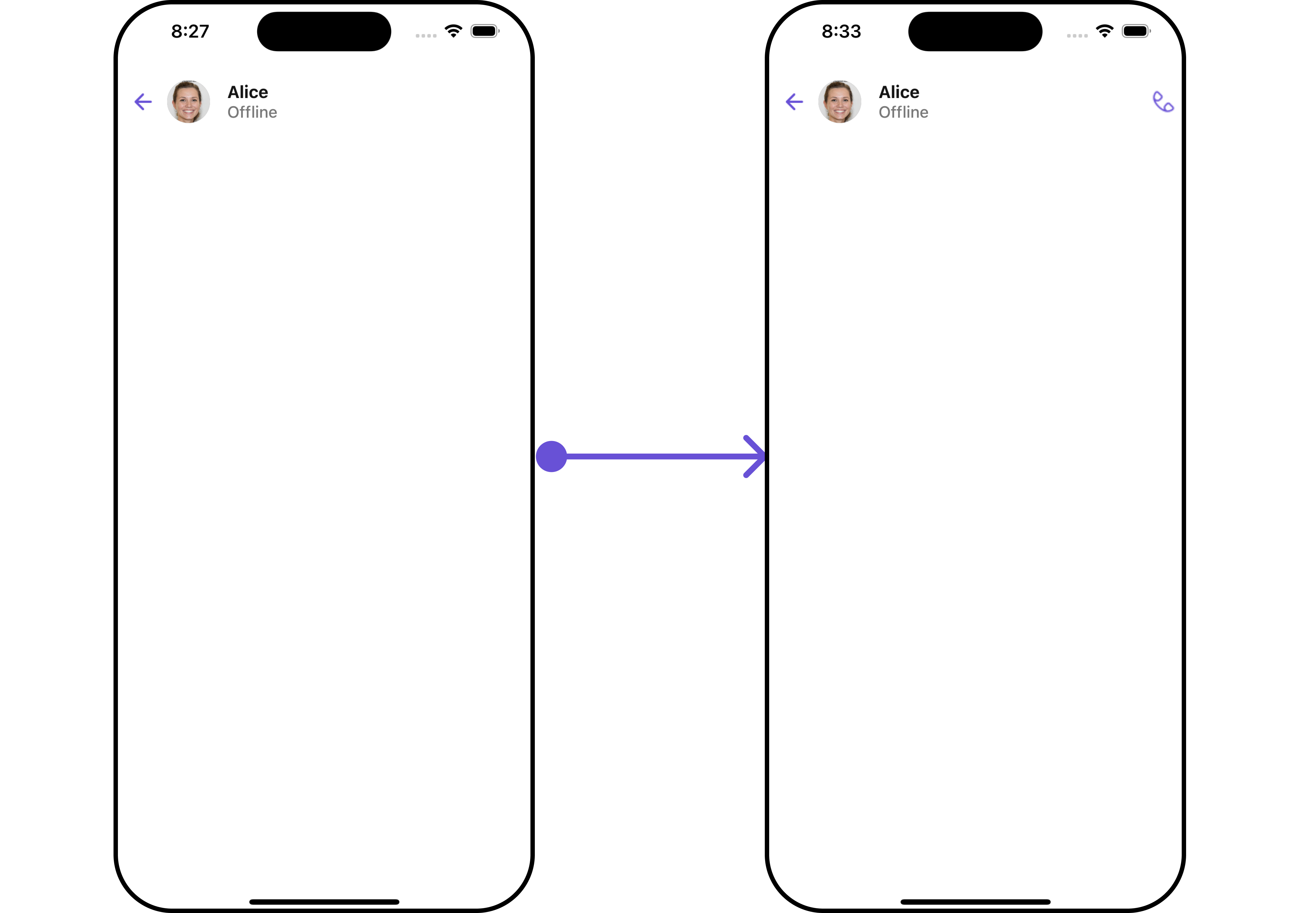
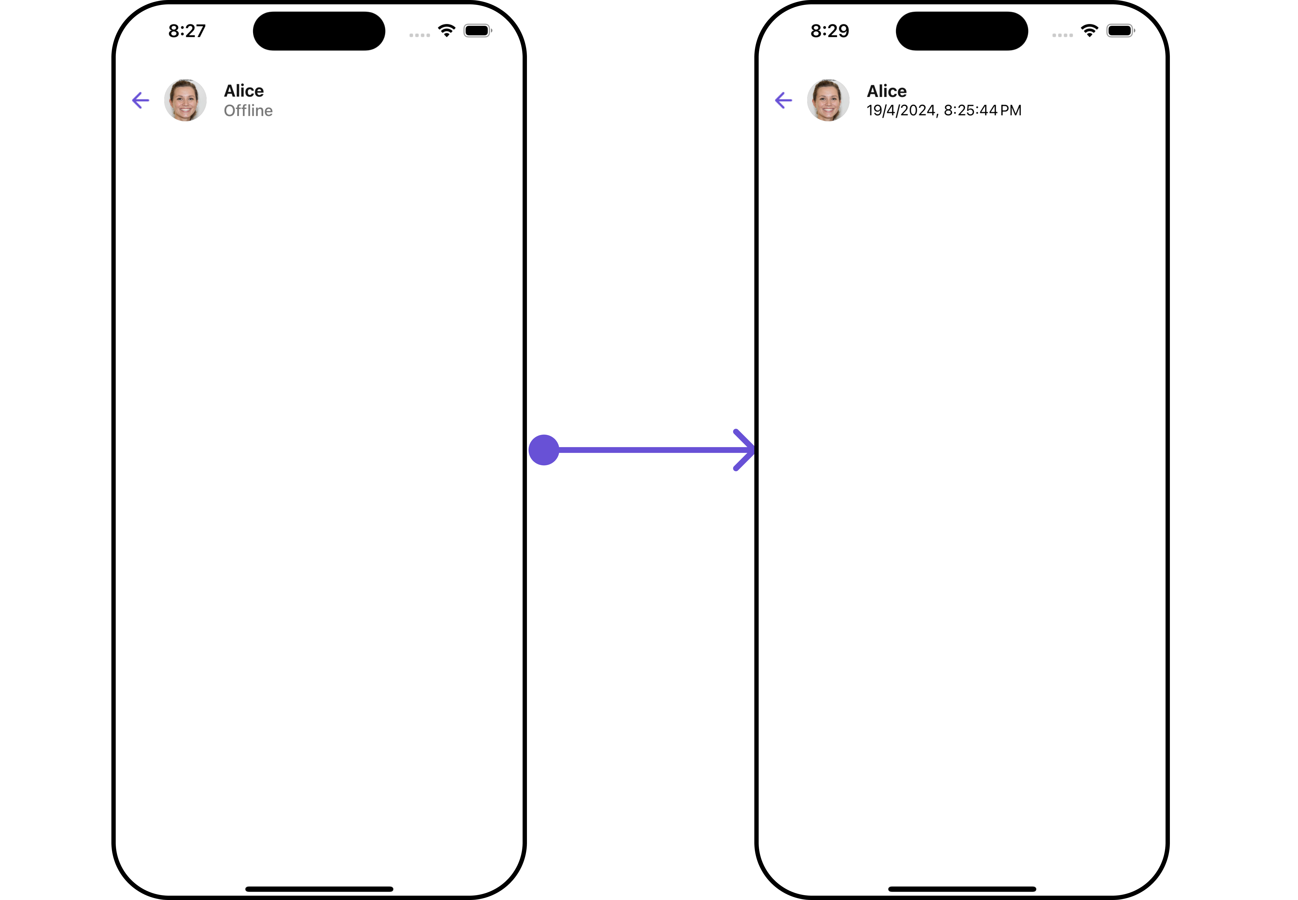
#### SubtitleView
By using the `SubtitleView` method, you can modify the SubtitleView to meet your specific needs.
```tsx theme={null}
import { CometChat } from '@cometchat/chat-sdk-react-native';
import { CometChatMessageHeader, MessageHeaderStyleInterface } from '@cometchat/chat-uikit-react-native';
import React from 'react';
function App(): React.JSX.Element {
const [chatUser, setChatUser] = React.useState();
React.useEffect(() => {
CometChat.getUser("uid").then((user) => {
setChatUser(user);
})
}, []);
const messageHeaderStyle : MessageHeaderStyleInterface = {
backgroundColor: "#c7caed"
}
function formatTime(timestamp: number) {
const date = new Date(timestamp * 1000);
return date.toLocaleString();
}
const getSubtitleView = () =>{
return (
{formatTime(chatUser!.getLastActiveAt())}
)
}
return (
<>
{ chatUser &&
}
);
}
```
**Example**
```tsx theme={null}
import { CometChat } from "@cometchat/chat-sdk-react-native";
import {
CometChatMessageHeader,
MessageHeaderStyleInterface,
} from "@cometchat/chat-uikit-react-native";
import React from "react";
function App(): React.JSX.Element {
const [chatUser, setChatUser] = React.useState();
React.useEffect(() => {
CometChat.getUser("uid").then((user) => {
setChatUser(user);
});
}, []);
const messageHeaderStyle: MessageHeaderStyleInterface = {
backgroundColor: "#c7caed",
};
return (
<>
{chatUser && (
)}
);
}
```
Following is a list of customizations along with their corresponding code snippets:
| Property | Description | Code |
| ------------------------ | ------------------------------------------------------------------------ | --------------------------------------------------------------------------------------------------------------------------------------------------------------------- |
| **user** | Used to pass user object of which header specific details will be shown | `user={chatUser}` |
| **group** | Used to pass group object of which header specific details will be shown | `group={chatGroup}` |
| **protectedGroupIcon** | Used to set custom protected group icon | `protectedGroupIcon={{uri: }}` OR `import customProtectedGroupIcon from "./customProtectedGroupIcon.svg"; ``protectedGroupIcon={customProtectedGroupIcon}` |
| **privateGroupIcon** | Used to set custom private group icon | `privateGroupIcon={{uri: }}` OR `import customPrivateGroupIcon from "./customPrivateGroupIcon.svg"; ``privateGroupIcon={customPrivateGroupIcon}` |
| **hideBackIcon** | Used to toggle back button visibility | `hideBackhideBackIconButton={true}` |
| **disableTyping** | Used to enable disable typing indicators | `disableTyping={true}` |
| **disableUsersPresence** | Used to toggle functionality to show user's presence | `disableUsersPresence={true` |
### Advanced
For advanced-level customization, you can set custom views to the component. This lets you tailor each aspect of the component to fit your exact needs and application aesthetics. You can create and define your views, layouts, and UI elements and then incorporate those into the component.
***
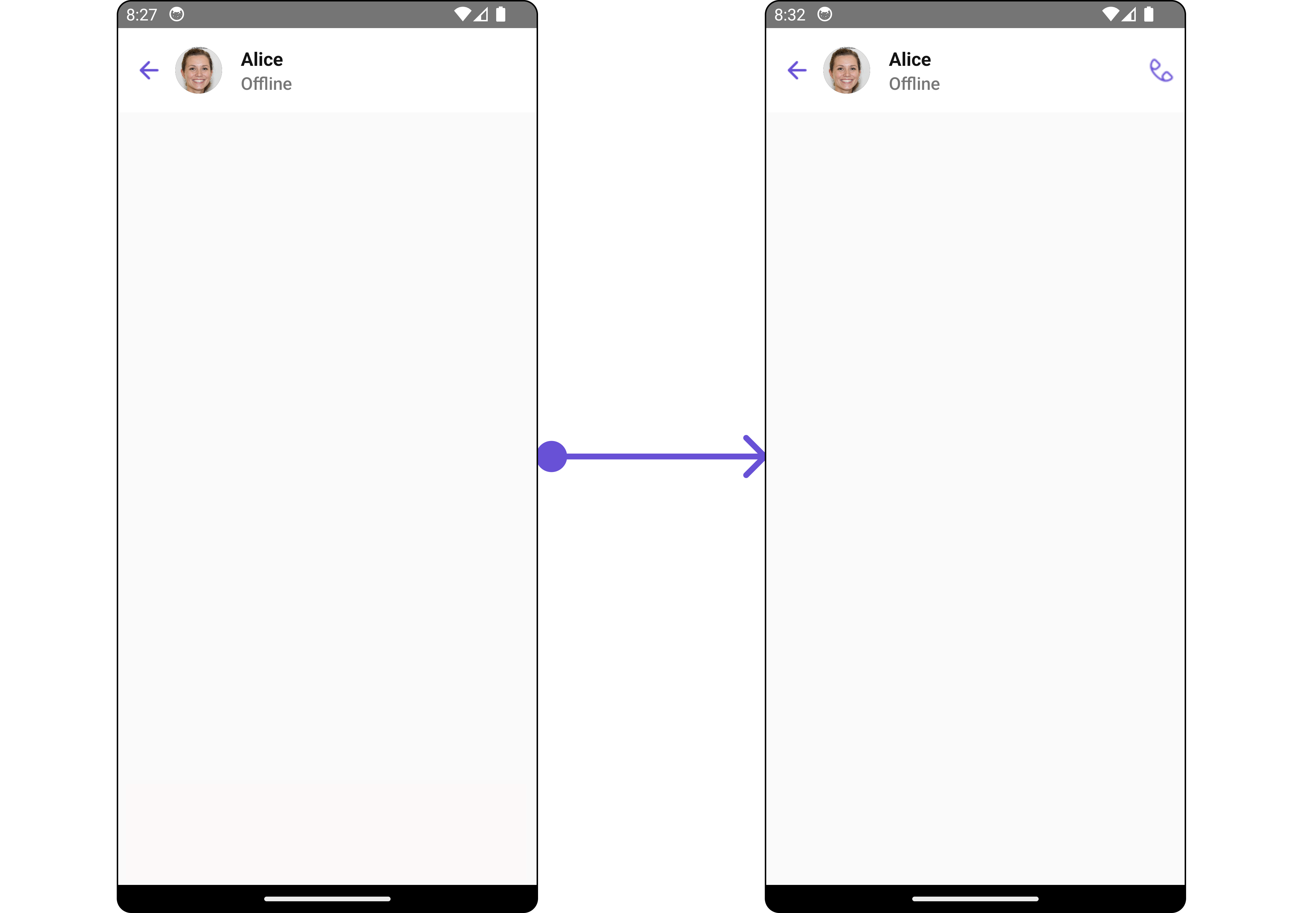
#### SubtitleView
By using the `SubtitleView` method, you can modify the SubtitleView to meet your specific needs.
```tsx theme={null}
import { CometChat } from '@cometchat/chat-sdk-react-native';
import { CometChatMessageHeader, MessageHeaderStyleInterface } from '@cometchat/chat-uikit-react-native';
import React from 'react';
function App(): React.JSX.Element {
const [chatUser, setChatUser] = React.useState();
React.useEffect(() => {
CometChat.getUser("uid").then((user) => {
setChatUser(user);
})
}, []);
const messageHeaderStyle : MessageHeaderStyleInterface = {
backgroundColor: "#c7caed"
}
function formatTime(timestamp: number) {
const date = new Date(timestamp * 1000);
return date.toLocaleString();
}
const getSubtitleView = () =>{
return (
{formatTime(chatUser!.getLastActiveAt())}
)
}
return (
<>
{ chatUser &&
}
);
}
```
**Example**
 ***
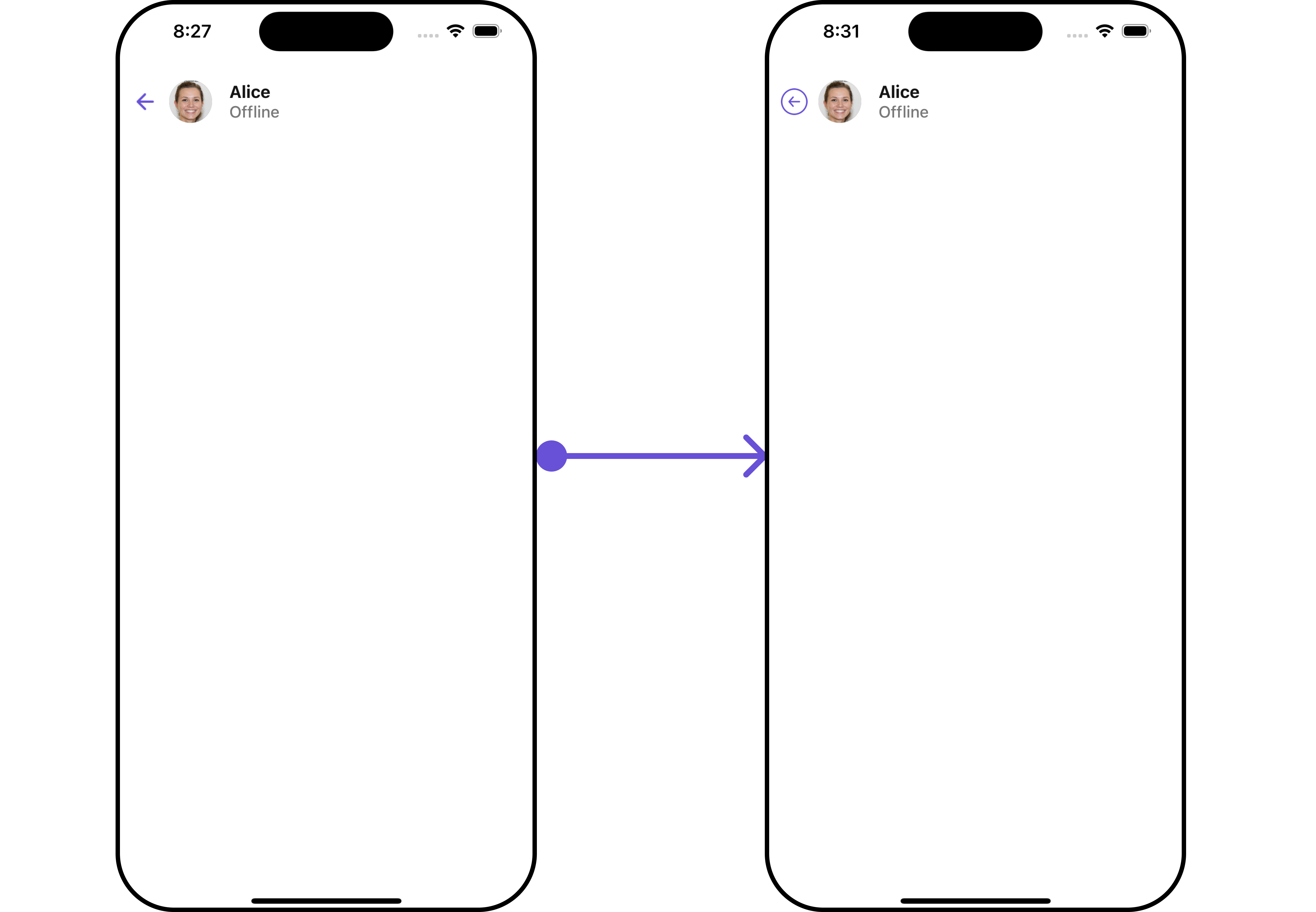
#### BackButtonIcon
You can customize the Back Icon according to your specific requirements by using the `backButtonIcon` method.
```tsx theme={null}
import { CometChat } from "@cometchat/chat-sdk-react-native";
import {
CometChatMessageHeader,
MessageHeaderStyleInterface,
} from "@cometchat/chat-uikit-react-native";
import React from "react";
import BackArrow from "./back-arrow.png";
function App(): React.JSX.Element {
const [chatUser, setChatUser] = React.useState();
React.useEffect(() => {
CometChat.getUser("uid").then((user) => {
setChatUser(user);
});
}, []);
const messageHeaderStyle: MessageHeaderStyleInterface = {
backgroundColor: "#c7caed",
};
return (
<>
{chatUser && (
)}
);
}
```
**Example**
***
#### BackButtonIcon
You can customize the Back Icon according to your specific requirements by using the `backButtonIcon` method.
```tsx theme={null}
import { CometChat } from "@cometchat/chat-sdk-react-native";
import {
CometChatMessageHeader,
MessageHeaderStyleInterface,
} from "@cometchat/chat-uikit-react-native";
import React from "react";
import BackArrow from "./back-arrow.png";
function App(): React.JSX.Element {
const [chatUser, setChatUser] = React.useState();
React.useEffect(() => {
CometChat.getUser("uid").then((user) => {
setChatUser(user);
});
}, []);
const messageHeaderStyle: MessageHeaderStyleInterface = {
backgroundColor: "#c7caed",
};
return (
<>
{chatUser && (
)}
);
}
```
**Example**
 ***
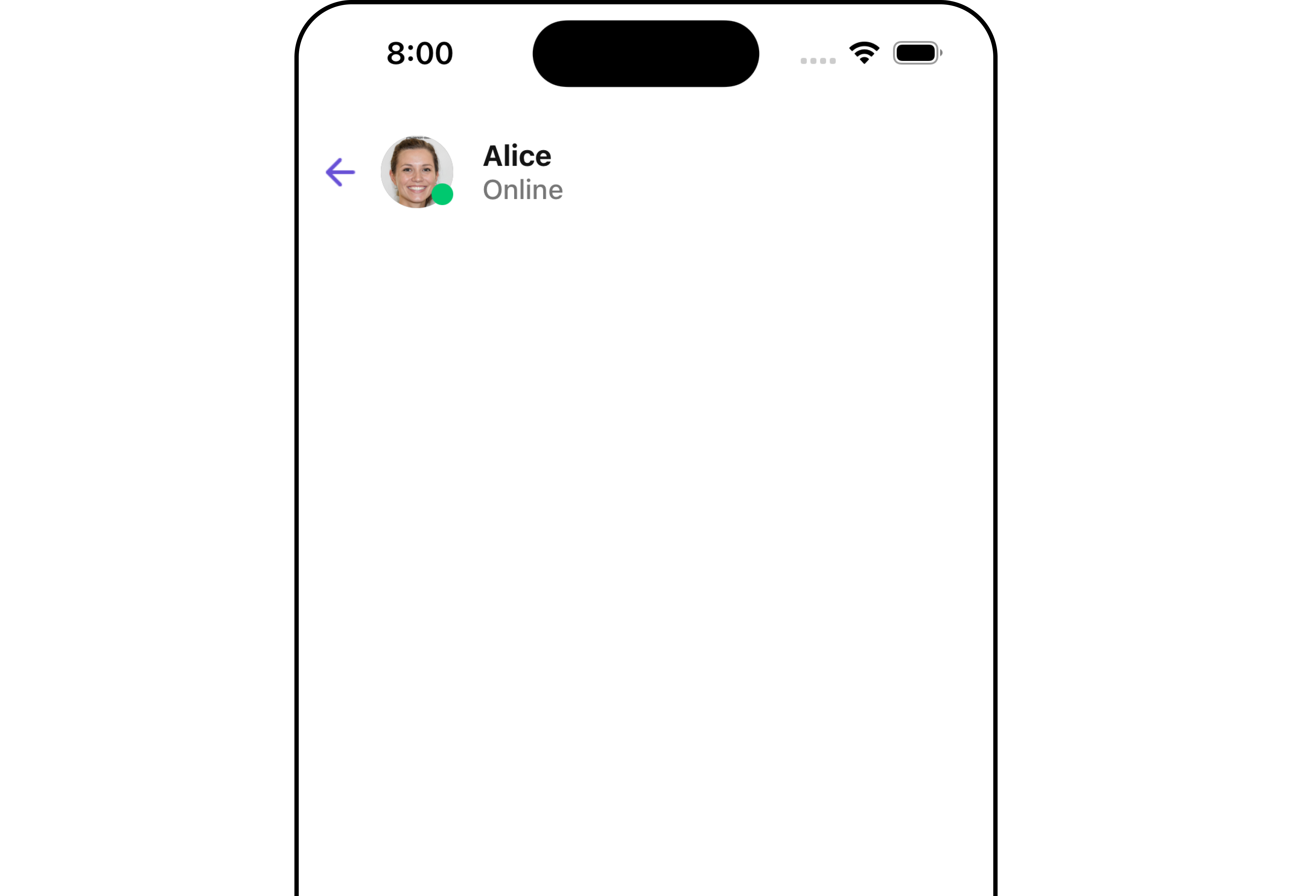
#### AppBarOptions
You can customize the Menu options to meet your specific needs by using the `AppBarOptions` method.
```tsx theme={null}
import { CometChat } from '@cometchat/chat-sdk-react-native';
import { CometChatMessageHeader, MessageHeaderStyleInterface } from '@cometchat/chat-uikit-react-native';
import React from 'react';
import Call from './Call.png';
function App(): React.JSX.Element {
const [chatUser, setChatUser] = React.useState();
React.useEffect(() => {
CometChat.getUser("uid").then((user) => {
setChatUser(user);
})
}, []);
const messageHeaderStyle : MessageHeaderStyleInterface = {
backgroundColor: "#c7caed"
}
const appBarOptions = () =>{
return (
)
}
return (
<>
{ chatUser &&
}
);
}
```
**Example**
***
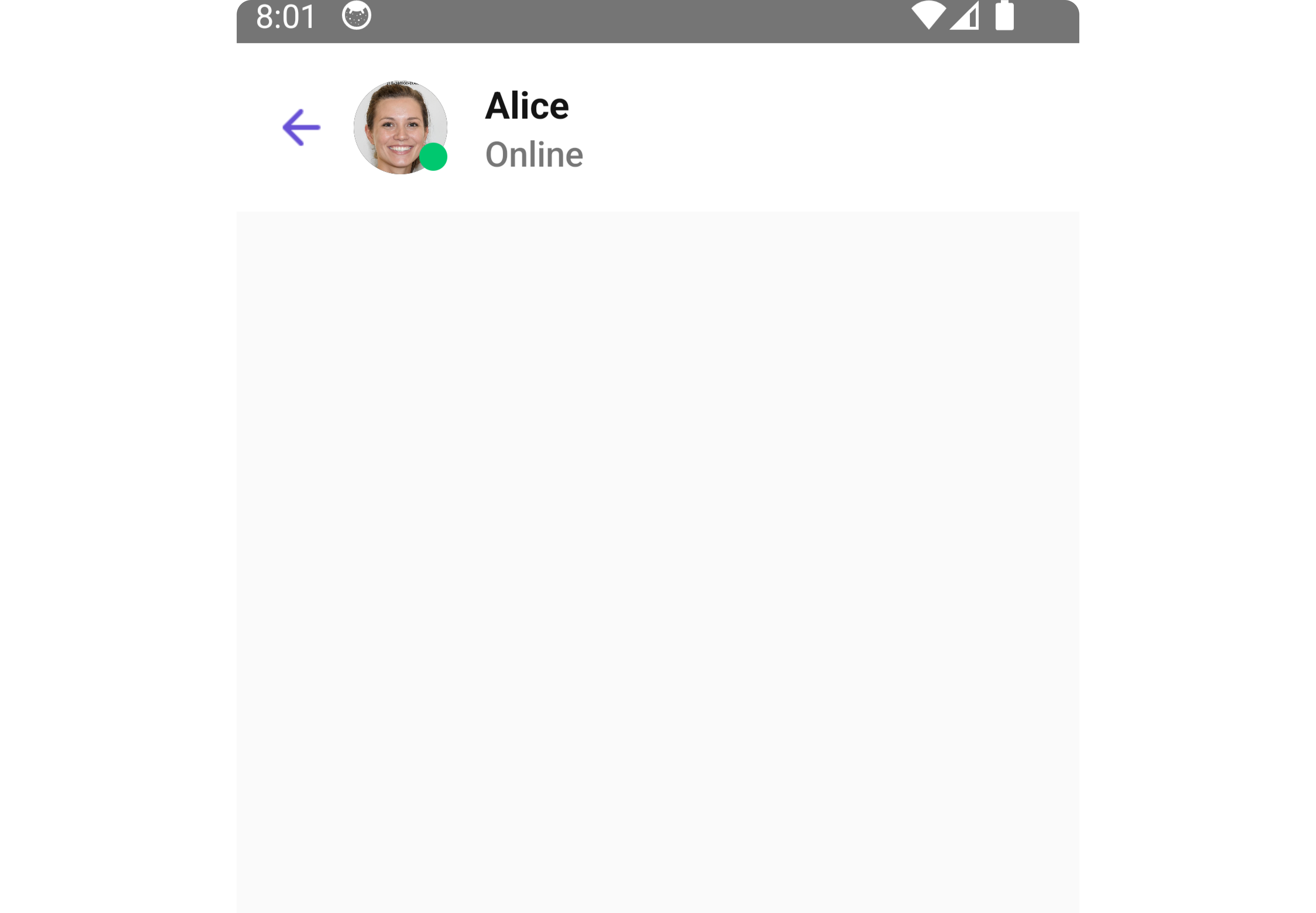
#### AppBarOptions
You can customize the Menu options to meet your specific needs by using the `AppBarOptions` method.
```tsx theme={null}
import { CometChat } from '@cometchat/chat-sdk-react-native';
import { CometChatMessageHeader, MessageHeaderStyleInterface } from '@cometchat/chat-uikit-react-native';
import React from 'react';
import Call from './Call.png';
function App(): React.JSX.Element {
const [chatUser, setChatUser] = React.useState();
React.useEffect(() => {
CometChat.getUser("uid").then((user) => {
setChatUser(user);
})
}, []);
const messageHeaderStyle : MessageHeaderStyleInterface = {
backgroundColor: "#c7caed"
}
const appBarOptions = () =>{
return (
)
}
return (
<>
{ chatUser &&
}
);
}
```
**Example**