> ## Documentation Index
> Fetch the complete documentation index at: https://cometchat-22654f5b-docs-rn-guide-message-privately.mintlify.site/llms.txt
> Use this file to discover all available pages before exploring further.
# Message Composer
> Message Composer — CometChat documentation.
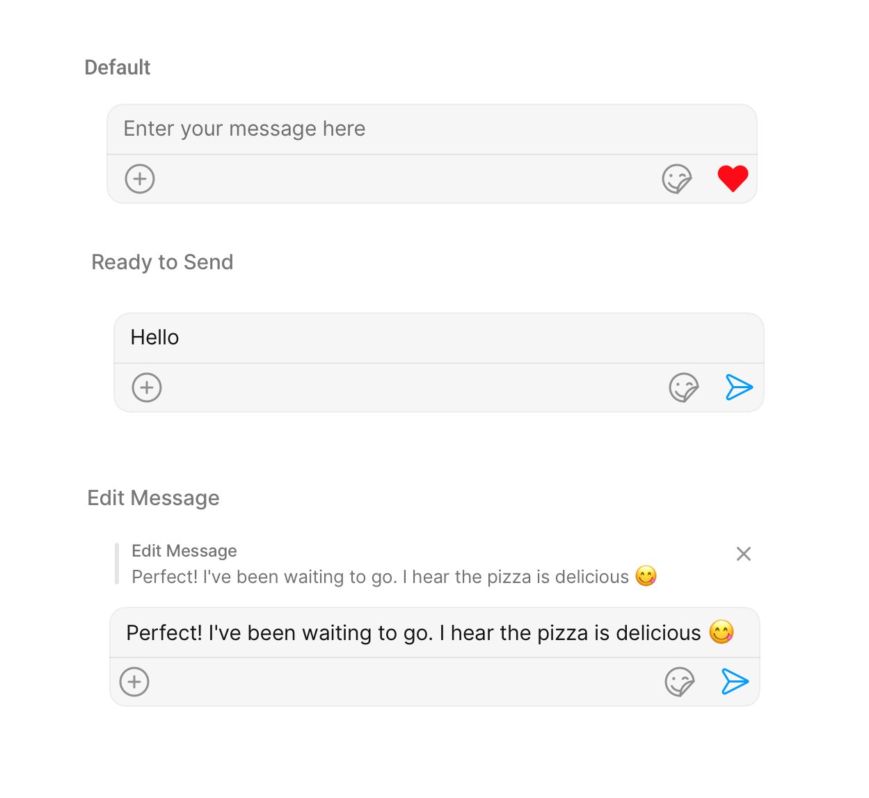
## Overview
MessageComposer is a [Component](/ui-kit/react-native/v4/components-overview#components) that enables users to write and send a variety of messages, including text, image, video, and custom messages.
Features such as **Live Reaction**, **Attachments**, and **Message Editing** are also supported by it.
 MessageComposer is comprised of the following [Base Components](/ui-kit/react-native/v4/components-overview#base-components):
| Base Components | Description |
| --------------- | ---------------------------------------------------------------------------------------------------------------------- |
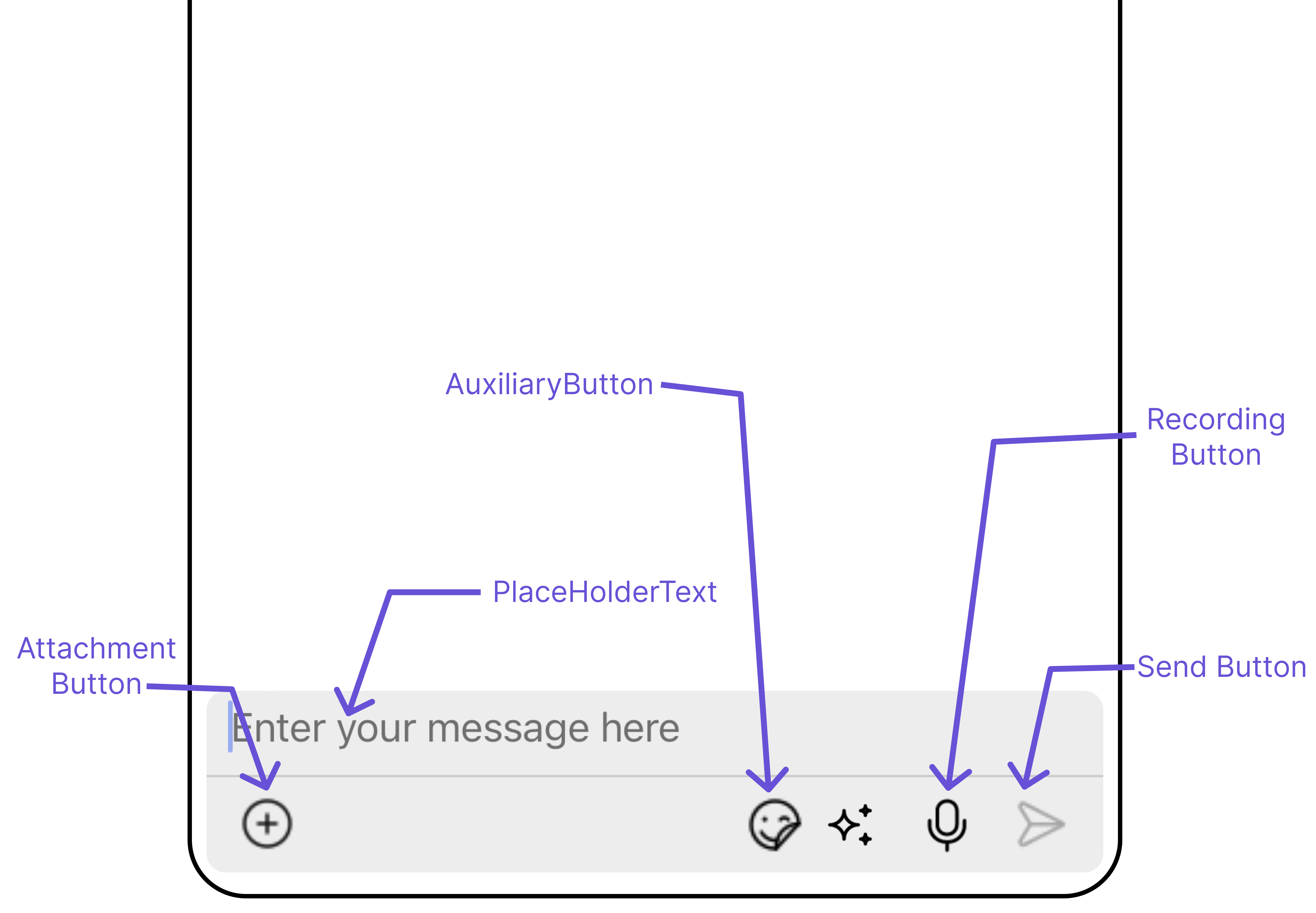
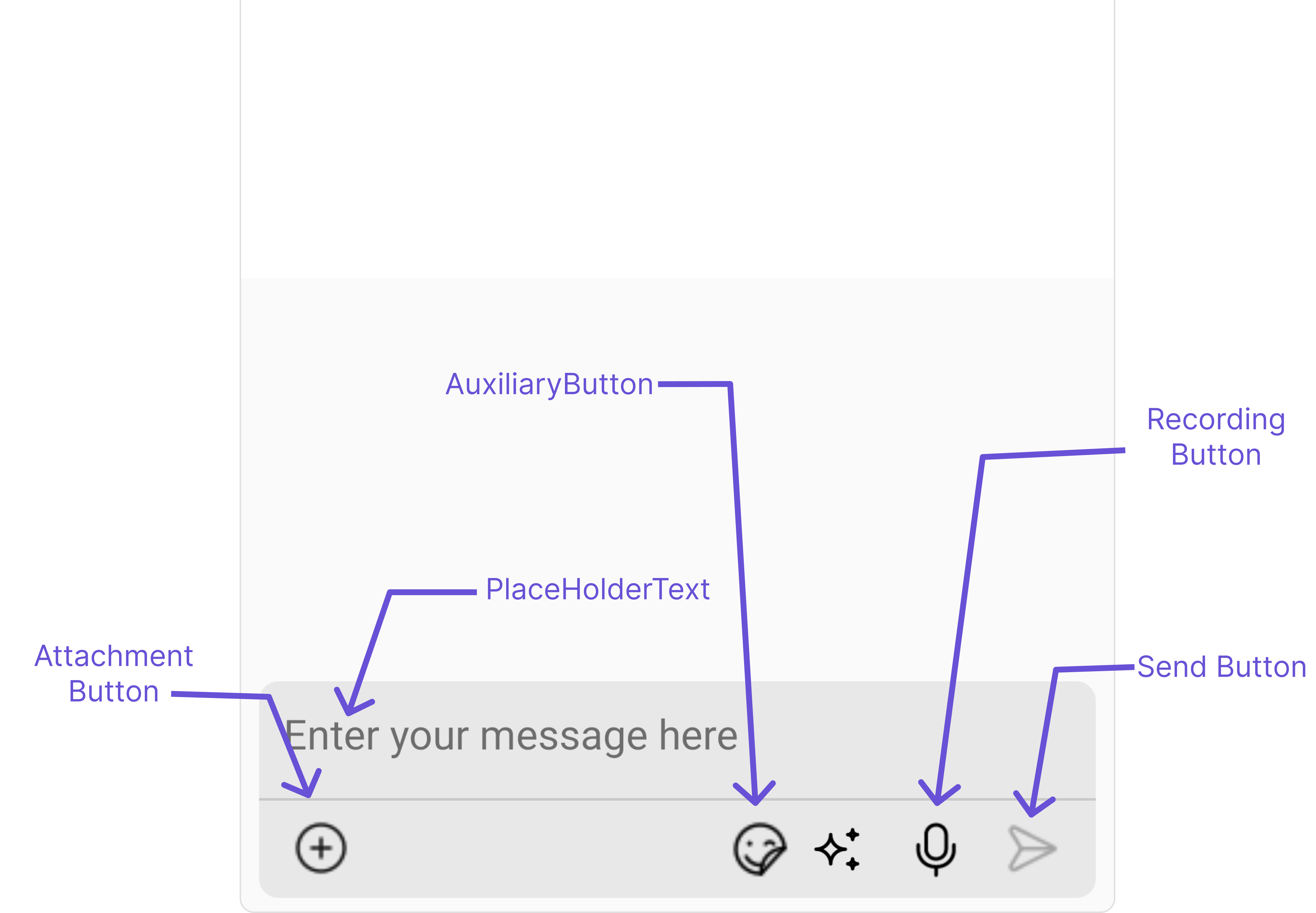
| MessageInput | This provides a basic layout for the contents of this component, such as the TextField and buttons |
| ActionSheet | The ActionSheet component presents a list of options in either a list or grid mode, depending on the user's preference |
## Usage
### Integration
The following code snippet illustrates how you can directly incorporate the MessageComposer component into your app.
```tsx theme={null}
import React from "react";
import { CometChat } from '@cometchat/chat-sdk-react-native';
import { CometChatMessageComposer } from '@cometchat/chat-uikit-react-native';
function App(): React.JSX.Element {
const [chatUser, setChatUser] = React.useState();
React.useEffect(() => {
CometChat.getUser("uid").then((user) => {
setChatUser(user);
})
}, []);
return (
<>
{ chatUser && }
);
}
```
### Actions
[Actions](/ui-kit/react-native/v4/components-overview#actions) dictate how a component functions. They are divided into two types: Predefined and User-defined. You can override either type, allowing you to tailor the behavior of the component to fit your specific needs.
##### 1. onSendButtonPress
The `onSendButtonPress` event gets activated when the send message button is clicked. It has a predefined function of sending messages entered in the composer `EditText`. However, you can overide this action with the following code snippet.
```tsx theme={null}
import React from "react";
import { CometChat } from '@cometchat/chat-sdk-react-native';
import { CometChatMessageComposer } from '@cometchat/chat-uikit-react-native';
function App(): React.JSX.Element {
const [chatUser, setChatUser] = React.useState();
React.useEffect(() => {
CometChat.getUser("uid").then((user) => {
setChatUser(user);
})
}, []);
const onSendButtonPressHandler = (message: CometChat.BaseMessage) => {
//code
}
return (
<>
{ chatUser && }
);
}
```
##### 2. onError
This action doesn't change the behavior of the component but rather listens for any errors that occur in the MessageList component.
```tsx theme={null}
import React from "react";
import { CometChat } from '@cometchat/chat-sdk-react-native';
import { CometChatMessageComposer } from '@cometchat/chat-uikit-react-native';
function App(): React.JSX.Element {
const [chatUser, setChatUser] = React.useState();
React.useEffect(() => {
CometChat.getUser("uid").then((user) => {
setChatUser(user);
})
}, []);
const onErrorHandler = (error: CometChat.CometChatException) => {
//handle error
}
return (
<>
{ chatUser && }
);
}
```
***
### Filters
MessageComposer component does not have any available filters.
***
### Events
[Events](/ui-kit/react-native/v4/components-overview#events) are emitted by a `Component`. By using event you can extend existing functionality. Being global events, they can be applied in Multiple Locations and are capable of being Added or Removed.
The list of events emitted by the Messages component is as follows.
| Event | Description |
| ------------------------- | ------------------------------------------------------------------------------------------------------------------------------------------------- |
| **ccMessageSent** | Triggers whenever a loggedIn user sends any message, it will have two states such as: `inprogress`, `success` & `error` |
| **ccMessageEdited** | Triggers whenever a loggedIn user edits any message from the list of messages. It will have two states such as: `inprogress`, `success` & `error` |
| **ccMessageLiveReaction** | Triggers whenever a loggedIn clicks on live reaction |
Adding `CometChatMessageEvents` Listener's
```js theme={null}
import { CometChatUIEventHandler } from "@cometchat/chat-uikit-react-native";
CometChatUIEventHandler.addMessageListener("MESSAGE_LISTENER_ID", {
ccMessageSent: (item) => {
//code
},
});
CometChatUIEventHandler.addMessageListener("MESSAGE_LISTENER_ID", {
ccMessageEdited: (item) => {
//code
},
});
CometChatUIEventHandler.addMessageListener("MESSAGE_LISTENER_ID", {
ccMessageLiveReaction: (item) => {
//code
},
});
```
***
Removing `CometChatMessageEvents` Listener's
```js theme={null}
import { CometChatUIEventHandler } from "@cometchat/chat-uikit-react-native";
CometChatUIEventHandler.removeMessageListener("MESSAGE_LISTENER_ID");
```
***
## Customization
To fit your app's design requirements, you can customize the appearance of the MessageComposer component. We provide exposed methods that allow you to modify the experience and behavior according to your specific needs.
### Style
Using Style you can customize the look and feel of the component in your app, These parameters typically control elements such as the color, size, shape, and fonts used within the component.
##### 1. MessageComposer Style
To modify the styling, you can apply the MessageComposerStyle to the MessageComposer Component using the `messageComposerStyle` property.
```tsx theme={null}
import React from "react";
import { CometChat } from '@cometchat/chat-sdk-react-native';
import { CometChatMessageComposer, MessageComposerStyleInterface } from '@cometchat/chat-uikit-react-native';
function App(): React.JSX.Element {
const [chatUser, setChatUser] = React.useState();
React.useEffect(() => {
CometChat.getUser("uid").then((user) => {
setChatUser(user);
})
}, []);
const messageComposerStyle : MessageComposerStyleInterface = {
sendIconTint: "red",
inputBackground: "#f2c2e9",
borderRadius: 20,
textColor:"red",
}
return (
<>
{ chatUser && }
);
}
```
The following properties are exposed by MessageComposerStyle:
| Property | Description | Code |
| ----------------------------------- | ------------------------------------------------------ | -------------------------------------------- |
| **border** | Used to set border | `border?: BorderStyleInterface,` |
| **borderRadius** | Used to set border radius | `borderRadius?: string;` |
| **backgroundColor** | Used to set background colour | `background?: string;` |
| **height** | Used to set height | `height?: string;` |
| **width** | Used to set width | `width?: string;` |
| **inputBackground** | Used to set input background color | `inputBackground?: string;` |
| **inputBorder** | used to set input border | `inputBorder?: BorderStyleInterface;` |
| **textFont** | Used to set input text font | `textFont?: FontStyleInterface;` |
| **textColor** | used to set input text color | `textColor?: string;` |
| **placeHolderTextColor** | Used to set placeholder text color | `placeHolderTextColor?: string;` |
| **placeHolderTextFont** | Used to set placeholder text font | `placeHolderTextFont?: FontStyleInterface;` |
| **attachIconTint** | Used to set attachment icon tint | `attachIcontint?: string;` |
| **sendIconTint** | Used to set send button icon tint | `sendIconTint?: string;` |
| **dividerTint** | Used to set separator color | `dividerTint?: string;` |
| **actionSheetSeparatorTint** | Used to set action sheet separator tint | `actionSheetTitleColor?: string;` |
| **actionSheetTitleColor** | Used to set action sheet title color | `dividerTint?: string;` |
| **actionSheetTitleFont** | Used to set action sheet title font | `actionSheetTitleFont?: FontStyleInterface;` |
| **actionSheetLayoutModeIconTint** | Used to set action sheet layout mode icon tint color | `actionSheetLayoutModeIconTint?: string;` |
| **actionSheetCancelButtonIconTint** | Used to set action sheet cancel button icon tint color | `actionSheetCancelButtonIconTint?: string;` |
| **voiceRecordingIconTint** | Used to set voice recording icon color | `voiceRecordingIconTint?: string;` |
##### 2. MediaRecorder Style
To customize the styles of the MediaRecorder component within the MessageComposer Component, use the `mediaRecorderStyle` property. For more details, please refer to [MediaRecorder](/ui-kit/react-native/v4/media-recorder) styles.
```tsx theme={null}
import React from "react";
import { CometChat } from '@cometchat/chat-sdk-react-native';
import { CometChatMessageComposer, MediaRecorderStyleInterface } from '@cometchat/chat-uikit-react-native';
function App(): React.JSX.Element {
const [chatUser, setChatUser] = React.useState();
React.useEffect(() => {
CometChat.getUser("uid").then((user) => {
setChatUser(user);
})
}, []);
const mediaRecorderStyle: MediaRecorderStyleInterface = {
playIconTint: "#6851D6",
closeIconTint:"red",
submitIconTint:"red",
}
return (
<>
{ chatUser && }
);
}
```
***
### Functionality
These are a set of small functional customizations that allow you to fine-tune the overall experience of the component. With these, you can change text, set custom icons, and toggle the visibility of UI elements.
```tsx theme={null}
import React from "react";
import { CometChat } from '@cometchat/chat-sdk-react-native';
import { CometChatMessageComposer, MediaRecorderStyleInterface } from '@cometchat/chat-uikit-react-native';
function App(): React.JSX.Element {
const [chatUser, setChatUser] = React.useState();
React.useEffect(() => {
CometChat.getUser("uid").then((user) => {
setChatUser(user);
})
}, []);
return (
<>
{ chatUser && }
);
}
```
MessageComposer is comprised of the following [Base Components](/ui-kit/react-native/v4/components-overview#base-components):
| Base Components | Description |
| --------------- | ---------------------------------------------------------------------------------------------------------------------- |
| MessageInput | This provides a basic layout for the contents of this component, such as the TextField and buttons |
| ActionSheet | The ActionSheet component presents a list of options in either a list or grid mode, depending on the user's preference |
## Usage
### Integration
The following code snippet illustrates how you can directly incorporate the MessageComposer component into your app.
```tsx theme={null}
import React from "react";
import { CometChat } from '@cometchat/chat-sdk-react-native';
import { CometChatMessageComposer } from '@cometchat/chat-uikit-react-native';
function App(): React.JSX.Element {
const [chatUser, setChatUser] = React.useState();
React.useEffect(() => {
CometChat.getUser("uid").then((user) => {
setChatUser(user);
})
}, []);
return (
<>
{ chatUser && }
);
}
```
### Actions
[Actions](/ui-kit/react-native/v4/components-overview#actions) dictate how a component functions. They are divided into two types: Predefined and User-defined. You can override either type, allowing you to tailor the behavior of the component to fit your specific needs.
##### 1. onSendButtonPress
The `onSendButtonPress` event gets activated when the send message button is clicked. It has a predefined function of sending messages entered in the composer `EditText`. However, you can overide this action with the following code snippet.
```tsx theme={null}
import React from "react";
import { CometChat } from '@cometchat/chat-sdk-react-native';
import { CometChatMessageComposer } from '@cometchat/chat-uikit-react-native';
function App(): React.JSX.Element {
const [chatUser, setChatUser] = React.useState();
React.useEffect(() => {
CometChat.getUser("uid").then((user) => {
setChatUser(user);
})
}, []);
const onSendButtonPressHandler = (message: CometChat.BaseMessage) => {
//code
}
return (
<>
{ chatUser && }
);
}
```
##### 2. onError
This action doesn't change the behavior of the component but rather listens for any errors that occur in the MessageList component.
```tsx theme={null}
import React from "react";
import { CometChat } from '@cometchat/chat-sdk-react-native';
import { CometChatMessageComposer } from '@cometchat/chat-uikit-react-native';
function App(): React.JSX.Element {
const [chatUser, setChatUser] = React.useState();
React.useEffect(() => {
CometChat.getUser("uid").then((user) => {
setChatUser(user);
})
}, []);
const onErrorHandler = (error: CometChat.CometChatException) => {
//handle error
}
return (
<>
{ chatUser && }
);
}
```
***
### Filters
MessageComposer component does not have any available filters.
***
### Events
[Events](/ui-kit/react-native/v4/components-overview#events) are emitted by a `Component`. By using event you can extend existing functionality. Being global events, they can be applied in Multiple Locations and are capable of being Added or Removed.
The list of events emitted by the Messages component is as follows.
| Event | Description |
| ------------------------- | ------------------------------------------------------------------------------------------------------------------------------------------------- |
| **ccMessageSent** | Triggers whenever a loggedIn user sends any message, it will have two states such as: `inprogress`, `success` & `error` |
| **ccMessageEdited** | Triggers whenever a loggedIn user edits any message from the list of messages. It will have two states such as: `inprogress`, `success` & `error` |
| **ccMessageLiveReaction** | Triggers whenever a loggedIn clicks on live reaction |
Adding `CometChatMessageEvents` Listener's
```js theme={null}
import { CometChatUIEventHandler } from "@cometchat/chat-uikit-react-native";
CometChatUIEventHandler.addMessageListener("MESSAGE_LISTENER_ID", {
ccMessageSent: (item) => {
//code
},
});
CometChatUIEventHandler.addMessageListener("MESSAGE_LISTENER_ID", {
ccMessageEdited: (item) => {
//code
},
});
CometChatUIEventHandler.addMessageListener("MESSAGE_LISTENER_ID", {
ccMessageLiveReaction: (item) => {
//code
},
});
```
***
Removing `CometChatMessageEvents` Listener's
```js theme={null}
import { CometChatUIEventHandler } from "@cometchat/chat-uikit-react-native";
CometChatUIEventHandler.removeMessageListener("MESSAGE_LISTENER_ID");
```
***
## Customization
To fit your app's design requirements, you can customize the appearance of the MessageComposer component. We provide exposed methods that allow you to modify the experience and behavior according to your specific needs.
### Style
Using Style you can customize the look and feel of the component in your app, These parameters typically control elements such as the color, size, shape, and fonts used within the component.
##### 1. MessageComposer Style
To modify the styling, you can apply the MessageComposerStyle to the MessageComposer Component using the `messageComposerStyle` property.
```tsx theme={null}
import React from "react";
import { CometChat } from '@cometchat/chat-sdk-react-native';
import { CometChatMessageComposer, MessageComposerStyleInterface } from '@cometchat/chat-uikit-react-native';
function App(): React.JSX.Element {
const [chatUser, setChatUser] = React.useState();
React.useEffect(() => {
CometChat.getUser("uid").then((user) => {
setChatUser(user);
})
}, []);
const messageComposerStyle : MessageComposerStyleInterface = {
sendIconTint: "red",
inputBackground: "#f2c2e9",
borderRadius: 20,
textColor:"red",
}
return (
<>
{ chatUser && }
);
}
```
The following properties are exposed by MessageComposerStyle:
| Property | Description | Code |
| ----------------------------------- | ------------------------------------------------------ | -------------------------------------------- |
| **border** | Used to set border | `border?: BorderStyleInterface,` |
| **borderRadius** | Used to set border radius | `borderRadius?: string;` |
| **backgroundColor** | Used to set background colour | `background?: string;` |
| **height** | Used to set height | `height?: string;` |
| **width** | Used to set width | `width?: string;` |
| **inputBackground** | Used to set input background color | `inputBackground?: string;` |
| **inputBorder** | used to set input border | `inputBorder?: BorderStyleInterface;` |
| **textFont** | Used to set input text font | `textFont?: FontStyleInterface;` |
| **textColor** | used to set input text color | `textColor?: string;` |
| **placeHolderTextColor** | Used to set placeholder text color | `placeHolderTextColor?: string;` |
| **placeHolderTextFont** | Used to set placeholder text font | `placeHolderTextFont?: FontStyleInterface;` |
| **attachIconTint** | Used to set attachment icon tint | `attachIcontint?: string;` |
| **sendIconTint** | Used to set send button icon tint | `sendIconTint?: string;` |
| **dividerTint** | Used to set separator color | `dividerTint?: string;` |
| **actionSheetSeparatorTint** | Used to set action sheet separator tint | `actionSheetTitleColor?: string;` |
| **actionSheetTitleColor** | Used to set action sheet title color | `dividerTint?: string;` |
| **actionSheetTitleFont** | Used to set action sheet title font | `actionSheetTitleFont?: FontStyleInterface;` |
| **actionSheetLayoutModeIconTint** | Used to set action sheet layout mode icon tint color | `actionSheetLayoutModeIconTint?: string;` |
| **actionSheetCancelButtonIconTint** | Used to set action sheet cancel button icon tint color | `actionSheetCancelButtonIconTint?: string;` |
| **voiceRecordingIconTint** | Used to set voice recording icon color | `voiceRecordingIconTint?: string;` |
##### 2. MediaRecorder Style
To customize the styles of the MediaRecorder component within the MessageComposer Component, use the `mediaRecorderStyle` property. For more details, please refer to [MediaRecorder](/ui-kit/react-native/v4/media-recorder) styles.
```tsx theme={null}
import React from "react";
import { CometChat } from '@cometchat/chat-sdk-react-native';
import { CometChatMessageComposer, MediaRecorderStyleInterface } from '@cometchat/chat-uikit-react-native';
function App(): React.JSX.Element {
const [chatUser, setChatUser] = React.useState();
React.useEffect(() => {
CometChat.getUser("uid").then((user) => {
setChatUser(user);
})
}, []);
const mediaRecorderStyle: MediaRecorderStyleInterface = {
playIconTint: "#6851D6",
closeIconTint:"red",
submitIconTint:"red",
}
return (
<>
{ chatUser && }
);
}
```
***
### Functionality
These are a set of small functional customizations that allow you to fine-tune the overall experience of the component. With these, you can change text, set custom icons, and toggle the visibility of UI elements.
```tsx theme={null}
import React from "react";
import { CometChat } from '@cometchat/chat-sdk-react-native';
import { CometChatMessageComposer, MediaRecorderStyleInterface } from '@cometchat/chat-uikit-react-native';
function App(): React.JSX.Element {
const [chatUser, setChatUser] = React.useState();
React.useEffect(() => {
CometChat.getUser("uid").then((user) => {
setChatUser(user);
})
}, []);
return (
<>
{ chatUser && }
);
}
```
 Below is a list of customizations along with corresponding code snippets
| Property | Description | Code |
| --------------------------------------------------- | ----------------------------------------------------------------------------------------------------------------------------------------------------------------------------------------------------------------------------------------------- | ---------------------------------------------------------------------------------------------------------------------------------------------- |
| **User** 🛑 | Used to pass user object of which header specific details will be show | `user={chatUser}` |
| **Group** 🛑 | Used to pass group object of which header specific details will be shown | `group={chatGroup}` |
| **placeHolderText** | Used to set composer's placeholder text | `placeHolderText="your custom placeholder text"` |
| **disableTypingEvents** | Used to disable/enable typing events , default false | `disableTypingEvents={true}` |
| **disableSoundForMessages** | Used to toggle sound for outgoing messages | `disableSoundForMessages={true}` |
| **text** | Used to set predefined text | `text="Your custom text"` |
| **voiceRecordingIconURL** | Sets custom icon for voice recording. | `voiceRecordingIconURL="your custom voice recording start icon"` |
| **recordIconUrl** | Sets custom icon for voice recording start. | `recordIconUrl={{uri: }}` OR `import customReadIcon from "./customReadIcon.svg"; ``recordIconUrl={customReadIconUrl}` |
| **pauseIconUrl** | Sets custom icon for voice recording pause. | `pauseIconUrl={{uri: }}` OR `import customPauseIcon from "./customPauseIcon.svg"; ``pauseIconUrl={customPauseIcon}` |
| **stopIconUrl** | Sets custom icon for voice recording stop. | `stopIconUrl={{uri: }}` OR `import customStopIcon from "./customStopIcon.svg"; ``stopIconUrl={customStopIcon}` |
| **deleteIconUrl** | Sets custom icon for voice recording close. | `deleteIconUrl={{uri: }}` OR `import customDeleteIcon from "./customDeleteIcon.svg"; ``deleteIconUrl={customDeleteIcon}` |
| **submitIconUrl** | Sets custom icon for voice recording submit | `submitIconUrl={{uri: }}` OR `import customSubmitIcon from "./customSubmitIcon.svg"; ``submitIconUrl={customSubmitIcon}` |
| **auxiliaryButtonsAlignment** | controls position of auxiliary button view , can be **left** or **right** . default **right** | `auxiliaryButtonsAlignment={"left"}` |
| **attachmentIcon** | sets the icon to show in the attachment button | `attachmentIcon={{uri: }}` OR `import customAttchmentIcon from "./customAttchmentIcon.svg"; ``attachmentIcon={customAttchmentIcon}` |
| **hideLiveReaction** | used to toggle visibility for live reaction component | `hideLiveReaction={true}` |
| **customSoundForMessage** | Used to give custom sounds to outgoing messages | `customSoundForMessage="your custom sound for messages"` |
| **liveReactionIcon** | used to set custom live reaction icon. | `liveReactionIcon="your custom live reaction icon"` |
| **AIIconURL** | used to set custom AI icon. | `AIIconURL="your custom AI icon"` |
| **hideVoiceRecording** | used to hide the voice recording option. | `hideVoiceRecording={true}` |
| **disableMentions** | Sets whether mentions in text should be disabled. Processes the text formatters If there are text formatters available and the disableMentions flag is set to true, it removes any formatters that are instances of CometChatMentionsFormatter. | `disableMentions={true}` |
***
### Advanced
For advanced-level customization, you can set custom views to the component. This lets you tailor each aspect of the component to fit your exact needs and application aesthetics. You can create and define your views, layouts, and UI elements and then incorporate those into the component.
***
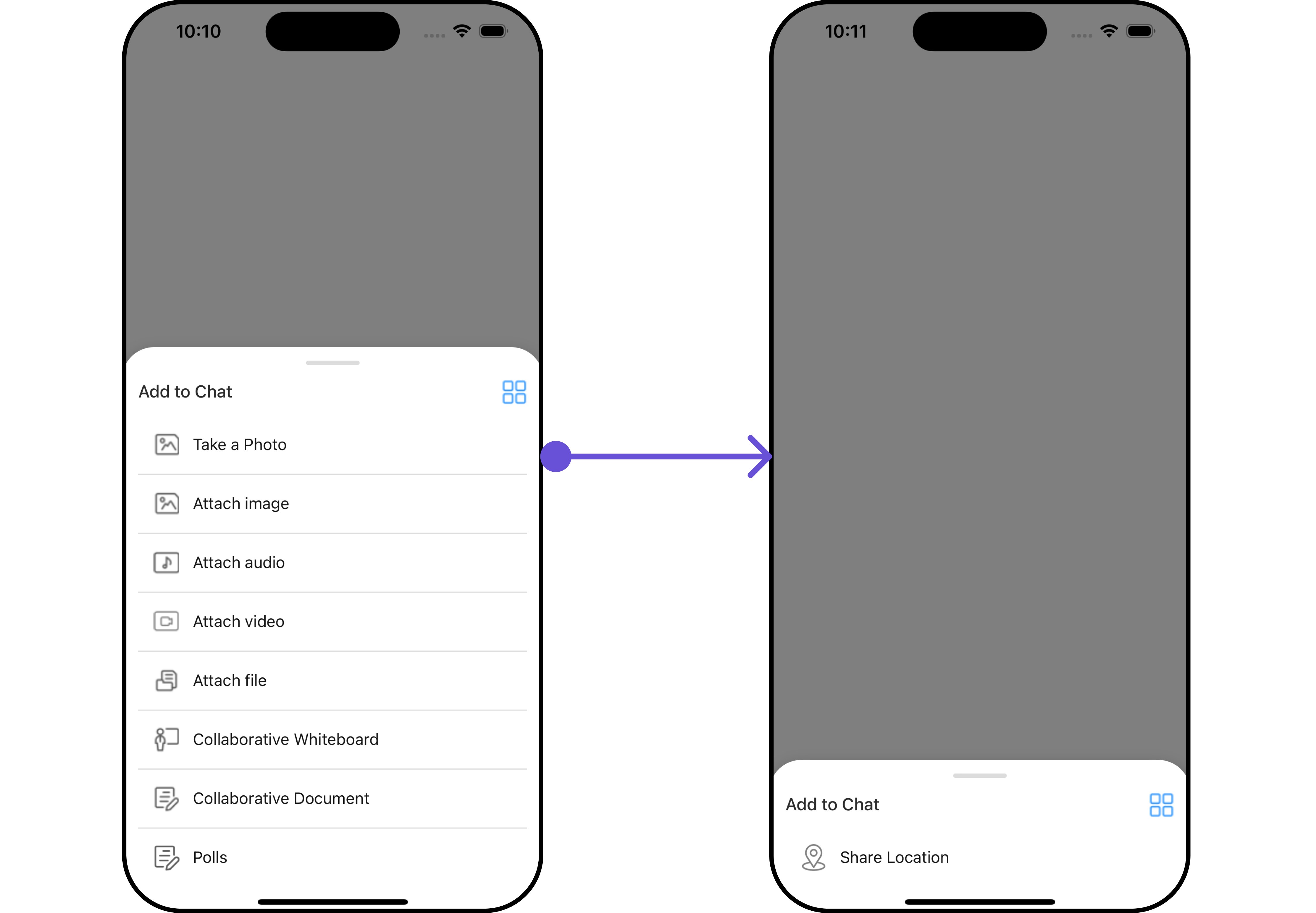
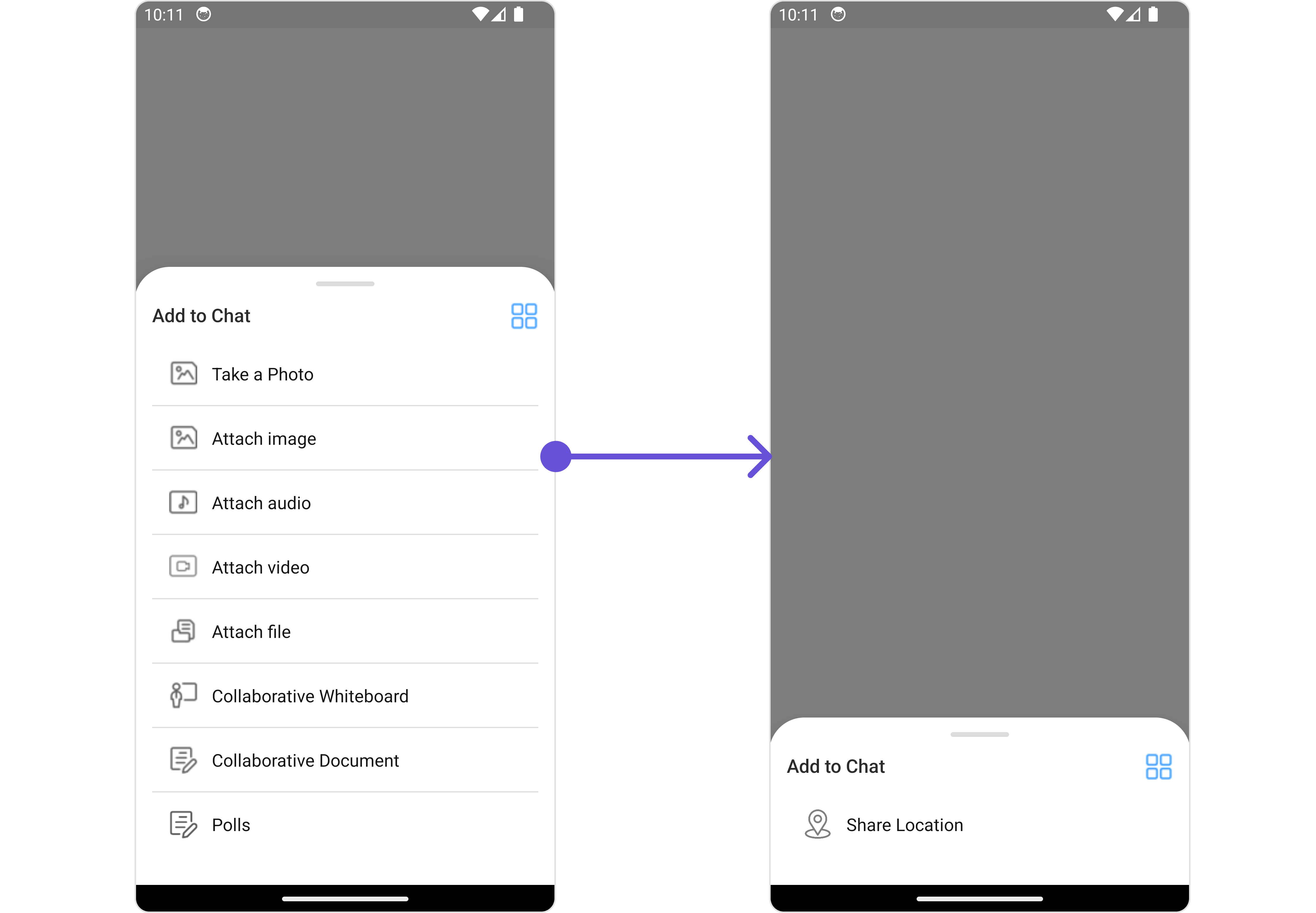
#### AttachmentOptions
By using `attachmentOptions`, you can set a list of custom `MessageComposerActions` for the MessageComposer Component. This will override the existing list of `MessageComposerActions`.
**Example**
Below is a list of customizations along with corresponding code snippets
| Property | Description | Code |
| --------------------------------------------------- | ----------------------------------------------------------------------------------------------------------------------------------------------------------------------------------------------------------------------------------------------- | ---------------------------------------------------------------------------------------------------------------------------------------------- |
| **User** 🛑 | Used to pass user object of which header specific details will be show | `user={chatUser}` |
| **Group** 🛑 | Used to pass group object of which header specific details will be shown | `group={chatGroup}` |
| **placeHolderText** | Used to set composer's placeholder text | `placeHolderText="your custom placeholder text"` |
| **disableTypingEvents** | Used to disable/enable typing events , default false | `disableTypingEvents={true}` |
| **disableSoundForMessages** | Used to toggle sound for outgoing messages | `disableSoundForMessages={true}` |
| **text** | Used to set predefined text | `text="Your custom text"` |
| **voiceRecordingIconURL** | Sets custom icon for voice recording. | `voiceRecordingIconURL="your custom voice recording start icon"` |
| **recordIconUrl** | Sets custom icon for voice recording start. | `recordIconUrl={{uri: }}` OR `import customReadIcon from "./customReadIcon.svg"; ``recordIconUrl={customReadIconUrl}` |
| **pauseIconUrl** | Sets custom icon for voice recording pause. | `pauseIconUrl={{uri: }}` OR `import customPauseIcon from "./customPauseIcon.svg"; ``pauseIconUrl={customPauseIcon}` |
| **stopIconUrl** | Sets custom icon for voice recording stop. | `stopIconUrl={{uri: }}` OR `import customStopIcon from "./customStopIcon.svg"; ``stopIconUrl={customStopIcon}` |
| **deleteIconUrl** | Sets custom icon for voice recording close. | `deleteIconUrl={{uri: }}` OR `import customDeleteIcon from "./customDeleteIcon.svg"; ``deleteIconUrl={customDeleteIcon}` |
| **submitIconUrl** | Sets custom icon for voice recording submit | `submitIconUrl={{uri: }}` OR `import customSubmitIcon from "./customSubmitIcon.svg"; ``submitIconUrl={customSubmitIcon}` |
| **auxiliaryButtonsAlignment** | controls position of auxiliary button view , can be **left** or **right** . default **right** | `auxiliaryButtonsAlignment={"left"}` |
| **attachmentIcon** | sets the icon to show in the attachment button | `attachmentIcon={{uri: }}` OR `import customAttchmentIcon from "./customAttchmentIcon.svg"; ``attachmentIcon={customAttchmentIcon}` |
| **hideLiveReaction** | used to toggle visibility for live reaction component | `hideLiveReaction={true}` |
| **customSoundForMessage** | Used to give custom sounds to outgoing messages | `customSoundForMessage="your custom sound for messages"` |
| **liveReactionIcon** | used to set custom live reaction icon. | `liveReactionIcon="your custom live reaction icon"` |
| **AIIconURL** | used to set custom AI icon. | `AIIconURL="your custom AI icon"` |
| **hideVoiceRecording** | used to hide the voice recording option. | `hideVoiceRecording={true}` |
| **disableMentions** | Sets whether mentions in text should be disabled. Processes the text formatters If there are text formatters available and the disableMentions flag is set to true, it removes any formatters that are instances of CometChatMentionsFormatter. | `disableMentions={true}` |
***
### Advanced
For advanced-level customization, you can set custom views to the component. This lets you tailor each aspect of the component to fit your exact needs and application aesthetics. You can create and define your views, layouts, and UI elements and then incorporate those into the component.
***
#### AttachmentOptions
By using `attachmentOptions`, you can set a list of custom `MessageComposerActions` for the MessageComposer Component. This will override the existing list of `MessageComposerActions`.
**Example**
 ```tsx theme={null}
import React from "react";
import { CometChat } from '@cometchat/chat-sdk-react-native';
import { CometChatMessageComposer, CometChatMessageComposerActionInterface } from '@cometchat/chat-uikit-react-native';
function App(): React.JSX.Element {
const [chatUser, setChatUser] = React.useState();
React.useEffect(() => {
CometChat.getUser("uid").then((user) => {
setChatUser(user);
})
}, []);
const customAttachMentOptions = ({
user,
group,
composerId,
}: {
user?: CometChat.User;
group?: CometChat.Group;
composerId: Map;
}) : CometChatMessageComposerActionInterface[] => {
let attachmentOptions : CometChatMessageComposerActionInterface[] = [];
attachmentOptions.push(
{
id: 'location',
iconUrl: Location,
title: 'Share Location',
iconTint: 'grey'
}
)
return attachmentOptions;
};
return (
<>
{ chatUser && }
);
}
```
***
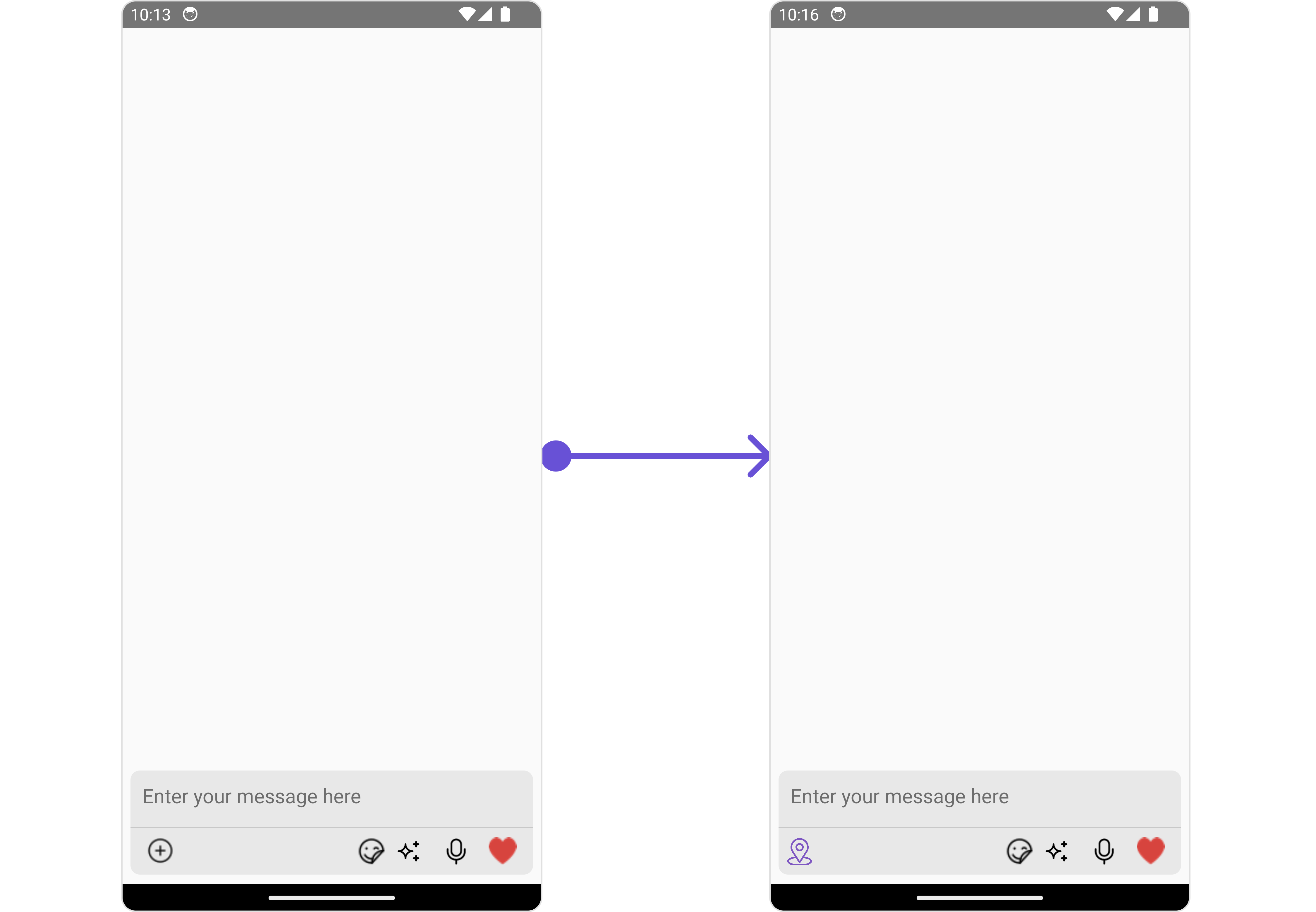
#### AuxiliaryButtonView
You can insert a custom view into the MessageComposer component to add additional functionality using the following method.
Please note that the MessageComposer Component utilizes the AuxiliaryButton to provide sticker functionality. Overriding the AuxiliaryButton will subsequently replace the sticker functionality.
In this example, we'll be adding a custom SOS button.
**Example**
```tsx theme={null}
import React from "react";
import { CometChat } from '@cometchat/chat-sdk-react-native';
import { CometChatMessageComposer, CometChatMessageComposerActionInterface } from '@cometchat/chat-uikit-react-native';
function App(): React.JSX.Element {
const [chatUser, setChatUser] = React.useState();
React.useEffect(() => {
CometChat.getUser("uid").then((user) => {
setChatUser(user);
})
}, []);
const customAttachMentOptions = ({
user,
group,
composerId,
}: {
user?: CometChat.User;
group?: CometChat.Group;
composerId: Map;
}) : CometChatMessageComposerActionInterface[] => {
let attachmentOptions : CometChatMessageComposerActionInterface[] = [];
attachmentOptions.push(
{
id: 'location',
iconUrl: Location,
title: 'Share Location',
iconTint: 'grey'
}
)
return attachmentOptions;
};
return (
<>
{ chatUser && }
);
}
```
***
#### AuxiliaryButtonView
You can insert a custom view into the MessageComposer component to add additional functionality using the following method.
Please note that the MessageComposer Component utilizes the AuxiliaryButton to provide sticker functionality. Overriding the AuxiliaryButton will subsequently replace the sticker functionality.
In this example, we'll be adding a custom SOS button.
**Example**
 ```tsx theme={null}
import React from "react";
import { CometChat } from '@cometchat/chat-sdk-react-native';
import { CometChatMessageComposer, CometChatMessageComposerActionInterface } from '@cometchat/chat-uikit-react-native';
function App(): React.JSX.Element {
const [chatUser, setChatUser] = React.useState();
React.useEffect(() => {
CometChat.getUser("uid").then((user) => {
setChatUser(user);
})
}, []);
const styles = StyleSheet.create({
button: {
height: 25,
width: 25,
borderRadius: 0,
backgroundColor: 'transparent',
paddingTop: 9
},
image: {
height: 23,
width: 24,
tintColor: '#7E57C2',
},
});
const customAuxiliaryButtonView = ({
user,
group,
composerId,
}: {
user?: CometChat.User;
group?: CometChat.Group;
composerId: string | number;
}) : JSX.Element => {
return (
{/* code */}}>
);
};
return (
<>
{ chatUser && }
);
}
```
***
#### SecondaryButtonView
You can add a custom view into the SecondaryButton component for additional functionality using the below method.
In this example, we'll be adding a custom SOS button.
**Example**
```tsx theme={null}
import React from "react";
import { CometChat } from '@cometchat/chat-sdk-react-native';
import { CometChatMessageComposer, CometChatMessageComposerActionInterface } from '@cometchat/chat-uikit-react-native';
function App(): React.JSX.Element {
const [chatUser, setChatUser] = React.useState();
React.useEffect(() => {
CometChat.getUser("uid").then((user) => {
setChatUser(user);
})
}, []);
const styles = StyleSheet.create({
button: {
height: 25,
width: 25,
borderRadius: 0,
backgroundColor: 'transparent',
paddingTop: 9
},
image: {
height: 23,
width: 24,
tintColor: '#7E57C2',
},
});
const customAuxiliaryButtonView = ({
user,
group,
composerId,
}: {
user?: CometChat.User;
group?: CometChat.Group;
composerId: string | number;
}) : JSX.Element => {
return (
{/* code */}}>
);
};
return (
<>
{ chatUser && }
);
}
```
***
#### SecondaryButtonView
You can add a custom view into the SecondaryButton component for additional functionality using the below method.
In this example, we'll be adding a custom SOS button.
**Example**
 ```tsx theme={null}
import React from "react";
import { CometChat } from '@cometchat/chat-sdk-react-native';
import { CometChatMessageComposer, CometChatMessageComposerActionInterface } from '@cometchat/chat-uikit-react-native';
function App(): React.JSX.Element {
const [chatUser, setChatUser] = React.useState();
React.useEffect(() => {
CometChat.getUser("uid").then((user) => {
setChatUser(user);
})
}, []);
const styles = StyleSheet.create({
button: {
height: 25,
width: 25,
borderRadius: 0,
backgroundColor: 'transparent',
paddingTop: 9
},
image: {
height: 23,
width: 24,
tintColor: '#7E57C2',
},
});
const customSecondaryButtonView = ({
user,
group,
composerId,
}: {
user?: CometChat.User;
group?: CometChat.Group;
composerId: string | number;
}) : JSX.Element => {
return (
{/* code */}}>
);
};
return (
<>
{ chatUser && }
);
}
```
***
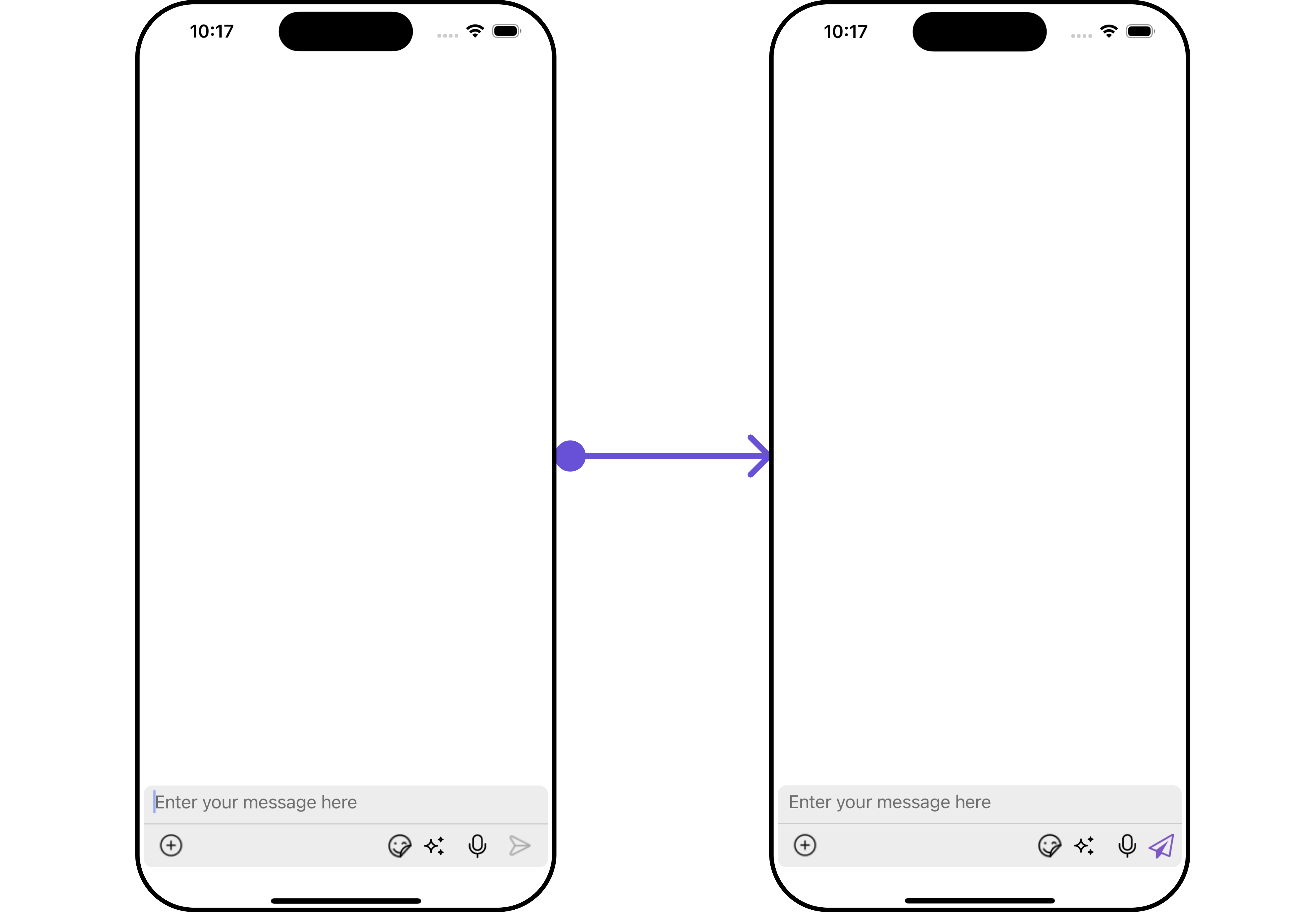
#### SendButtonView
You can set a custom view in place of the already existing send button view. Using the following method.
**Example**
```tsx theme={null}
import React from "react";
import { CometChat } from '@cometchat/chat-sdk-react-native';
import { CometChatMessageComposer, CometChatMessageComposerActionInterface } from '@cometchat/chat-uikit-react-native';
function App(): React.JSX.Element {
const [chatUser, setChatUser] = React.useState();
React.useEffect(() => {
CometChat.getUser("uid").then((user) => {
setChatUser(user);
})
}, []);
const styles = StyleSheet.create({
button: {
height: 25,
width: 25,
borderRadius: 0,
backgroundColor: 'transparent',
paddingTop: 9
},
image: {
height: 23,
width: 24,
tintColor: '#7E57C2',
},
});
const customSecondaryButtonView = ({
user,
group,
composerId,
}: {
user?: CometChat.User;
group?: CometChat.Group;
composerId: string | number;
}) : JSX.Element => {
return (
{/* code */}}>
);
};
return (
<>
{ chatUser && }
);
}
```
***
#### SendButtonView
You can set a custom view in place of the already existing send button view. Using the following method.
**Example**
 ```tsx theme={null}
import React from "react";
import { CometChat } from '@cometchat/chat-sdk-react-native';
import { CometChatMessageComposer, CometChatMessageComposerActionInterface } from '@cometchat/chat-uikit-react-native';
import SendIcon from './send-icon.png';
function App(): React.JSX.Element {
const [chatUser, setChatUser] = React.useState();
React.useEffect(() => {
CometChat.getUser("uid").then((user) => {
setChatUser(user);
})
}, []);
const styles = StyleSheet.create({
button: {
height: 25,
width: 25,
borderRadius: 0,
backgroundColor: 'transparent',
paddingTop: 9
},
image: {
height: 23,
width: 24,
tintColor: '#7E57C2',
},
});
const customSendButtonView = ({
user,
group,
composerId,
}: {
user?: CometChat.User;
group?: CometChat.Group;
composerId: string | number;
}) : JSX.Element => {
return (
{/* code */}}>
);
};
return (
<>
{ chatUser && }
);
}
```
***
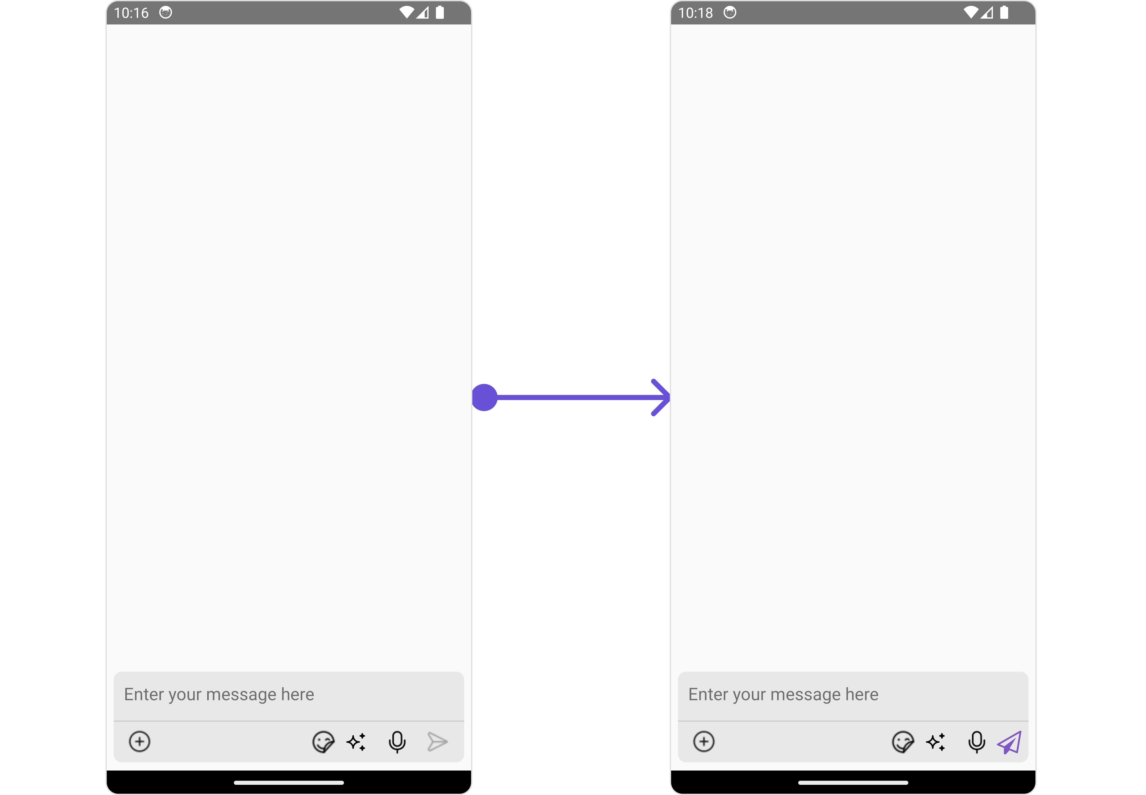
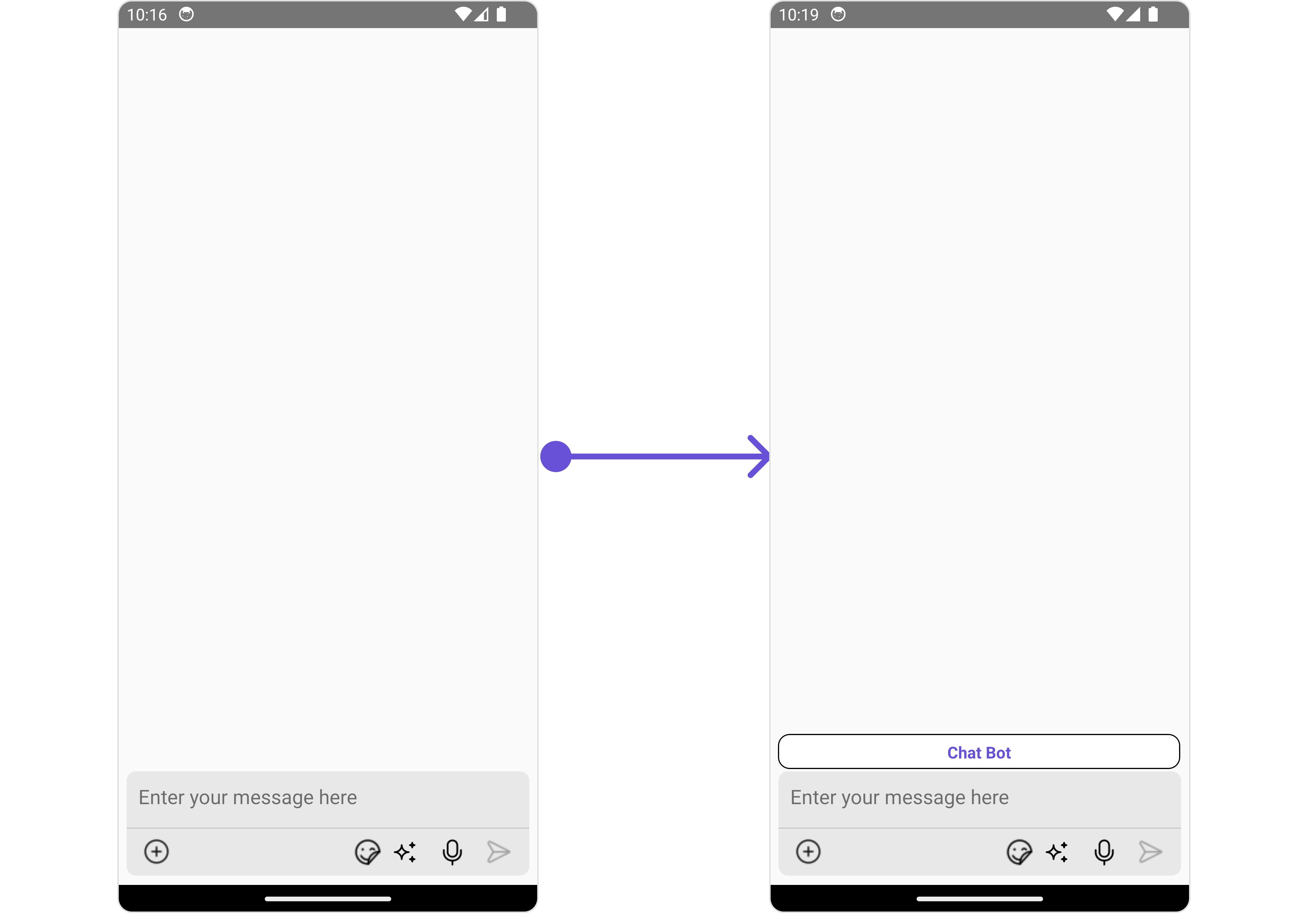
#### HeaderView
You can set custom HeaderView to the MessageComposer component using the following method
In the following example, we're going to apply a mock chat bot button to the MessageComposer Component using the `HeaderView` property.
**Example**
```tsx theme={null}
import React from "react";
import { CometChat } from '@cometchat/chat-sdk-react-native';
import { CometChatMessageComposer, CometChatMessageComposerActionInterface } from '@cometchat/chat-uikit-react-native';
import SendIcon from './send-icon.png';
function App(): React.JSX.Element {
const [chatUser, setChatUser] = React.useState();
React.useEffect(() => {
CometChat.getUser("uid").then((user) => {
setChatUser(user);
})
}, []);
const styles = StyleSheet.create({
button: {
height: 25,
width: 25,
borderRadius: 0,
backgroundColor: 'transparent',
paddingTop: 9
},
image: {
height: 23,
width: 24,
tintColor: '#7E57C2',
},
});
const customSendButtonView = ({
user,
group,
composerId,
}: {
user?: CometChat.User;
group?: CometChat.Group;
composerId: string | number;
}) : JSX.Element => {
return (
{/* code */}}>
);
};
return (
<>
{ chatUser && }
);
}
```
***
#### HeaderView
You can set custom HeaderView to the MessageComposer component using the following method
In the following example, we're going to apply a mock chat bot button to the MessageComposer Component using the `HeaderView` property.
**Example**
 ```tsx theme={null}
import React from "react";
import { CometChat } from '@cometchat/chat-sdk-react-native';
import { CometChatMessageComposer, CometChatMessageComposerActionInterface } from '@cometchat/chat-uikit-react-native';
function App(): React.JSX.Element {
const [chatUser, setChatUser] = React.useState();
React.useEffect(() => {
CometChat.getUser("uid").then((user) => {
setChatUser(user);
})
}, []);
const viewStyle: StyleProp = {
flexDirection: 'row',
alignItems: 'flex-start',
justifyContent: 'center',
padding: 5,
borderColor: 'black',
borderWidth: 1,
backgroundColor: 'white',
borderRadius: 10,
margin: 2,
marginLeft: 7.4,
height: 30,
width: '95.5%',
};
const customHeaderView = () => {
return
Chat Bot
}
return (
<>
{ chatUser && }
);
}
```
***
#### TextFormatters
Assigns the list of text formatters. If the provided list is not null, it sets the list. Otherwise, it assigns the default text formatters retrieved from the data source. To configure the existing Mentions look and feel check out [CometChatMentionsFormatter](/ui-kit/react-native/v4/mentions-formatter-guide)
```ts theme={null}
import { CometChat } from "@cometchat/chat-sdk-react-native";
import {
CometChatTextFormatter,
SuggestionItem,
} from "@cometchat/chat-uikit-react-native";
export class ShortCutFormatter extends CometChatTextFormatter {
constructor() {
super();
this.trackCharacter = "!";
}
search = (searchKey: string) => {
let data: Array = [];
CometChat.callExtension("message-shortcuts", "GET", "v1/fetch", undefined)
.then((data: any) => {
if (data && data?.shortcuts) {
let suggestionData = Object.keys(data.shortcuts).map((key) => {
return new SuggestionItem({
id: key,
name: data.shortcuts[key],
promptText: data.shortcuts[key],
trackingCharacter: "!",
underlyingText: data.shortcuts[key],
});
});
this.setSearchData(suggestionData); // setting data in setSearchData();
}
})
.catch((error) => {
// Some error occured
});
this.setSearchData(data);
};
// return null in fetchNext, if there's no pagination.
fetchNext = () => {
return null;
};
}
```
```tsx theme={null}
import React from "react";
import { CometChat } from "@cometchat/chat-sdk-react-native";
import { CometChatMessageComposer } from "@cometchat/chat-uikit-react-native";
import { ShortCutFormatter } from "./ShortcutsTextFormatter";
function App(): React.JSX.Element {
const [chatUser, setChatUser] = React.useState();
React.useEffect(() => {
CometChat.getUser("uid").then((user) => {
setChatUser(user);
});
}, []);
const shortcutFormatter = new ShortCutFormatter();
return (
);
}
```
***
```tsx theme={null}
import React from "react";
import { CometChat } from '@cometchat/chat-sdk-react-native';
import { CometChatMessageComposer, CometChatMessageComposerActionInterface } from '@cometchat/chat-uikit-react-native';
function App(): React.JSX.Element {
const [chatUser, setChatUser] = React.useState();
React.useEffect(() => {
CometChat.getUser("uid").then((user) => {
setChatUser(user);
})
}, []);
const viewStyle: StyleProp = {
flexDirection: 'row',
alignItems: 'flex-start',
justifyContent: 'center',
padding: 5,
borderColor: 'black',
borderWidth: 1,
backgroundColor: 'white',
borderRadius: 10,
margin: 2,
marginLeft: 7.4,
height: 30,
width: '95.5%',
};
const customHeaderView = () => {
return
Chat Bot
}
return (
<>
{ chatUser && }
);
}
```
***
#### TextFormatters
Assigns the list of text formatters. If the provided list is not null, it sets the list. Otherwise, it assigns the default text formatters retrieved from the data source. To configure the existing Mentions look and feel check out [CometChatMentionsFormatter](/ui-kit/react-native/v4/mentions-formatter-guide)
```ts theme={null}
import { CometChat } from "@cometchat/chat-sdk-react-native";
import {
CometChatTextFormatter,
SuggestionItem,
} from "@cometchat/chat-uikit-react-native";
export class ShortCutFormatter extends CometChatTextFormatter {
constructor() {
super();
this.trackCharacter = "!";
}
search = (searchKey: string) => {
let data: Array = [];
CometChat.callExtension("message-shortcuts", "GET", "v1/fetch", undefined)
.then((data: any) => {
if (data && data?.shortcuts) {
let suggestionData = Object.keys(data.shortcuts).map((key) => {
return new SuggestionItem({
id: key,
name: data.shortcuts[key],
promptText: data.shortcuts[key],
trackingCharacter: "!",
underlyingText: data.shortcuts[key],
});
});
this.setSearchData(suggestionData); // setting data in setSearchData();
}
})
.catch((error) => {
// Some error occured
});
this.setSearchData(data);
};
// return null in fetchNext, if there's no pagination.
fetchNext = () => {
return null;
};
}
```
```tsx theme={null}
import React from "react";
import { CometChat } from "@cometchat/chat-sdk-react-native";
import { CometChatMessageComposer } from "@cometchat/chat-uikit-react-native";
import { ShortCutFormatter } from "./ShortcutsTextFormatter";
function App(): React.JSX.Element {
const [chatUser, setChatUser] = React.useState();
React.useEffect(() => {
CometChat.getUser("uid").then((user) => {
setChatUser(user);
});
}, []);
const shortcutFormatter = new ShortCutFormatter();
return (
);
}
```
***