> ## Documentation Index
> Fetch the complete documentation index at: https://cometchat-22654f5b-docs-rn-guide-message-privately.mintlify.site/llms.txt
> Use this file to discover all available pages before exploring further.
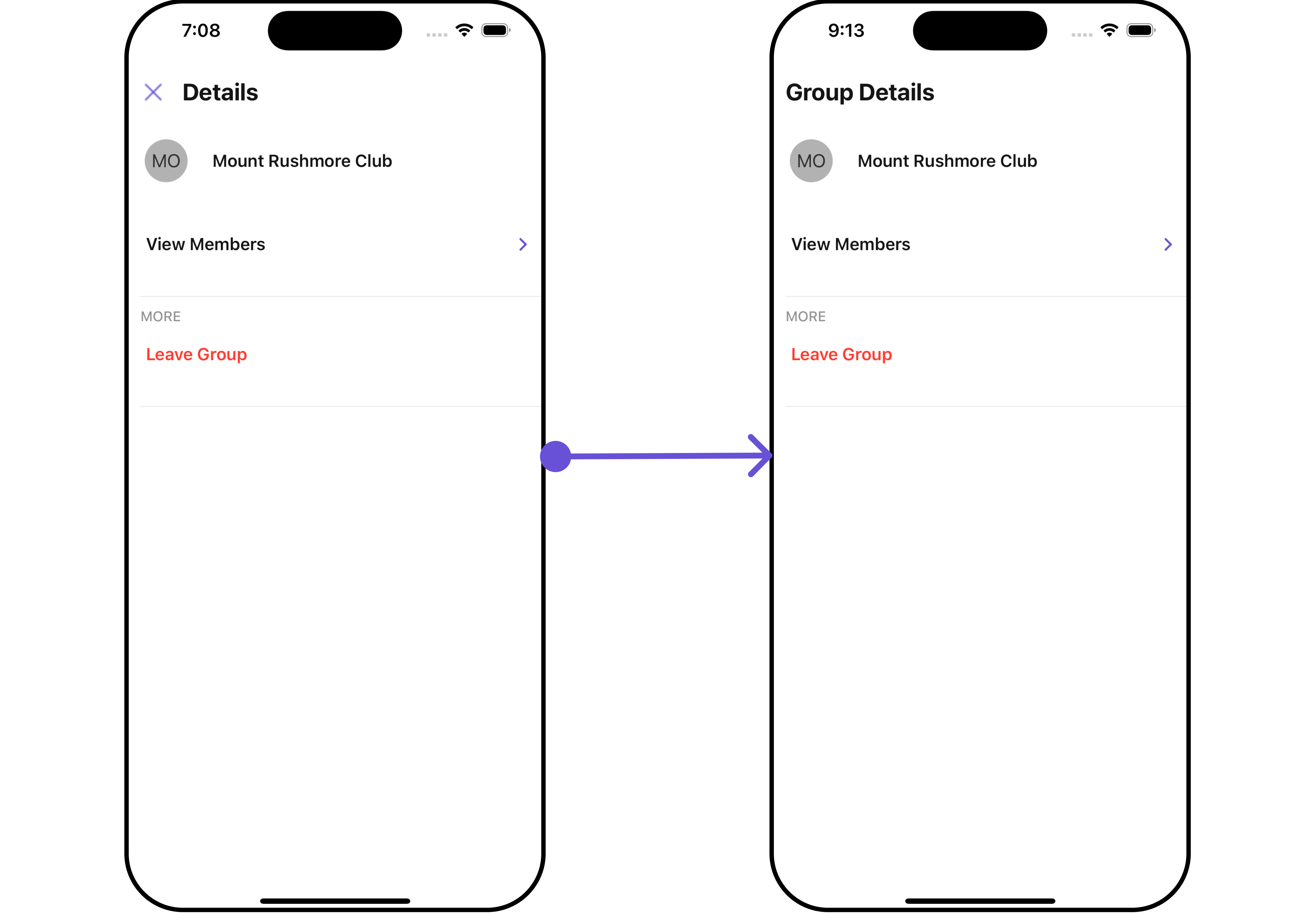
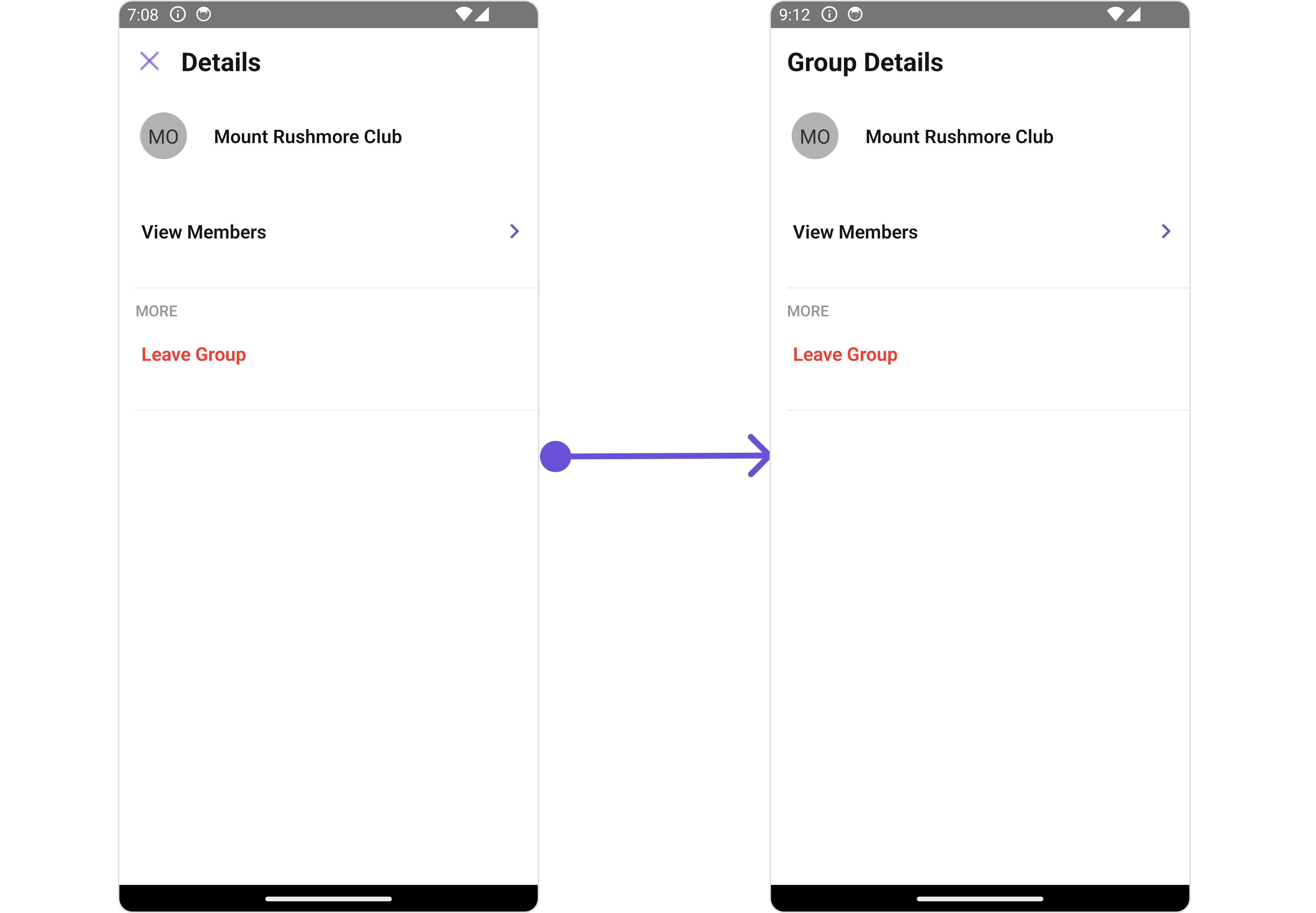
# Group Details
> Group Details — CometChat documentation.
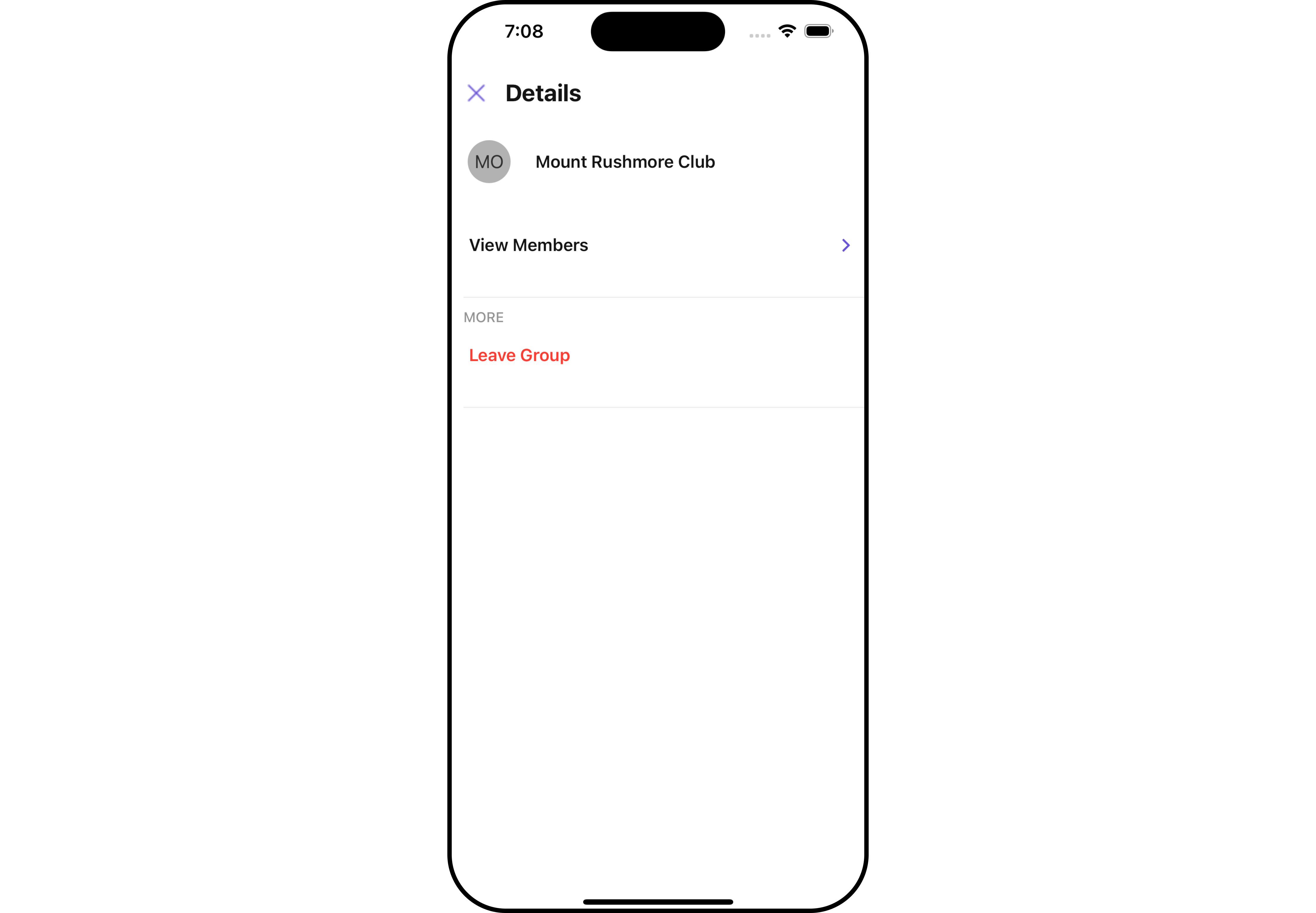
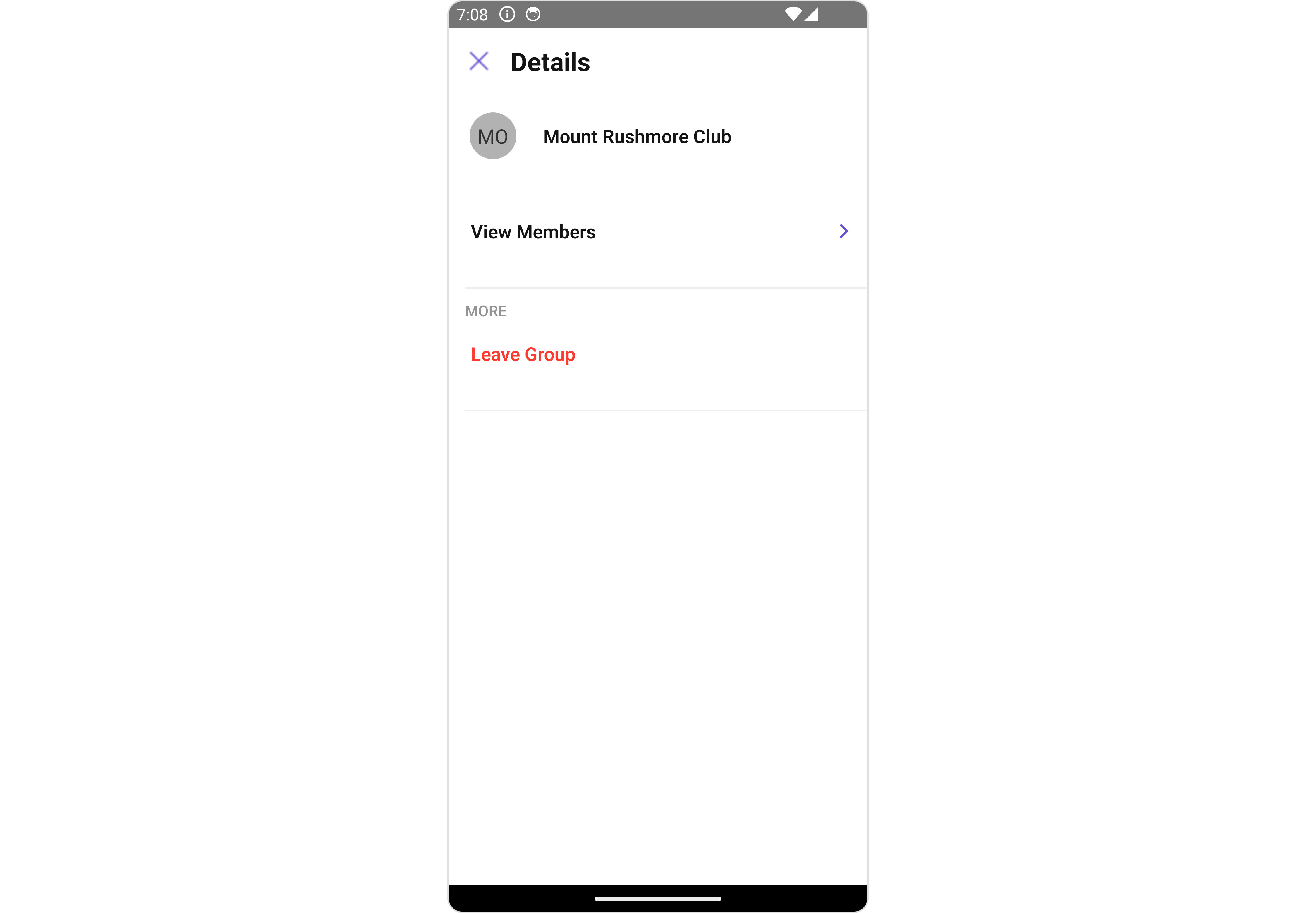
## Overview
`CometChatDetails` is a [Component](/ui-kit/react-native/v4/components-overview#components) that provides additional information and settings related to a specific group.
The details screen includes the following elements and functionalities:
1. Group Information: It displays details about the user. This includes his/her profile picture, name, status, and other relevant information.
2. Group Chat Features: It provides additional functionalities for managing the group. This includes options to add or remove participants, assign roles or permissions, and view group-related information.
3. Group Actions: This offers actions related to the group, such as leaving the group, or deleting the group.
 ## Usage
### Integration
```tsx theme={null}
import { CometChat } from "@cometchat/chat-sdk-react-native";
import { CometChatDetails } from "@cometchat/chat-uikit-react-native";
function App(): React.JSX.Element {
const [group, setGroup] = useState(undefined);
const getGroup = async () => {
const group = await CometChat.getGroup("guid");
setGroup(group);
};
useEffect(() => {
//login
getGroup();
});
return <>{group && };
}
```
### Actions
[Actions](/ui-kit/react-native/v4/components-overview#actions) dictate how a component functions. They are divided into two types: Predefined and User-defined. You can override either type, allowing you to tailor the behavior of the component to fit your specific needs.
##### 1. onBack
The `onBack` event is typically triggered when the back button is clicked and it does not carry a default action.
With the following code snippet, you can effortlessly override this default operation.
```tsx theme={null}
import { CometChat } from "@cometchat/chat-sdk-react-native";
import { CometChatDetails } from "@cometchat/chat-uikit-react-native";
function App(): React.JSX.Element {
const [group, setGroup] = useState(undefined);
const getGroup = async () => {
const group = await CometChat.getGroup("guid");
setGroup(group);
};
useEffect(() => {
//login
getGroup();
});
const onBackHandler = () => {
//code
};
return (
<>
{group && (
)}
);
}
```
##### 2. onError
This action doesn't change the behavior of the component but rather listens for any errors that occur in the Details component.
```tsx theme={null}
import { CometChat } from "@cometchat/chat-sdk-react-native";
import { CometChatDetails } from "@cometchat/chat-uikit-react-native";
function App(): React.JSX.Element {
const [group, setGroup] = useState(undefined);
const getGroup = async () => {
const group = await CometChat.getGroup("guid");
setGroup(group);
};
useEffect(() => {
//login
getGroup();
});
const onErrorHandler = (error: CometChat.CometChatException) => {
//code
};
return (
<>
{group && (
)}
);
}
```
### Filters
**Filters** allow you to customize the data displayed in a list within a Component. You can filter the list based on your specific criteria, allowing for a more customized. Filters can be applied using RequestBuilders of Chat SDK.
`CometChatDetails` component does not have available filters.
### Events
[Events](/ui-kit/react-native/v4/components-overview#events) are emitted by a `Component`. By using event you can extend existing functionality. Being global events, they can be applied in Multiple Locations and are capable of being Added or Removed.
The list of `Group Related Events` emitted by the Details component is as follows:
| Event | Description |
| ------------------ | ---------------------------------------------------------------------------- |
| **ccGroupLeft** | This event is triggered when the group member leaves the group successfully |
| **ccGroupDeleted** | This event is triggered when the group member deletes the group successfully |
```tsx theme={null}
import { CometChatUIEventHandler } from "@cometchat/chat-uikit-react-native";
CometChatUIEventHandler.addGroupListener("GROUP_LISTENER_ID", {
ccGroupLeft: ({ leftGroup }) => {
//code
},
});
CometChatUIEventHandler.addGroupListener("GROUP_LISTENER_ID", {
ccGroupDeleted: ({ group }) => {
//code
},
});
```
***
```tsx theme={null}
import { CometChatUIEventHandler } from "@cometchat/chat-uikit-react-native";
CometChatUIEventHandler.removeGroupListener("GROUP_LISTENER_ID");
```
***
## Customization
To fit your app's design requirements, you can customize the appearance of the details component. We provide exposed methods that allow you to modify the experience and behavior according to your specific needs.
### Style
Using Style you can customize the look and feel of the component in your app, These parameters typically control elements such as the color, size, shape, and fonts used within the component.
##### 1. Details Style
You can set the `DetailsStyle` to the User Details Component to customize the styling.
```tsx theme={null}
import { CometChat } from "@cometchat/chat-sdk-react-native";
import {
CometChatMessageList,
DetailsStyleInterface,
} from "@cometchat/chat-uikit-react-native";
function App(): React.JSX.Element {
const [group, setGroup] =
(useState < CometChat.Group) | (undefined > undefined);
const getGroup = async () => {
const group = await CometChat.getGroup("guid");
setGroup(group);
};
const detailsStyle: DetailsStyleInterface = {
width: "100",
height: "1000",
backgroundColor: "#ddd7f7",
titleColor: "red",
closeIconTint: "red",
};
return (
<>
{group && }
);
}
```
## Usage
### Integration
```tsx theme={null}
import { CometChat } from "@cometchat/chat-sdk-react-native";
import { CometChatDetails } from "@cometchat/chat-uikit-react-native";
function App(): React.JSX.Element {
const [group, setGroup] = useState(undefined);
const getGroup = async () => {
const group = await CometChat.getGroup("guid");
setGroup(group);
};
useEffect(() => {
//login
getGroup();
});
return <>{group && };
}
```
### Actions
[Actions](/ui-kit/react-native/v4/components-overview#actions) dictate how a component functions. They are divided into two types: Predefined and User-defined. You can override either type, allowing you to tailor the behavior of the component to fit your specific needs.
##### 1. onBack
The `onBack` event is typically triggered when the back button is clicked and it does not carry a default action.
With the following code snippet, you can effortlessly override this default operation.
```tsx theme={null}
import { CometChat } from "@cometchat/chat-sdk-react-native";
import { CometChatDetails } from "@cometchat/chat-uikit-react-native";
function App(): React.JSX.Element {
const [group, setGroup] = useState(undefined);
const getGroup = async () => {
const group = await CometChat.getGroup("guid");
setGroup(group);
};
useEffect(() => {
//login
getGroup();
});
const onBackHandler = () => {
//code
};
return (
<>
{group && (
)}
);
}
```
##### 2. onError
This action doesn't change the behavior of the component but rather listens for any errors that occur in the Details component.
```tsx theme={null}
import { CometChat } from "@cometchat/chat-sdk-react-native";
import { CometChatDetails } from "@cometchat/chat-uikit-react-native";
function App(): React.JSX.Element {
const [group, setGroup] = useState(undefined);
const getGroup = async () => {
const group = await CometChat.getGroup("guid");
setGroup(group);
};
useEffect(() => {
//login
getGroup();
});
const onErrorHandler = (error: CometChat.CometChatException) => {
//code
};
return (
<>
{group && (
)}
);
}
```
### Filters
**Filters** allow you to customize the data displayed in a list within a Component. You can filter the list based on your specific criteria, allowing for a more customized. Filters can be applied using RequestBuilders of Chat SDK.
`CometChatDetails` component does not have available filters.
### Events
[Events](/ui-kit/react-native/v4/components-overview#events) are emitted by a `Component`. By using event you can extend existing functionality. Being global events, they can be applied in Multiple Locations and are capable of being Added or Removed.
The list of `Group Related Events` emitted by the Details component is as follows:
| Event | Description |
| ------------------ | ---------------------------------------------------------------------------- |
| **ccGroupLeft** | This event is triggered when the group member leaves the group successfully |
| **ccGroupDeleted** | This event is triggered when the group member deletes the group successfully |
```tsx theme={null}
import { CometChatUIEventHandler } from "@cometchat/chat-uikit-react-native";
CometChatUIEventHandler.addGroupListener("GROUP_LISTENER_ID", {
ccGroupLeft: ({ leftGroup }) => {
//code
},
});
CometChatUIEventHandler.addGroupListener("GROUP_LISTENER_ID", {
ccGroupDeleted: ({ group }) => {
//code
},
});
```
***
```tsx theme={null}
import { CometChatUIEventHandler } from "@cometchat/chat-uikit-react-native";
CometChatUIEventHandler.removeGroupListener("GROUP_LISTENER_ID");
```
***
## Customization
To fit your app's design requirements, you can customize the appearance of the details component. We provide exposed methods that allow you to modify the experience and behavior according to your specific needs.
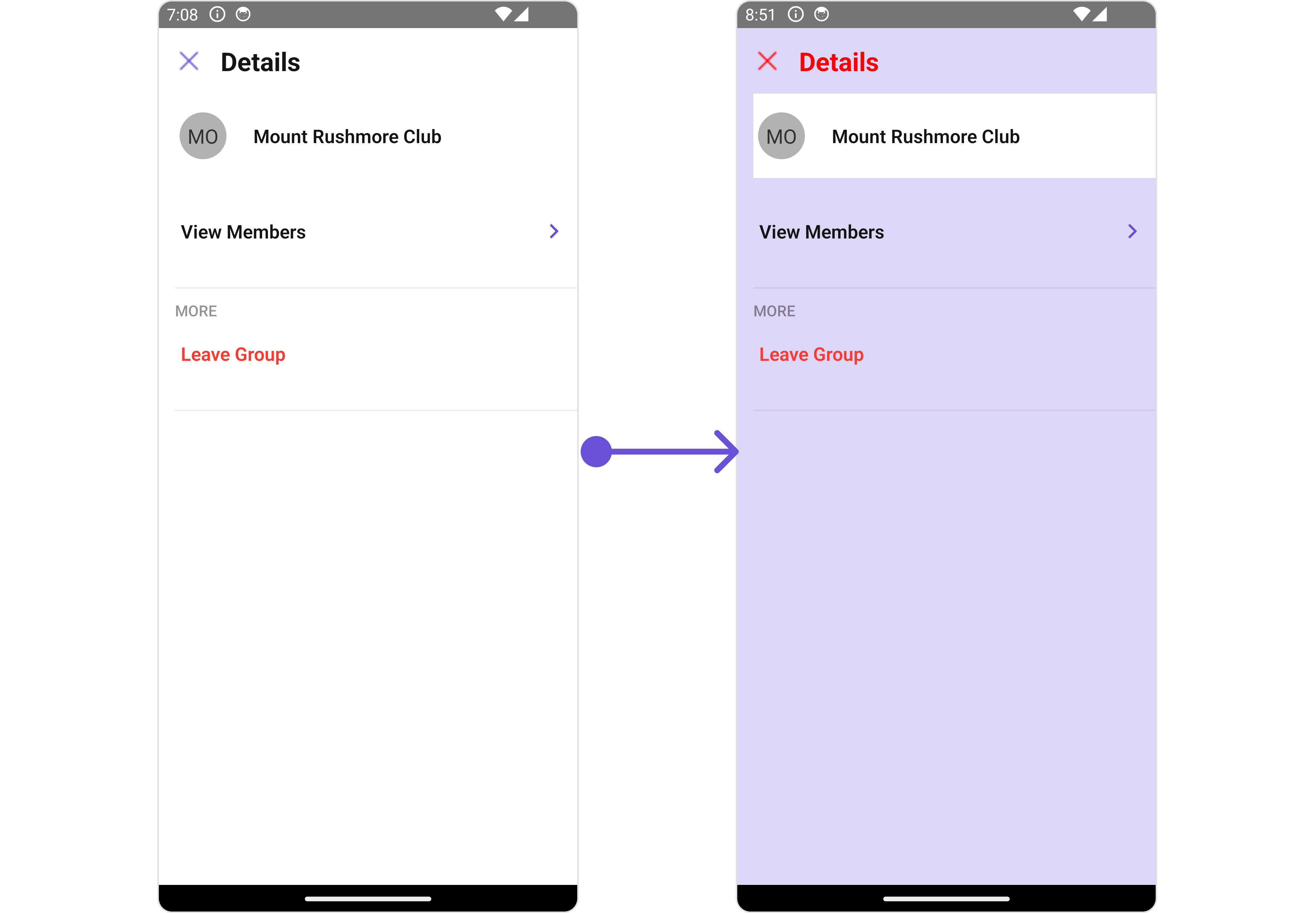
### Style
Using Style you can customize the look and feel of the component in your app, These parameters typically control elements such as the color, size, shape, and fonts used within the component.
##### 1. Details Style
You can set the `DetailsStyle` to the User Details Component to customize the styling.
```tsx theme={null}
import { CometChat } from "@cometchat/chat-sdk-react-native";
import {
CometChatMessageList,
DetailsStyleInterface,
} from "@cometchat/chat-uikit-react-native";
function App(): React.JSX.Element {
const [group, setGroup] =
(useState < CometChat.Group) | (undefined > undefined);
const getGroup = async () => {
const group = await CometChat.getGroup("guid");
setGroup(group);
};
const detailsStyle: DetailsStyleInterface = {
width: "100",
height: "1000",
backgroundColor: "#ddd7f7",
titleColor: "red",
closeIconTint: "red",
};
return (
<>
{group && }
);
}
```
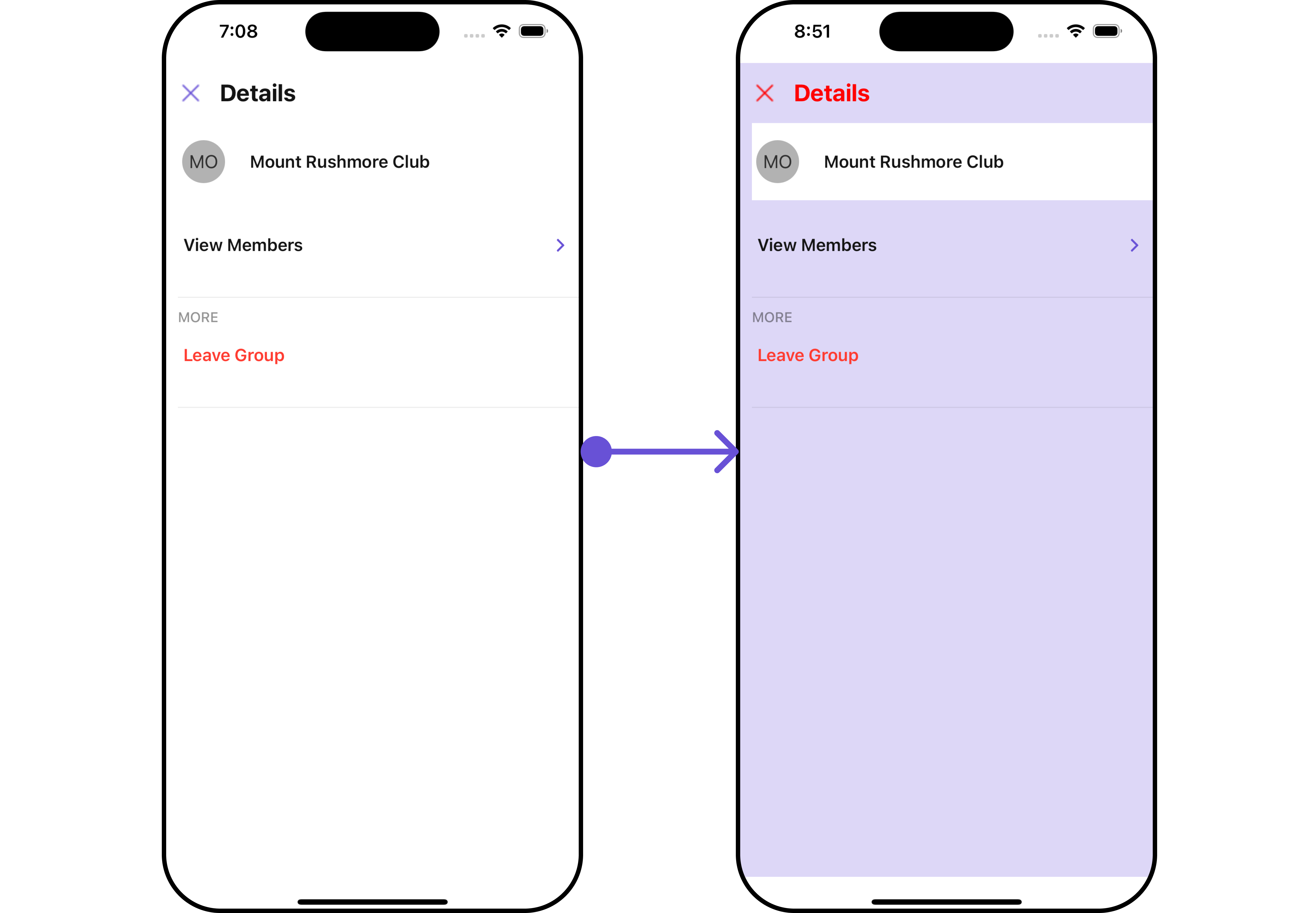
 List of properties exposed by DetailsStyle
| Property | Description | Code |
| --------------------- | ---------------------------------------------------------------------------- | --------------------------------- |
| **height** | Used to set height | `height?: string;` |
| **width** | Used to set width | `width?: string;` |
| **backgroundColor** | Used to set background colour | `backgroundColor?: string;` |
| **border** | Used to set border | `border?: BorderStyleInterface,` |
| **borderRadius** | Used to set border radius | `borderRadius?: string;` |
| **titleFont** | Used to customise the font of the title in the app bar | `titleFont?: FontStyleInterface;` |
| **titleColor** | Used to customise the color of the title in the app bar | `titleColor?: string;` |
| **backIconTint** | Sets the color of the back icon of the component | `backIconTint?: string;` |
| **closeIconTint** | Sets the color of the close icon of the component | `closeIconTint?: string;` |
| **onlineStatusColor** | Sets the color of the status indicator representing the user's online status | `onlineStatusColor?: string;` |
##### 2. StatusIndicator Style
To apply customized styles to the `StatusIndicator` component in the `Details` Component, you can use the following code snippet. For further insights on `StatusIndicator` Styles [refer](/ui-kit/react-native/v4/status-indicator)
```tsx theme={null}
import { CometChat } from "@cometchat/chat-sdk-react-native";
import {
CometChatMessageList,
StatusIndicatorStyleInterface,
} from "@cometchat/chat-uikit-react-native";
function App(): React.JSX.Element {
const [group, setGroup] =
(useState < CometChat.Group) | (undefined > undefined);
const getGroup = async () => {
const group = await CometChat.getGroup("guid");
setGroup(group);
};
const statusIndicatorStyle: StatusIndicatorStyleInterface = {
backgroundColor: "grey",
};
return (
<>
{group && (
)}
);
}
```
##### 3. ListItem Style
To apply customized styles to the List Item component in the Details Component, you can use the following code snippet. For further insights on List Item Styles [refer](/ui-kit/react-native/v4/list-item)
```tsx theme={null}
import { CometChat } from "@cometchat/chat-sdk-react-native";
import {
CometChatMessageList,
ListItemStyleInterface,
} from "@cometchat/chat-uikit-react-native";
function App(): React.JSX.Element {
const [group, setGroup] =
(useState < CometChat.Group) | (undefined > undefined);
const getGroup = async () => {
const group = await CometChat.getGroup("guid");
setGroup(group);
};
const listItemStyle: ListItemStyleInterface = {
backgroundColor: "#ddd7f7",
};
return (
<>
{group && (
)}
);
}
```
##### 4. Avatar Style
To apply customized styles to the `Avatar` component in the `Conversations` Component, you can use the following code snippet. For further insights on `Avatar` Styles [refer](/ui-kit/react-native/v4/avatar)
```tsx theme={null}
import { CometChat } from "@cometchat/chat-sdk-react-native";
import {
CometChatMessageList,
BorderStyleInterface,
AvatarStyleInterface,
} from "@cometchat/chat-uikit-react-native";
function App(): React.JSX.Element {
const [group, setGroup] =
(useState < CometChat.Group) | (undefined > undefined);
const getGroup = async () => {
const group = await CometChat.getGroup("guid");
setGroup(group);
};
const borderStyle: BorderStyleInterface = {
borderWidth: 1,
borderStyle: "solid",
borderColor: "red",
};
const avatarStyle: AvatarStyleInterface = {
border: borderStyle,
};
return (
<>{group && }
);
}
```
***
### Functionality
These are a set of small functional customizations that allow you to fine-tune the overall experience of the component. With these, you can change text, set custom icons, and toggle the visibility of UI elements.
```tsx theme={null}
import { CometChat } from "@cometchat/chat-sdk-react-native";
import {
CometChatUsers,
CometChatListStylesInterface,
} from "@cometchat/chat-uikit-react-native";
function App(): React.JSX.Element {
const [group, setGroup] = useState(undefined);
const getGroup = async () => {
const group = await CometChat.getGroup("guid");
setGroup(group);
};
return (
<>
{group && (
)}
);
}
```
List of properties exposed by DetailsStyle
| Property | Description | Code |
| --------------------- | ---------------------------------------------------------------------------- | --------------------------------- |
| **height** | Used to set height | `height?: string;` |
| **width** | Used to set width | `width?: string;` |
| **backgroundColor** | Used to set background colour | `backgroundColor?: string;` |
| **border** | Used to set border | `border?: BorderStyleInterface,` |
| **borderRadius** | Used to set border radius | `borderRadius?: string;` |
| **titleFont** | Used to customise the font of the title in the app bar | `titleFont?: FontStyleInterface;` |
| **titleColor** | Used to customise the color of the title in the app bar | `titleColor?: string;` |
| **backIconTint** | Sets the color of the back icon of the component | `backIconTint?: string;` |
| **closeIconTint** | Sets the color of the close icon of the component | `closeIconTint?: string;` |
| **onlineStatusColor** | Sets the color of the status indicator representing the user's online status | `onlineStatusColor?: string;` |
##### 2. StatusIndicator Style
To apply customized styles to the `StatusIndicator` component in the `Details` Component, you can use the following code snippet. For further insights on `StatusIndicator` Styles [refer](/ui-kit/react-native/v4/status-indicator)
```tsx theme={null}
import { CometChat } from "@cometchat/chat-sdk-react-native";
import {
CometChatMessageList,
StatusIndicatorStyleInterface,
} from "@cometchat/chat-uikit-react-native";
function App(): React.JSX.Element {
const [group, setGroup] =
(useState < CometChat.Group) | (undefined > undefined);
const getGroup = async () => {
const group = await CometChat.getGroup("guid");
setGroup(group);
};
const statusIndicatorStyle: StatusIndicatorStyleInterface = {
backgroundColor: "grey",
};
return (
<>
{group && (
)}
);
}
```
##### 3. ListItem Style
To apply customized styles to the List Item component in the Details Component, you can use the following code snippet. For further insights on List Item Styles [refer](/ui-kit/react-native/v4/list-item)
```tsx theme={null}
import { CometChat } from "@cometchat/chat-sdk-react-native";
import {
CometChatMessageList,
ListItemStyleInterface,
} from "@cometchat/chat-uikit-react-native";
function App(): React.JSX.Element {
const [group, setGroup] =
(useState < CometChat.Group) | (undefined > undefined);
const getGroup = async () => {
const group = await CometChat.getGroup("guid");
setGroup(group);
};
const listItemStyle: ListItemStyleInterface = {
backgroundColor: "#ddd7f7",
};
return (
<>
{group && (
)}
);
}
```
##### 4. Avatar Style
To apply customized styles to the `Avatar` component in the `Conversations` Component, you can use the following code snippet. For further insights on `Avatar` Styles [refer](/ui-kit/react-native/v4/avatar)
```tsx theme={null}
import { CometChat } from "@cometchat/chat-sdk-react-native";
import {
CometChatMessageList,
BorderStyleInterface,
AvatarStyleInterface,
} from "@cometchat/chat-uikit-react-native";
function App(): React.JSX.Element {
const [group, setGroup] =
(useState < CometChat.Group) | (undefined > undefined);
const getGroup = async () => {
const group = await CometChat.getGroup("guid");
setGroup(group);
};
const borderStyle: BorderStyleInterface = {
borderWidth: 1,
borderStyle: "solid",
borderColor: "red",
};
const avatarStyle: AvatarStyleInterface = {
border: borderStyle,
};
return (
<>{group && }
);
}
```
***
### Functionality
These are a set of small functional customizations that allow you to fine-tune the overall experience of the component. With these, you can change text, set custom icons, and toggle the visibility of UI elements.
```tsx theme={null}
import { CometChat } from "@cometchat/chat-sdk-react-native";
import {
CometChatUsers,
CometChatListStylesInterface,
} from "@cometchat/chat-uikit-react-native";
function App(): React.JSX.Element {
const [group, setGroup] = useState(undefined);
const getGroup = async () => {
const group = await CometChat.getGroup("guid");
setGroup(group);
};
return (
<>
{group && (
)}
);
}
```
 Below is a list of customizations along with corresponding code snippets
| Property | Description | Code |
| ----------------------------------------------------------------------------- | --------------------------------------------------------------------------------------- | ---------------------------------------------------------------------------------------------------------- |
| **group** | Used to set the group 🛑 | `user: CometChat.User;` |
| **title** | Used to set title in the app bar | `title?: string;` |
| **showCloseButton** | Used to toggle visibility for back button | `showCloseButton?: boolean` |
| **closeButtonIcon** | Used to override the default close/back icon | `closeButtonIcon?: ImageURISource` |
| **hideProfile** | Used to hide user profile view | `hideProfile?: boolean;` |
| **disableUsersPresence** | Used to control visibility of user indicator shown if user is online | `disableUsersPresence?: boolean` |
| **searchBoxIcon** | Used to set search Icon in the search field | `searchBoxIcon?: ImageURISource` |
| **hideSearch** | Used to toggle visibility for search box | `hideSearch?: boolean` |
| **hideError** | Used to hide error on fetching users | `hideError?: boolean` |
| **hideSeparator** | Used to hide the divider separating the user items | `hideSeparator?: boolean` |
| **emptyStateText** | Used to set a custom text response when fetching the users has returned an empty list | `emptyStateText?: string` |
| **errorStateText** | Used to set a custom text response when some error occurs on fetching the list of users | `errorStateText?: string` |
| **data** | Used to pass custom details template | `data?: ({user, group,}: {user?: CometChat.User;group?: CometChat.Group;}) => CometChatDetailsTemplate[];` |
| **leaveGroupButtonText** 🛑 | Used to set custom leave group button text | `leaveGroupButtonText='Your Custom Leave Button Text'` |
| **leaveGroupCancelButtonText** 🛑 | Used to set cancel `leave group` button text | `leaveGroupCancelButtonText='Your Custom Cancel Button Text'` |
| **deleteGroupButtonText** 🛑 | Used to set delete group button text | `deleteGroupButtonText='Your Custom delete Button Text'` |
| **deleteGroupCancelButtonText** 🛑 | Used to set cancel `delete group` button text | `deleteGroupCancelButtonText='Your Custom transfer Button Text'` |
| **leaveGroupConfirmDialogMessage** 🛑 | Custom message for leave confirm dialog | `leaveGroupConfirmDialogMessage?: string` |
| **deleteGroupConfirmDialogMessage** 🛑 | Custom message for delete confirm dialog | `deleteGroupConfirmDialogMessage?: string` |
***
### Advanced
For advanced-level customization, you can set custom views to the component. This lets you tailor each aspect of the component to fit your exact needs and application aesthetics. You can create and define your views, layouts, and UI elements and then incorporate those into the component.
***
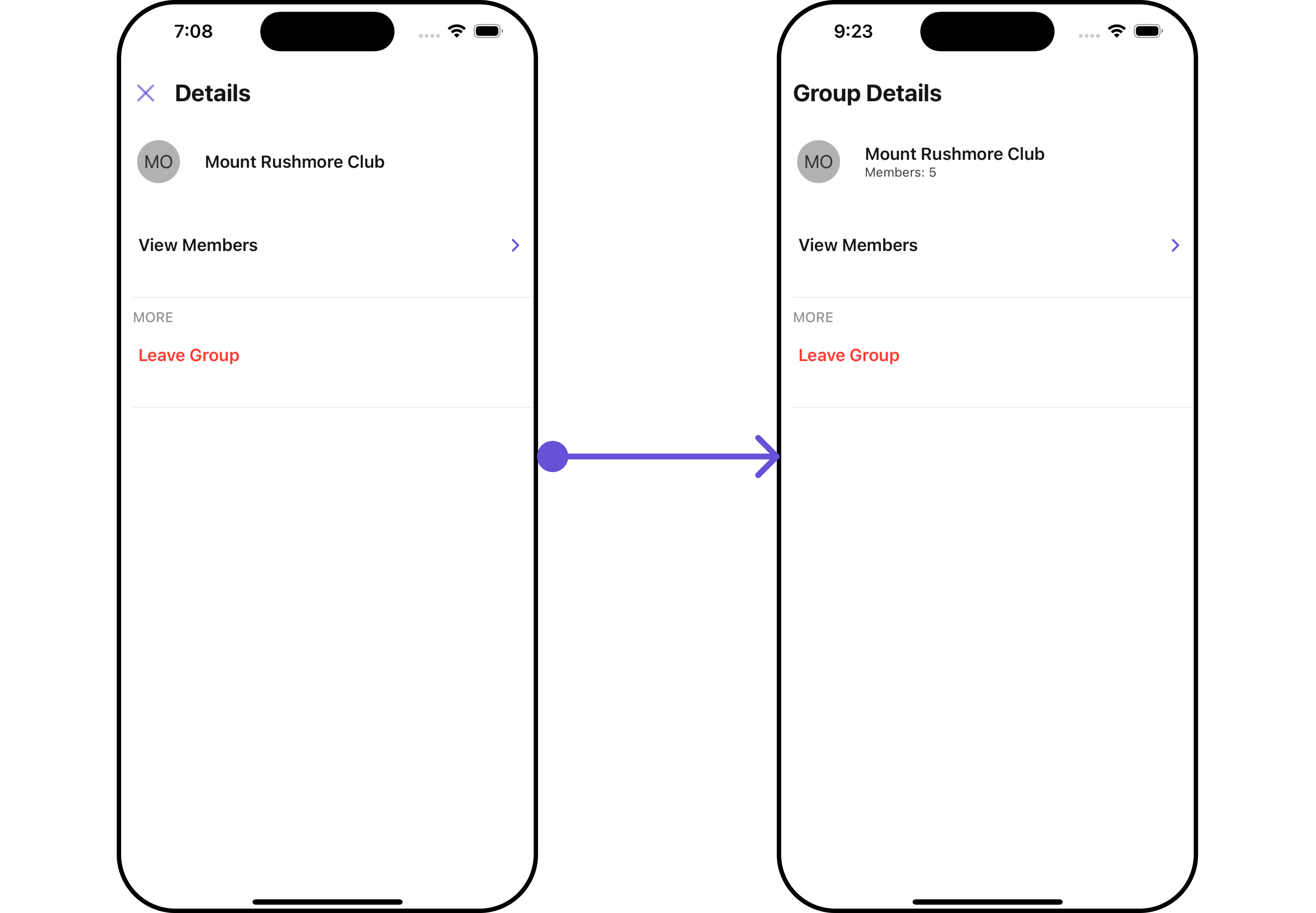
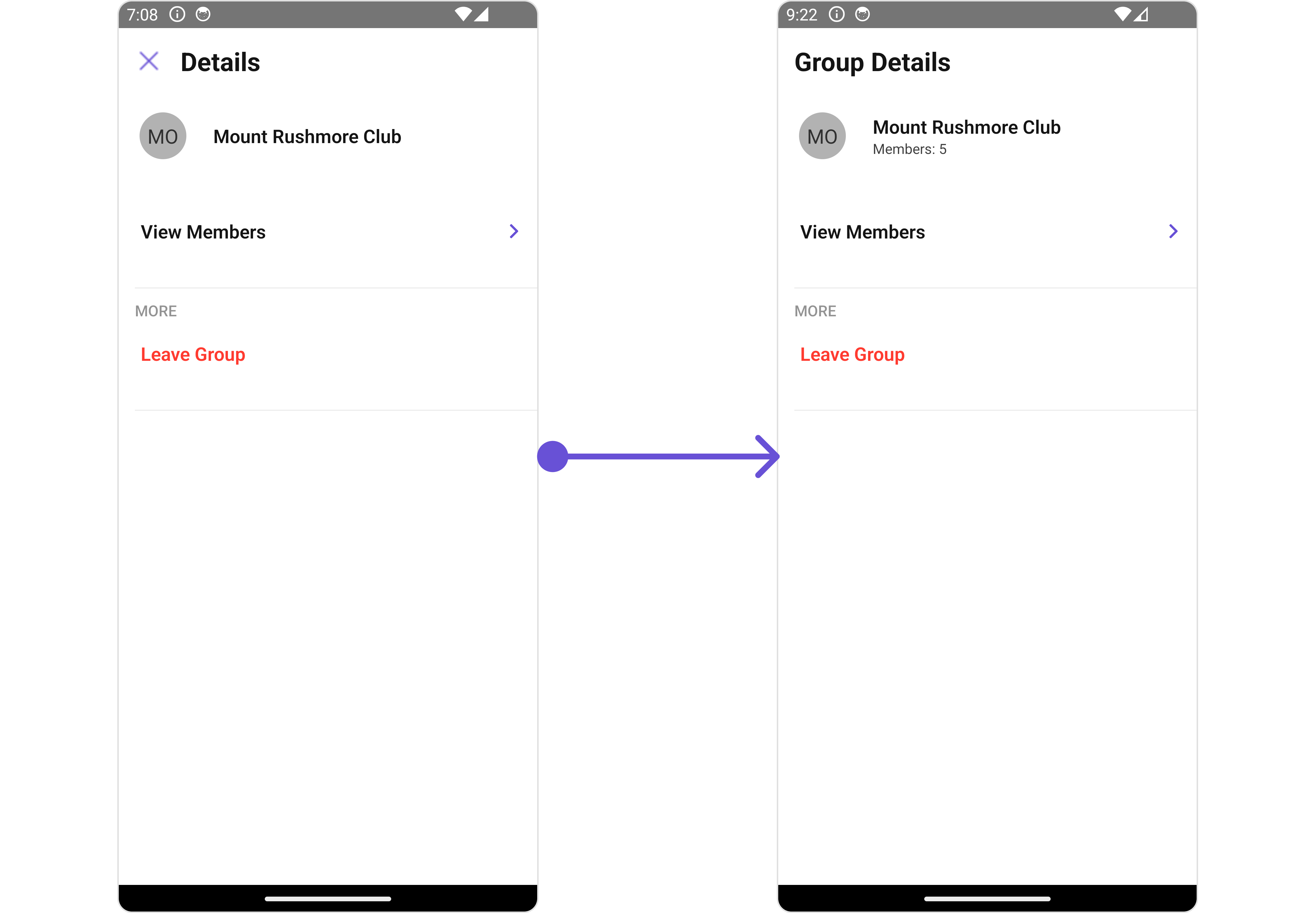
#### SubtitleView
Using this prop, you can assign a custom `SubtitleView` to the Details Component.
```tsx theme={null}
import { CometChat } from "@cometchat/chat-sdk-react-native";
import {
CometChatUsers,
CometChatListStylesInterface,
} from "@cometchat/chat-uikit-react-native";
function App(): React.JSX.Element {
const [group, setGroup] = useState(undefined);
const getGroup = async () => {
const group = await CometChat.getGroup("guid");
setGroup(group);
};
const getGroupSubtitleView = ({
user,
group,
}: {
user?: CometChat.User | undefined;
group?: CometChat.Group | undefined;
}) => {
return (
Members: {group ? group?.getMembersCount() : "--"}
);
};
return (
<>
{group && (
)}
);
}
```
Below is a list of customizations along with corresponding code snippets
| Property | Description | Code |
| ----------------------------------------------------------------------------- | --------------------------------------------------------------------------------------- | ---------------------------------------------------------------------------------------------------------- |
| **group** | Used to set the group 🛑 | `user: CometChat.User;` |
| **title** | Used to set title in the app bar | `title?: string;` |
| **showCloseButton** | Used to toggle visibility for back button | `showCloseButton?: boolean` |
| **closeButtonIcon** | Used to override the default close/back icon | `closeButtonIcon?: ImageURISource` |
| **hideProfile** | Used to hide user profile view | `hideProfile?: boolean;` |
| **disableUsersPresence** | Used to control visibility of user indicator shown if user is online | `disableUsersPresence?: boolean` |
| **searchBoxIcon** | Used to set search Icon in the search field | `searchBoxIcon?: ImageURISource` |
| **hideSearch** | Used to toggle visibility for search box | `hideSearch?: boolean` |
| **hideError** | Used to hide error on fetching users | `hideError?: boolean` |
| **hideSeparator** | Used to hide the divider separating the user items | `hideSeparator?: boolean` |
| **emptyStateText** | Used to set a custom text response when fetching the users has returned an empty list | `emptyStateText?: string` |
| **errorStateText** | Used to set a custom text response when some error occurs on fetching the list of users | `errorStateText?: string` |
| **data** | Used to pass custom details template | `data?: ({user, group,}: {user?: CometChat.User;group?: CometChat.Group;}) => CometChatDetailsTemplate[];` |
| **leaveGroupButtonText** 🛑 | Used to set custom leave group button text | `leaveGroupButtonText='Your Custom Leave Button Text'` |
| **leaveGroupCancelButtonText** 🛑 | Used to set cancel `leave group` button text | `leaveGroupCancelButtonText='Your Custom Cancel Button Text'` |
| **deleteGroupButtonText** 🛑 | Used to set delete group button text | `deleteGroupButtonText='Your Custom delete Button Text'` |
| **deleteGroupCancelButtonText** 🛑 | Used to set cancel `delete group` button text | `deleteGroupCancelButtonText='Your Custom transfer Button Text'` |
| **leaveGroupConfirmDialogMessage** 🛑 | Custom message for leave confirm dialog | `leaveGroupConfirmDialogMessage?: string` |
| **deleteGroupConfirmDialogMessage** 🛑 | Custom message for delete confirm dialog | `deleteGroupConfirmDialogMessage?: string` |
***
### Advanced
For advanced-level customization, you can set custom views to the component. This lets you tailor each aspect of the component to fit your exact needs and application aesthetics. You can create and define your views, layouts, and UI elements and then incorporate those into the component.
***
#### SubtitleView
Using this prop, you can assign a custom `SubtitleView` to the Details Component.
```tsx theme={null}
import { CometChat } from "@cometchat/chat-sdk-react-native";
import {
CometChatUsers,
CometChatListStylesInterface,
} from "@cometchat/chat-uikit-react-native";
function App(): React.JSX.Element {
const [group, setGroup] = useState(undefined);
const getGroup = async () => {
const group = await CometChat.getGroup("guid");
setGroup(group);
};
const getGroupSubtitleView = ({
user,
group,
}: {
user?: CometChat.User | undefined;
group?: CometChat.Group | undefined;
}) => {
return (
Members: {group ? group?.getMembersCount() : "--"}
);
};
return (
<>
{group && (
)}
);
}
```
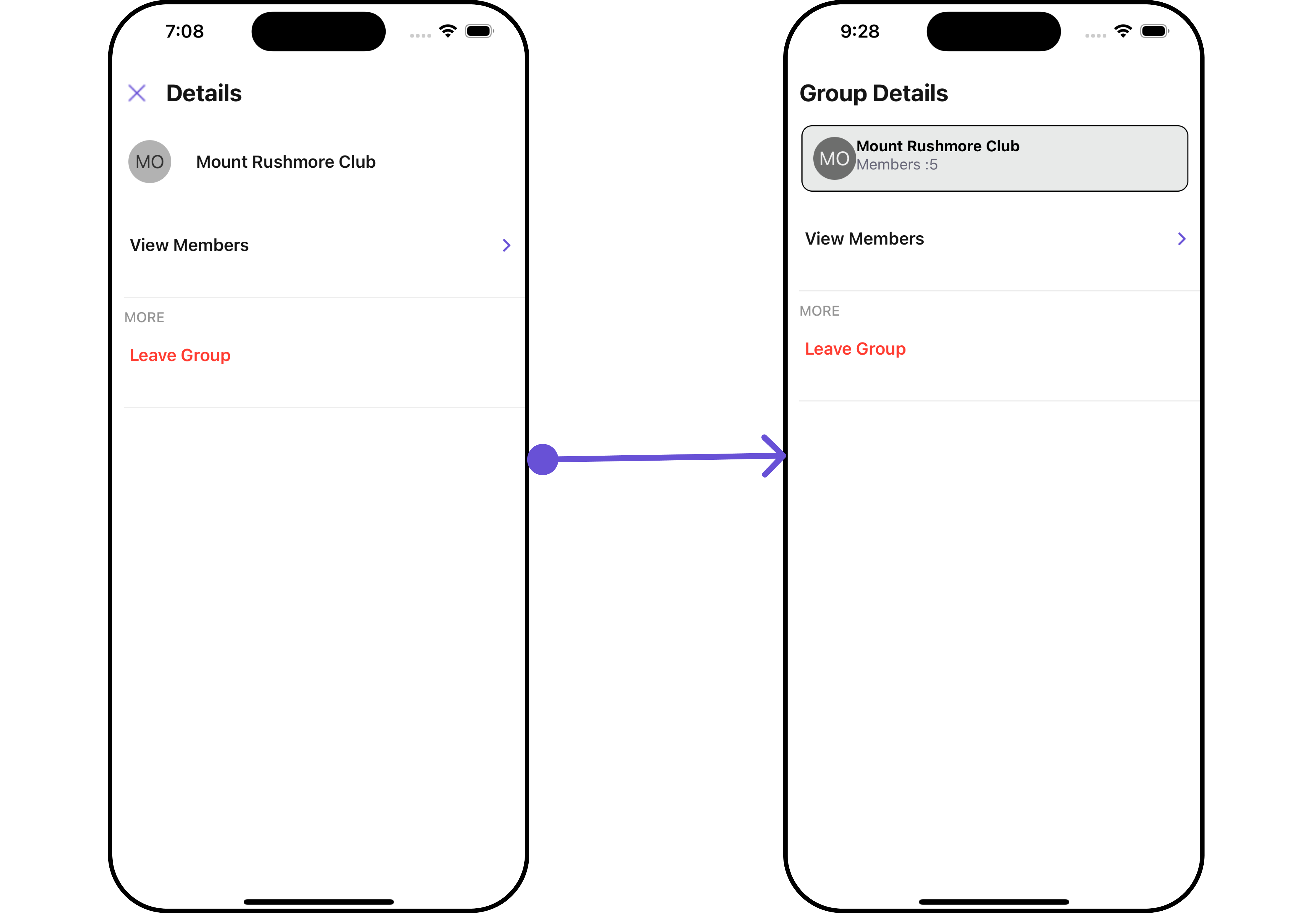
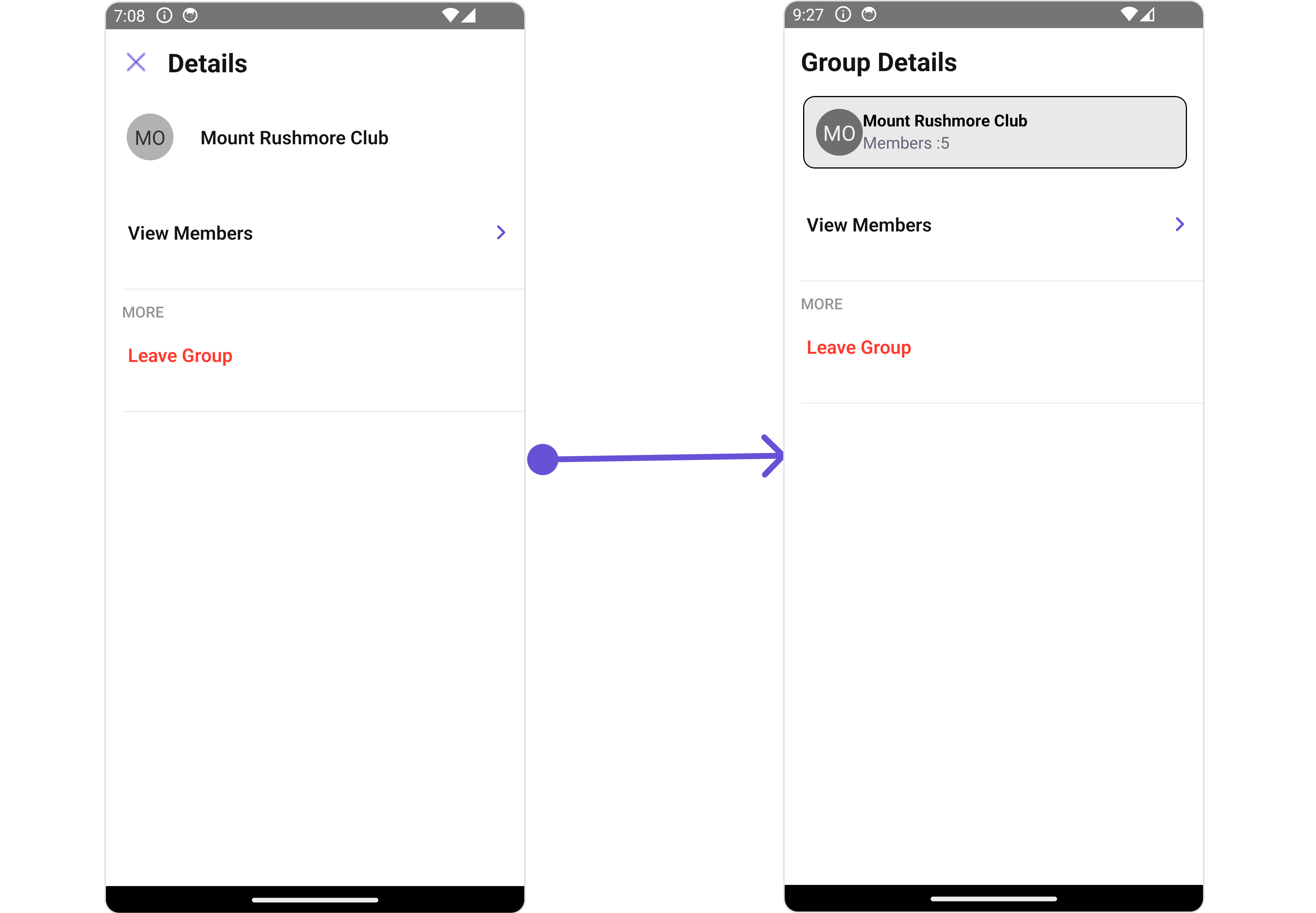
 #### CustomProfileView
Using this prop, you can assign a `Custom ProfileView` to the Details Component.
```tsx theme={null}
import { CometChat } from "@cometchat/chat-sdk-react-native";
import {
CometChatUsers,
CometChatListStylesInterface,
} from "@cometchat/chat-uikit-react-native";
function App(): React.JSX.Element {
const [group, setGroup] = useState(undefined);
const getGroup = async () => {
const group = await CometChat.getGroup("guid");
setGroup(group);
};
const customProfileViewStyle: StyleProp = {
flexDirection: "row",
alignItems: "flex-start",
padding: 10,
marginRight: 15,
borderColor: "black",
borderWidth: 1,
backgroundColor: "#E8EAE9",
borderRadius: 10,
margin: 2,
};
const getCustomGroupProfileView = ({
user,
group,
}: {
user?: CometChat.User;
group?: CometChat.Group;
}) => {
return (
{group?.getName()}
{"Members :" + group?.getMembersCount()}
);
};
return (
<>
{group && (
)}
);
}
```
#### CustomProfileView
Using this prop, you can assign a `Custom ProfileView` to the Details Component.
```tsx theme={null}
import { CometChat } from "@cometchat/chat-sdk-react-native";
import {
CometChatUsers,
CometChatListStylesInterface,
} from "@cometchat/chat-uikit-react-native";
function App(): React.JSX.Element {
const [group, setGroup] = useState(undefined);
const getGroup = async () => {
const group = await CometChat.getGroup("guid");
setGroup(group);
};
const customProfileViewStyle: StyleProp = {
flexDirection: "row",
alignItems: "flex-start",
padding: 10,
marginRight: 15,
borderColor: "black",
borderWidth: 1,
backgroundColor: "#E8EAE9",
borderRadius: 10,
margin: 2,
};
const getCustomGroupProfileView = ({
user,
group,
}: {
user?: CometChat.User;
group?: CometChat.Group;
}) => {
return (
{group?.getName()}
{"Members :" + group?.getMembersCount()}
);
};
return (
<>
{group && (
)}
);
}
```
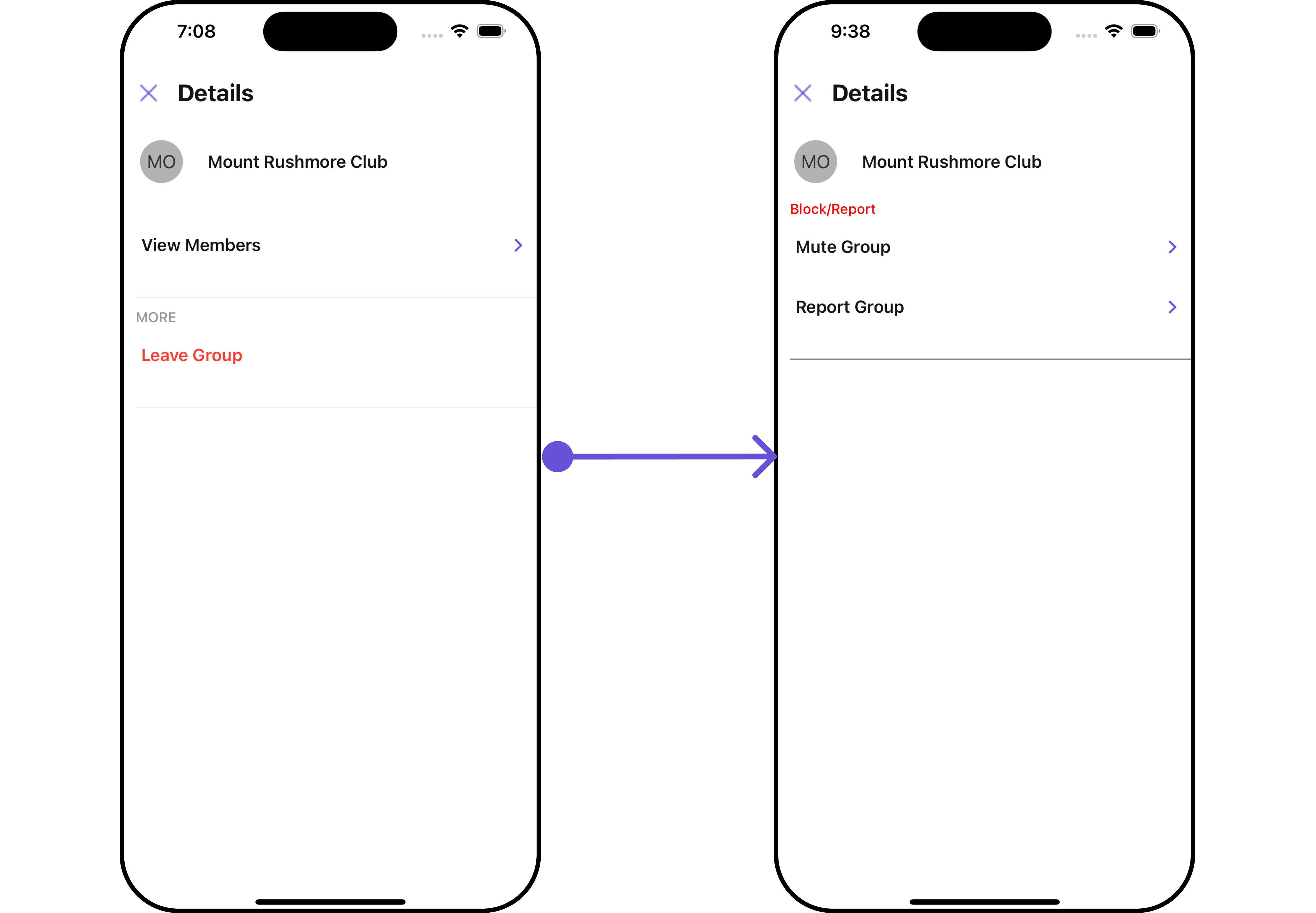
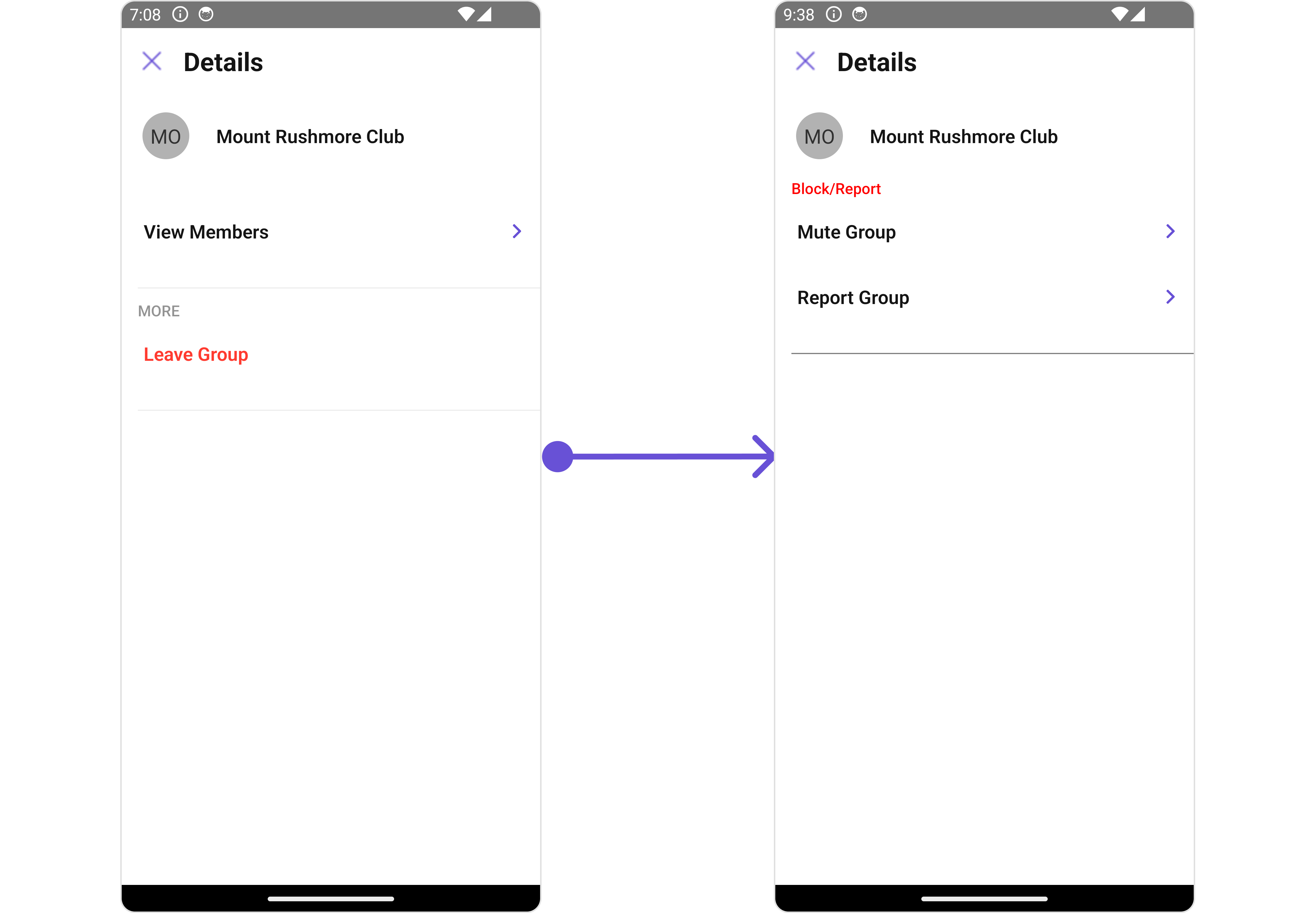
 #### DetailsTemplate
The `CometChatDetailsTemplate` offers a structure for organizing information in the CometChat details component. It serves as a blueprint, defining how user-related details are presented. This structure allows for customization and organization within the CometChat interface.
This defines the structure of template data for the details component.
| Name | Type | Description |
| ------------------------- | -------------------------- | ----------------------------------------------------------------------------------------- |
| **id** | `string` \| `number` | Identifier for the template option |
| **title** | `string` | Heading text for the template option |
| **titleColor** | `string` | User-defined UI component to customise the trailing view for each option in a template. |
| **titleFont** | `FontStyleInterface` | User-defined UI component to override the default view for the option. |
| **titleStyle** | `TextStyle` | Function invoked when user clicks on the option. |
| **sectionSeparatorColor** | `string` | Sets all the different properties of font for the title text |
| **itemSeparatorColor** | `string` | Sets the foreground colour of title text |
| **hideSectionSeparator** | `boolean` | Image url for the icon to symbolise an option |
| **hideItemSeparator** | `boolean` | Color applied to the icon of the option |
| **options** | `CometChatDetailsOption[]` | Sets the [`CometChatDetailsOption`](/ui-kit/react-native/v4/group-details#detailsoption)s |
#### DetailsOption
The `DetailsOption` defines the structure for individual options within the CometChat details component, facilitating customization and functionality for user interactions.
This defines the structure of each option for a template in the details component.
| Property | Type | Description |
| ------------------- | --------------------------------------------------------- | ------------------------------------------------------------ |
| **id** | `string` \| `number` | Identifier for the template |
| **title** | `string` | Heading text for the template |
| **titleStyle** | `TextStyle` | Sets the title style |
| **icon** | `ImageType` | Sets all the different properties of font for the title text |
| **iconTint** | `string` | Sets the icon tint\` |
| **backgroundColor** | `string` | Sets the background color |
| **CustomView** | `() => JSX.Element` | Sets custom view for the option |
| **Tail** | `() => JSX.Element` | Sets the tail view for the option |
| **height** | `number` | Sets the height |
| **onClick** | `({ user, group }: { user?: any; group?: any }) => void;` | Sets the onClick Handler for the option |
Below is an example of using Custom Details templates:
```tsx theme={null}
import { CometChat } from "@cometchat/chat-sdk-react-native";
import {
CometChatUsers,
CometChatListStylesInterface,
} from "@cometchat/chat-uikit-react-native";
function App(): React.JSX.Element {
const [group, setGroup] = useState(undefined);
const getGroup = async () => {
const group = await CometChat.getGroup("guid");
setGroup(group);
};
const getTemplate = ({
user,
group,
}: {
user?: CometChat.User;
group?: CometChat.Group;
}): CometChatDetailsTemplate[] => {
const blockOption: CometChatDetailsOption = {
id: "mute",
title: "Mute Group",
onClick: ({
user,
group,
}: {
user?: CometChat.User;
group?: CometChat.group;
}) => {
//code
},
};
const reportOption: CometChatDetailsOption = {
id: "report",
title: "Report Group",
onClick: ({
user,
group,
}: {
user?: CometChat.User;
group?: CometChat.group;
}) => {
//code
},
};
const detailsTemplate: CometChatDetailsTemplate = {
id: "Block",
title: "Block/Report",
titleColor: "red",
sectionSeparatorColor: "grey",
itemSeparatorColor: "#6851D6",
hideItemSeparator: false,
options: [blockOption, reportOption],
};
return [detailsTemplate];
};
return <>{group && };
}
```
#### DetailsTemplate
The `CometChatDetailsTemplate` offers a structure for organizing information in the CometChat details component. It serves as a blueprint, defining how user-related details are presented. This structure allows for customization and organization within the CometChat interface.
This defines the structure of template data for the details component.
| Name | Type | Description |
| ------------------------- | -------------------------- | ----------------------------------------------------------------------------------------- |
| **id** | `string` \| `number` | Identifier for the template option |
| **title** | `string` | Heading text for the template option |
| **titleColor** | `string` | User-defined UI component to customise the trailing view for each option in a template. |
| **titleFont** | `FontStyleInterface` | User-defined UI component to override the default view for the option. |
| **titleStyle** | `TextStyle` | Function invoked when user clicks on the option. |
| **sectionSeparatorColor** | `string` | Sets all the different properties of font for the title text |
| **itemSeparatorColor** | `string` | Sets the foreground colour of title text |
| **hideSectionSeparator** | `boolean` | Image url for the icon to symbolise an option |
| **hideItemSeparator** | `boolean` | Color applied to the icon of the option |
| **options** | `CometChatDetailsOption[]` | Sets the [`CometChatDetailsOption`](/ui-kit/react-native/v4/group-details#detailsoption)s |
#### DetailsOption
The `DetailsOption` defines the structure for individual options within the CometChat details component, facilitating customization and functionality for user interactions.
This defines the structure of each option for a template in the details component.
| Property | Type | Description |
| ------------------- | --------------------------------------------------------- | ------------------------------------------------------------ |
| **id** | `string` \| `number` | Identifier for the template |
| **title** | `string` | Heading text for the template |
| **titleStyle** | `TextStyle` | Sets the title style |
| **icon** | `ImageType` | Sets all the different properties of font for the title text |
| **iconTint** | `string` | Sets the icon tint\` |
| **backgroundColor** | `string` | Sets the background color |
| **CustomView** | `() => JSX.Element` | Sets custom view for the option |
| **Tail** | `() => JSX.Element` | Sets the tail view for the option |
| **height** | `number` | Sets the height |
| **onClick** | `({ user, group }: { user?: any; group?: any }) => void;` | Sets the onClick Handler for the option |
Below is an example of using Custom Details templates:
```tsx theme={null}
import { CometChat } from "@cometchat/chat-sdk-react-native";
import {
CometChatUsers,
CometChatListStylesInterface,
} from "@cometchat/chat-uikit-react-native";
function App(): React.JSX.Element {
const [group, setGroup] = useState(undefined);
const getGroup = async () => {
const group = await CometChat.getGroup("guid");
setGroup(group);
};
const getTemplate = ({
user,
group,
}: {
user?: CometChat.User;
group?: CometChat.Group;
}): CometChatDetailsTemplate[] => {
const blockOption: CometChatDetailsOption = {
id: "mute",
title: "Mute Group",
onClick: ({
user,
group,
}: {
user?: CometChat.User;
group?: CometChat.group;
}) => {
//code
},
};
const reportOption: CometChatDetailsOption = {
id: "report",
title: "Report Group",
onClick: ({
user,
group,
}: {
user?: CometChat.User;
group?: CometChat.group;
}) => {
//code
},
};
const detailsTemplate: CometChatDetailsTemplate = {
id: "Block",
title: "Block/Report",
titleColor: "red",
sectionSeparatorColor: "grey",
itemSeparatorColor: "#6851D6",
hideItemSeparator: false,
options: [blockOption, reportOption],
};
return [detailsTemplate];
};
return <>{group && };
}
```
 ***
## Configurations
[Configurations](/ui-kit/react-native/v4/components-overview#configurations) offer the ability to customize the properties of each component within a Composite Component.
CometChatDetails has `Add Members`, `Banned Members`, `Transfer Ownership` and `Group Members` component. Hence, each of these components will have its individual \`Configuration\`\`.
* `Configurations` expose properties that are available in its individual components.
#### Group Members
You can customize the properties of the Group Members component by making use of the `groupMembersConfiguration`. You can accomplish this by employing the `groupMembersConfiguration` props as demonstrated below:
```tsx theme={null}
import { CometChat } from "@cometchat/chat-sdk-react-native";
import {
CometChatDetails,
GroupMemberConfigurationInterface,
} from "@cometchat/chat-uikit-react-native";
function App(): React.JSX.Element {
const [group, setGroup] = useState(undefined);
const getGroup = async () => {
const group = await CometChat.getGroup("guid");
setGroup(group);
};
const groupMembersConfiguration: GroupMemberConfigurationInterface = {
//override
};
return (
<>
{group && (
)}
);
}
```
All exposed properties of `GroupMembersConfiguration` can be found under [Group Members](/ui-kit/react-native/v4/group-members#functionality). 🛑 symbol are not accessible within the Configuration Object.
**Example**
Let's say you want to change the style of the Group Member subcomponent and, in addition, you only want to hide separator and left allign the title.
You can change the title using `title` property and hide the separator using `hideSeperator` property.
```tsx theme={null}
import { CometChat } from "@cometchat/chat-sdk-react-native";
import {
CometChatDetails,
GroupMemberConfigurationInterface,
} from "@cometchat/chat-uikit-react-native";
function App(): React.JSX.Element {
const [group, setGroup] = useState(undefined);
const getGroup = async () => {
const group = await CometChat.getGroup("guid");
setGroup(group);
};
const groupMembersConfiguration: GroupMemberConfigurationInterface = {
title: "List Of Members",
hideSeperator: true,
};
return (
<>
{group && (
)}
);
}
```
#### Add Members
You can customize the properties of the Add Members component by making use of the `AddMembersConfiguration`. You can accomplish this by employing the `addMembersConfiguration` props as demonstrated below:
```tsx theme={null}
import { CometChat } from "@cometchat/chat-sdk-react-native";
import {
CometChatDetails,
AddMembersConfigurationInterface,
} from "@cometchat/chat-uikit-react-native";
function App(): React.JSX.Element {
const [group, setGroup] = useState(undefined);
const getGroup = async () => {
const group = await CometChat.getGroup("guid");
setGroup(group);
};
const addMembersConfiguration: AddMembersConfigurationInterface = {
//overide
};
return (
<>
{group && (
)}
);
}
```
All exposed properties of `AddMembersConfiguration` can be found under [Add Members](/ui-kit/react-native/v4/group-add-members#functionality). 🛑 symbol are not accessible within the Configuration Object.
**Example**
Let's say you want to change the style of the Add Members subcomponent and, in addition, you only want to show section header.
You can modify the style using the `addMembersStyle` property and shide the separator using `hideSeparator` property.
```tsx theme={null}
import { CometChat } from "@cometchat/chat-sdk-react-native";
import {
CometChatDetails,
AddMembersConfigurationInterface,
CometChatListStylesInterface,
} from "@cometchat/chat-uikit-react-native";
function App(): React.JSX.Element {
const [group, setGroup] = useState(undefined);
const getGroup = async () => {
const group = await CometChat.getGroup("guid");
setGroup(group);
};
const addMembersStyle: CometChatListStylesInterface = {
titleColor: "red",
};
const addMembersConfiguration: AddMembersConfigurationInterface = {
title: "Custom Title",
hideSeparator: true,
addMembersStyle: addMembersStyle,
};
return (
<>
{group && (
)}
);
}
```
#### Banned Members
You can customize the properties of the Banned Members component by making use of the `BannedMembersConfiguration`. You can accomplish this by employing the `bannedMembersConfiguration` props as demonstrated below:
```tsx theme={null}
import { CometChat } from "@cometchat/chat-sdk-react-native";
import {
CometChatDetails,
BannedMembersConfigurationInterface,
} from "@cometchat/chat-uikit-react-native";
function App(): React.JSX.Element {
const [group, setGroup] = useState(undefined);
const getGroup = async () => {
const group = await CometChat.getGroup("guid");
setGroup(group);
};
const bannedMembersConfiguration: BannedMembersConfigurationInterface = {
//override
};
return (
<>
{group && (
)}
);
}
```
All exposed properties of `BannedMembersConfiguration` can be found under [Banned Members](/ui-kit/react-native/v4/group-banned-members#functionality). 🛑 symbol are not accessible within the Configuration Object.
**Example**
Let's say you want to change the style of the Banned Members subcomponent and, in addition, you only want to hide the search bar.
You can modify the style using the `bannedMembersStyle` property and hide the search bar using `hideSearch` property.
```tsx theme={null}
import { CometChat } from "@cometchat/chat-sdk-react-native";
import {
CometChatDetails,
BannedMembersConfigurationInterface,
CometChatListStylesInterface,
} from "@cometchat/chat-uikit-react-native";
function App(): React.JSX.Element {
const [group, setGroup] = useState(undefined);
const getGroup = async () => {
const group = await CometChat.getGroup("guid");
setGroup(group);
};
const bannedMemberStyle: CometChatListStylesInterface = {
titleColor: "red",
};
const bannedMembersConfiguration: BannedMembersConfigurationInterface = {
bannedMemberStyle: bannedMemberStyle,
hideSearch: true,
};
return (
<>
{group && (
)}
);
}
```
#### Transfer Ownership
You can customize the properties of the Transfer Ownership component by making use of the `TransferOwnershipConfiguration`. You can accomplish this by employing the `transferOwnershipConfiguration` props as demonstrated below:
```tsx theme={null}
import { CometChat } from "@cometchat/chat-sdk-react-native";
import {
CometChatDetails,
CometChatTransferOwnershipInterface,
} from "@cometchat/chat-uikit-react-native";
function App(): React.JSX.Element {
const [group, setGroup] = useState(undefined);
let transferOwnershipConfiguration: CometChatTransferOwnershipInterface;
const getGroup = async () => {
const group = await CometChat.getGroup("guid");
/** add group **/
transferOwnershipConfiguration = {
group: group,
//overrie other properties
};
setGroup(group);
};
return (
<>
{group && (
)}
);
}
```
All exposed properties of `TransferOwnershipConfiguration` can be found under [Transfer Ownership](/ui-kit/react-native/v4/group-transfer-ownership#functionality). 🛑 symbol are not accessible within the Configuration Object.
**Example**
Let's say you want to change the style of the Transfer Ownership subcomponent and, in addition, you only want to disable the users presence.
You can modify the style using the `transferOwnershipStyle` property and disable the users presence using `disableUsersPresence` property.
```tsx theme={null}
import { CometChat } from "@cometchat/chat-sdk-react-native";
import {
CometChatDetails,
CometChatTransferOwnershipInterface,
} from "@cometchat/chat-uikit-react-native";
function App(): React.JSX.Element {
const [group, setGroup] = useState(undefined);
let transferOwnershipConfiguration: CometChatTransferOwnershipInterface;
const transferOwnershipStyle: GroupMembersStyleInterface = {
titleColor: "red",
};
const getGroup = async () => {
const group = await CometChat.getGroup("guid");
/** add group **/
transferOwnershipConfiguration = {
group: group,
transferOwnershipStyle: transferOwnershipStyle,
disableUsersPresence: true,
};
setGroup(group);
};
return (
<>
{group && (
)}
);
}
```
***
***
## Configurations
[Configurations](/ui-kit/react-native/v4/components-overview#configurations) offer the ability to customize the properties of each component within a Composite Component.
CometChatDetails has `Add Members`, `Banned Members`, `Transfer Ownership` and `Group Members` component. Hence, each of these components will have its individual \`Configuration\`\`.
* `Configurations` expose properties that are available in its individual components.
#### Group Members
You can customize the properties of the Group Members component by making use of the `groupMembersConfiguration`. You can accomplish this by employing the `groupMembersConfiguration` props as demonstrated below:
```tsx theme={null}
import { CometChat } from "@cometchat/chat-sdk-react-native";
import {
CometChatDetails,
GroupMemberConfigurationInterface,
} from "@cometchat/chat-uikit-react-native";
function App(): React.JSX.Element {
const [group, setGroup] = useState(undefined);
const getGroup = async () => {
const group = await CometChat.getGroup("guid");
setGroup(group);
};
const groupMembersConfiguration: GroupMemberConfigurationInterface = {
//override
};
return (
<>
{group && (
)}
);
}
```
All exposed properties of `GroupMembersConfiguration` can be found under [Group Members](/ui-kit/react-native/v4/group-members#functionality). 🛑 symbol are not accessible within the Configuration Object.
**Example**
Let's say you want to change the style of the Group Member subcomponent and, in addition, you only want to hide separator and left allign the title.
You can change the title using `title` property and hide the separator using `hideSeperator` property.
```tsx theme={null}
import { CometChat } from "@cometchat/chat-sdk-react-native";
import {
CometChatDetails,
GroupMemberConfigurationInterface,
} from "@cometchat/chat-uikit-react-native";
function App(): React.JSX.Element {
const [group, setGroup] = useState(undefined);
const getGroup = async () => {
const group = await CometChat.getGroup("guid");
setGroup(group);
};
const groupMembersConfiguration: GroupMemberConfigurationInterface = {
title: "List Of Members",
hideSeperator: true,
};
return (
<>
{group && (
)}
);
}
```
#### Add Members
You can customize the properties of the Add Members component by making use of the `AddMembersConfiguration`. You can accomplish this by employing the `addMembersConfiguration` props as demonstrated below:
```tsx theme={null}
import { CometChat } from "@cometchat/chat-sdk-react-native";
import {
CometChatDetails,
AddMembersConfigurationInterface,
} from "@cometchat/chat-uikit-react-native";
function App(): React.JSX.Element {
const [group, setGroup] = useState(undefined);
const getGroup = async () => {
const group = await CometChat.getGroup("guid");
setGroup(group);
};
const addMembersConfiguration: AddMembersConfigurationInterface = {
//overide
};
return (
<>
{group && (
)}
);
}
```
All exposed properties of `AddMembersConfiguration` can be found under [Add Members](/ui-kit/react-native/v4/group-add-members#functionality). 🛑 symbol are not accessible within the Configuration Object.
**Example**
Let's say you want to change the style of the Add Members subcomponent and, in addition, you only want to show section header.
You can modify the style using the `addMembersStyle` property and shide the separator using `hideSeparator` property.
```tsx theme={null}
import { CometChat } from "@cometchat/chat-sdk-react-native";
import {
CometChatDetails,
AddMembersConfigurationInterface,
CometChatListStylesInterface,
} from "@cometchat/chat-uikit-react-native";
function App(): React.JSX.Element {
const [group, setGroup] = useState(undefined);
const getGroup = async () => {
const group = await CometChat.getGroup("guid");
setGroup(group);
};
const addMembersStyle: CometChatListStylesInterface = {
titleColor: "red",
};
const addMembersConfiguration: AddMembersConfigurationInterface = {
title: "Custom Title",
hideSeparator: true,
addMembersStyle: addMembersStyle,
};
return (
<>
{group && (
)}
);
}
```
#### Banned Members
You can customize the properties of the Banned Members component by making use of the `BannedMembersConfiguration`. You can accomplish this by employing the `bannedMembersConfiguration` props as demonstrated below:
```tsx theme={null}
import { CometChat } from "@cometchat/chat-sdk-react-native";
import {
CometChatDetails,
BannedMembersConfigurationInterface,
} from "@cometchat/chat-uikit-react-native";
function App(): React.JSX.Element {
const [group, setGroup] = useState(undefined);
const getGroup = async () => {
const group = await CometChat.getGroup("guid");
setGroup(group);
};
const bannedMembersConfiguration: BannedMembersConfigurationInterface = {
//override
};
return (
<>
{group && (
)}
);
}
```
All exposed properties of `BannedMembersConfiguration` can be found under [Banned Members](/ui-kit/react-native/v4/group-banned-members#functionality). 🛑 symbol are not accessible within the Configuration Object.
**Example**
Let's say you want to change the style of the Banned Members subcomponent and, in addition, you only want to hide the search bar.
You can modify the style using the `bannedMembersStyle` property and hide the search bar using `hideSearch` property.
```tsx theme={null}
import { CometChat } from "@cometchat/chat-sdk-react-native";
import {
CometChatDetails,
BannedMembersConfigurationInterface,
CometChatListStylesInterface,
} from "@cometchat/chat-uikit-react-native";
function App(): React.JSX.Element {
const [group, setGroup] = useState(undefined);
const getGroup = async () => {
const group = await CometChat.getGroup("guid");
setGroup(group);
};
const bannedMemberStyle: CometChatListStylesInterface = {
titleColor: "red",
};
const bannedMembersConfiguration: BannedMembersConfigurationInterface = {
bannedMemberStyle: bannedMemberStyle,
hideSearch: true,
};
return (
<>
{group && (
)}
);
}
```
#### Transfer Ownership
You can customize the properties of the Transfer Ownership component by making use of the `TransferOwnershipConfiguration`. You can accomplish this by employing the `transferOwnershipConfiguration` props as demonstrated below:
```tsx theme={null}
import { CometChat } from "@cometchat/chat-sdk-react-native";
import {
CometChatDetails,
CometChatTransferOwnershipInterface,
} from "@cometchat/chat-uikit-react-native";
function App(): React.JSX.Element {
const [group, setGroup] = useState(undefined);
let transferOwnershipConfiguration: CometChatTransferOwnershipInterface;
const getGroup = async () => {
const group = await CometChat.getGroup("guid");
/** add group **/
transferOwnershipConfiguration = {
group: group,
//overrie other properties
};
setGroup(group);
};
return (
<>
{group && (
)}
);
}
```
All exposed properties of `TransferOwnershipConfiguration` can be found under [Transfer Ownership](/ui-kit/react-native/v4/group-transfer-ownership#functionality). 🛑 symbol are not accessible within the Configuration Object.
**Example**
Let's say you want to change the style of the Transfer Ownership subcomponent and, in addition, you only want to disable the users presence.
You can modify the style using the `transferOwnershipStyle` property and disable the users presence using `disableUsersPresence` property.
```tsx theme={null}
import { CometChat } from "@cometchat/chat-sdk-react-native";
import {
CometChatDetails,
CometChatTransferOwnershipInterface,
} from "@cometchat/chat-uikit-react-native";
function App(): React.JSX.Element {
const [group, setGroup] = useState(undefined);
let transferOwnershipConfiguration: CometChatTransferOwnershipInterface;
const transferOwnershipStyle: GroupMembersStyleInterface = {
titleColor: "red",
};
const getGroup = async () => {
const group = await CometChat.getGroup("guid");
/** add group **/
transferOwnershipConfiguration = {
group: group,
transferOwnershipStyle: transferOwnershipStyle,
disableUsersPresence: true,
};
setGroup(group);
};
return (
<>
{group && (
)}
);
}
```
***