> ## Documentation Index
> Fetch the complete documentation index at: https://cometchat-22654f5b-docs-rn-guide-message-privately.mintlify.site/llms.txt
> Use this file to discover all available pages before exploring further.
# Conversations
> Conversations — CometChat documentation.
## Overview
The Conversations is a [Component](/ui-kit/react-native/v4/components-overview#components), That shows all conversations for the currently logged-in user,
 ## Usage
### Integration
To use Conversations in your component, use the following code snippet:
```tsx App.tsx theme={null}
import { CometChatConversations } from "@cometchat/chat-uikit-react-native";
return ;
```
### Actions
[Actions](/ui-kit/react-native/v4/components-overview#actions) dictate how a component functions. They are divided into two types: Predefined and User-defined. You can override either type, allowing you to tailor the behavior of the component to fit your specific needs.
##### 1. onItemPress
`OnItemPress` is triggered when you press on a ListItem of the Conversations component. The `OnItemPress` action doesn't have a predefined behavior. You can override this action using the following code snippet.
```tsx theme={null}
import { CometChatConversations } from "@cometchat/chat-uikit-react-native";
const onPressHandler = (conversationClicked: CometChat.Conversation) => {
//code
};
return ;
```
***
##### 2. onItemLongPress
`onItemLongPress` is triggered when you long press on a ListItem of the Conversations component. The `onItemLongPress` action doesn't have a predefined behavior. You can override this action using the following code snippet.
```tsx theme={null}
import { CometChatConversations } from "@cometchat/chat-uikit-react-native";
const onLongPressHandler = (conversationClicked: CometChat.Conversation) => {
//code
};
return ;
```
***
##### 3. onSelection
The `onSelection` event is triggered upon the completion of a selection in `SelectionMode`. It does not have a default behavior. However, you can override its behavior using the following code snippet.
```tsx theme={null}
import { CometChatConversations } from "@cometchat/chat-uikit-react-native";
const onSelectionHandler = (selection: Array) => {
//code
};
return (
);
```
***
##### 4. onBack
`onBack` is triggered when you press the back button in the app bar. It does not have a default behavior. However, you can override its behavior using the following code snippet.
```tsx theme={null}
import { CometChatConversations } from "@cometchat/chat-uikit-react-native";
const onBackHandler = () => {
//code
};
return ;
```
***
##### 5. OnError
This action doesn't change the behavior of the component but rather listens for any errors that occur in the Conversations component.
```tsx theme={null}
import { CometChatConversations } from "@cometchat/chat-uikit-react-native";
const onErrorHandler = (error: CometChat.CometChatException) => {
console.log("Error");
};
return ;
```
***
***
### Filters
You can set `ConversationsRequestBuilder` in the Conversations Component to filter the conversation list. You can modify the builder as per your specific requirements with multiple options available to know more refer to [ConversationRequestBuilder](/sdk/react-native/retrieve-conversations).
You can set filters using the following parameters.
1. **Conversation Type:** Filters on type of Conversation, `User` or `Groups`
2. **Limit:** Number of conversations fetched in a single request.
3. **WithTags:** Filter on fetching conversations containing tags
4. **Tags:** Filters on specific `Tag`
5. **UserTags:** Filters on specific User `Tag`
6. **GroupTags:** Filters on specific Group `Tag`
```tsx theme={null}
import { CometChatConversations } from "@cometchat/chat-uikit-react-native";
import { CometChat } from "@cometchat/chat-sdk-react-native";
const conversationsRequestBuilder = new CometChat.ConversationsRequestBuilder();
conversationsRequestBuilder.setLimit(30);
return (
);
```
***
### Events
[Events](/ui-kit/react-native/v4/components-overview#events) are emitted by a `Component`. By using event you can extend existing functionality. Being global events, they can be applied in Multiple Locations and are capable of being Added or Removed.
```tsx theme={null}
import { CometChatUIEventHandler } from "@cometchat/chat-uikit-react-native";
CometChatUIEventHandler.addConversationListener("SOME_UNIQUE_ID", {
ccConversationDeleted: (conversation: CometChat.Conversation) => {
//code
},
});
return {
/* your view*/
};
```
***
```tsx theme={null}
import { CometChatUIEventHandler } from "@cometchat/chat-uikit-react-native";
CometChatUIEventHandler.removeListener("SOME_UNIQUE_ID");
```
## Customization
To fit your app's design requirements, you can customize the appearance of the conversation component. We provide exposed methods that allow you to modify the experience and behavior according to your specific needs.
### Style
Using Style you can customize the look and feel of the component in your app, These parameters typically control elements such as the color, size, shape, and fonts used within the component.
##### 1. Conversations Style
You can set the `ConversationsStyle` to the `Conversations` Component to customize the styling.
***
```tsx theme={null}
import {
CometChatConversations,
ConversationsStyleInterface,
ListItemStyleInterface,
} from "@cometchat/chat-uikit-react-native";
const conversationsStyle: ConversationsStyleInterface = {
width: "100%",
height: "100%",
backgroundColor: "green",
titleColor: "red",
};
const listItemStyle: ListItemStyleInterface = {
backgroundColor: "green",
};
return (
);
```
List of properties exposed by ConversationsStyle
| Name | Type | Description |
| ------------------------ | -------------------- | ----------------------------------------------------- |
| backgroundColor | string | Sets the background colour for Conversations |
| height | number \| string | Sets the height for Conversations |
| borderRadius | number | Sets the border radius for Conversations |
| width | number \| string | Sets the width for Conversations |
| border | BorderStyleInterface | Sets the border colour for Conversations |
| titleColor | string | Sets the title colour for Conversations |
| titleFont | FontStyleInterface | Sets the title font for Conversations |
| backIconTint | string | Sets the back button tint colour for Conversations |
| onlineStatusColor | string | Sets the online status colour for Conversations |
| separatorColor | string | Sets the separator colour for Conversations |
| loadingIconTint | string | Sets the loading icon colour for Conversations |
| emptyTextColor | string | Sets the empty text colour for Conversations |
| emptyTextFont | FontStyle | Sets the empty text font for Conversations |
| errorTextColor | string | Sets the error text colour for Conversations |
| errorTextFont | FontStyle | Sets the error text font for Conversations |
| lastMessageTextColor | string | Sets the last message text text colour |
| lastMessageTextFont | FontStyle | Sets the last message text font for Conversations |
| typingIndictorTextColor | string | Sets the typing indicator colour for Conversations |
| typingIndictorTextFont | FontStyle | Sets the typing indicator font for Conversations |
| threadIndicatorTextFont | FontStyle | Sets the thread indicator text font for Conversations |
| threadIndicatorTextColor | string | Sets the thread indicator text font for Conversations |
##### 2. Avatar Style
To apply customized styles to the `Avatar` component in the `Conversations` Component, you can use the following code snippet. For further insights on `Avatar` Styles [refer](/ui-kit/react-native/v4/avatar)
***
```tsx theme={null}
import {
CometChatConversations,
AvatarStyleInterface,
} from "@cometchat/chat-uikit-react-native";
const avatarStyle: AvatarStyleInterface = {
border: {
borderWidth: 2,
borderStyle: "dotted",
borderColor: "red",
},
};
return ;
```
##### 3. StatusIndicator Style
To apply customized styles to the Status Indicator component in the `Conversations` Component, you can use the following code snippet. For further insights on Status Indicator Styles [refer](/ui-kit/react-native/v4/status-indicator)
***
```tsx theme={null}
import {
CometChatConversations,
StatusIndicatorStyleInterface,
} from "@cometchat/chat-uikit-react-native";
const statusIndicatorStyle: StatusIndicatorStyleInterface = {
backgroundColor: "rgb(0, 200, 111)",
};
return ;
```
##### 4. Date Style
To apply customized styles to the `Date` component in the `Conversations` Component, you can use the following code snippet. For further insights on `Date` Styles [refer](/ui-kit/react-native/v4/date)
***
```tsx theme={null}
import {
CometChatConversations,
DateStyleInterface,
} from "@cometchat/chat-uikit-react-native";
const dateStyle: DateStyleInterface = {
textColor: "red",
};
return ;
```
##### 5. Badge Style
To apply customized styles to the `Badge` component in the `Conversations` Component, you can use the following code snippet. For further insights on `Badge` Styles [refer](/ui-kit/react-native/v4/badge)
```tsx theme={null}
import {
CometChatConversations,
BadgeStyleInterface,
} from "@cometchat/chat-uikit-react-native";
const badgeStyle: BadgeStyleInterface = {
textColor: "red",
};
return ;
```
##### 6. Confirm Dialog Style
To apply customized styles to the `delete dialog` component in the `Conversations` Component, you can use the following code snippet.
```tsx theme={null}
import {
CometChatConversations,
CometChatConfirmDialogStyleInterface,
} from "@cometchat/chat-uikit-react-native";
const confirmDialogStyle: CometChatConfirmDialogStyleInterface = {
confirmBackground: "red",
};
return ;
```
##### 6. List Item Style
To apply customized styles to the `ListItemStyle` component in the `Conversations` Component, you can use the following code snippet. For further insights on `ListItemStyle` Styles [refer](/ui-kit/react-native/v4/list-item)
```tsx theme={null}
import {
CometChatConversations,
ListItemStyleInterface,
} from "@cometchat/chat-uikit-react-native";
const listItemStyle: ListItemStyleInterface = {
backgroundColor: "green",
};
return ;
```
### Functionality
These are a set of small functional customizations that allow you to fine-tune the overall experience of the component. With these, you can change text, set custom icons, and toggle the visibility of UI elements.
```tsx theme={null}
import { CometChatConversations, ListItemStyleInterface } from '@cometchat/chat-uikit-react-native';
return (
);
```
Below is a list of customizations along with corresponding code snippets
| Property | Description | Code |
| ----------------------- | ----------------------------------------------------------------------------------------------------------------------------------------------------------------------------------------------------------------------------------------------- | --------------------------------------------------------------------------------------------------------------------------------------------------------------------- |
| Title | Used to set custom title in the app bar. | `title="Your Custom Title"` |
| EmptyState Text | Used to set a custom text response when fetching the conversations has returned an empty list | `emptyStateText="Your Custom Empty State text"` |
| Selection Mode | Used to set a custom text response when fetching the conversations has returned an empty list | `selectionMode={SelectionMode.multiple}` |
| ProtectedGroup Icon | Used to set icon shown in place of status indicator for password protected group | `protectedGroupIcon={{uri: }}` OR `import customProtectedGroupIcon from "./customProtectedGroupIcon.svg"; ``protectedGroupIcon={customProtectedGroupIcon}` |
| privateGroupIcon | Used to set icon shown in place of status indicator for private group | `privateGroupIcon={{uri: }}` OR `import customPrivateGroupIcon from "./customPrivateGroupIcon.svg";` `privateGroupIcon={customPrivateGroupIcon}` |
| SentIcon | Used to customize the receipt icon shown in the subtitle of the conversation item if hideReceipt is false and if the status of the last message in the conversation is sent | `sentIcon={{uri: }}` OR `import customSentIcon from "./secustomSentIconntIcon.svg";` `sentIcon={customSentIcon}` |
| Delivered Icon | Used to customize the receipt icon shown in the subtitle of the conversation item if hideReceipt is false and if the status of the last message in the conversation is delivered | `deliveredIcon={{uri: }}` OR `import customDeliveredIcon from "./customDeliveredIcon.svg"; ``deliveredIcon={customDeliveredIcon}` |
| Read Icon | Used to customize the receipt icon shown in the subtitle of the conversation item if hideReceipt is false and if the status of the last message in the conversation is read | `readIcon={{uri: }}` OR `import customReadIcon from "./customReadIcon.svg";` `readIcon={customReadIcon}` |
| errorIcon | Asset URL for the error state indicating that an error has occurred when the message was in transit. | `errorIcon={{uri: }}` OR `import customErrorIcon from "./customErrorIcon.svg";` `errorIcon={customErrorIcon}` |
| Hide Error | Used to hide error on fetching conversations | `hideError={true}` |
| Hide Separator | Used to control visibility of Separators in the list view | `hideSeparator={true}` |
| Disable UsersPresence | Used to control visibility of status indicator shown if user is online | `disableUsersPresence={true}` |
| Hide Receipt | Used to control the visibility of read receipts without affecting the functionality of marking messages as read and delivered | `hideReceipt={false}` |
| Disable Typing | Used to toggle visibility of typing indicator | `disableTyping={true}` |
| disableSoundForMessages | When set to true, the component will not produce sound for all incoming messages.indicator | `disableSoundForMessages={true}` |
| customSoundForMessages | mp3 file asset of your choice. | `import customMessageSound from "./customMessageSound.wav";` `customSoundForMessages={customMessageSound}` |
| disableMentions | Sets whether mentions in text should be disabled. Processes the text formatters If there are text formatters available and the disableMentions flag is set to true, it removes any formatters that are instances of CometChatMentionsFormatter. | `disableMentions={true}` |
### Advanced
For advanced-level customization, you can set custom views to the component. This lets you tailor each aspect of the component to fit your exact needs and application aesthetics. You can create and define your views, layouts, and UI elements and then incorporate those into the component.
***
#### ListItemView
With this function, you can assign a custom ListItem to the Conversations Component.
```ts theme={null}
import { CometChatConversations, ListItemStyleInterface } from '@cometchat/chat-uikit-react-native';
const getListItemView = () => {
//your custom list item view
};
return (
);
```
Demonstration
## Usage
### Integration
To use Conversations in your component, use the following code snippet:
```tsx App.tsx theme={null}
import { CometChatConversations } from "@cometchat/chat-uikit-react-native";
return ;
```
### Actions
[Actions](/ui-kit/react-native/v4/components-overview#actions) dictate how a component functions. They are divided into two types: Predefined and User-defined. You can override either type, allowing you to tailor the behavior of the component to fit your specific needs.
##### 1. onItemPress
`OnItemPress` is triggered when you press on a ListItem of the Conversations component. The `OnItemPress` action doesn't have a predefined behavior. You can override this action using the following code snippet.
```tsx theme={null}
import { CometChatConversations } from "@cometchat/chat-uikit-react-native";
const onPressHandler = (conversationClicked: CometChat.Conversation) => {
//code
};
return ;
```
***
##### 2. onItemLongPress
`onItemLongPress` is triggered when you long press on a ListItem of the Conversations component. The `onItemLongPress` action doesn't have a predefined behavior. You can override this action using the following code snippet.
```tsx theme={null}
import { CometChatConversations } from "@cometchat/chat-uikit-react-native";
const onLongPressHandler = (conversationClicked: CometChat.Conversation) => {
//code
};
return ;
```
***
##### 3. onSelection
The `onSelection` event is triggered upon the completion of a selection in `SelectionMode`. It does not have a default behavior. However, you can override its behavior using the following code snippet.
```tsx theme={null}
import { CometChatConversations } from "@cometchat/chat-uikit-react-native";
const onSelectionHandler = (selection: Array) => {
//code
};
return (
);
```
***
##### 4. onBack
`onBack` is triggered when you press the back button in the app bar. It does not have a default behavior. However, you can override its behavior using the following code snippet.
```tsx theme={null}
import { CometChatConversations } from "@cometchat/chat-uikit-react-native";
const onBackHandler = () => {
//code
};
return ;
```
***
##### 5. OnError
This action doesn't change the behavior of the component but rather listens for any errors that occur in the Conversations component.
```tsx theme={null}
import { CometChatConversations } from "@cometchat/chat-uikit-react-native";
const onErrorHandler = (error: CometChat.CometChatException) => {
console.log("Error");
};
return ;
```
***
***
### Filters
You can set `ConversationsRequestBuilder` in the Conversations Component to filter the conversation list. You can modify the builder as per your specific requirements with multiple options available to know more refer to [ConversationRequestBuilder](/sdk/react-native/retrieve-conversations).
You can set filters using the following parameters.
1. **Conversation Type:** Filters on type of Conversation, `User` or `Groups`
2. **Limit:** Number of conversations fetched in a single request.
3. **WithTags:** Filter on fetching conversations containing tags
4. **Tags:** Filters on specific `Tag`
5. **UserTags:** Filters on specific User `Tag`
6. **GroupTags:** Filters on specific Group `Tag`
```tsx theme={null}
import { CometChatConversations } from "@cometchat/chat-uikit-react-native";
import { CometChat } from "@cometchat/chat-sdk-react-native";
const conversationsRequestBuilder = new CometChat.ConversationsRequestBuilder();
conversationsRequestBuilder.setLimit(30);
return (
);
```
***
### Events
[Events](/ui-kit/react-native/v4/components-overview#events) are emitted by a `Component`. By using event you can extend existing functionality. Being global events, they can be applied in Multiple Locations and are capable of being Added or Removed.
```tsx theme={null}
import { CometChatUIEventHandler } from "@cometchat/chat-uikit-react-native";
CometChatUIEventHandler.addConversationListener("SOME_UNIQUE_ID", {
ccConversationDeleted: (conversation: CometChat.Conversation) => {
//code
},
});
return {
/* your view*/
};
```
***
```tsx theme={null}
import { CometChatUIEventHandler } from "@cometchat/chat-uikit-react-native";
CometChatUIEventHandler.removeListener("SOME_UNIQUE_ID");
```
## Customization
To fit your app's design requirements, you can customize the appearance of the conversation component. We provide exposed methods that allow you to modify the experience and behavior according to your specific needs.
### Style
Using Style you can customize the look and feel of the component in your app, These parameters typically control elements such as the color, size, shape, and fonts used within the component.
##### 1. Conversations Style
You can set the `ConversationsStyle` to the `Conversations` Component to customize the styling.
***
```tsx theme={null}
import {
CometChatConversations,
ConversationsStyleInterface,
ListItemStyleInterface,
} from "@cometchat/chat-uikit-react-native";
const conversationsStyle: ConversationsStyleInterface = {
width: "100%",
height: "100%",
backgroundColor: "green",
titleColor: "red",
};
const listItemStyle: ListItemStyleInterface = {
backgroundColor: "green",
};
return (
);
```
List of properties exposed by ConversationsStyle
| Name | Type | Description |
| ------------------------ | -------------------- | ----------------------------------------------------- |
| backgroundColor | string | Sets the background colour for Conversations |
| height | number \| string | Sets the height for Conversations |
| borderRadius | number | Sets the border radius for Conversations |
| width | number \| string | Sets the width for Conversations |
| border | BorderStyleInterface | Sets the border colour for Conversations |
| titleColor | string | Sets the title colour for Conversations |
| titleFont | FontStyleInterface | Sets the title font for Conversations |
| backIconTint | string | Sets the back button tint colour for Conversations |
| onlineStatusColor | string | Sets the online status colour for Conversations |
| separatorColor | string | Sets the separator colour for Conversations |
| loadingIconTint | string | Sets the loading icon colour for Conversations |
| emptyTextColor | string | Sets the empty text colour for Conversations |
| emptyTextFont | FontStyle | Sets the empty text font for Conversations |
| errorTextColor | string | Sets the error text colour for Conversations |
| errorTextFont | FontStyle | Sets the error text font for Conversations |
| lastMessageTextColor | string | Sets the last message text text colour |
| lastMessageTextFont | FontStyle | Sets the last message text font for Conversations |
| typingIndictorTextColor | string | Sets the typing indicator colour for Conversations |
| typingIndictorTextFont | FontStyle | Sets the typing indicator font for Conversations |
| threadIndicatorTextFont | FontStyle | Sets the thread indicator text font for Conversations |
| threadIndicatorTextColor | string | Sets the thread indicator text font for Conversations |
##### 2. Avatar Style
To apply customized styles to the `Avatar` component in the `Conversations` Component, you can use the following code snippet. For further insights on `Avatar` Styles [refer](/ui-kit/react-native/v4/avatar)
***
```tsx theme={null}
import {
CometChatConversations,
AvatarStyleInterface,
} from "@cometchat/chat-uikit-react-native";
const avatarStyle: AvatarStyleInterface = {
border: {
borderWidth: 2,
borderStyle: "dotted",
borderColor: "red",
},
};
return ;
```
##### 3. StatusIndicator Style
To apply customized styles to the Status Indicator component in the `Conversations` Component, you can use the following code snippet. For further insights on Status Indicator Styles [refer](/ui-kit/react-native/v4/status-indicator)
***
```tsx theme={null}
import {
CometChatConversations,
StatusIndicatorStyleInterface,
} from "@cometchat/chat-uikit-react-native";
const statusIndicatorStyle: StatusIndicatorStyleInterface = {
backgroundColor: "rgb(0, 200, 111)",
};
return ;
```
##### 4. Date Style
To apply customized styles to the `Date` component in the `Conversations` Component, you can use the following code snippet. For further insights on `Date` Styles [refer](/ui-kit/react-native/v4/date)
***
```tsx theme={null}
import {
CometChatConversations,
DateStyleInterface,
} from "@cometchat/chat-uikit-react-native";
const dateStyle: DateStyleInterface = {
textColor: "red",
};
return ;
```
##### 5. Badge Style
To apply customized styles to the `Badge` component in the `Conversations` Component, you can use the following code snippet. For further insights on `Badge` Styles [refer](/ui-kit/react-native/v4/badge)
```tsx theme={null}
import {
CometChatConversations,
BadgeStyleInterface,
} from "@cometchat/chat-uikit-react-native";
const badgeStyle: BadgeStyleInterface = {
textColor: "red",
};
return ;
```
##### 6. Confirm Dialog Style
To apply customized styles to the `delete dialog` component in the `Conversations` Component, you can use the following code snippet.
```tsx theme={null}
import {
CometChatConversations,
CometChatConfirmDialogStyleInterface,
} from "@cometchat/chat-uikit-react-native";
const confirmDialogStyle: CometChatConfirmDialogStyleInterface = {
confirmBackground: "red",
};
return ;
```
##### 6. List Item Style
To apply customized styles to the `ListItemStyle` component in the `Conversations` Component, you can use the following code snippet. For further insights on `ListItemStyle` Styles [refer](/ui-kit/react-native/v4/list-item)
```tsx theme={null}
import {
CometChatConversations,
ListItemStyleInterface,
} from "@cometchat/chat-uikit-react-native";
const listItemStyle: ListItemStyleInterface = {
backgroundColor: "green",
};
return ;
```
### Functionality
These are a set of small functional customizations that allow you to fine-tune the overall experience of the component. With these, you can change text, set custom icons, and toggle the visibility of UI elements.
```tsx theme={null}
import { CometChatConversations, ListItemStyleInterface } from '@cometchat/chat-uikit-react-native';
return (
);
```
Below is a list of customizations along with corresponding code snippets
| Property | Description | Code |
| ----------------------- | ----------------------------------------------------------------------------------------------------------------------------------------------------------------------------------------------------------------------------------------------- | --------------------------------------------------------------------------------------------------------------------------------------------------------------------- |
| Title | Used to set custom title in the app bar. | `title="Your Custom Title"` |
| EmptyState Text | Used to set a custom text response when fetching the conversations has returned an empty list | `emptyStateText="Your Custom Empty State text"` |
| Selection Mode | Used to set a custom text response when fetching the conversations has returned an empty list | `selectionMode={SelectionMode.multiple}` |
| ProtectedGroup Icon | Used to set icon shown in place of status indicator for password protected group | `protectedGroupIcon={{uri: }}` OR `import customProtectedGroupIcon from "./customProtectedGroupIcon.svg"; ``protectedGroupIcon={customProtectedGroupIcon}` |
| privateGroupIcon | Used to set icon shown in place of status indicator for private group | `privateGroupIcon={{uri: }}` OR `import customPrivateGroupIcon from "./customPrivateGroupIcon.svg";` `privateGroupIcon={customPrivateGroupIcon}` |
| SentIcon | Used to customize the receipt icon shown in the subtitle of the conversation item if hideReceipt is false and if the status of the last message in the conversation is sent | `sentIcon={{uri: }}` OR `import customSentIcon from "./secustomSentIconntIcon.svg";` `sentIcon={customSentIcon}` |
| Delivered Icon | Used to customize the receipt icon shown in the subtitle of the conversation item if hideReceipt is false and if the status of the last message in the conversation is delivered | `deliveredIcon={{uri: }}` OR `import customDeliveredIcon from "./customDeliveredIcon.svg"; ``deliveredIcon={customDeliveredIcon}` |
| Read Icon | Used to customize the receipt icon shown in the subtitle of the conversation item if hideReceipt is false and if the status of the last message in the conversation is read | `readIcon={{uri: }}` OR `import customReadIcon from "./customReadIcon.svg";` `readIcon={customReadIcon}` |
| errorIcon | Asset URL for the error state indicating that an error has occurred when the message was in transit. | `errorIcon={{uri: }}` OR `import customErrorIcon from "./customErrorIcon.svg";` `errorIcon={customErrorIcon}` |
| Hide Error | Used to hide error on fetching conversations | `hideError={true}` |
| Hide Separator | Used to control visibility of Separators in the list view | `hideSeparator={true}` |
| Disable UsersPresence | Used to control visibility of status indicator shown if user is online | `disableUsersPresence={true}` |
| Hide Receipt | Used to control the visibility of read receipts without affecting the functionality of marking messages as read and delivered | `hideReceipt={false}` |
| Disable Typing | Used to toggle visibility of typing indicator | `disableTyping={true}` |
| disableSoundForMessages | When set to true, the component will not produce sound for all incoming messages.indicator | `disableSoundForMessages={true}` |
| customSoundForMessages | mp3 file asset of your choice. | `import customMessageSound from "./customMessageSound.wav";` `customSoundForMessages={customMessageSound}` |
| disableMentions | Sets whether mentions in text should be disabled. Processes the text formatters If there are text formatters available and the disableMentions flag is set to true, it removes any formatters that are instances of CometChatMentionsFormatter. | `disableMentions={true}` |
### Advanced
For advanced-level customization, you can set custom views to the component. This lets you tailor each aspect of the component to fit your exact needs and application aesthetics. You can create and define your views, layouts, and UI elements and then incorporate those into the component.
***
#### ListItemView
With this function, you can assign a custom ListItem to the Conversations Component.
```ts theme={null}
import { CometChatConversations, ListItemStyleInterface } from '@cometchat/chat-uikit-react-native';
const getListItemView = () => {
//your custom list item view
};
return (
);
```
Demonstration
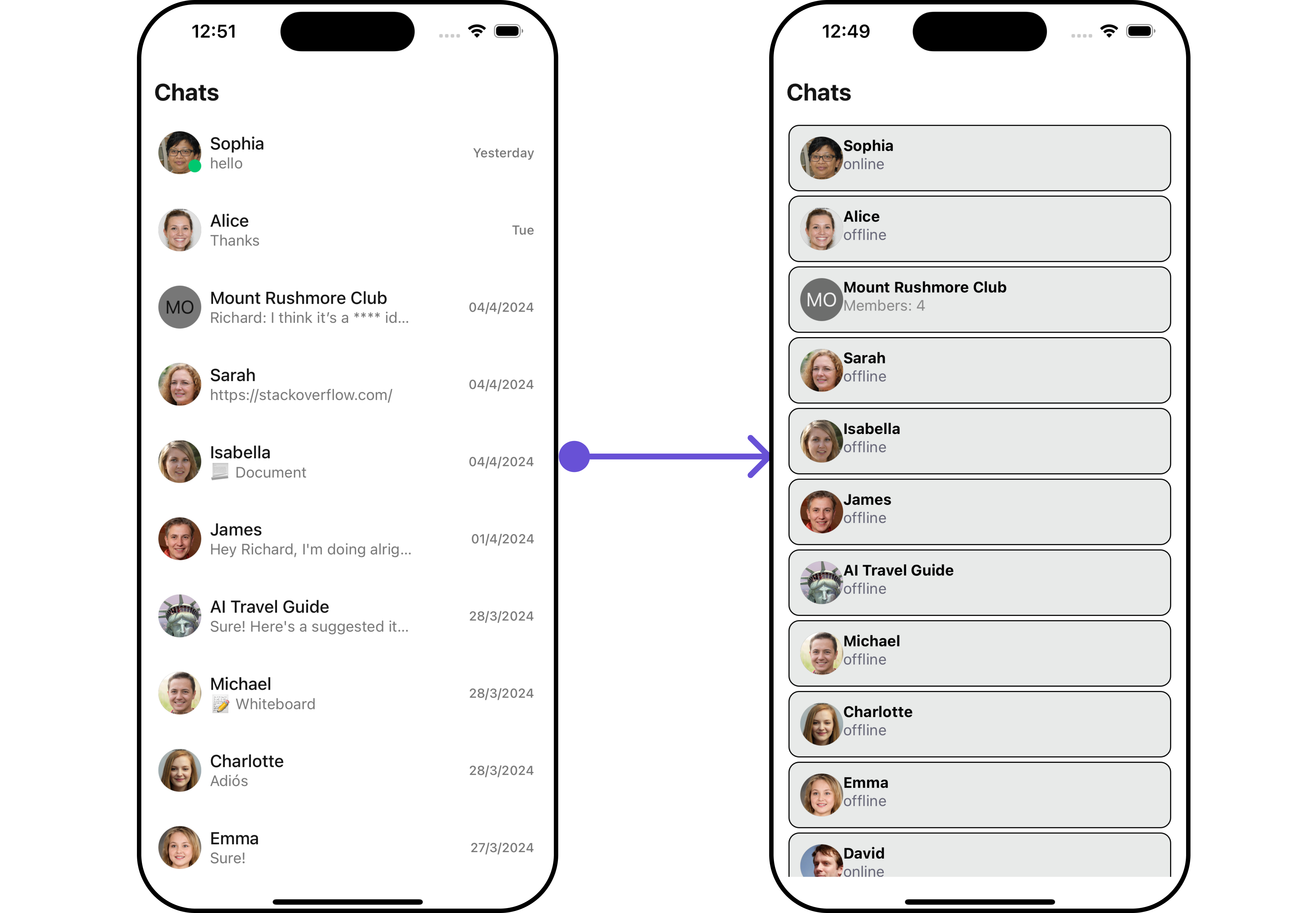
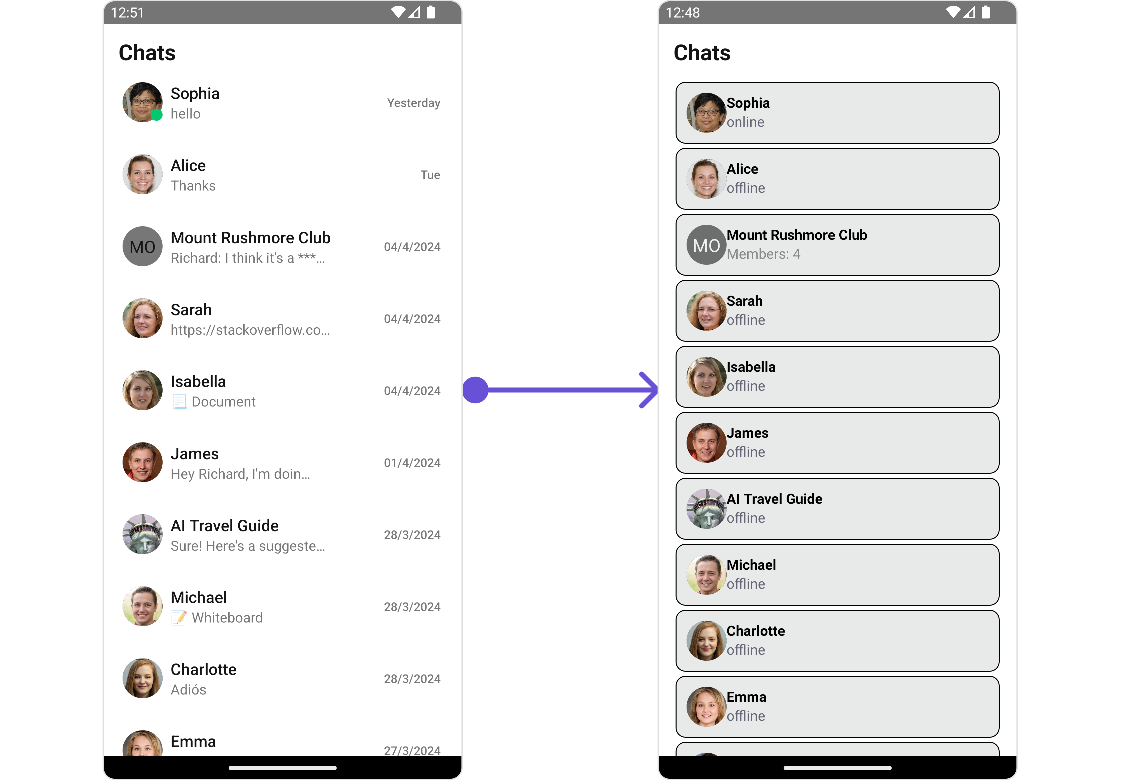 You can customize the appearance of each list item by modifying the `getListItemView` function as follows:
```ts theme={null}
const viewStyle: StyleProp = {
flex: 1,
flexDirection: 'row',
alignItems: 'flex-start',
padding: 10,
borderColor: 'black',
borderWidth: 1,
backgroundColor: '#E8EAE9',
borderRadius: 10,
margin: 2
}
const getListItemView = (conversation: CometChat.Conversation) => {
const conversationWith = conversation.getConversationWith();
if (conversationWith instanceof CometChat.User) {
return (
{conversationWith.getName()}
{conversationWith.getStatus()}
);
} else if (conversationWith instanceof CometChat.Group) {
return (
{conversationWith.getName()}
Members: {conversationWith.getMembersCount()}
);
} else {
return Unknown conversation type;
}
};
```
***
#### TextFormatters
Assigns the list of text formatters. If the provided list is not null, it sets the list. Otherwise, it assigns the default text formatters retrieved from the data source. To configure the existing Mentions look and feel check out [CometChatMentionsFormatter](/ui-kit/react-native/v4/mentions-formatter-guide)
```ts theme={null}
import { CometChat } from "@cometchat/chat-sdk-react-native";
import { CometChatTextFormatter, SuggestionItem } from "@cometchat/chat-uikit-react-native";
export class ShortCutFormatter extends CometChatTextFormatter {
constructor() {
super();
this.trackCharacter = "!";
}
search = (searchKey: string) => {
let data: Array = [];
CometChat.callExtension('message-shortcuts', 'GET', 'v1/fetch', undefined)
.then((data : any) => {
if (data && data?.shortcuts) {
let suggestionData = Object.keys(data.shortcuts).map((key) => {
return new SuggestionItem({
id: key,
name: data.shortcuts[key],
promptText: data.shortcuts[key],
trackingCharacter: '!',
underlyingText: data.shortcuts[key],
})
});
this.setSearchData(suggestionData); // setting data in setSearchData();
}
})
.catch(error => {
// Some error occured
});
this.setSearchData(data)
}
// return null in fetchNext, if there's no pagination.
fetchNext = () => {
return null;
}
}
```
```tsx theme={null}
import React from "react";
import { CometChat } from '@cometchat/chat-sdk-react-native';
import { CometChatConversations } from '@cometchat/chat-uikit-react-native';
import { ShortCutFormatter } from './ShortcutsTextFormatter';
function App(): React.JSX.Element {
const [chatUser, setChatUser] = React.useState();
React.useEffect(() => {
CometChat.getUser("uid").then((user) => {
setChatUser(user);
})
}, []);
const shortcutFormatter = new ShortCutFormatter();
return (
);
}
```
***
#### AppBarOptions
You can set the Custom AppBar Options to add more options to the Conversations component.
```ts theme={null}
const getAppBarOptions = () =>{
//custom app bar options
}
;
```
Demonstration
You can customize the appearance of each list item by modifying the `getListItemView` function as follows:
```ts theme={null}
const viewStyle: StyleProp = {
flex: 1,
flexDirection: 'row',
alignItems: 'flex-start',
padding: 10,
borderColor: 'black',
borderWidth: 1,
backgroundColor: '#E8EAE9',
borderRadius: 10,
margin: 2
}
const getListItemView = (conversation: CometChat.Conversation) => {
const conversationWith = conversation.getConversationWith();
if (conversationWith instanceof CometChat.User) {
return (
{conversationWith.getName()}
{conversationWith.getStatus()}
);
} else if (conversationWith instanceof CometChat.Group) {
return (
{conversationWith.getName()}
Members: {conversationWith.getMembersCount()}
);
} else {
return Unknown conversation type;
}
};
```
***
#### TextFormatters
Assigns the list of text formatters. If the provided list is not null, it sets the list. Otherwise, it assigns the default text formatters retrieved from the data source. To configure the existing Mentions look and feel check out [CometChatMentionsFormatter](/ui-kit/react-native/v4/mentions-formatter-guide)
```ts theme={null}
import { CometChat } from "@cometchat/chat-sdk-react-native";
import { CometChatTextFormatter, SuggestionItem } from "@cometchat/chat-uikit-react-native";
export class ShortCutFormatter extends CometChatTextFormatter {
constructor() {
super();
this.trackCharacter = "!";
}
search = (searchKey: string) => {
let data: Array = [];
CometChat.callExtension('message-shortcuts', 'GET', 'v1/fetch', undefined)
.then((data : any) => {
if (data && data?.shortcuts) {
let suggestionData = Object.keys(data.shortcuts).map((key) => {
return new SuggestionItem({
id: key,
name: data.shortcuts[key],
promptText: data.shortcuts[key],
trackingCharacter: '!',
underlyingText: data.shortcuts[key],
})
});
this.setSearchData(suggestionData); // setting data in setSearchData();
}
})
.catch(error => {
// Some error occured
});
this.setSearchData(data)
}
// return null in fetchNext, if there's no pagination.
fetchNext = () => {
return null;
}
}
```
```tsx theme={null}
import React from "react";
import { CometChat } from '@cometchat/chat-sdk-react-native';
import { CometChatConversations } from '@cometchat/chat-uikit-react-native';
import { ShortCutFormatter } from './ShortcutsTextFormatter';
function App(): React.JSX.Element {
const [chatUser, setChatUser] = React.useState();
React.useEffect(() => {
CometChat.getUser("uid").then((user) => {
setChatUser(user);
})
}, []);
const shortcutFormatter = new ShortCutFormatter();
return (
);
}
```
***
#### AppBarOptions
You can set the Custom AppBar Options to add more options to the Conversations component.
```ts theme={null}
const getAppBarOptions = () =>{
//custom app bar options
}
;
```
Demonstration
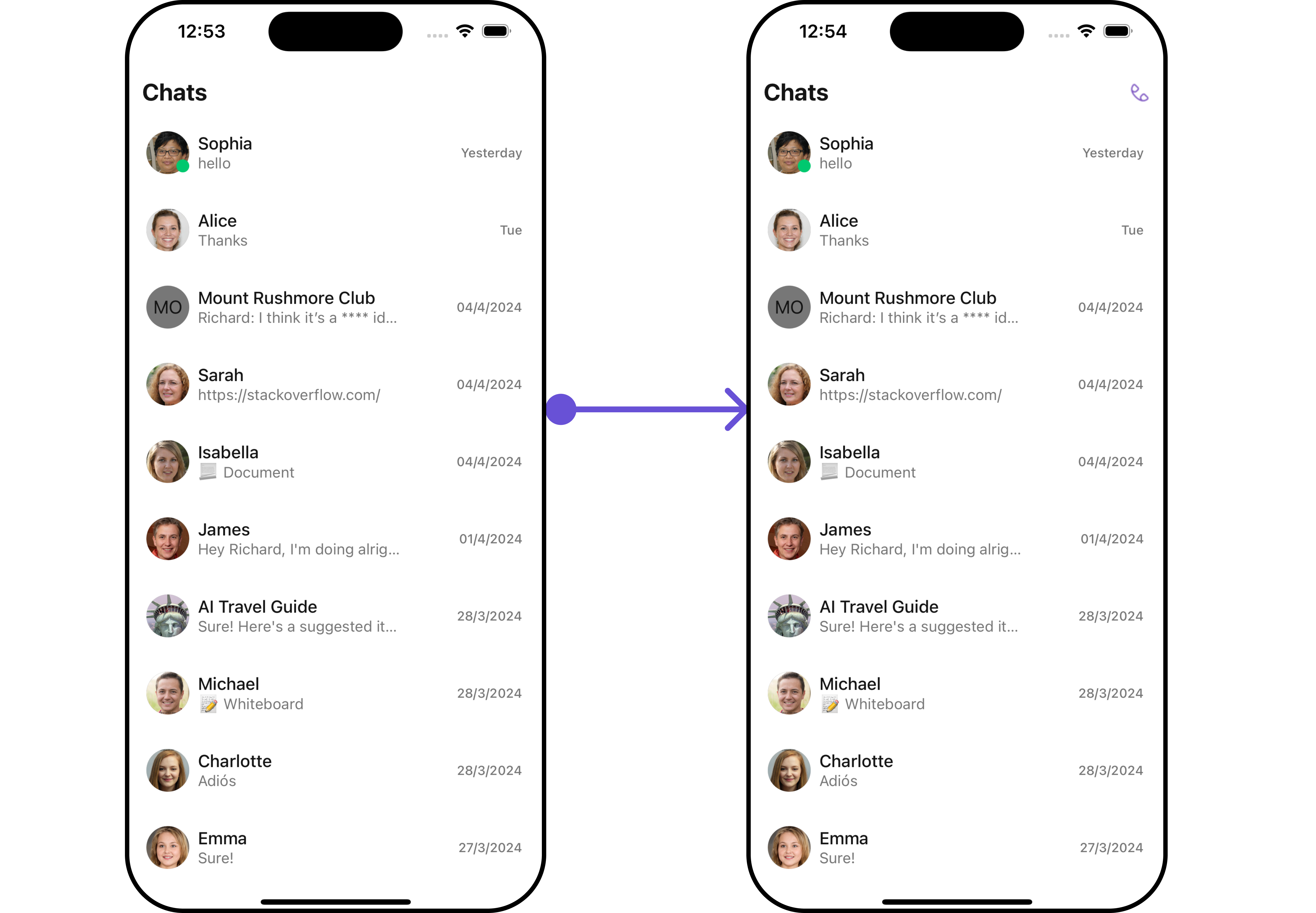
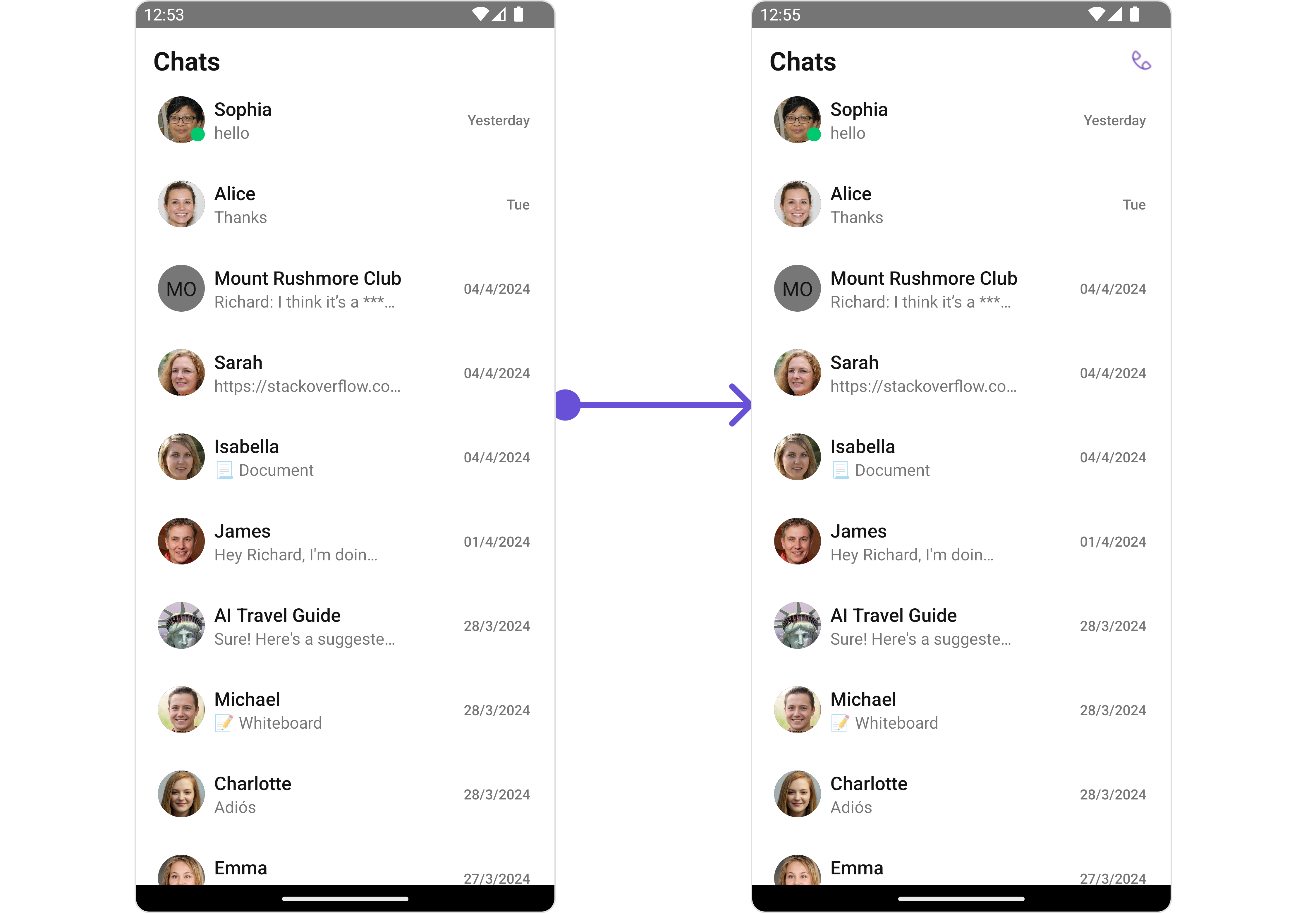 You can customize the menu by modifying the `getAppBarOptions` function as follows:
```ts theme={null}
import { CometChatConversations, CometChatCallLogsWithDetails, CallLogsConfiguration } from '@cometchat/chat-uikit-react-native';
import Call from "./Call.png";
const [showCallLogs, setShowCallLogs] = useState(false);
const callLogsConfiguration = new CallLogsConfiguration({
showBackButton: true,
onBack: () => {
setShowCallLogs(false);
}
}) ;
function toggleShowCallLogs() {
setShowCallLogs(true);
}
const getAppBarOptions = () => {
return (
);
};
return(
{!showCallLogs &&
}
{showCallLogs && }
);
```
***
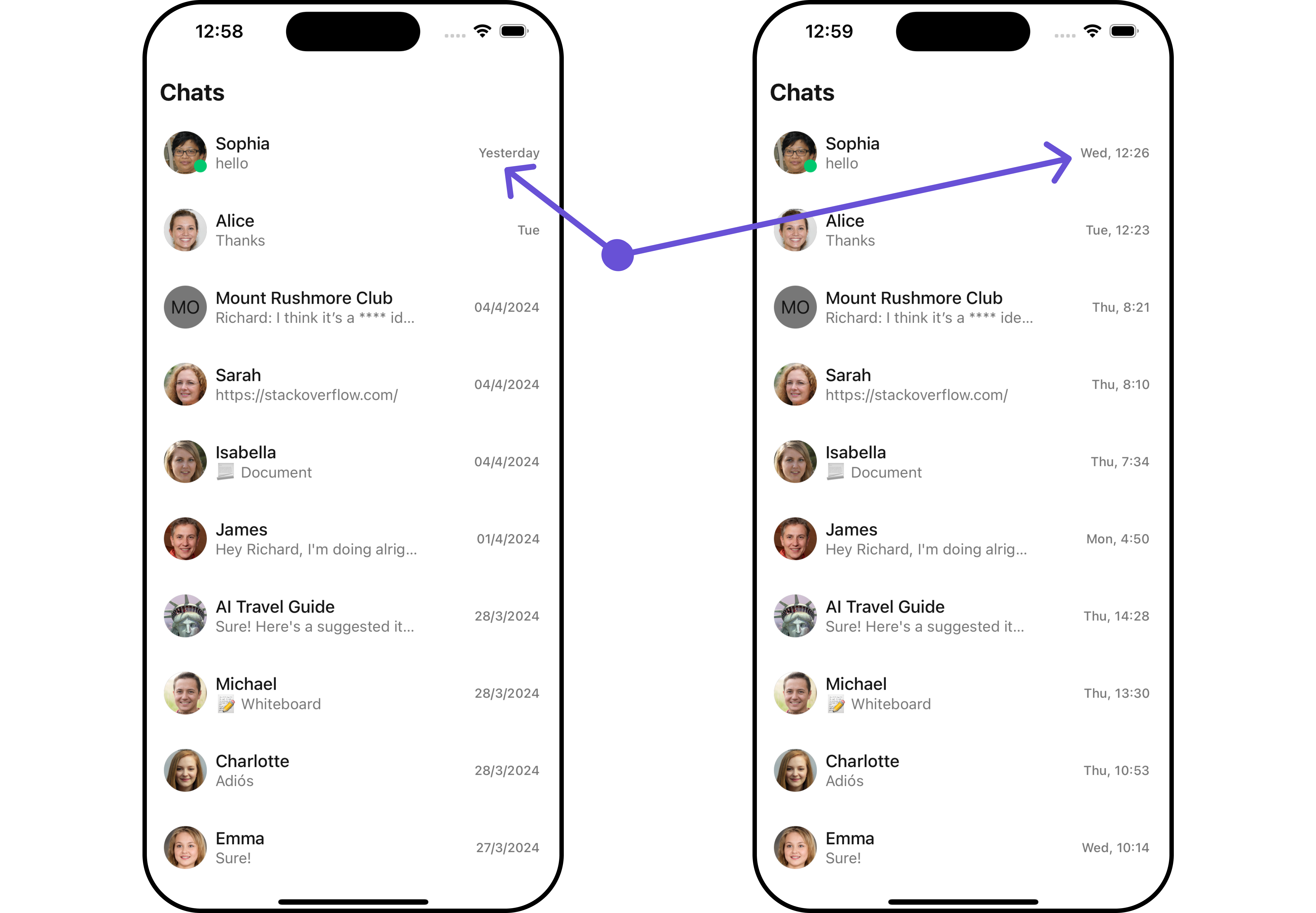
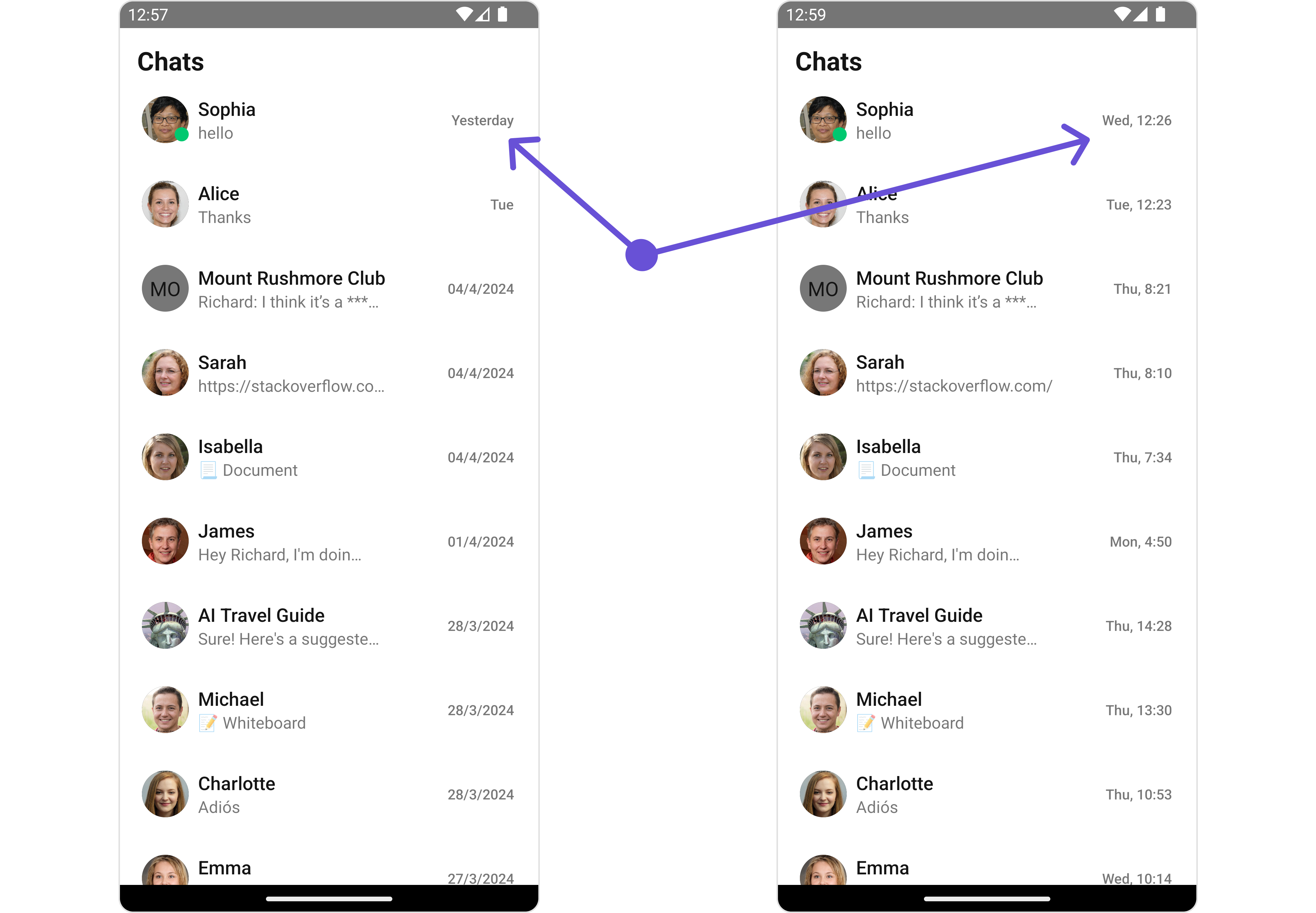
#### DatePattern
You can modify the date pattern to your requirement using DatePattern. datePattern formats date and time values according to a predefined standard, enhancing consistency and clarity in their presentation.
```tsx theme={null}
import { CometChatConversations, CometChatConversationUtils} from '@cometchat/chat-uikit-react-native';
import { CometChat } from '@cometchat/chat-sdk-react-native';
const generateDateString = (conversation: CometChat.Conversation) => {
const lastMessage : any = CometChatConversationUtils.getLastMessage(conversation);
const conversationWith : any = conversation.getConversationWith();
const days = ["Sunday", "Monday", "Tuesday", "Wednesday", "Thursday", "Friday", "Saturday"];
const timeStamp = (lastMessage && lastMessage['updatedAt']) || conversationWith['createdAt'] || conversationWith['lastActiveAt'];
let timeStampInSeconds = new Date(timeStamp * 1000);
const day = days[timeStampInSeconds.getUTCDay()].substring(0, 3);
const hours = timeStampInSeconds.getUTCHours();
const minutes = String(timeStampInSeconds.getUTCMinutes()).padStart(2, '0');
return `${day}, ${hours}:${minutes}`;
}
return (
);
```
Demonstration
You can customize the menu by modifying the `getAppBarOptions` function as follows:
```ts theme={null}
import { CometChatConversations, CometChatCallLogsWithDetails, CallLogsConfiguration } from '@cometchat/chat-uikit-react-native';
import Call from "./Call.png";
const [showCallLogs, setShowCallLogs] = useState(false);
const callLogsConfiguration = new CallLogsConfiguration({
showBackButton: true,
onBack: () => {
setShowCallLogs(false);
}
}) ;
function toggleShowCallLogs() {
setShowCallLogs(true);
}
const getAppBarOptions = () => {
return (
);
};
return(
{!showCallLogs &&
}
{showCallLogs && }
);
```
***
#### DatePattern
You can modify the date pattern to your requirement using DatePattern. datePattern formats date and time values according to a predefined standard, enhancing consistency and clarity in their presentation.
```tsx theme={null}
import { CometChatConversations, CometChatConversationUtils} from '@cometchat/chat-uikit-react-native';
import { CometChat } from '@cometchat/chat-sdk-react-native';
const generateDateString = (conversation: CometChat.Conversation) => {
const lastMessage : any = CometChatConversationUtils.getLastMessage(conversation);
const conversationWith : any = conversation.getConversationWith();
const days = ["Sunday", "Monday", "Tuesday", "Wednesday", "Thursday", "Friday", "Saturday"];
const timeStamp = (lastMessage && lastMessage['updatedAt']) || conversationWith['createdAt'] || conversationWith['lastActiveAt'];
let timeStampInSeconds = new Date(timeStamp * 1000);
const day = days[timeStampInSeconds.getUTCDay()].substring(0, 3);
const hours = timeStampInSeconds.getUTCHours();
const minutes = String(timeStampInSeconds.getUTCMinutes()).padStart(2, '0');
return `${day}, ${hours}:${minutes}`;
}
return (
);
```
Demonstration
 #### Subtitle View
You can customize the subtitle view for each conversation item to meet your requirements
```tsx theme={null}
const getSubtitleView = (conversation: CometChat.Conversation) =>{
//custom subtitle view
}
return(
)
```
Demonstration
#### Subtitle View
You can customize the subtitle view for each conversation item to meet your requirements
```tsx theme={null}
const getSubtitleView = (conversation: CometChat.Conversation) =>{
//custom subtitle view
}
return(
)
```
Demonstration
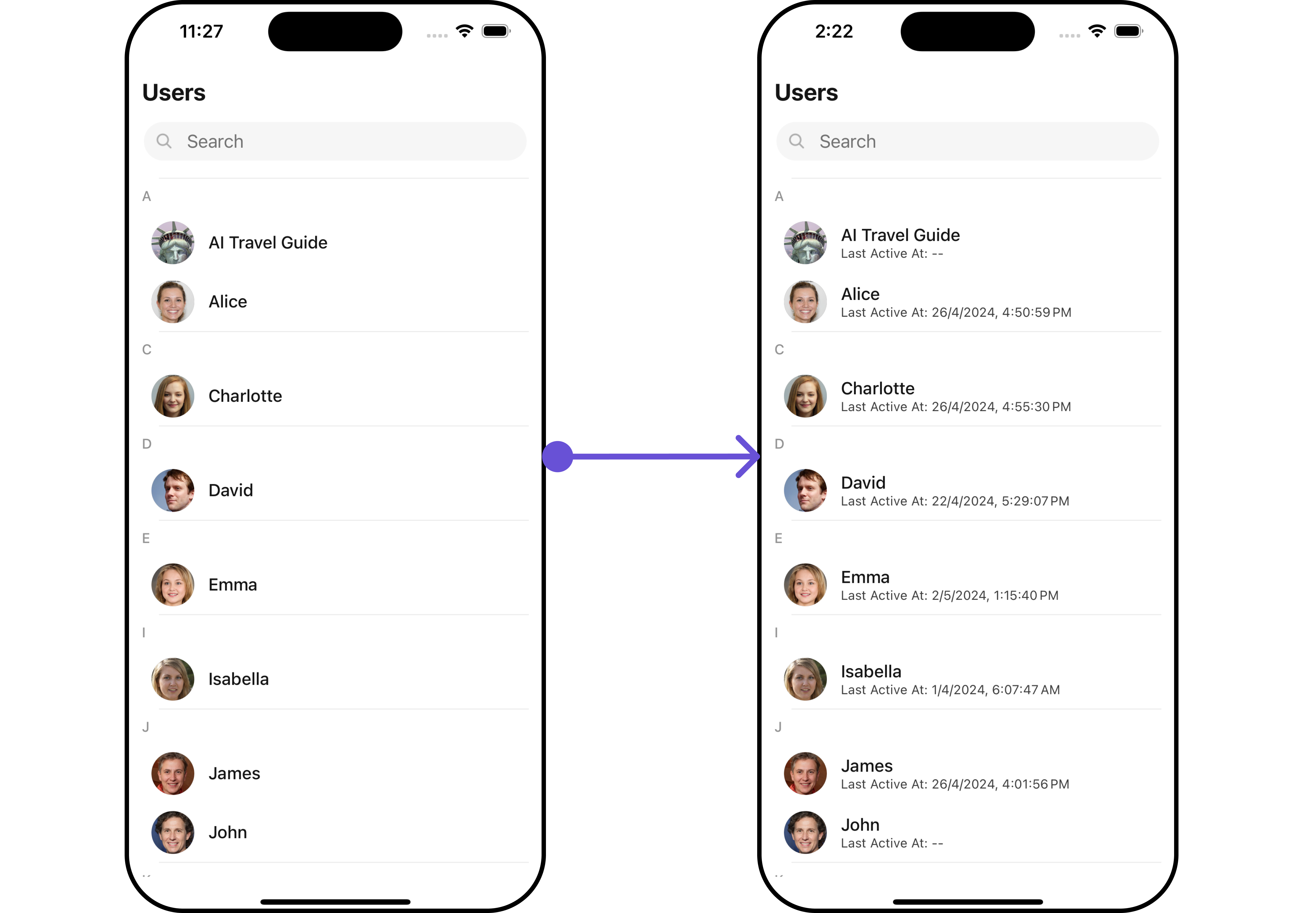
 You can customize the subtitle view by modifying the `getSubtitleView` function as follows:
```tsx theme={null}
import { CometChat } from '@cometchat/chat-sdk-react-native';
const getSubtitleView = (conversation: CometChat.Conversation) => {
const conversationWith: any = conversation.getConversationWith();
if (conversationWith instanceof CometChat.User) {
return (
Last Active At:{' '}
{conversationWith.getLastActiveAt()
? formatTime(conversationWith.getLastActiveAt())
: '--'}
);
} else if (conversationWith instanceof CometChat.Group) {
return (
Created At: {formatTime(conversationWith.getCreatedAt())}
);
} else {
return (
Click To View Chat
);
}
};
```
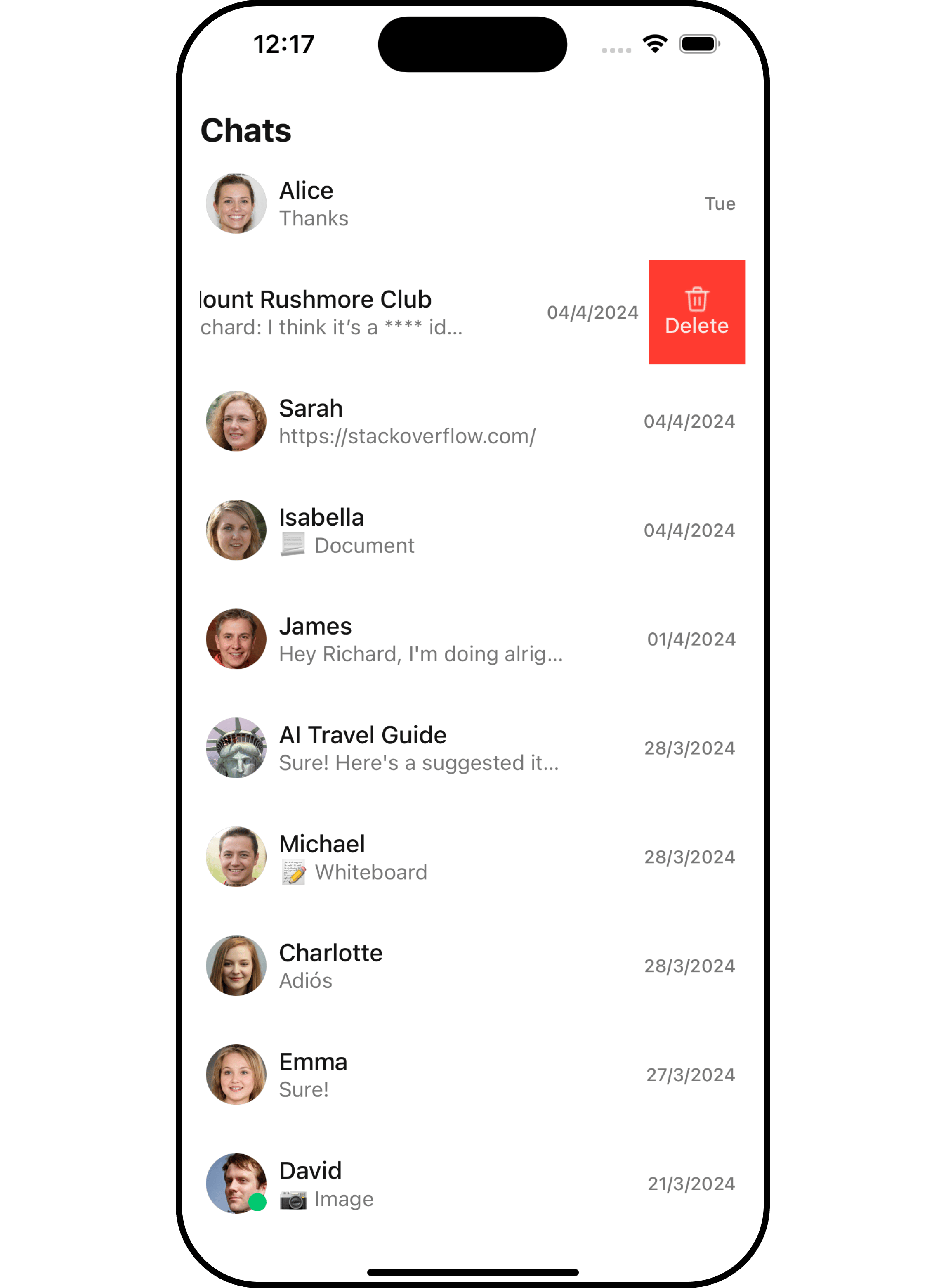
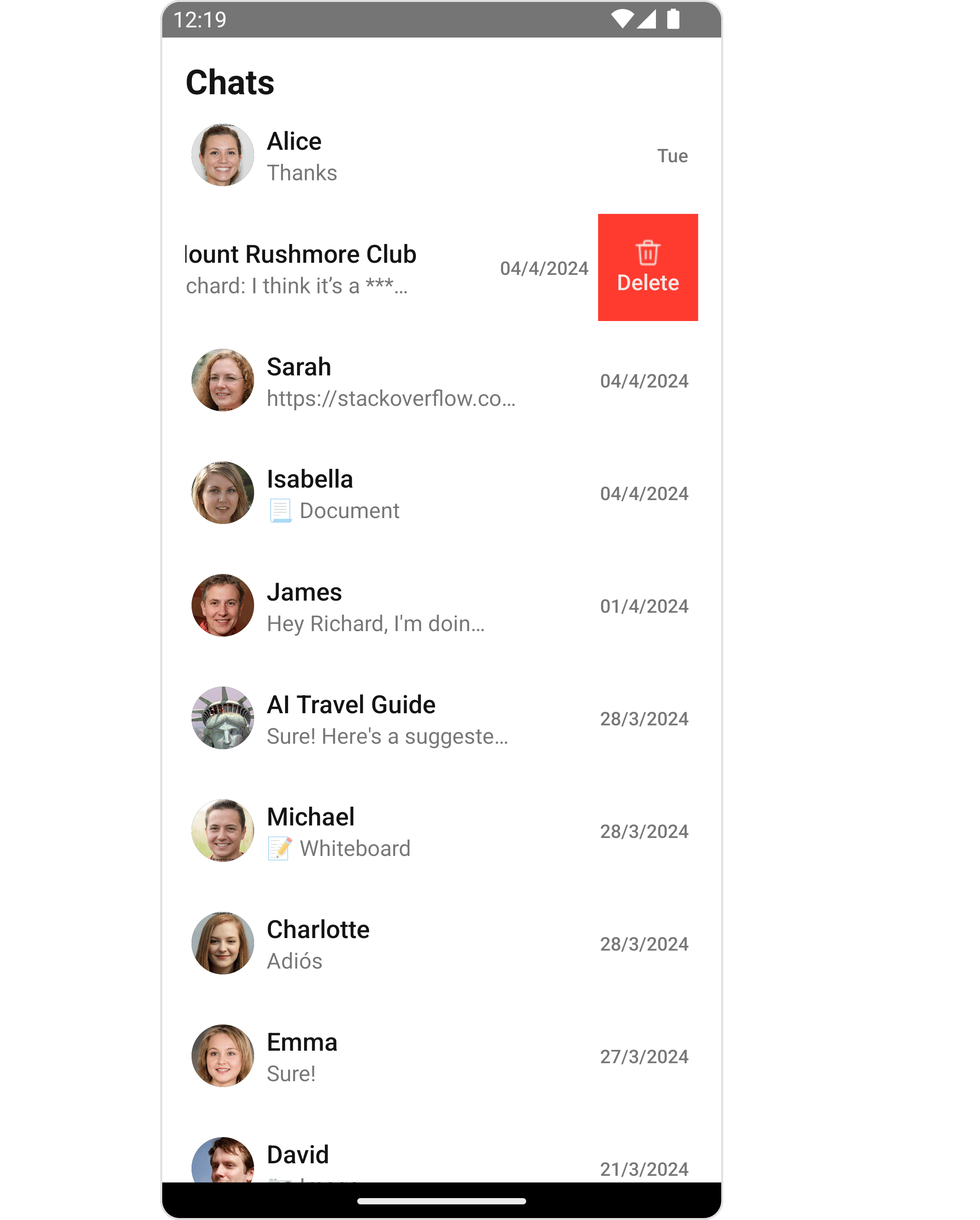
#### Swipe Options
This prop will add the array of options on swipe to perform actions on Conversation.
| Name | Type | Description |
| -------- | ----------------------------------------------------- | ------------------------------------------------------------------------------------ |
| options? | (item: CometChat.Conversation) => CometChatOptions\[] | This prop will add the array of options on swipe to perform actions on Conversation. |
##### Structure of CometChatOptions
| Name | Type | Description |
| --------------- | ------------------------- | --------------------------------------------------------------------------------------------- |
| id | String | Unique identifier for the option |
| title | String | A text to display below the icon |
| icon | ImageType | A image to display for the option |
| titleStyle | CometChatOptionTitleStyle | Defines the style for the title containing color, fontWeight, fontSize, fontFamily properties |
| iconTint | string | Defines the colour for the icon |
| backgroundColor | string | Defines the colour for the option |
| onPress | Function | The action to perform when user clicks on option |
Demonstration
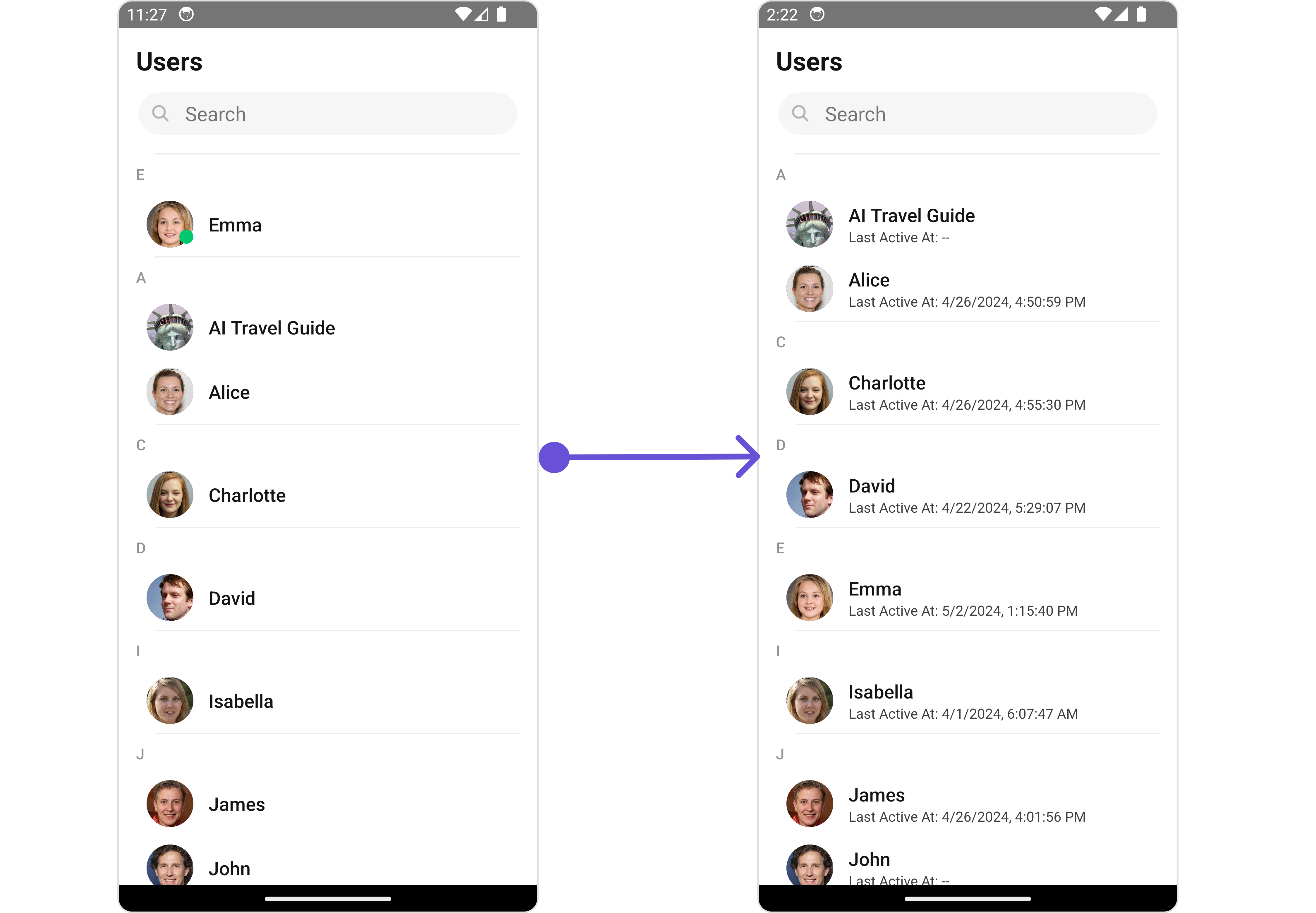
You can customize the subtitle view by modifying the `getSubtitleView` function as follows:
```tsx theme={null}
import { CometChat } from '@cometchat/chat-sdk-react-native';
const getSubtitleView = (conversation: CometChat.Conversation) => {
const conversationWith: any = conversation.getConversationWith();
if (conversationWith instanceof CometChat.User) {
return (
Last Active At:{' '}
{conversationWith.getLastActiveAt()
? formatTime(conversationWith.getLastActiveAt())
: '--'}
);
} else if (conversationWith instanceof CometChat.Group) {
return (
Created At: {formatTime(conversationWith.getCreatedAt())}
);
} else {
return (
Click To View Chat
);
}
};
```
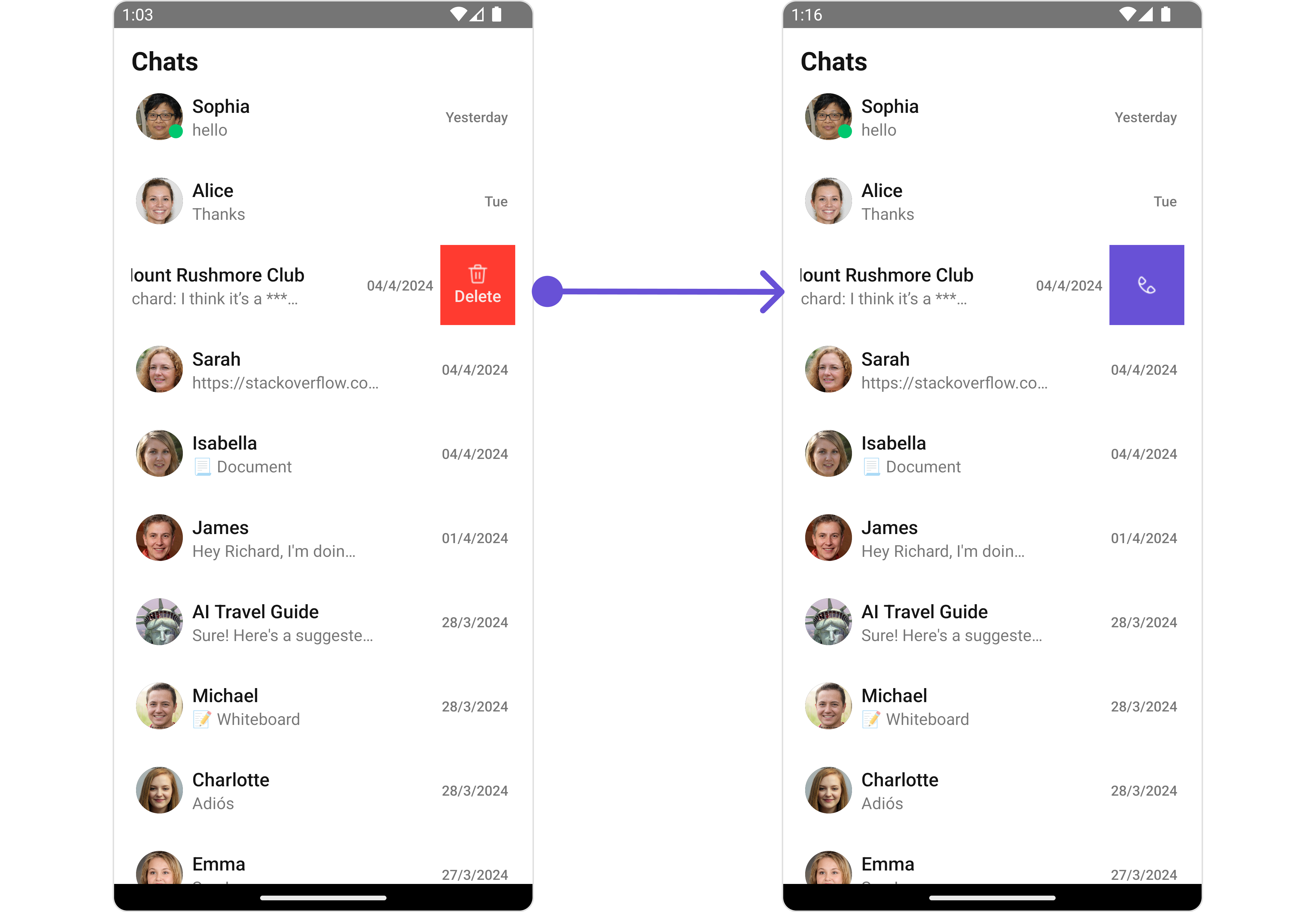
#### Swipe Options
This prop will add the array of options on swipe to perform actions on Conversation.
| Name | Type | Description |
| -------- | ----------------------------------------------------- | ------------------------------------------------------------------------------------ |
| options? | (item: CometChat.Conversation) => CometChatOptions\[] | This prop will add the array of options on swipe to perform actions on Conversation. |
##### Structure of CometChatOptions
| Name | Type | Description |
| --------------- | ------------------------- | --------------------------------------------------------------------------------------------- |
| id | String | Unique identifier for the option |
| title | String | A text to display below the icon |
| icon | ImageType | A image to display for the option |
| titleStyle | CometChatOptionTitleStyle | Defines the style for the title containing color, fontWeight, fontSize, fontFamily properties |
| iconTint | string | Defines the colour for the icon |
| backgroundColor | string | Defines the colour for the option |
| onPress | Function | The action to perform when user clicks on option |
Demonstration
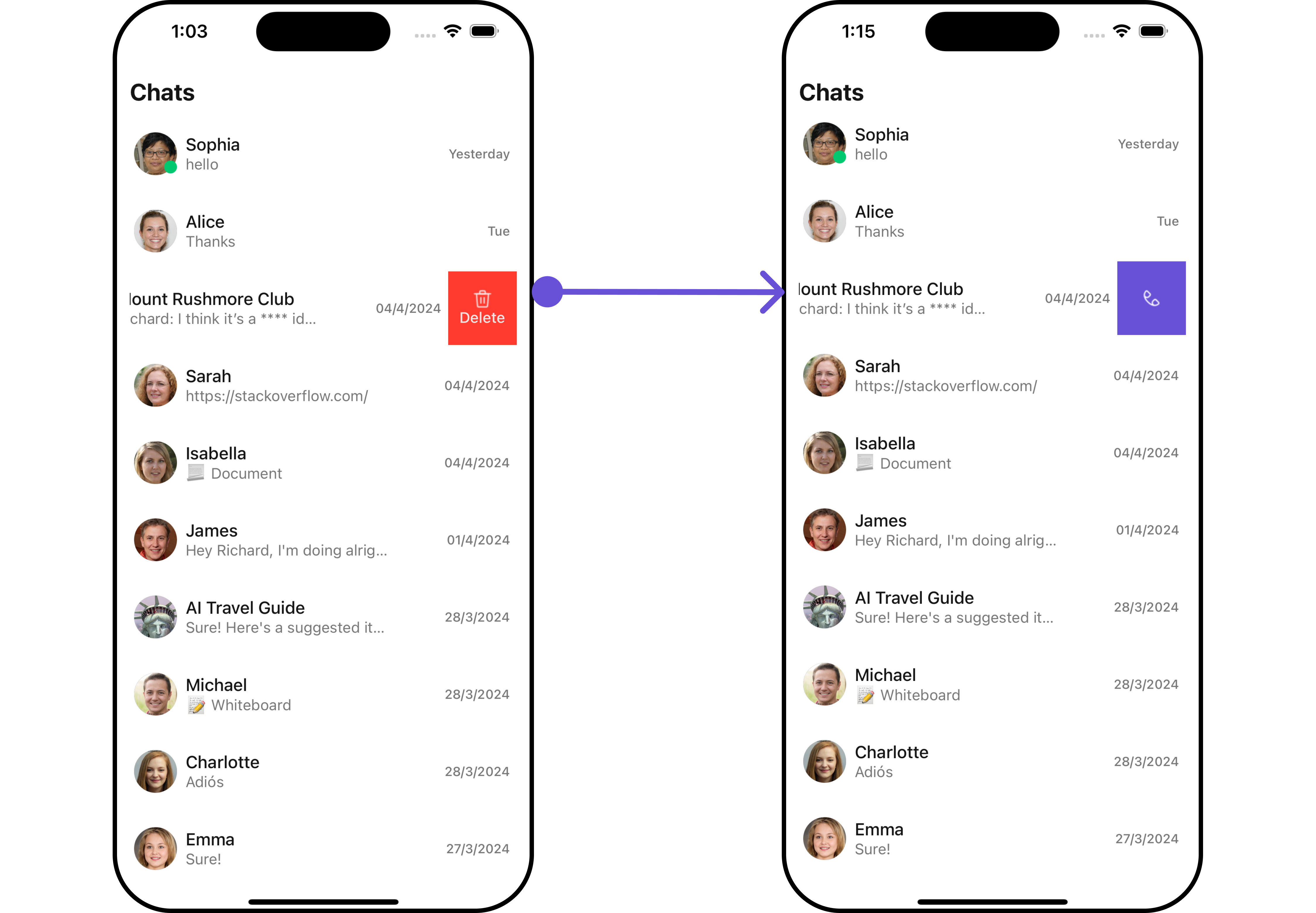
 ```ts theme={null}
import { CometChatConversations} from '@cometchat/chat-uikit-react-native';
import Call from './Call.png';
{
const customOptions = [
{
id: "1",
//title: "Call",
icon: Call,
iconTint: "white",
backgroundColor: "#6851D6",
onPress: () => {
//code
},
},
];
return customOptions;
}}
/>
```
***
#### Loading State View
You can set a custom loader view using `LoadingStateView` to match the loading view of your app.
```ts theme={null}
const getLoadingStateView = () =>{
//your custom loading view
}
```
Demonstration
```ts theme={null}
import { CometChatConversations} from '@cometchat/chat-uikit-react-native';
import Call from './Call.png';
{
const customOptions = [
{
id: "1",
//title: "Call",
icon: Call,
iconTint: "white",
backgroundColor: "#6851D6",
onPress: () => {
//code
},
},
];
return customOptions;
}}
/>
```
***
#### Loading State View
You can set a custom loader view using `LoadingStateView` to match the loading view of your app.
```ts theme={null}
const getLoadingStateView = () =>{
//your custom loading view
}
```
Demonstration
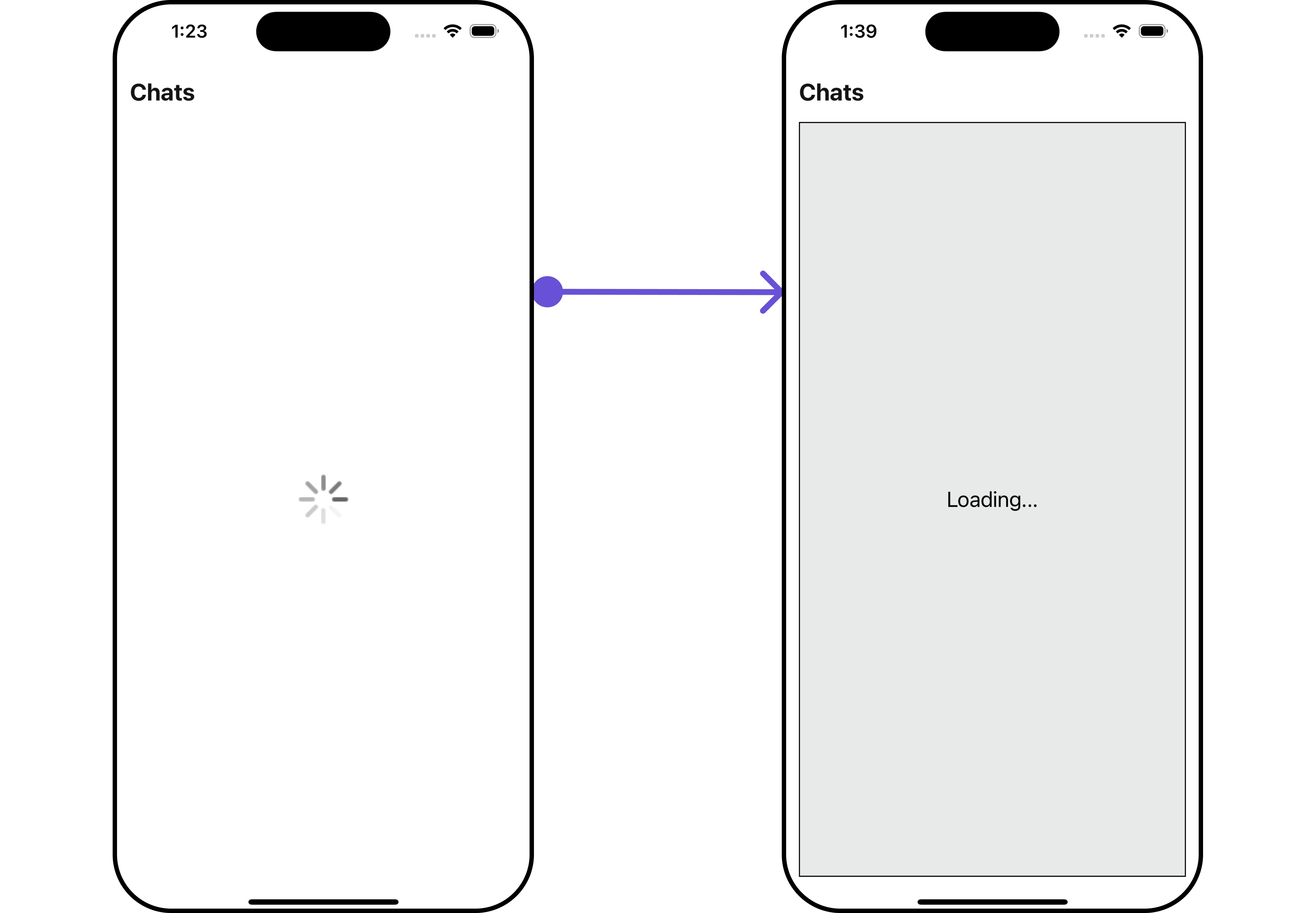
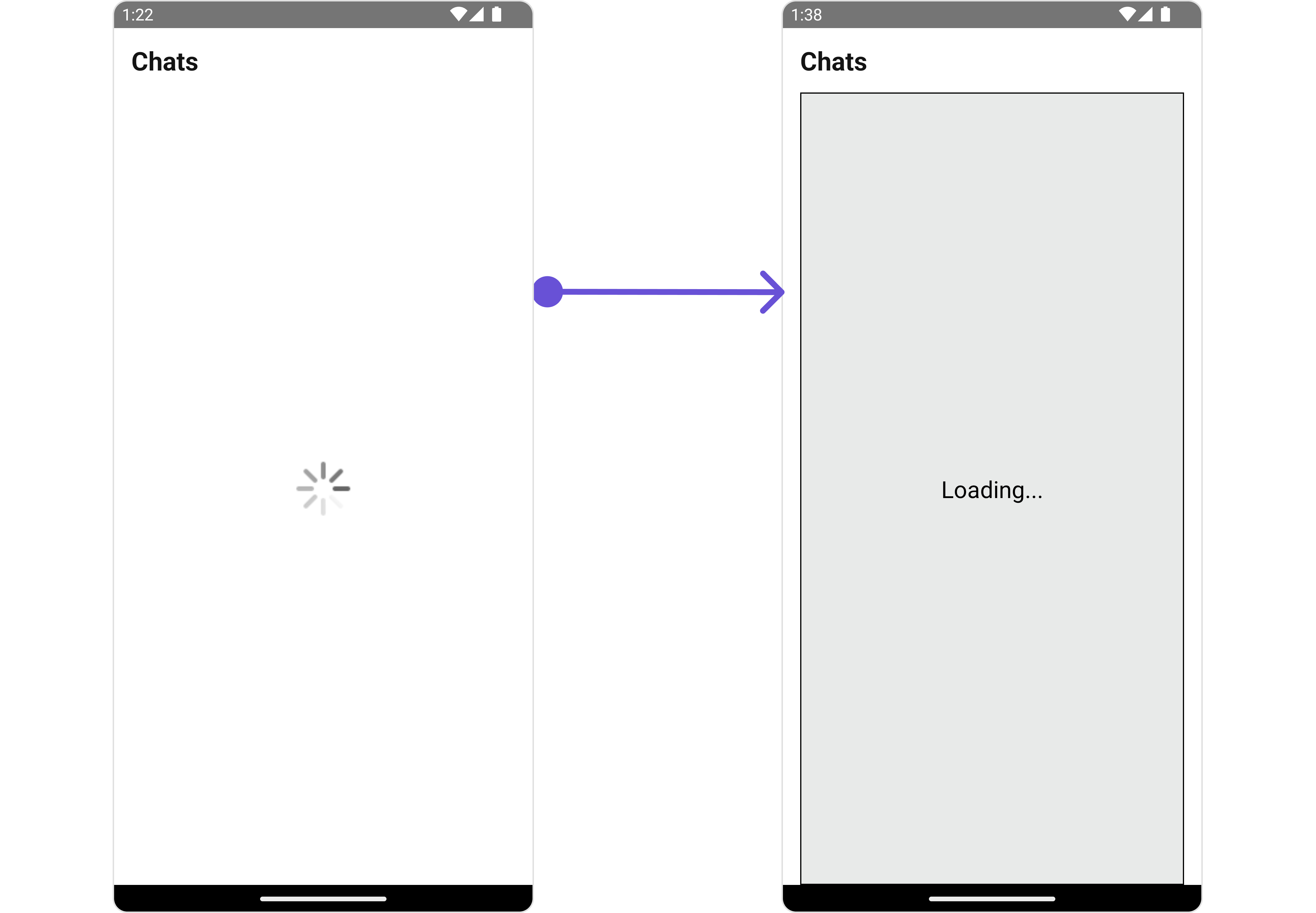 You can customize the loading state view by modifying the `getLoadingStateView` function as follows:
```tsx theme={null}
const loadingViewStyle: StyleProp = {
flex: 1,
alignItems: 'center',
justifyContent: 'center',
padding: 10,
borderColor: 'black',
borderWidth: 1,
backgroundColor: '#E8EAE9',
};
const getLoadingStateView = () => {
return (
Loading...
);
};
```
You can customize the loading state view by modifying the `getLoadingStateView` function as follows:
```tsx theme={null}
const loadingViewStyle: StyleProp = {
flex: 1,
alignItems: 'center',
justifyContent: 'center',
padding: 10,
borderColor: 'black',
borderWidth: 1,
backgroundColor: '#E8EAE9',
};
const getLoadingStateView = () => {
return (
Loading...
);
};
```