> ## Documentation Index
> Fetch the complete documentation index at: https://cometchat-22654f5b-docs-rn-guide-message-privately.mintlify.site/llms.txt
> Use this file to discover all available pages before exploring further.
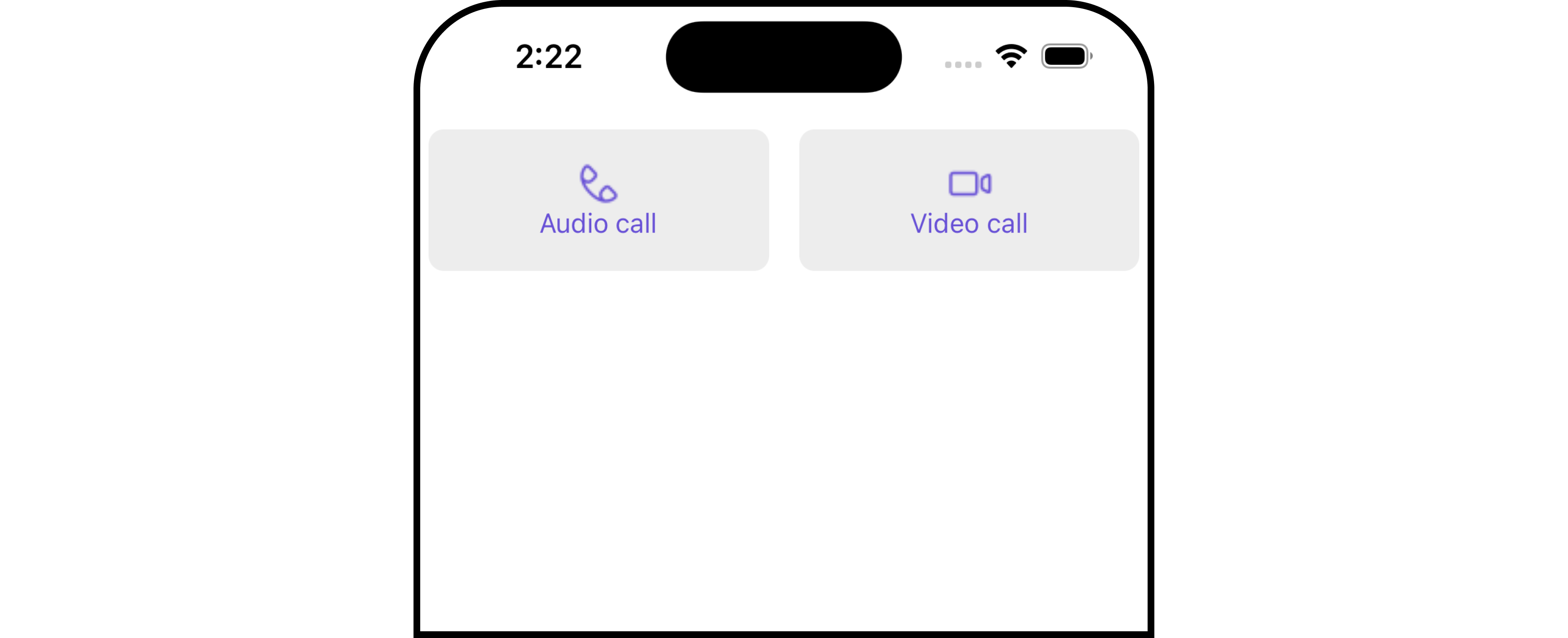
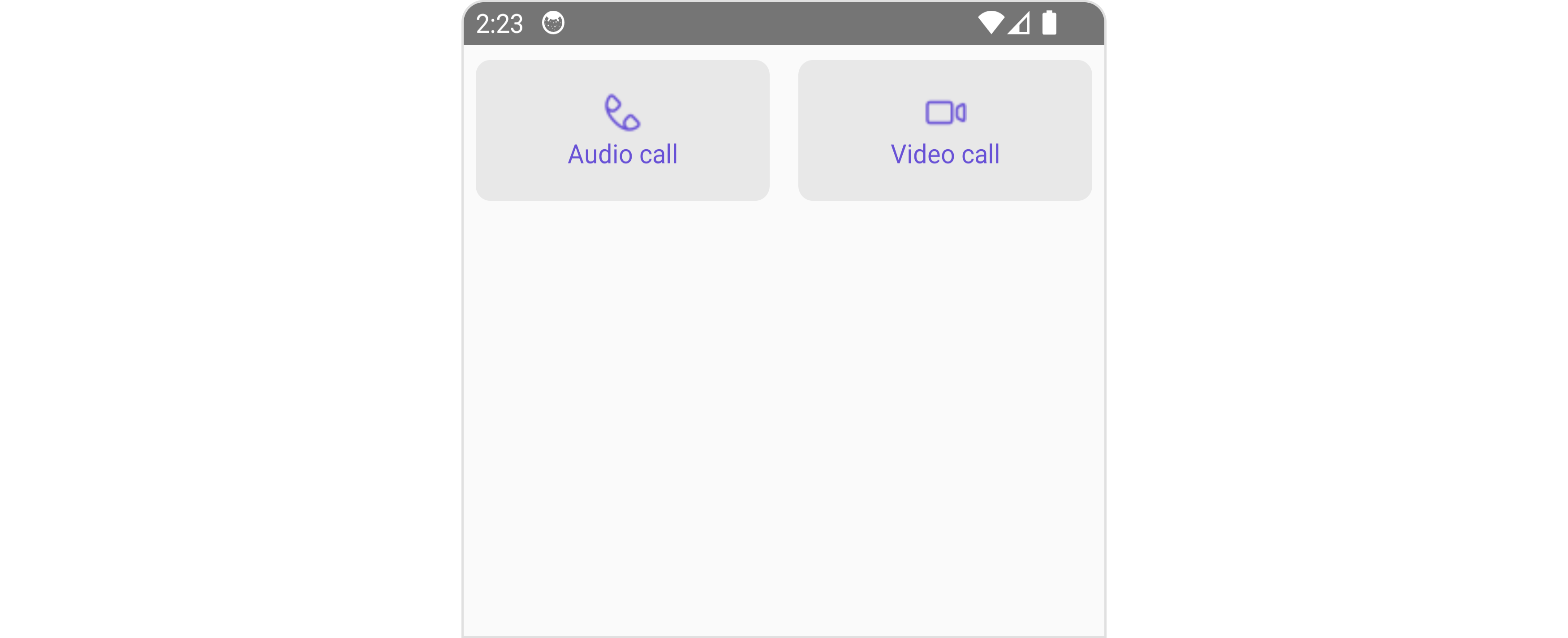
# Call Buttons
> Call Buttons — CometChat documentation.
## Overview
The `Call Button` is a [Component](/ui-kit/react-native/v4/components-overview#components) provides users with the ability to make calls, access call-related functionalities, and control call settings. Clicking this button typically triggers the call to be placed to the desired recipient.
 ## Usage
### Integration
```tsx theme={null}
import {CometChat} from '@cometchat/chat-sdk-react-native';
import { CometChatCallButtons } from '@cometchat/chat-uikit-react-native';
function App(): React.JSX.Element {
const [user, setUser] = useState(undefined);
const getUser = async () => {
const user = await CometChat.getUser('uid');
setUser(user);
};
useEffect(() => {
//login
getUser();
}, []);
return (
{ user &&
}
);
}
```
### Actions
[Actions](/ui-kit/react-native/v4/components-overview#actions) dictate how a component functions. They are divided into two types: Predefined and User-defined. You can override either type, allowing you to tailor the behavior of the component to fit your specific needs.
##### 1. onVoiceCallPress
`onVoiceCallPress` is triggered when you click the voice call button of the `Call Buttons` component. You can override this action using the following code snippet.
```tsx theme={null}
import {CometChat} from '@cometchat/chat-sdk-react-native';
import { CometChatCallButtons } from '@cometchat/chat-uikit-react-native';
function App(): React.JSX.Element {
const [user, setUser] = useState(undefined);
const getUser = async () => {
const user = await CometChat.getUser('uid');
setUser(user);
};
useEffect(() => {
//login
getUser();
}, []);
const onVoiceCallPressHandler = ({user, group}: {user?: CometChat.User | undefined,
group?: CometChat.Group | undefined }
) => {
//code
}
return (
{ user &&
}
);
}
```
##### 2. onVideoCallClick
`onVideoCallClick` is triggered when you click the video call button of the `Call Buttons` component. You can override this action using the following code snippet.
```tsx theme={null}
import {CometChat} from '@cometchat/chat-sdk-react-native';
import { CometChatCallButtons } from '@cometchat/chat-uikit-react-native';
function App(): React.JSX.Element {
const [user, setUser] = useState(undefined);
const getUser = async () => {
const user = await CometChat.getUser('uid');
setUser(user);
};
useEffect(() => {
//login
getUser();
}, []);
const onVideoCallPressHandler = ({user, group}: {user?: CometChat.User | undefined,
group?: CometChat.Group | undefined }
) => {
//code
}
return (
{ user &&
}
);
}
```
##### 3. onError
This action doesn't change the behavior of the component but rather listens for any errors that occur in the Call Button component.
```tsx theme={null}
import {CometChat} from '@cometchat/chat-sdk-react-native';
import { CometChatCallButtons } from '@cometchat/chat-uikit-react-native';
function App(): React.JSX.Element {
const [user, setUser] = useState(undefined);
const getUser = async () => {
const user = await CometChat.getUser('uid');
setUser(user);
};
useEffect(() => {
//login
getUser();
}, []);
const onErrorHandler = (error: CometChat.CometChatException) => {
//code
}
return (
{ user &&
}
);
}
```
***
### Filters
**Filters** allow you to customize the data displayed in a list within a `Component`. You can filter the list based on your specific criteria, allowing for a more customized. Filters can be applied using `RequestBuilders` of Chat SDK.
The `Call Buttons` component does not have any exposed filters.
***
### Events
[Events](/ui-kit/react-native/v4/components-overview#events) are emitted by a `Component`. By using event you can extend existing functionality. Being global events, they can be applied in Multiple Locations and are capable of being Added or Removed.
The list of events emitted by the `Call Buttons` component is as follows.
| Event | Description |
| ------------------ | ---------------------------------------------------------------------------- |
| **ccCallRejected** | This event is triggered when the initiated call is rejected by the receiver. |
| **ccCallFailled** | This event is triggered when an error occurs during the intiated call. |
| **ccOutgoingCall** | This event is triggered when the user initiates a voice/video call. |
```tsx theme={null}
import { CometChatUIEventHandler } from "@cometchat/chat-uikit-react-native";
CometChatUIEventHandler.addCallListener("CALL_LISTENER_ID", {
ccCallRejected: ({ call }) => {
//code
},
});
CometChatUIEventHandler.addCallListener("CALL_LISTENER_ID", {
ccOutgoingCall: ({ call }) => {
//code
},
});
CometChatUIEventHandler.addCallListener("CALL_LISTENER_ID", {
ccCallFailled: ({ call }) => {
//code
},
});
```
***
```tsx theme={null}
import { CometChatUIEventHandler } from "@cometchat/chat-uikit-react-native";
CometChatUIEventHandler.removeCallListener("CALL_LISTENER_ID");
```
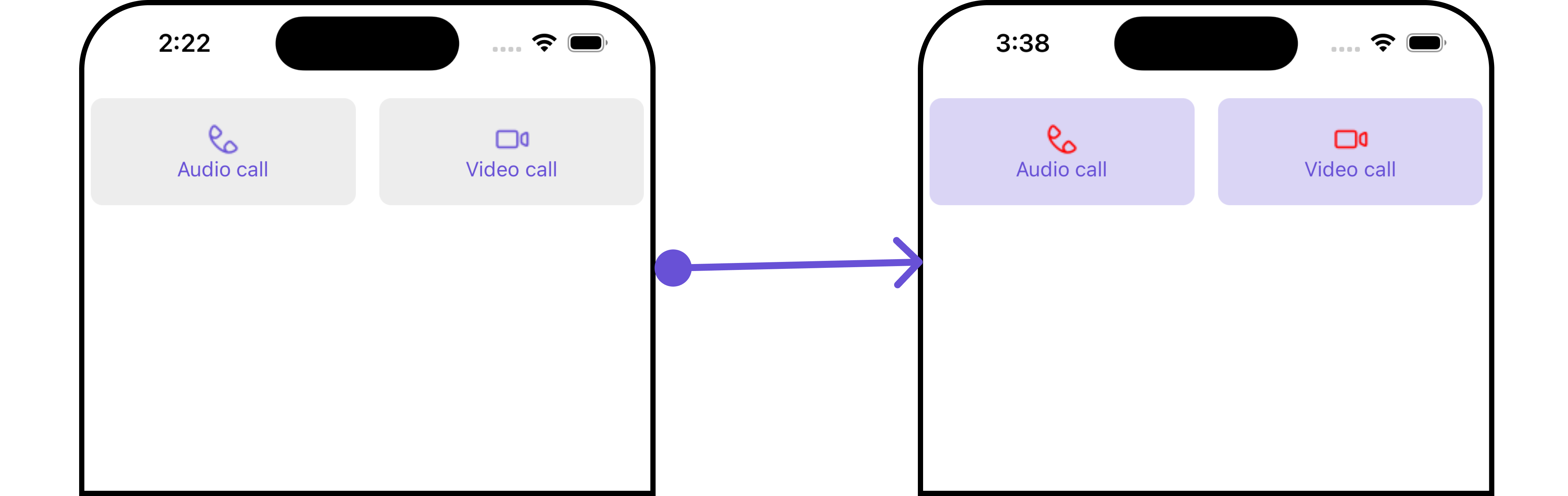
## Customization
To fit your app's design requirements, you can customize the appearance of the Call Buttons component. We provide exposed methods that allow you to modify the experience and behavior according to your specific needs.
### Style
Using Style you can customize the look and feel of the component in your app, These parameters typically control elements such as the color, size, shape, and fonts used within the component.
##### 1. CallButtons Style
To customize the appearance, you can assign a `CallButtonsStyle` object to the `Call Buttons` component.
## Usage
### Integration
```tsx theme={null}
import {CometChat} from '@cometchat/chat-sdk-react-native';
import { CometChatCallButtons } from '@cometchat/chat-uikit-react-native';
function App(): React.JSX.Element {
const [user, setUser] = useState(undefined);
const getUser = async () => {
const user = await CometChat.getUser('uid');
setUser(user);
};
useEffect(() => {
//login
getUser();
}, []);
return (
{ user &&
}
);
}
```
### Actions
[Actions](/ui-kit/react-native/v4/components-overview#actions) dictate how a component functions. They are divided into two types: Predefined and User-defined. You can override either type, allowing you to tailor the behavior of the component to fit your specific needs.
##### 1. onVoiceCallPress
`onVoiceCallPress` is triggered when you click the voice call button of the `Call Buttons` component. You can override this action using the following code snippet.
```tsx theme={null}
import {CometChat} from '@cometchat/chat-sdk-react-native';
import { CometChatCallButtons } from '@cometchat/chat-uikit-react-native';
function App(): React.JSX.Element {
const [user, setUser] = useState(undefined);
const getUser = async () => {
const user = await CometChat.getUser('uid');
setUser(user);
};
useEffect(() => {
//login
getUser();
}, []);
const onVoiceCallPressHandler = ({user, group}: {user?: CometChat.User | undefined,
group?: CometChat.Group | undefined }
) => {
//code
}
return (
{ user &&
}
);
}
```
##### 2. onVideoCallClick
`onVideoCallClick` is triggered when you click the video call button of the `Call Buttons` component. You can override this action using the following code snippet.
```tsx theme={null}
import {CometChat} from '@cometchat/chat-sdk-react-native';
import { CometChatCallButtons } from '@cometchat/chat-uikit-react-native';
function App(): React.JSX.Element {
const [user, setUser] = useState(undefined);
const getUser = async () => {
const user = await CometChat.getUser('uid');
setUser(user);
};
useEffect(() => {
//login
getUser();
}, []);
const onVideoCallPressHandler = ({user, group}: {user?: CometChat.User | undefined,
group?: CometChat.Group | undefined }
) => {
//code
}
return (
{ user &&
}
);
}
```
##### 3. onError
This action doesn't change the behavior of the component but rather listens for any errors that occur in the Call Button component.
```tsx theme={null}
import {CometChat} from '@cometchat/chat-sdk-react-native';
import { CometChatCallButtons } from '@cometchat/chat-uikit-react-native';
function App(): React.JSX.Element {
const [user, setUser] = useState(undefined);
const getUser = async () => {
const user = await CometChat.getUser('uid');
setUser(user);
};
useEffect(() => {
//login
getUser();
}, []);
const onErrorHandler = (error: CometChat.CometChatException) => {
//code
}
return (
{ user &&
}
);
}
```
***
### Filters
**Filters** allow you to customize the data displayed in a list within a `Component`. You can filter the list based on your specific criteria, allowing for a more customized. Filters can be applied using `RequestBuilders` of Chat SDK.
The `Call Buttons` component does not have any exposed filters.
***
### Events
[Events](/ui-kit/react-native/v4/components-overview#events) are emitted by a `Component`. By using event you can extend existing functionality. Being global events, they can be applied in Multiple Locations and are capable of being Added or Removed.
The list of events emitted by the `Call Buttons` component is as follows.
| Event | Description |
| ------------------ | ---------------------------------------------------------------------------- |
| **ccCallRejected** | This event is triggered when the initiated call is rejected by the receiver. |
| **ccCallFailled** | This event is triggered when an error occurs during the intiated call. |
| **ccOutgoingCall** | This event is triggered when the user initiates a voice/video call. |
```tsx theme={null}
import { CometChatUIEventHandler } from "@cometchat/chat-uikit-react-native";
CometChatUIEventHandler.addCallListener("CALL_LISTENER_ID", {
ccCallRejected: ({ call }) => {
//code
},
});
CometChatUIEventHandler.addCallListener("CALL_LISTENER_ID", {
ccOutgoingCall: ({ call }) => {
//code
},
});
CometChatUIEventHandler.addCallListener("CALL_LISTENER_ID", {
ccCallFailled: ({ call }) => {
//code
},
});
```
***
```tsx theme={null}
import { CometChatUIEventHandler } from "@cometchat/chat-uikit-react-native";
CometChatUIEventHandler.removeCallListener("CALL_LISTENER_ID");
```
## Customization
To fit your app's design requirements, you can customize the appearance of the Call Buttons component. We provide exposed methods that allow you to modify the experience and behavior according to your specific needs.
### Style
Using Style you can customize the look and feel of the component in your app, These parameters typically control elements such as the color, size, shape, and fonts used within the component.
##### 1. CallButtons Style
To customize the appearance, you can assign a `CallButtonsStyle` object to the `Call Buttons` component.
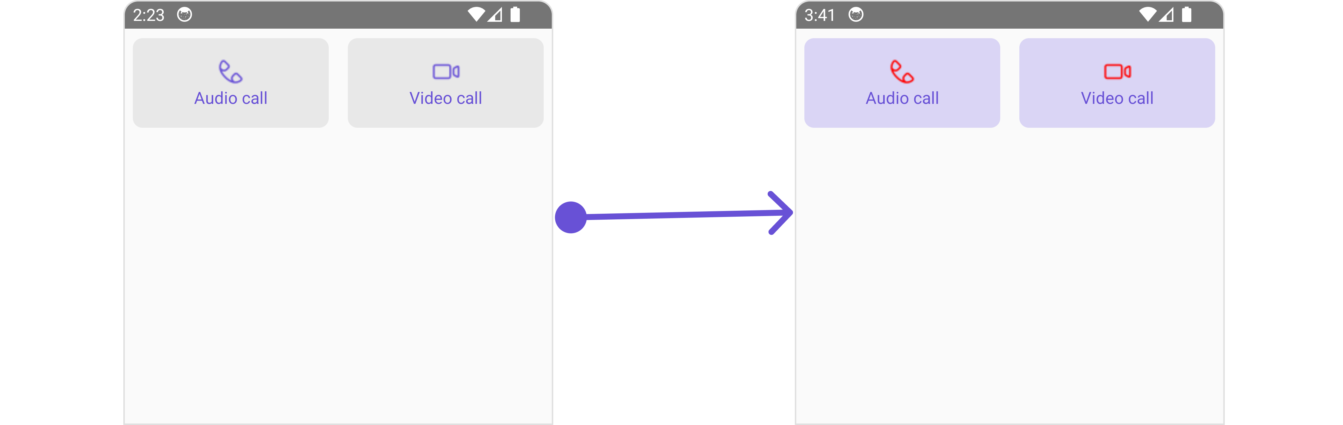 In this example, we are employing the `callButtonsStyle`.
```tsx theme={null}
import {CometChat} from '@cometchat/chat-sdk-react-native';
import { CometChatCallButtons, CallButtonStyleInterface } from '@cometchat/chat-uikit-react-native';
function App(): React.JSX.Element {
const [user, setUser] = useState(undefined);
const getUser = async () => {
const user = await CometChat.getUser('uid');
setUser(user);
};
useEffect(() => {
//login
getUser();
}, []);
const callButtonsStyle : CallButtonStyleInterface = {
videoCallIconTint: "red",
voiceCallIconTint: "red",
backgroundColor: "#dad5f5",
}
return (
{ user &&
}
);
}
```
***
The following properties are exposed by `CallButtonsStyle`:
| Property | Description | Code |
| --------------------- | ------------------------------------- | -------------------------------- |
| **border** | Used to set border | `border?: BorderStyleInterface,` |
| **borderRadius** | Used to set border radius | `borderRadius?: number;` |
| **backgroundColor** | Used to set background colour | `background?: string;` |
| **height** | Used to set height | `height?: number` \| `string;` |
| **width** | Used to set width | `width?: number` \| `string;` |
| **voiceCallIconTint** | Used to set voice call icon tint | `voiceCallIconTint?: string,` |
| **videoCallIconTint** | Used to set video call icon tint | `videoCallIconTint?: string;` |
| **buttonPadding** | Used to set voice call icon text font | `buttonPadding?: number;` |
***
### Functionality
These are a set of small functional customizations that allow you to fine-tune the overall experience of the component. With these, you can change text, set custom icons, and toggle the visibility of UI elements.
In this example, we are employing the `callButtonsStyle`.
```tsx theme={null}
import {CometChat} from '@cometchat/chat-sdk-react-native';
import { CometChatCallButtons, CallButtonStyleInterface } from '@cometchat/chat-uikit-react-native';
function App(): React.JSX.Element {
const [user, setUser] = useState(undefined);
const getUser = async () => {
const user = await CometChat.getUser('uid');
setUser(user);
};
useEffect(() => {
//login
getUser();
}, []);
const callButtonsStyle : CallButtonStyleInterface = {
videoCallIconTint: "red",
voiceCallIconTint: "red",
backgroundColor: "#dad5f5",
}
return (
{ user &&
}
);
}
```
***
The following properties are exposed by `CallButtonsStyle`:
| Property | Description | Code |
| --------------------- | ------------------------------------- | -------------------------------- |
| **border** | Used to set border | `border?: BorderStyleInterface,` |
| **borderRadius** | Used to set border radius | `borderRadius?: number;` |
| **backgroundColor** | Used to set background colour | `background?: string;` |
| **height** | Used to set height | `height?: number` \| `string;` |
| **width** | Used to set width | `width?: number` \| `string;` |
| **voiceCallIconTint** | Used to set voice call icon tint | `voiceCallIconTint?: string,` |
| **videoCallIconTint** | Used to set video call icon tint | `videoCallIconTint?: string;` |
| **buttonPadding** | Used to set voice call icon text font | `buttonPadding?: number;` |
***
### Functionality
These are a set of small functional customizations that allow you to fine-tune the overall experience of the component. With these, you can change text, set custom icons, and toggle the visibility of UI elements.
 Here is a code snippet demonstrating how you can customize the functionality of the `Call Buttons` component.
```tsx theme={null}
import {CometChat} from '@cometchat/chat-sdk-react-native';
import { CometChatCallButtons } from '@cometchat/chat-uikit-react-native';
function App(): React.JSX.Element {
const [user, setUser] = useState(undefined);
const getUser = async () => {
const user = await CometChat.getUser('uid');
setUser(user);
};
useEffect(() => {
//login
getUser();
}, []);
return (
{ user &&
}
);
}
```
Below is a list of customizations along with corresponding code snippets
| Property | Description | Code |
| -------------------------- | ---------------------------------------------------------------------------------------- | ----------------------------------------------------------------- |
| **group** | Used to set the group object for Call Buttons | `group?: CometChat.Group` |
| **user** | Sets the user object for Call Buttons | `user?: CometChat.User` |
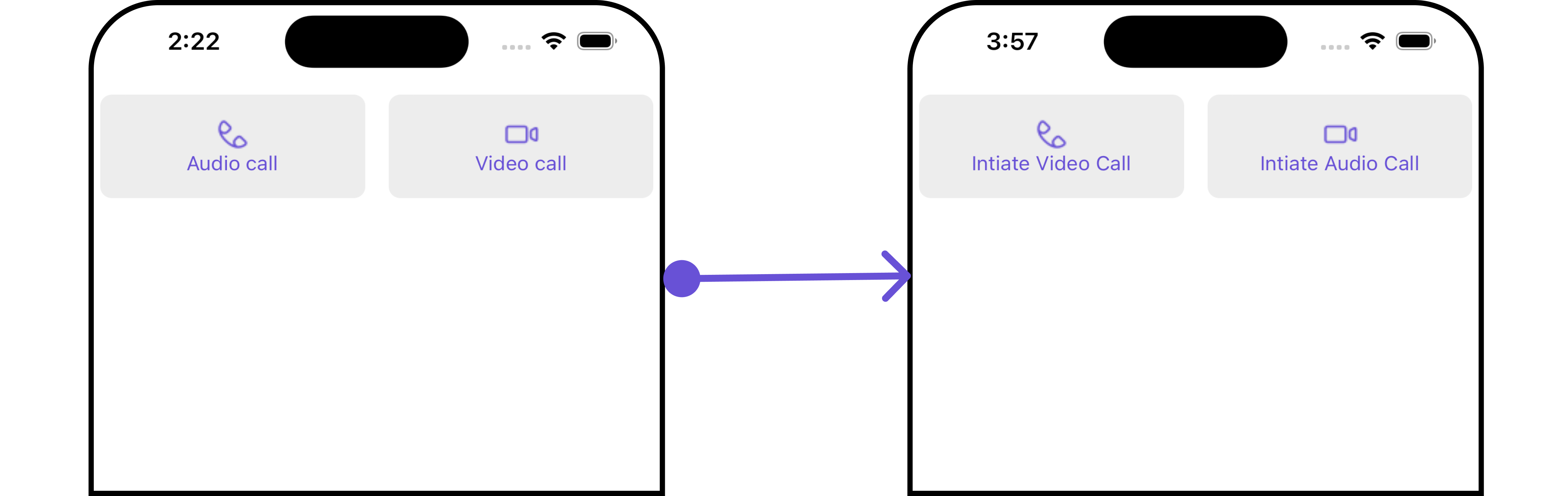
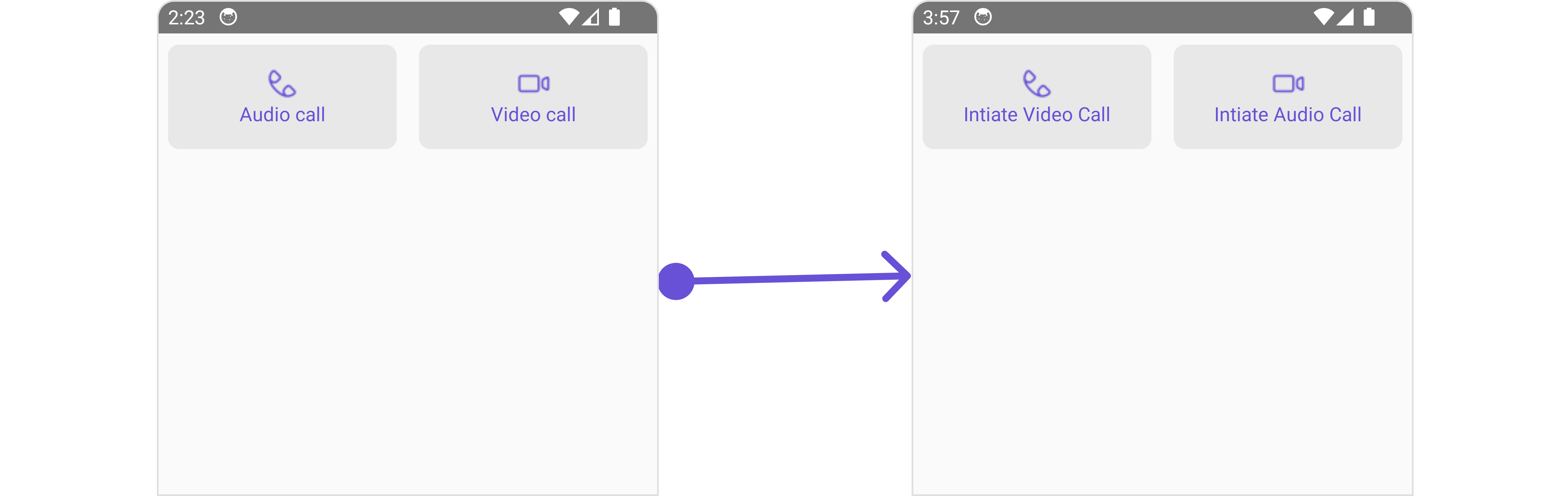
| **videoCallIconHoverText** | Used to set the custom text or tooltip displayed on the video call button on mouse over. | `videoCallIconHoverText='Your Custom Video Call Icon Hover Text'` |
| **voiceCallIconHoverText** | Used to set the custom text or tooltip displayed on the voice call button on mouse over. | `voiceCallIconHoverText='Your Custom Voice Call Icon Hover text'` |
| **voiceCallIconText** | Used to set custom voice call icon text | `voiceCallIconText?: string` |
| **videoCallIconText** | Used to set custom video call icon text | `videoCallIconText?: string` |
| **voiceCallIconImage** | Used to set custom Icon for Video Call Button | `voiceCallIconImage?: ImageType` |
| **videoCallIconImage** | Used to set custom Icon for Voice Call Button | `videoCallIconImage?: ImageType` |
| **hideVoiceCall** | Used to hide Voice Call | \`hideVoiceCall?: boolean |
| **hideVideoCall** | Used to hide Video Call | \`hideVideoCall?: boolean |
***
### Advanced
For advanced-level customization, you can set custom views to the component. This lets you tailor each aspect of the component to fit your exact needs and application aesthetics. You can create and define your views, layouts, and UI elements and then incorporate those into the component.
the `Call Buttons` component does not offer any advanced functionalities beyond this level of customization.
***
Here is a code snippet demonstrating how you can customize the functionality of the `Call Buttons` component.
```tsx theme={null}
import {CometChat} from '@cometchat/chat-sdk-react-native';
import { CometChatCallButtons } from '@cometchat/chat-uikit-react-native';
function App(): React.JSX.Element {
const [user, setUser] = useState(undefined);
const getUser = async () => {
const user = await CometChat.getUser('uid');
setUser(user);
};
useEffect(() => {
//login
getUser();
}, []);
return (
{ user &&
}
);
}
```
Below is a list of customizations along with corresponding code snippets
| Property | Description | Code |
| -------------------------- | ---------------------------------------------------------------------------------------- | ----------------------------------------------------------------- |
| **group** | Used to set the group object for Call Buttons | `group?: CometChat.Group` |
| **user** | Sets the user object for Call Buttons | `user?: CometChat.User` |
| **videoCallIconHoverText** | Used to set the custom text or tooltip displayed on the video call button on mouse over. | `videoCallIconHoverText='Your Custom Video Call Icon Hover Text'` |
| **voiceCallIconHoverText** | Used to set the custom text or tooltip displayed on the voice call button on mouse over. | `voiceCallIconHoverText='Your Custom Voice Call Icon Hover text'` |
| **voiceCallIconText** | Used to set custom voice call icon text | `voiceCallIconText?: string` |
| **videoCallIconText** | Used to set custom video call icon text | `videoCallIconText?: string` |
| **voiceCallIconImage** | Used to set custom Icon for Video Call Button | `voiceCallIconImage?: ImageType` |
| **videoCallIconImage** | Used to set custom Icon for Voice Call Button | `videoCallIconImage?: ImageType` |
| **hideVoiceCall** | Used to hide Voice Call | \`hideVoiceCall?: boolean |
| **hideVideoCall** | Used to hide Video Call | \`hideVideoCall?: boolean |
***
### Advanced
For advanced-level customization, you can set custom views to the component. This lets you tailor each aspect of the component to fit your exact needs and application aesthetics. You can create and define your views, layouts, and UI elements and then incorporate those into the component.
the `Call Buttons` component does not offer any advanced functionalities beyond this level of customization.
***