> ## Documentation Index
> Fetch the complete documentation index at: https://cometchat-22654f5b-docs-rn-guide-message-privately.mintlify.site/llms.txt
> Use this file to discover all available pages before exploring further.
# Customizing UI With Theming
> Customize CometChat React Native UI Kit themes, including light and dark modes, colors, typography, and component styles.
| Field | Value |
| ---------------- | ---------------------------------------------------------------------------------------------------------------------------------------------------------------- |
| Goal | Customize UI Kit appearance (colors, fonts, dark mode) via theme provider |
| Provider | `CometChatThemeProvider` — wrap your app to enable theming |
| Import | `import { CometChatThemeProvider } from "@cometchat/chat-uikit-react-native";` |
| Set mode | `` or `"dark"` |
| Override colors | `theme={{ light: { color: { primary: "#F76808" } } }}` |
| Component styles | `theme={{ light: { conversationStyles: { ... } } }}` |
| Key tokens | `primary`, `textPrimary`, `background1`, `neutral50`, `extendedPrimary500` |
| Constraints | Colors must be hex values, theme merges with defaults (deep merge) |
| Full token list | [Colors](/ui-kit/react-native/colors) \| [GitHub source](https://github.com/cometchat/cometchat-uikit-react-native/blob/v5/packages/ChatUiKit/src/theme/type.ts) |
Theming controls the look and feel of the chat UI — colors, fonts, and component styles — through the `CometChatThemeProvider`.
Prerequisites:
1. Wrap your app with `CometChatThemeProvider` to enable theming
2. Wrap with `SafeAreaProvider` and `GestureHandlerRootView` for proper layout
3. Colors must be supplied as hex values (e.g., `#F76808`)
4. Theme values are deeply merged with defaults — only override what you need
***
## Theming Contract
**Inputs**
* `CometChatThemeProvider` wrapper with optional `theme` prop
* Theme mode: `{ mode: "light" }` or `{ mode: "dark" }`
* Color overrides: `{ light: { color: { primary: "#F76808" } } }`
* Component-specific styles: `{ light: { conversationStyles: { ... } } }`
**Precedence**
1. Style prop on component (highest priority)
2. Custom theme via `CometChatThemeProvider`
3. Default theme (lowest priority)
**Outputs**
* Primary color changes buttons, outgoing bubbles, and active states
* Background tokens change panels and surfaces
* Typography tokens change fonts across the UI
* Component styles override specific component appearances
***
## Top Tokens (Quick Mapping)
For the complete list, see [Colors](/ui-kit/react-native/colors).
| Token | Common Usage |
| ------------------------------------- | --------------------------------------------------------------- |
| `primary` | Primary accent color (buttons, outgoing bubbles, active states) |
| `extendedPrimary500` | Mid primary shade (secondary accents/hover) |
| `extendedPrimary900` | Darker primary shade (outgoing bubble shade) |
| `neutral50` | White/dark surface (light: `#FFFFFF`, dark: `#141414`) |
| `neutral300` | Neutral surface (incoming bubbles/panels) |
| `background1` | Main app background |
| `background2` | Secondary/panel background |
| `textPrimary` | Primary text color |
| `textSecondary` | Secondary/caption text |
| `info`, `warning`, `success`, `error` | Semantic state colors |
***
## Using Theming in Your Project
By default, the theme is automatically selected based on the system settings, ensuring that your app aligns with the user's preferred light or dark mode unless you choose to override it with a custom theme.
The `CometChatThemeProvider` is used to apply a custom theme to your components. By setting the theme prop with a specific mode, such as `{ mode: 'dark' }`, you can override the default system theme and ensure that the UI is displayed in the desired light or dark mode. This allows you to provide a consistent visual experience based on the selected theme mode.
To ensure the app dynamically adapts to the device's OS-level light or dark theme, it must be wrapped in the `CometChatThemeProvider`. Without this wrapper, system theme changes will not be reflected in the app's UI.
Here's an example of how to explicitly set the theme mode to `light`:
```ts theme={null}
import { SafeAreaView } from "react-native-safe-area-context";
import { CometChatThemeProvider } from "@cometchat/chat-uikit-react-native";
return (
{/* Component */}
);
```
 ## Customization
To customize the primary color in your app, you can override the primary color attribute in the theme. Here's how to override the primary color for the light theme:
```ts theme={null}
import { SafeAreaView } from "react-native-safe-area-context";
import { CometChatThemeProvider } from "@cometchat/chat-uikit-react-native";
return (
{/* Component */}
);
```
## Customization
To customize the primary color in your app, you can override the primary color attribute in the theme. Here's how to override the primary color for the light theme:
```ts theme={null}
import { SafeAreaView } from "react-native-safe-area-context";
import { CometChatThemeProvider } from "@cometchat/chat-uikit-react-native";
return (
{/* Component */}
);
```
 All default icons are implemented as SVGs.
For these icons, only the following imageStyle properties are supported:
* tintColor
* height
* width
Any extra properties provided in imageStyle will be ignored for default icons.
For custom icons, you can provide either JSX components or an ImageSourcePropType. JSX Components: These are rendered as-is, and no additional styles are applied.
ImageSourcePropType (e.g., PNG, JPEG): The entire imageStyle passed will be applied to the image as expected.
### Overriding the Theme for Specific Components by Customizing Style Properties
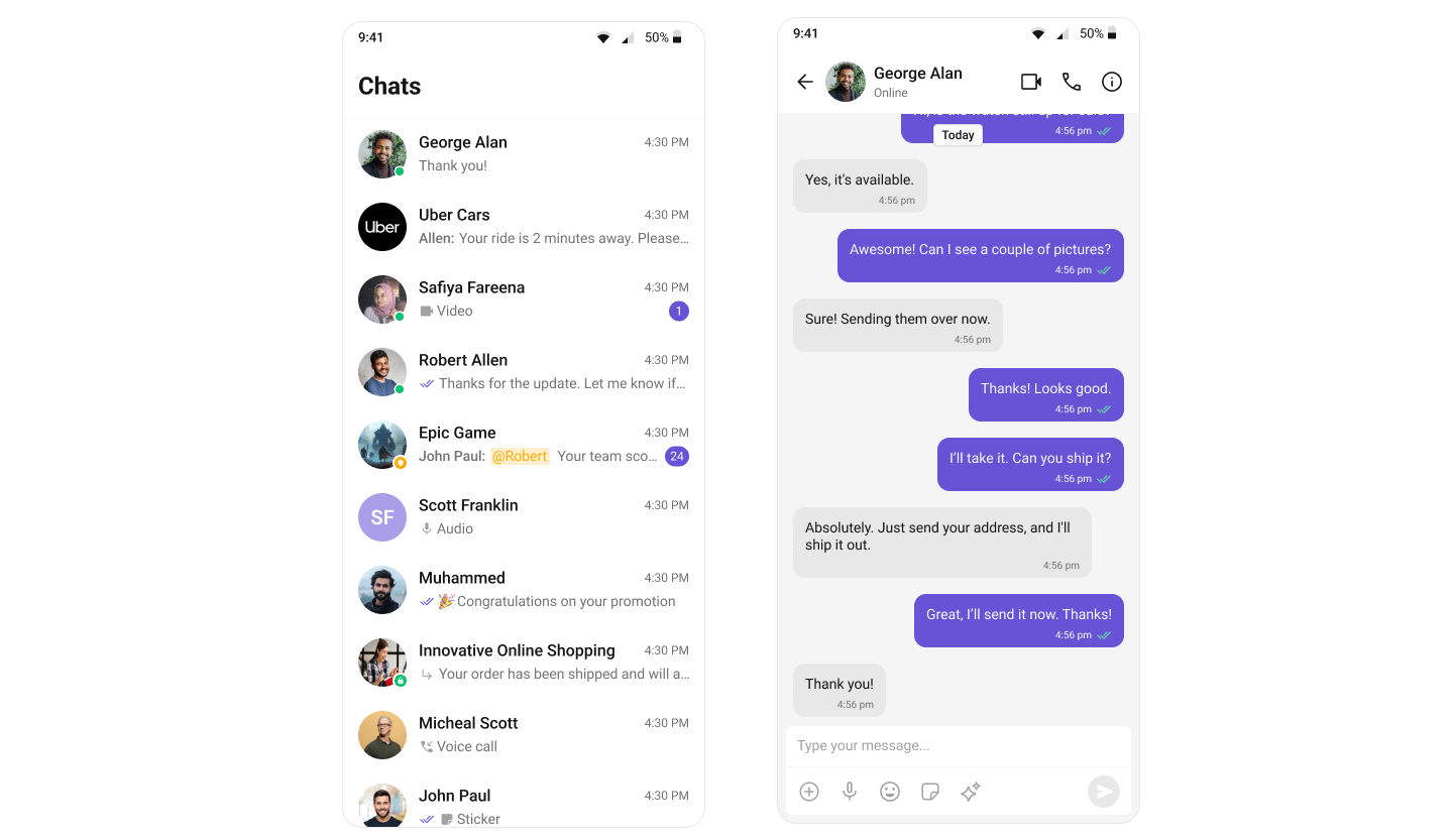
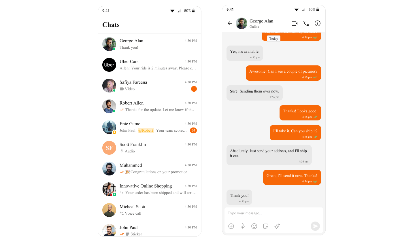
The following example shows how the light theme for the `CometChatConversations` component is overridden directly by setting custom theme properties within the `CometChatThemeProvider`. This ensures that `CometChatConversations` uses a specific light theme, independent of the global theme applied to the rest of the app. The light theme is customized further by defining specific styles, such as the background color for the conversation container. This approach allows you to customize the theme for specific components while keeping the global theme intact.
```tsx theme={null}
import {
CometChatConversations,
CometChatUIKit,
CometChatUiKitConstants,
UIKitSettings,
useTheme,
} from "@cometchat/chat-uikit-react-native";
import { CometChatThemeProvider } from "@cometchat/chat-uikit-react-native/src/theme/provider";
import { SafeAreaView } from "react-native-safe-area-context";
import Messages from "./src/Messages";
//other code
const theme = useTheme();
return (
{loggedIn && (
<>
{
if (
item.getConversationType() ==
CometChatUiKitConstants.ConversationTypeConstants.user
) {
setMessageUser(item.getConversationWith() as CometChat.User);
return;
}
setMessageGroup(item.getConversationWith() as CometChat.Group);
}}
>
{(messageUser || messageGroup) && (
{
setMessageUser(undefined);
setMessageGroup(undefined);
}}
/>
)}
)}
);
```
### Supplying Custom Theme to Specific Components by wrapping them in a separate CometChatThemeProvider
The following example shows how the theme for the `CometChatConversations` component is specifically overridden by wrapping it in a separate `CometChatThemeProvider`. This allows `CometChatConversations` to use a dark mode theme, independent of the global theme applied to the rest of the app. Additionally, the dark theme is further customized for the component by defining specific styles, such as the background color for the conversation container. This approach enables you to tailor the theme for specific components while maintaining the overall consistency of the global theme.
```tsx theme={null}
import {
CometChatConversations,
CometChatUIKit,
CometChatUiKitConstants,
UIKitSettings,
useTheme,
CometChatThemeProvider,
} from "@cometchat/chat-uikit-react-native";
import { SafeAreaView } from "react-native-safe-area-context";
import Messages from "./src/Messages";
//other code
const theme = useTheme();
return (
{loggedIn && (
<>
{
if (
item.getConversationType() ==
CometChatUiKitConstants.ConversationTypeConstants.user
) {
setMessageUser(item.getConversationWith() as CometChat.User);
return;
}
setMessageGroup(item.getConversationWith() as CometChat.Group);
}}
>
{(messageUser || messageGroup) && (
{
setMessageUser(undefined);
setMessageGroup(undefined);
}}
/>
)}
)}
);
```
When customizing theme properties, whether by overriding specific properties or supplying a completely custom theme, the provided values will be deeply merged with the default theme. This means that only the specified properties will be overridden, while all other properties will retain their default values. Additionally, if a style is passed through props, it will take priority over the style provided via the theme. The deep merge occurs in the following order of priority:
1. The style prop (highest priority)
2. The custom theme
3. The default theme (lowest priority)
This ensures that customizations are prioritized and applied while preserving the integrity of the default theme.
```ts theme={null}
// The custom theme is merged with the default theme (handled internally)
const mergedTheme = internalDeepMergeImplementation(defaultTheme, customTheme);
// The style prop is applied with higher priority, merging it with the previous result (handled internally)
const finalConversationsStyle = internalDeepMergeImplementation(
mergedTheme,
conversationStyleProp
);
```
***
## Next Steps
Customize primary, neutral, alert, and other color tokens
Style individual message bubbles and their content
Translate UI strings and support multiple languages
Explore all available UI Kit components
All default icons are implemented as SVGs.
For these icons, only the following imageStyle properties are supported:
* tintColor
* height
* width
Any extra properties provided in imageStyle will be ignored for default icons.
For custom icons, you can provide either JSX components or an ImageSourcePropType. JSX Components: These are rendered as-is, and no additional styles are applied.
ImageSourcePropType (e.g., PNG, JPEG): The entire imageStyle passed will be applied to the image as expected.
### Overriding the Theme for Specific Components by Customizing Style Properties
The following example shows how the light theme for the `CometChatConversations` component is overridden directly by setting custom theme properties within the `CometChatThemeProvider`. This ensures that `CometChatConversations` uses a specific light theme, independent of the global theme applied to the rest of the app. The light theme is customized further by defining specific styles, such as the background color for the conversation container. This approach allows you to customize the theme for specific components while keeping the global theme intact.
```tsx theme={null}
import {
CometChatConversations,
CometChatUIKit,
CometChatUiKitConstants,
UIKitSettings,
useTheme,
} from "@cometchat/chat-uikit-react-native";
import { CometChatThemeProvider } from "@cometchat/chat-uikit-react-native/src/theme/provider";
import { SafeAreaView } from "react-native-safe-area-context";
import Messages from "./src/Messages";
//other code
const theme = useTheme();
return (
{loggedIn && (
<>
{
if (
item.getConversationType() ==
CometChatUiKitConstants.ConversationTypeConstants.user
) {
setMessageUser(item.getConversationWith() as CometChat.User);
return;
}
setMessageGroup(item.getConversationWith() as CometChat.Group);
}}
>
{(messageUser || messageGroup) && (
{
setMessageUser(undefined);
setMessageGroup(undefined);
}}
/>
)}
)}
);
```
### Supplying Custom Theme to Specific Components by wrapping them in a separate CometChatThemeProvider
The following example shows how the theme for the `CometChatConversations` component is specifically overridden by wrapping it in a separate `CometChatThemeProvider`. This allows `CometChatConversations` to use a dark mode theme, independent of the global theme applied to the rest of the app. Additionally, the dark theme is further customized for the component by defining specific styles, such as the background color for the conversation container. This approach enables you to tailor the theme for specific components while maintaining the overall consistency of the global theme.
```tsx theme={null}
import {
CometChatConversations,
CometChatUIKit,
CometChatUiKitConstants,
UIKitSettings,
useTheme,
CometChatThemeProvider,
} from "@cometchat/chat-uikit-react-native";
import { SafeAreaView } from "react-native-safe-area-context";
import Messages from "./src/Messages";
//other code
const theme = useTheme();
return (
{loggedIn && (
<>
{
if (
item.getConversationType() ==
CometChatUiKitConstants.ConversationTypeConstants.user
) {
setMessageUser(item.getConversationWith() as CometChat.User);
return;
}
setMessageGroup(item.getConversationWith() as CometChat.Group);
}}
>
{(messageUser || messageGroup) && (
{
setMessageUser(undefined);
setMessageGroup(undefined);
}}
/>
)}
)}
);
```
When customizing theme properties, whether by overriding specific properties or supplying a completely custom theme, the provided values will be deeply merged with the default theme. This means that only the specified properties will be overridden, while all other properties will retain their default values. Additionally, if a style is passed through props, it will take priority over the style provided via the theme. The deep merge occurs in the following order of priority:
1. The style prop (highest priority)
2. The custom theme
3. The default theme (lowest priority)
This ensures that customizations are prioritized and applied while preserving the integrity of the default theme.
```ts theme={null}
// The custom theme is merged with the default theme (handled internally)
const mergedTheme = internalDeepMergeImplementation(defaultTheme, customTheme);
// The style prop is applied with higher priority, merging it with the previous result (handled internally)
const finalConversationsStyle = internalDeepMergeImplementation(
mergedTheme,
conversationStyleProp
);
```
***
## Next Steps
Customize primary, neutral, alert, and other color tokens
Style individual message bubbles and their content
Translate UI strings and support multiple languages
Explore all available UI Kit components