> ## Documentation Index
> Fetch the complete documentation index at: https://cometchat-22654f5b-docs-rn-guide-message-privately.mintlify.site/llms.txt
> Use this file to discover all available pages before exploring further.
# Message Composer
> Compose and send messages including text, media, and attachments with CometChatMessageComposer component in React Native UI Kit.
```json theme={null}
{
"component": "CometChatMessageComposer",
"package": "@cometchat/chat-uikit-react-native",
"import": "import { CometChatMessageComposer } from \"@cometchat/chat-uikit-react-native\";",
"description": "Rich text input for composing and sending text, media, attachments, mentions, voice notes, and custom messages.",
"primaryOutput": {
"prop": "onSendButtonPress",
"type": "(message: CometChat.BaseMessage) => void"
},
"props": {
"data": {
"user": { "type": "CometChat.User", "default": "undefined" },
"group": { "type": "CometChat.Group", "default": "undefined" },
"parentMessageId": { "type": "number", "default": "undefined" },
"initialComposertext": { "type": "string", "default": "\"\"" }
},
"callbacks": {
"onSendButtonPress": "(message: CometChat.BaseMessage) => void",
"onTextChange": "(text: string) => void",
"onError": "(error: CometChat.CometChatException) => void"
},
"visibility": {
"hideVoiceRecordingButton": { "type": "boolean", "default": false },
"hideCameraOption": { "type": "boolean", "default": false },
"hideImageAttachmentOption": { "type": "boolean", "default": false },
"hideVideoAttachmentOption": { "type": "boolean", "default": false },
"hideAudioAttachmentOption": { "type": "boolean", "default": false },
"hideFileAttachmentOption": { "type": "boolean", "default": false },
"hidePollsAttachmentOption": { "type": "boolean", "default": false },
"hideCollaborativeDocumentOption": { "type": "boolean", "default": false },
"hideCollaborativeWhiteboardOption": { "type": "boolean", "default": false },
"hideAttachmentButton": { "type": "boolean", "default": false },
"hideStickersButton": { "type": "boolean", "default": false },
"hideSendButton": { "type": "boolean", "default": false },
"hideAuxiliaryButtons": { "type": "boolean", "default": false }
},
"configuration": {
"imageQuality": { "type": "number (1-100)", "default": 20 },
"auxiliaryButtonsAlignment": { "type": "\"left\" | \"right\"", "default": "\"left\"" }
},
"sound": {
"disableSoundForOutgoingMessages": { "type": "boolean", "default": false },
"customSoundForOutgoingMessage": { "type": "audio source", "default": "built-in" }
},
"behavior": {
"disableTypingEvents": { "type": "boolean", "default": false },
"disableMentions": { "type": "boolean", "default": false },
"disableMentionAll": { "type": "boolean", "default": false },
"mentionAllLabel": { "type": "string", "default": "\"all\"" }
},
"viewSlots": {
"HeaderView": "({ user, group }: { user?: CometChat.User, group?: CometChat.Group }) => JSX.Element",
"AuxiliaryButtonView": "({ user, group, composerId }: { user?: CometChat.User, group?: CometChat.Group, composerId: string | number }) => JSX.Element",
"SendButtonView": "({ user, group, composerId }: { user?: CometChat.User, group?: CometChat.Group, composerId: string | number }) => JSX.Element"
},
"formatting": {
"textFormatters": {
"type": "CometChatTextFormatter[]",
"default": "default formatters from data source"
},
"attachmentOptions": {
"type": "CometChatMessageComposerAction[]",
"note": "Custom attachment options list"
},
"addAttachmentOptions": {
"type": "CometChatMessageComposerAction[]",
"note": "Additional attachment options to append to defaults"
}
}
},
"events": [
{
"name": "ccMessageSent",
"payload": "{ message: CometChat.BaseMessage, status: string }",
"description": "Triggers when a message is sent with status: inprogress, success, or error"
},
{
"name": "ccMessageEdited",
"payload": "{ message: CometChat.BaseMessage, status: string }",
"description": "Triggers when a message is edited with status: inprogress, success, or error"
},
{
"name": "ccMessageLiveReaction",
"payload": "object",
"description": "Triggers when user clicks on live reaction"
}
],
"compositionExample": {
"description": "Message composer wired with message header and list for complete chat view",
"components": [
"CometChatMessageHeader",
"CometChatMessageList",
"CometChatMessageComposer"
],
"flow": "Pass user or group prop to composer -> onSendButtonPress fires with CometChat.BaseMessage -> message appears in MessageList"
}
}
```
## Where It Fits
`CometChatMessageComposer` is a [Component](/ui-kit/react-native/components-overview#components) that enables users to write and send a variety of messages, including text, image, video, and custom messages. Features such as **Live Reaction**, **Attachments**, and **Message Editing** are also supported.
Wire it alongside `CometChatMessageHeader` and `CometChatMessageList` to build a standard chat view.
 ***
## Minimal Render
```tsx lines theme={null}
import { CometChatMessageComposer } from "@cometchat/chat-uikit-react-native";
function MessageComposerDemo() {
return ;
}
export default MessageComposerDemo;
```
***
## Actions and Events
### Callback Props
#### onSendButtonPress
Fires when the send message button is clicked. Overrides the default send behavior.
```tsx lines theme={null}
onSendButtonPress?: (message: CometChat.BaseMessage) => void
```
```tsx lines theme={null}
import { CometChatMessageComposer } from "@cometchat/chat-uikit-react-native";
import { CometChat } from "@cometchat/chat-sdk-react-native";
function ComposerWithCustomSend() {
const onSendButtonPressHandler = (message: CometChat.BaseMessage) => {
console.log("Custom send:", message);
};
return (
);
}
```
#### onError
Fires on internal errors (network failure, auth issue, SDK exception).
```tsx lines theme={null}
onError?: (error: CometChat.CometChatException) => void
```
```tsx lines theme={null}
import { CometChatMessageComposer } from "@cometchat/chat-uikit-react-native";
import { CometChat } from "@cometchat/chat-sdk-react-native";
function ComposerWithErrorHandler() {
return (
{
console.error("Composer error:", error);
}}
/>
);
}
```
#### onTextChange
Fires as the user types in the composer input.
```tsx lines theme={null}
onTextChange?: (text: string) => void
```
```tsx lines theme={null}
import { CometChatMessageComposer } from "@cometchat/chat-uikit-react-native";
function ComposerWithTextTracking() {
return (
{
console.log("Text changed:", text);
}}
/>
);
}
```
### Global UI Events
`CometChatUIEventHandler` emits events subscribable from anywhere in the application. Add listeners and remove them on cleanup.
| Event | Fires when | Payload |
| ----------------------- | ---------------------------- | ---------------------------------------------------- |
| `ccMessageSent` | A message is sent | `{ message: CometChat.BaseMessage, status: string }` |
| `ccMessageEdited` | A message is edited | `{ message: CometChat.BaseMessage, status: string }` |
| `ccMessageLiveReaction` | User clicks on live reaction | `object` |
When to use: sync external UI with message state changes. For example, update a notification badge when messages are sent, or trigger analytics when a message is edited.
```tsx lines theme={null}
import { useEffect } from "react";
import { CometChatUIEventHandler } from "@cometchat/chat-uikit-react-native";
function useComposerEvents() {
useEffect(() => {
const listenerId = "MESSAGE_COMPOSER_EVENTS_" + Date.now();
CometChatUIEventHandler.addMessageListener(listenerId, {
ccMessageSent: (item) => {
console.log("Message sent:", item);
},
ccMessageEdited: (item) => {
console.log("Message edited:", item);
},
ccMessageLiveReaction: (item) => {
console.log("Live reaction:", item);
},
});
return () => {
CometChatUIEventHandler.removeMessageListener(listenerId);
};
}, []);
}
```
In React 18 StrictMode, `useEffect` runs twice on mount in development. The component handles listener cleanup internally, but any additional listeners added alongside the component need cleanup in the `useEffect` return function to avoid duplicate event handling.
***
## Custom View Slots
Each slot replaces a section of the default UI. Slots that accept parameters receive the relevant data for customization.
| Slot | Signature | Replaces |
| --------------------- | ---------------------------------------------- | ------------------------------- |
| `HeaderView` | `({ user, group }) => JSX.Element` | Area above the composer input |
| `AuxiliaryButtonView` | `({ user, group, composerId }) => JSX.Element` | Sticker button area |
| `SendButtonView` | `({ user, group, composerId }) => JSX.Element` | Send button |
| `attachmentOptions` | `CometChatMessageComposerAction[]` | Default attachment options list |
| `textFormatters` | `CometChatTextFormatter[]` | Text formatting in composer |
### textFormatters
Custom text formatters for the composer input. To configure the existing Mentions look and feel check out [CometChatMentionsFormatter](/ui-kit/react-native/mentions-formatter-guide).
```tsx lines theme={null}
import {
CometChatMessageComposer,
CometChatTextFormatter,
CometChatMentionsFormatter,
} from "@cometchat/chat-uikit-react-native";
const getTextFormatters = () => {
const textFormatters: CometChatTextFormatter[] = [];
const mentionsFormatter = new CometChatMentionsFormatter();
mentionsFormatter.setMentionsStyle({
textStyle: { color: "#D6409F" },
selfTextStyle: { color: "#30A46C" },
});
textFormatters.push(mentionsFormatter);
return textFormatters;
};
return (
);
```
***
## Minimal Render
```tsx lines theme={null}
import { CometChatMessageComposer } from "@cometchat/chat-uikit-react-native";
function MessageComposerDemo() {
return ;
}
export default MessageComposerDemo;
```
***
## Actions and Events
### Callback Props
#### onSendButtonPress
Fires when the send message button is clicked. Overrides the default send behavior.
```tsx lines theme={null}
onSendButtonPress?: (message: CometChat.BaseMessage) => void
```
```tsx lines theme={null}
import { CometChatMessageComposer } from "@cometchat/chat-uikit-react-native";
import { CometChat } from "@cometchat/chat-sdk-react-native";
function ComposerWithCustomSend() {
const onSendButtonPressHandler = (message: CometChat.BaseMessage) => {
console.log("Custom send:", message);
};
return (
);
}
```
#### onError
Fires on internal errors (network failure, auth issue, SDK exception).
```tsx lines theme={null}
onError?: (error: CometChat.CometChatException) => void
```
```tsx lines theme={null}
import { CometChatMessageComposer } from "@cometchat/chat-uikit-react-native";
import { CometChat } from "@cometchat/chat-sdk-react-native";
function ComposerWithErrorHandler() {
return (
{
console.error("Composer error:", error);
}}
/>
);
}
```
#### onTextChange
Fires as the user types in the composer input.
```tsx lines theme={null}
onTextChange?: (text: string) => void
```
```tsx lines theme={null}
import { CometChatMessageComposer } from "@cometchat/chat-uikit-react-native";
function ComposerWithTextTracking() {
return (
{
console.log("Text changed:", text);
}}
/>
);
}
```
### Global UI Events
`CometChatUIEventHandler` emits events subscribable from anywhere in the application. Add listeners and remove them on cleanup.
| Event | Fires when | Payload |
| ----------------------- | ---------------------------- | ---------------------------------------------------- |
| `ccMessageSent` | A message is sent | `{ message: CometChat.BaseMessage, status: string }` |
| `ccMessageEdited` | A message is edited | `{ message: CometChat.BaseMessage, status: string }` |
| `ccMessageLiveReaction` | User clicks on live reaction | `object` |
When to use: sync external UI with message state changes. For example, update a notification badge when messages are sent, or trigger analytics when a message is edited.
```tsx lines theme={null}
import { useEffect } from "react";
import { CometChatUIEventHandler } from "@cometchat/chat-uikit-react-native";
function useComposerEvents() {
useEffect(() => {
const listenerId = "MESSAGE_COMPOSER_EVENTS_" + Date.now();
CometChatUIEventHandler.addMessageListener(listenerId, {
ccMessageSent: (item) => {
console.log("Message sent:", item);
},
ccMessageEdited: (item) => {
console.log("Message edited:", item);
},
ccMessageLiveReaction: (item) => {
console.log("Live reaction:", item);
},
});
return () => {
CometChatUIEventHandler.removeMessageListener(listenerId);
};
}, []);
}
```
In React 18 StrictMode, `useEffect` runs twice on mount in development. The component handles listener cleanup internally, but any additional listeners added alongside the component need cleanup in the `useEffect` return function to avoid duplicate event handling.
***
## Custom View Slots
Each slot replaces a section of the default UI. Slots that accept parameters receive the relevant data for customization.
| Slot | Signature | Replaces |
| --------------------- | ---------------------------------------------- | ------------------------------- |
| `HeaderView` | `({ user, group }) => JSX.Element` | Area above the composer input |
| `AuxiliaryButtonView` | `({ user, group, composerId }) => JSX.Element` | Sticker button area |
| `SendButtonView` | `({ user, group, composerId }) => JSX.Element` | Send button |
| `attachmentOptions` | `CometChatMessageComposerAction[]` | Default attachment options list |
| `textFormatters` | `CometChatTextFormatter[]` | Text formatting in composer |
### textFormatters
Custom text formatters for the composer input. To configure the existing Mentions look and feel check out [CometChatMentionsFormatter](/ui-kit/react-native/mentions-formatter-guide).
```tsx lines theme={null}
import {
CometChatMessageComposer,
CometChatTextFormatter,
CometChatMentionsFormatter,
} from "@cometchat/chat-uikit-react-native";
const getTextFormatters = () => {
const textFormatters: CometChatTextFormatter[] = [];
const mentionsFormatter = new CometChatMentionsFormatter();
mentionsFormatter.setMentionsStyle({
textStyle: { color: "#D6409F" },
selfTextStyle: { color: "#30A46C" },
});
textFormatters.push(mentionsFormatter);
return textFormatters;
};
return (
);
```
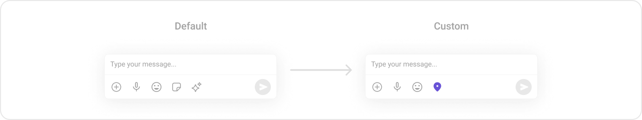
 ### attachmentOptions
Override the default attachment options with custom actions.
```tsx lines theme={null}
import { CometChatMessageComposer } from "@cometchat/chat-uikit-react-native";
import { CometChat } from "@cometchat/chat-sdk-react-native";
const getCustomAttachmentOptions = ({
user,
group,
composerId,
}: {
user?: CometChat.User;
group?: CometChat.Group;
composerId: Map;
}): CometChatMessageComposerAction[] => {
return [
{
id: "location",
icon: LocationIcon,
title: "Share Location",
style: { iconStyle: { tintColor: "grey" } },
onPress: () => {
// handle location share
},
},
];
};
return (
);
```
### attachmentOptions
Override the default attachment options with custom actions.
```tsx lines theme={null}
import { CometChatMessageComposer } from "@cometchat/chat-uikit-react-native";
import { CometChat } from "@cometchat/chat-sdk-react-native";
const getCustomAttachmentOptions = ({
user,
group,
composerId,
}: {
user?: CometChat.User;
group?: CometChat.Group;
composerId: Map;
}): CometChatMessageComposerAction[] => {
return [
{
id: "location",
icon: LocationIcon,
title: "Share Location",
style: { iconStyle: { tintColor: "grey" } },
onPress: () => {
// handle location share
},
},
];
};
return (
);
```
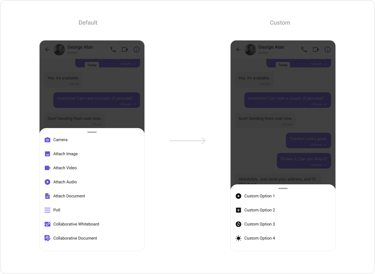 ### addAttachmentOptions
Extends the default attachment options with additional actions.
```tsx lines theme={null}
import { CometChatMessageComposer } from "@cometchat/chat-uikit-react-native";
import { CometChat } from "@cometchat/chat-sdk-react-native";
const getAdditionalAttachmentOptions = ({
user,
group,
composerId,
}: {
user?: CometChat.User;
group?: CometChat.Group;
composerId: Map;
}): CometChatMessageComposerAction[] => {
return [
{
id: "location",
icon: LocationIcon,
title: "Share Location",
style: { iconStyle: { tintColor: "grey" } },
onPress: () => {
// handle location share
},
},
];
};
return (
);
```
### AuxiliaryButtonView
Replace the sticker button area with a custom view.
```tsx lines theme={null}
import { CometChat } from "@cometchat/chat-sdk-react-native";
import { CometChatMessageComposer } from "@cometchat/chat-uikit-react-native";
import { TouchableOpacity, Image, StyleSheet } from "react-native";
const styles = StyleSheet.create({
button: {
height: 25,
width: 25,
borderRadius: 0,
backgroundColor: "transparent",
},
image: {
height: 23,
width: 24,
tintColor: "#7E57C2",
},
});
const customAuxiliaryButtonView = ({
user,
group,
composerId,
}: {
user?: CometChat.User;
group?: CometChat.Group;
composerId: string | number;
}): JSX.Element => {
return (
{}}>
);
};
return (
);
```
The MessageComposer Component utilizes the AuxiliaryButton to provide sticker functionality. Overriding the AuxiliaryButton will replace the sticker functionality.
### addAttachmentOptions
Extends the default attachment options with additional actions.
```tsx lines theme={null}
import { CometChatMessageComposer } from "@cometchat/chat-uikit-react-native";
import { CometChat } from "@cometchat/chat-sdk-react-native";
const getAdditionalAttachmentOptions = ({
user,
group,
composerId,
}: {
user?: CometChat.User;
group?: CometChat.Group;
composerId: Map;
}): CometChatMessageComposerAction[] => {
return [
{
id: "location",
icon: LocationIcon,
title: "Share Location",
style: { iconStyle: { tintColor: "grey" } },
onPress: () => {
// handle location share
},
},
];
};
return (
);
```
### AuxiliaryButtonView
Replace the sticker button area with a custom view.
```tsx lines theme={null}
import { CometChat } from "@cometchat/chat-sdk-react-native";
import { CometChatMessageComposer } from "@cometchat/chat-uikit-react-native";
import { TouchableOpacity, Image, StyleSheet } from "react-native";
const styles = StyleSheet.create({
button: {
height: 25,
width: 25,
borderRadius: 0,
backgroundColor: "transparent",
},
image: {
height: 23,
width: 24,
tintColor: "#7E57C2",
},
});
const customAuxiliaryButtonView = ({
user,
group,
composerId,
}: {
user?: CometChat.User;
group?: CometChat.Group;
composerId: string | number;
}): JSX.Element => {
return (
{}}>
);
};
return (
);
```
The MessageComposer Component utilizes the AuxiliaryButton to provide sticker functionality. Overriding the AuxiliaryButton will replace the sticker functionality.
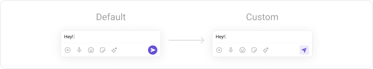
 ### SendButtonView
Replace the send button with a custom view.
```tsx lines theme={null}
import { CometChat } from "@cometchat/chat-sdk-react-native";
import { CometChatMessageComposer } from "@cometchat/chat-uikit-react-native";
import { TouchableOpacity, Image, StyleSheet } from "react-native";
const styles = StyleSheet.create({
button: {
height: 25,
width: 25,
borderRadius: 0,
backgroundColor: "transparent",
},
image: {
height: 23,
width: 24,
tintColor: "#7E57C2",
},
});
const customSendButtonView = ({
user,
group,
composerId,
}: {
user?: CometChat.User;
group?: CometChat.Group;
composerId: string | number;
}): JSX.Element => {
return (
{}}>
);
};
return (
);
```
### SendButtonView
Replace the send button with a custom view.
```tsx lines theme={null}
import { CometChat } from "@cometchat/chat-sdk-react-native";
import { CometChatMessageComposer } from "@cometchat/chat-uikit-react-native";
import { TouchableOpacity, Image, StyleSheet } from "react-native";
const styles = StyleSheet.create({
button: {
height: 25,
width: 25,
borderRadius: 0,
backgroundColor: "transparent",
},
image: {
height: 23,
width: 24,
tintColor: "#7E57C2",
},
});
const customSendButtonView = ({
user,
group,
composerId,
}: {
user?: CometChat.User;
group?: CometChat.Group;
composerId: string | number;
}): JSX.Element => {
return (
{}}>
);
};
return (
);
```
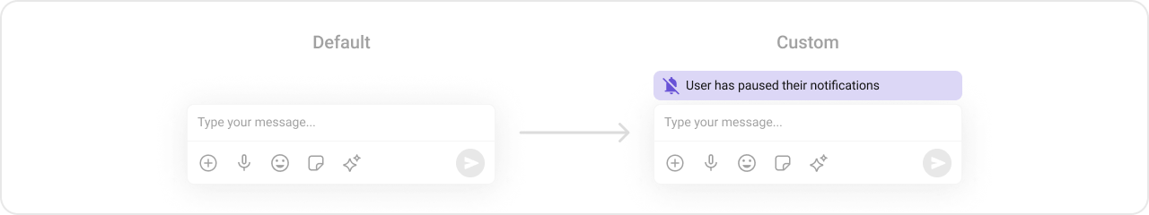
 ### HeaderView
Custom view above the composer input.
```tsx lines theme={null}
import { CometChat } from "@cometchat/chat-sdk-react-native";
import { CometChatMessageComposer } from "@cometchat/chat-uikit-react-native";
import { View, Text, StyleProp, ViewStyle } from "react-native";
const viewStyle: StyleProp = {
flexDirection: "row",
alignItems: "flex-start",
justifyContent: "center",
padding: 5,
borderColor: "black",
borderWidth: 1,
backgroundColor: "white",
borderRadius: 10,
margin: 2,
marginLeft: 7.4,
height: 30,
width: "95.5%",
};
const customHeaderView = ({
user,
group,
}: {
user?: CometChat.User;
group?: CometChat.Group;
}) => {
return (
Chat Bot
);
};
return (
);
```
### HeaderView
Custom view above the composer input.
```tsx lines theme={null}
import { CometChat } from "@cometchat/chat-sdk-react-native";
import { CometChatMessageComposer } from "@cometchat/chat-uikit-react-native";
import { View, Text, StyleProp, ViewStyle } from "react-native";
const viewStyle: StyleProp = {
flexDirection: "row",
alignItems: "flex-start",
justifyContent: "center",
padding: 5,
borderColor: "black",
borderWidth: 1,
backgroundColor: "white",
borderRadius: 10,
margin: 2,
marginLeft: 7.4,
height: 30,
width: "95.5%",
};
const customHeaderView = ({
user,
group,
}: {
user?: CometChat.User;
group?: CometChat.Group;
}) => {
return (
Chat Bot
);
};
return (
);
```
 ***
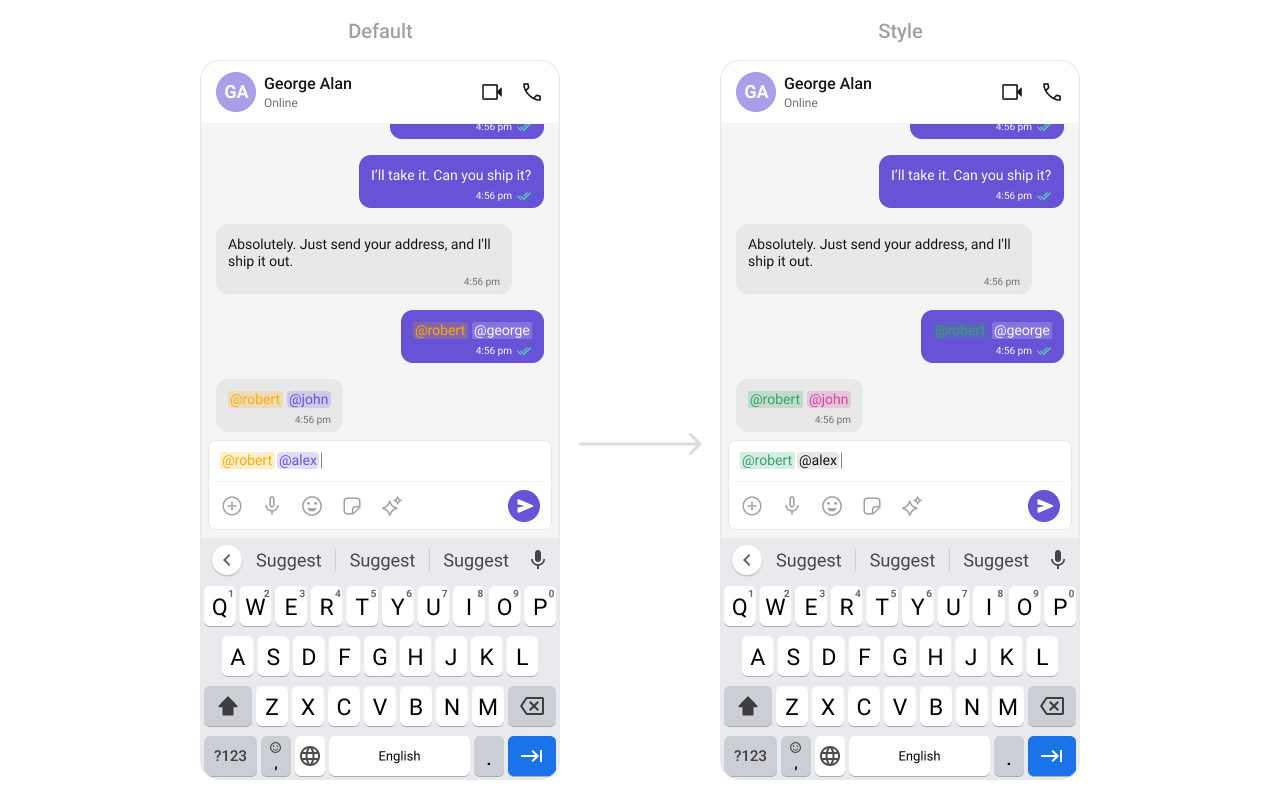
## Styling
Using Style you can customize the look and feel of the component in your app. These parameters typically control elements such as the color, size, shape, and fonts used within the component.
***
## Styling
Using Style you can customize the look and feel of the component in your app. These parameters typically control elements such as the color, size, shape, and fonts used within the component.
 ### Visibility Props
| Property | Description | Code |
| ----------------------------------- | ------------------------------------ | -------------------------------------------- |
| `user` | User object for 1-on-1 conversation | `user={chatUser}` |
| `group` | Group object for group conversation | `group={chatGroup}` |
| `disableTypingEvents` | Disable/enable typing events | `disableTypingEvents={true}` |
| `disableSoundForOutgoingMessages` | Toggle sound for outgoing messages | `disableSoundForOutgoingMessages={true}` |
| `initialComposertext` | Set predefined text | `initialComposertext="Your custom text"` |
| `customSoundForOutgoingMessage` | Custom sound for outgoing messages | `customSoundForOutgoingMessage="your-sound"` |
| `hideVoiceRecordingButton` | Hide voice recording option | `hideVoiceRecordingButton={true}` |
| `hideCameraOption` | Hide camera option from attachments | `hideCameraOption={true}` |
| `hideImageAttachmentOption` | Hide image attachment option | `hideImageAttachmentOption={true}` |
| `hideVideoAttachmentOption` | Hide video attachment option | `hideVideoAttachmentOption={true}` |
| `hideAudioAttachmentOption` | Hide audio attachment option | `hideAudioAttachmentOption={true}` |
| `hideFileAttachmentOption` | Hide file attachment option | `hideFileAttachmentOption={true}` |
| `hidePollsAttachmentOption` | Hide polls attachment option | `hidePollsAttachmentOption={true}` |
| `hideCollaborativeDocumentOption` | Hide collaborative document option | `hideCollaborativeDocumentOption={true}` |
| `hideCollaborativeWhiteboardOption` | Hide collaborative whiteboard option | `hideCollaborativeWhiteboardOption={true}` |
| `hideAttachmentButton` | Hide attachment button | `hideAttachmentButton={true}` |
| `hideStickersButton` | Hide stickers button | `hideStickersButton={true}` |
| `hideSendButton` | Hide send button | `hideSendButton={true}` |
| `hideAuxiliaryButtons` | Hide auxiliary buttons | `hideAuxiliaryButtons={true}` |
| `disableMentions` | Disable mentions functionality | `disableMentions={true}` |
| `disableMentionAll` | Disable @all mention | `disableMentionAll={true}` |
| `mentionAllLabel` | Custom label for @all mention | `mentionAllLabel="everyone"` |
| `imageQuality` | Image quality for camera (1-100) | `imageQuality={50}` |
| `auxiliaryButtonsAlignment` | Alignment of auxiliary buttons | `auxiliaryButtonsAlignment="right"` |
***
## Next Steps
Display the list of messages in a conversation
Display user or group details in the chat toolbar
Complete messaging interface with header, list, and composer
Customize the appearance of UI Kit components
### Visibility Props
| Property | Description | Code |
| ----------------------------------- | ------------------------------------ | -------------------------------------------- |
| `user` | User object for 1-on-1 conversation | `user={chatUser}` |
| `group` | Group object for group conversation | `group={chatGroup}` |
| `disableTypingEvents` | Disable/enable typing events | `disableTypingEvents={true}` |
| `disableSoundForOutgoingMessages` | Toggle sound for outgoing messages | `disableSoundForOutgoingMessages={true}` |
| `initialComposertext` | Set predefined text | `initialComposertext="Your custom text"` |
| `customSoundForOutgoingMessage` | Custom sound for outgoing messages | `customSoundForOutgoingMessage="your-sound"` |
| `hideVoiceRecordingButton` | Hide voice recording option | `hideVoiceRecordingButton={true}` |
| `hideCameraOption` | Hide camera option from attachments | `hideCameraOption={true}` |
| `hideImageAttachmentOption` | Hide image attachment option | `hideImageAttachmentOption={true}` |
| `hideVideoAttachmentOption` | Hide video attachment option | `hideVideoAttachmentOption={true}` |
| `hideAudioAttachmentOption` | Hide audio attachment option | `hideAudioAttachmentOption={true}` |
| `hideFileAttachmentOption` | Hide file attachment option | `hideFileAttachmentOption={true}` |
| `hidePollsAttachmentOption` | Hide polls attachment option | `hidePollsAttachmentOption={true}` |
| `hideCollaborativeDocumentOption` | Hide collaborative document option | `hideCollaborativeDocumentOption={true}` |
| `hideCollaborativeWhiteboardOption` | Hide collaborative whiteboard option | `hideCollaborativeWhiteboardOption={true}` |
| `hideAttachmentButton` | Hide attachment button | `hideAttachmentButton={true}` |
| `hideStickersButton` | Hide stickers button | `hideStickersButton={true}` |
| `hideSendButton` | Hide send button | `hideSendButton={true}` |
| `hideAuxiliaryButtons` | Hide auxiliary buttons | `hideAuxiliaryButtons={true}` |
| `disableMentions` | Disable mentions functionality | `disableMentions={true}` |
| `disableMentionAll` | Disable @all mention | `disableMentionAll={true}` |
| `mentionAllLabel` | Custom label for @all mention | `mentionAllLabel="everyone"` |
| `imageQuality` | Image quality for camera (1-100) | `imageQuality={50}` |
| `auxiliaryButtonsAlignment` | Alignment of auxiliary buttons | `auxiliaryButtonsAlignment="right"` |
***
## Next Steps
Display the list of messages in a conversation
Display user or group details in the chat toolbar
Complete messaging interface with header, list, and composer
Customize the appearance of UI Kit components