> ## Documentation Index
> Fetch the complete documentation index at: https://cometchat-22654f5b-docs-rn-guide-message-privately.mintlify.site/llms.txt
> Use this file to discover all available pages before exploring further.
# Color Resources
> Complete reference of CometChat React Native UI Kit color tokens for light and dark modes, custom themes, and brand styling.
| Field | Value |
| --------------- | ---------------------------------------------------------------------------------------------------------------------------------------------------------------------------------------------------------------------------------------------------------------------- |
| Goal | Override UI Kit color tokens to match a brand |
| Provider | `CometChatThemeProvider` — wrap app and pass `theme` prop |
| Import | `import { CometChatThemeProvider } from "@cometchat/chat-uikit-react-native";` |
| Override colors | `theme={{ light: { color: { primary: "#F76808", textPrimary: "#7f7f00" } } }}` |
| Key tokens | `primary` (brand/accent), `neutral50` (surfaces), `background1` (main bg), `textPrimary` |
| Extended colors | Auto-generated from `primary` (extendedPrimary50–900) unless explicitly overridden |
| Dark mode | `theme={{ dark: { color: { ... } } }}` — separate palette for dark theme |
| Constraints | Colors must be hex values, extended colors auto-derive from primary |
| Source | [GitHub theme types](https://github.com/cometchat/cometchat-uikit-react-native/blob/v5/packages/ChatUiKit/src/theme/type.ts) \| [Color helper](https://github.com/cometchat/cometchat-uikit-react-native/blob/v5/packages/ChatUiKit/src/theme/CometChatThemeHelper.ts) |
The UI Kit's color palette uses theme tokens for consistent styling. Override these tokens via `CometChatThemeProvider` to match your brand.
Prerequisites:
1. Wrap your app with `CometChatThemeProvider`
2. Colors must be supplied as hex values (e.g., `#F76808`)
3. Extended primary colors auto-generate from `primary` unless explicitly overridden
***
## Color Token Reference
This table maps every commonly used token to what it visually controls.
| Token | What It Controls | Default (Light) | Used By |
| ------------------------- | -------------------------------------------------------- | --------------- | ------------------------------------------------- |
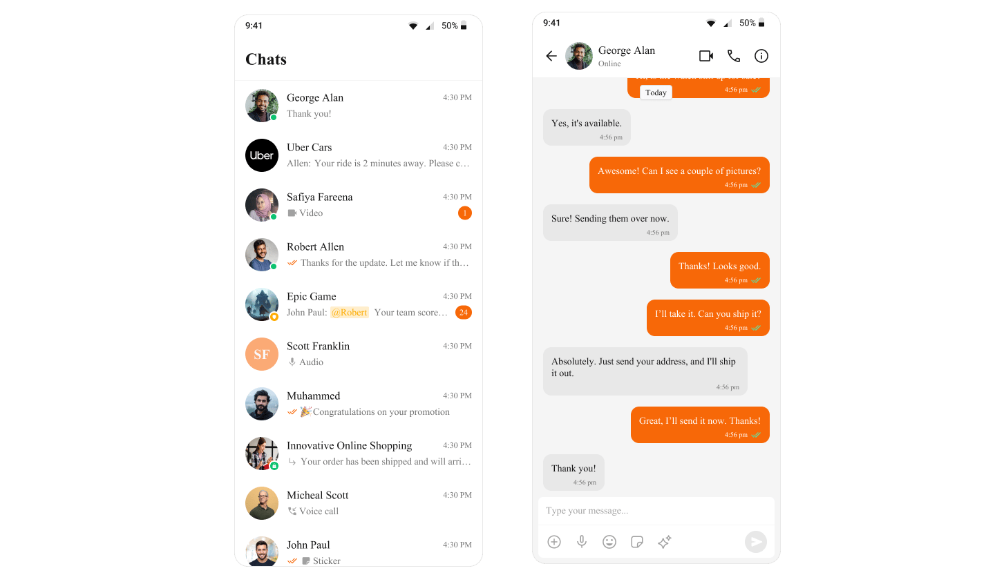
| `primary` | Brand accent, outgoing bubble bg, active states, buttons | `#6852D6` | Outgoing bubbles, send button, active tabs |
| `neutral50` | White surface | `#FFFFFF` | Background color 01, cards |
| `neutral100` | Light surface | `#FAFAFA` | Background color 02 |
| `neutral200` | Secondary surface | `#F5F5F5` | Background color 03 |
| `neutral300` | Incoming bubble background, borders | `#E8E8E8` | Incoming message bubbles, background color 04 |
| `neutral400` | Border dark | `#DCDCDC` | Borders, dividers |
| `neutral500` | Muted text, placeholders | `#A1A1A1` | Placeholder text, disabled states, icon secondary |
| `neutral600` | Secondary text | `#727272` | Timestamps, subtitles |
| `neutral700` | Tertiary text | `#5B5B5B` | Body text |
| `neutral800` | Strong text | `#434343` | Headings |
| `neutral900` | Strongest text | `#141414` | Text color primary |
| `background1` | Main app background | `neutral50` | Root container background |
| `background2` | Secondary/panel background | `neutral100` | Sidebars, panels |
| `background3` | Tertiary background | `neutral200` | Nested panels, cards |
| `background4` | Quaternary background | `neutral300` | Additional surface layer |
| `textPrimary` | Primary text color | `neutral900` | Main body text |
| `textSecondary` | Secondary/caption text | `neutral600` | Timestamps, subtitles |
| `textTertiary` | Tertiary text | `neutral500` | Hints, placeholders |
| `textHighlight` | Highlighted text | `primary` | Links, mentions |
| `iconPrimary` | Primary icon color | `neutral900` | Main icons |
| `iconSecondary` | Secondary icon color | `neutral500` | Inactive icons |
| `iconHighlight` | Highlighted icon color | `primary` | Active icons |
| `extendedPrimary50–900` | Primary color scale (lightest to darkest) | Auto-generated | Hover states, gradients, shades |
| `info` | Informational states | `#0B7BEA` | Info callouts, links |
| `warning` | Warning states | `#FFAB00` | Warning callouts |
| `success` | Success states | `#09C26F` | Online indicators, success messages |
| `error` | Error states | `#F44649` | Error messages, validation |
| `staticBlack` | Static black (doesn't change with theme) | `#141414` | Fixed dark elements |
| `staticWhite` | Static white (doesn't change with theme) | `#FFFFFF` | Fixed light elements |
| `sendBubbleBackground` | Outgoing bubble background | `primary` | Sent message bubbles |
| `sendBubbleText` | Outgoing bubble text | `staticWhite` | Sent message text |
| `receiveBubbleBackground` | Incoming bubble background | `neutral300` | Received message bubbles |
| `receiveBubbleText` | Incoming bubble text | `neutral900` | Received message text |
***
## Overview
Colors in `CometChatTheme` allow you to maintain a consistent visual identity across your application by providing predefined colors for various UI elements, such as text, buttons, backgrounds, alerts, and more. These color definitions seamlessly adapt to both light and dark themes, ensuring an optimal user experience across different modes.
The color resources are divided into the following categories:
* **Primary Colors**: Define the main theme of the application.
* **Neutral Colors**: Used for backgrounds, borders, and secondary UI elements.
* **Alert Colors**: Highlight states like success, warning, error, or information.
* **Text Colors**: Used for typography.
* **Icon Colors**: Define icon appearances.
* **Button Colors**: Customize button backgrounds, icons, and text.
CometChat provides separate color definitions for **light mode** and **dark mode**, enabling automatic theme adaptation.
***
## Usage
### Default Colors
CometChat provides predefined color sets for both light and dark modes, ensuring optimal visual contrast and accessibility across your application.
These colors can be accessed through the `theme value`, which is obtained using the `useTheme()` hook.
Example: Colors
```ts theme={null}
import { ColorValue } from "react-native";
const primaryColor = "#6852D6";
const extendedPrimaryColors = {
extendedPrimary50: "",
extendedPrimary100: "",
//generated based on
};
const neutralColors = {
neutral50: "#FFFFFF",
neutral100: "#FAFAFA",
//other colors
};
const alertColors = {
info: "#0B7BEA",
warning: "#FFAB00",
//other colors
};
const staticColors = {
staticBlack: "#141414",
staticWhite: "#FFFFFF",
};
export const defaultColorLight = {
primary: primaryColor,
...extendedPrimaryColors,
...neutralColors,
...alertColors,
...staticColors,
background1: neutralColors.neutral50,
background2: neutralColors.neutral100,
background3: neutralColors.neutral200,
background4: neutralColors.neutral300,
//other derived colors
};
type EachColorValue = {
[P in keyof T]: ColorValue;
};
//color type
export type Color = EachColorValue;
```
```ts theme={null}
import { Color } from "./light"; //type imported from light
const primaryColor = "#6852D6";
const extendedPrimaryColors = {
extendedPrimary50: "",
extendedPrimary100: "",
//other derived colors
};
const neutralColors = {
neutral50: "#141414",
neutral100: "#1A1A1A",
//other derived colors
};
const alertColors = {
info: "#0D66BF",
warning: "#D08D04",
success: "#0B9F5D",
error: "#C73C3E",
};
const staticColors = {
staticBlack: "#141414",
staticWhite: "#FFFFFF",
};
export const defaultColorDark: Color = {
primary: primaryColor,
...extendedPrimaryColors,
...neutralColors,
...alertColors,
...staticColors,
background1: neutralColors.neutral50,
background2: neutralColors.neutral100,
background3: neutralColors.neutral200,
background4: neutralColors.neutral300,
//other derived colors
};
```
Extended colors `50-100` are generated based on the following blend percentages.
```typescript theme={null}
export enum Brightness {
LIGHT = 0,
DARK = 1,
}
getBlendColorsPercentage(brightness: Brightness): {
[key: number]: number;
} {
return brightness === Brightness.LIGHT
? {
50: 0.96,
100: 0.88,
200: 0.77,
300: 0.66,
400: 0.55,
500: 0.44,
600: 0.33,
700: 0.22,
800: 0.11,
900: 0.11,
}
: {
50: 0.8,
100: 0.72,
200: 0.64,
300: 0.56,
400: 0.48,
500: 0.4,
600: 0.32,
700: 0.24,
800: 0.16,
900: 0.08,
};
}
//baseColor is the primary color
blendColors(baseColor: string, blendColor: string, percentage: number): string {
const { r: rBase, g: gBase, b: bBase } = this.hexToRgb(baseColor);
const { r: rBlend, g: gBlend, b: bBlend } = this.hexToRgb(blendColor);
const r = Math.round(rBase * (1 - percentage) + rBlend * percentage);
const g = Math.round(gBase * (1 - percentage) + gBlend * percentage);
const b = Math.round(bBase * (1 - percentage) + bBlend * percentage);
return this.rgbToHex(r, g, b);
}
```
For more details on how other colors are generated, [click here](https://github.com/cometchat/cometchat-uikit-react-native/blob/v5/packages/ChatUiKit/src/theme/CometChatThemeHelper.ts).
Extended primary colors, as well as background, text, button, and other UI colors, are automatically derived from the provided primary and neutral colors. However, any colors explicitly overridden in the theme via `CometChatThemeProvider` will take precedence over the generated values.
## Customizing Colors
You can override the default colors to align them with your application's branding.
Colors must be supplied as hex values.
Example: Changing the primary and textPrimary colors.
```ts theme={null}
import { SafeAreaView } from "react-native-safe-area-context";
import { CometChatThemeProvider } from "@cometchat/chat-uikit-react-native";
return (
{/* Component */}
);
```
To learn more about the theme structure, visit the [theme interface](https://github.com/cometchat/cometchat-uikit-react-native/blob/v5/packages/ChatUiKit/src/theme/type.ts).
 ***
## Next Steps
Learn how CometChatThemeProvider manages light and dark modes
Style individual message bubbles and their content
Translate UI strings and support multiple languages
Explore all available UI Kit components
***
## Next Steps
Learn how CometChatThemeProvider manages light and dark modes
Style individual message bubbles and their content
Translate UI strings and support multiple languages
Explore all available UI Kit components