> ## Documentation Index
> Fetch the complete documentation index at: https://cometchat-22654f5b-docs-rn-guide-message-privately.mintlify.site/llms.txt
> Use this file to discover all available pages before exploring further.
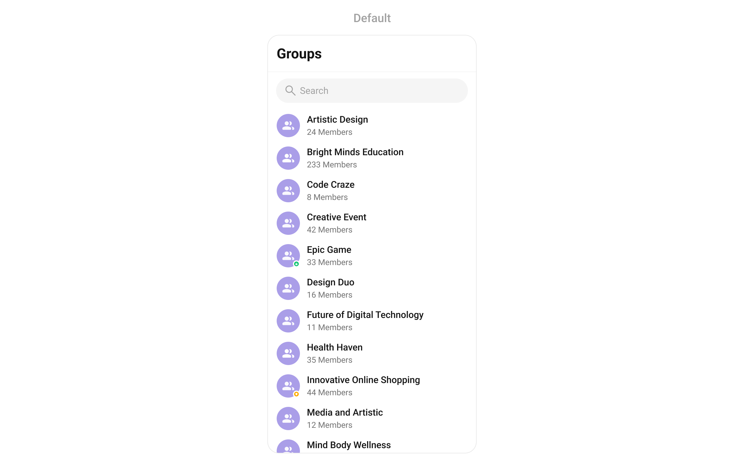
# Groups
> Searchable, scrollable list of all available groups with icon, name, member count, and group type indicator.
```json theme={null}
{
"component": "CometChatGroups",
"package": "cometchat_chat_uikit",
"import": "import 'package:cometchat_chat_uikit/cometchat_chat_uikit.dart';",
"description": "Searchable, scrollable list of all available groups with icon, name, member count, and group type indicator.",
"primaryOutput": {
"prop": "onItemTap",
"type": "Function(BuildContext context, Group group)?"
},
"props": {
"data": {
"groupsRequestBuilder": {
"type": "GroupsRequestBuilder?",
"default": "SDK default (30 per page)",
"note": "Pass the builder, not the result of .build()"
},
"groupsProtocol": {
"type": "GroupsBuilderProtocol?",
"default": "null",
"note": "Custom protocol for fetching groups"
},
"scrollController": {
"type": "ScrollController?",
"default": "null",
"note": "Custom scroll controller for the list"
},
"title": {
"type": "String?",
"default": "Groups",
"note": "Title text for the app bar"
},
"controllerTag": {
"type": "String?",
"default": "null",
"note": "Tag for controller management"
},
"searchPlaceholder": {
"type": "String?",
"default": "null",
"note": "Placeholder text for search input"
},
"searchKeyword": {
"type": "String?",
"default": "null",
"note": "Pre-fills search and filters list"
},
"height": {
"type": "double?",
"default": "null"
},
"width": {
"type": "double?",
"default": "null"
}
},
"callbacks": {
"onItemTap": "Function(BuildContext context, Group group)?",
"onItemLongPress": "Function(BuildContext context, Group group)?",
"onSelection": "Function(List?)?",
"onBack": "VoidCallback?",
"onError": "OnError?",
"onLoad": "OnLoad?",
"onEmpty": "OnEmpty?",
"stateCallBack": "Function(CometChatGroupsController controller)?"
},
"visibility": {
"groupTypeVisibility": { "type": "bool?", "default": true },
"hideAppbar": { "type": "bool?", "default": false },
"hideError": { "type": "bool?", "default": false },
"hideSearch": { "type": "bool", "default": false },
"showBackButton": { "type": "bool", "default": true }
},
"selection": {
"selectionMode": {
"type": "SelectionMode?",
"values": ["SelectionMode.single", "SelectionMode.multiple", "SelectionMode.none"],
"default": "null"
},
"activateSelection": {
"type": "ActivateSelection?",
"values": ["ActivateSelection.onClick", "ActivateSelection.onLongClick"],
"default": "null"
}
},
"viewSlots": {
"listItemView": "Widget Function(Group group)?",
"leadingView": "Widget? Function(BuildContext context, Group group)?",
"titleView": "Widget? Function(BuildContext context, Group group)?",
"subtitleView": "Widget? Function(BuildContext context, Group group)?",
"trailingView": "Widget? Function(BuildContext context, Group group)?",
"loadingStateView": "WidgetBuilder?",
"emptyStateView": "WidgetBuilder?",
"errorStateView": "WidgetBuilder?",
"setOptions": "List? Function(Group, CometChatGroupsController, BuildContext)?",
"addOptions": "List? Function(Group, CometChatGroupsController, BuildContext)?",
"appBarOptions": "List Function(BuildContext context)?"
},
"icons": {
"backButton": { "type": "Widget?", "default": "built-in back arrow" },
"searchBoxIcon": { "type": "Widget?", "default": "built-in search icon" },
"submitIcon": { "type": "Widget?", "default": "built-in check icon" },
"passwordGroupIcon": { "type": "Widget?", "default": "built-in lock icon" },
"privateGroupIcon": { "type": "Widget?", "default": "built-in shield icon" }
},
"style": {
"groupsStyle": { "type": "CometChatGroupsStyle?", "default": "null" }
}
},
"events": [
{ "name": "CometChatGroupEvents.ccGroupCreated", "payload": "Group", "description": "Group created" },
{ "name": "CometChatGroupEvents.ccGroupDeleted", "payload": "Group", "description": "Group deleted" },
{ "name": "CometChatGroupEvents.ccGroupLeft", "payload": "Action, User, Group", "description": "User left group" },
{ "name": "CometChatGroupEvents.ccGroupMemberJoined", "payload": "User, Group", "description": "User joined group" },
{ "name": "CometChatGroupEvents.ccGroupMemberAdded", "payload": "List, List, Group, User", "description": "Members added" },
{ "name": "CometChatGroupEvents.ccGroupMemberKicked", "payload": "Action, User, User, Group", "description": "Member kicked" },
{ "name": "CometChatGroupEvents.ccGroupMemberBanned", "payload": "Action, User, User, Group", "description": "Member banned" },
{ "name": "CometChatGroupEvents.ccGroupMemberUnbanned", "payload": "Action, User, User, Group", "description": "Member unbanned" },
{ "name": "CometChatGroupEvents.ccGroupMemberScopeChanged", "payload": "Action, User, String, String, Group", "description": "Member scope changed" },
{ "name": "CometChatGroupEvents.ccOwnershipChanged", "payload": "Group, GroupMember", "description": "Ownership transferred" }
],
"sdkListeners": [
"onGroupMemberJoined",
"onGroupMemberLeft",
"onMemberAddedToGroup",
"onGroupMemberKicked",
"onGroupMemberBanned",
"onGroupMemberScopeChanged",
"onConnected"
],
"compositionExample": {
"description": "Group directory wired to message view",
"components": [
"CometChatGroups",
"CometChatMessages",
"CometChatMessageHeader",
"CometChatMessageList",
"CometChatMessageComposer"
],
"flow": "onItemTap emits Group -> pass to CometChatMessages or individual message components"
},
"types": {
"CometChatOption": {
"id": "String?",
"title": "String?",
"icon": "String?",
"iconWidget": "Widget?",
"onClick": "VoidCallback?"
},
"SelectionMode": {
"single": "SelectionMode.single",
"multiple": "SelectionMode.multiple",
"none": "SelectionMode.none"
},
"ActivateSelection": {
"onClick": "ActivateSelection.onClick",
"onLongClick": "ActivateSelection.onLongClick"
}
}
}
```
## Where It Fits
`CometChatGroups` is a directory list widget. It renders available groups and emits the selected `Group` via `onItemTap`. Wire it to `CometChatMessageHeader`, `CometChatMessageList`, and `CometChatMessageComposer` to build a group chat layout.
```dart theme={null}
import 'package:flutter/material.dart';
import 'package:cometchat_chat_uikit/cometchat_chat_uikit.dart';
class GroupChatApp extends StatefulWidget {
const GroupChatApp({super.key});
@override
State createState() => _GroupChatAppState();
}
class _GroupChatAppState extends State {
Group? selectedGroup;
@override
Widget build(BuildContext context) {
return Scaffold(
body: Row(
children: [
SizedBox(
width: 400,
child: CometChatGroups(
onItemTap: (context, group) {
setState(() {
selectedGroup = group;
});
},
),
),
Expanded(
child: selectedGroup != null
? CometChatMessages(group: selectedGroup)
: const Center(child: Text('Select a group')),
),
],
),
);
}
}
```
 ***
## Minimal Render
```dart theme={null}
import 'package:flutter/material.dart';
import 'package:cometchat_chat_uikit/cometchat_chat_uikit.dart';
class GroupsDemo extends StatelessWidget {
const GroupsDemo({super.key});
@override
Widget build(BuildContext context) {
return const Scaffold(
body: SafeArea(
child: CometChatGroups(),
),
);
}
}
```
You can also launch it using `Navigator.push`:
```dart theme={null}
Navigator.push(
context,
MaterialPageRoute(builder: (context) => const CometChatGroups())
);
```
***
## Filtering Groups
Pass a `GroupsRequestBuilder` to `groupsRequestBuilder`. Pass the builder instance — not the result of `.build()`.
```dart theme={null}
CometChatGroups(
groupsRequestBuilder: GroupsRequestBuilder()
..joinedOnly = true
..limit = 10,
)
```
### Filter Recipes
| Recipe | Code |
| -------------------- | -------------------------------------------------- |
| Joined groups only | `GroupsRequestBuilder()..joinedOnly = true` |
| Limit to 10 per page | `GroupsRequestBuilder()..limit = 10` |
| Search by keyword | `GroupsRequestBuilder()..searchKeyword = "design"` |
| Filter by tags | `GroupsRequestBuilder()..tags = ["vip"]` |
| With tags data | `GroupsRequestBuilder()..withTags = true` |
Default page size is 30. The component uses infinite scroll — the next page loads as the user scrolls to the bottom.
### GroupsRequestBuilder Properties
| Property | Description | Code |
| --------------- | -------------------------------------------------- | -------------------------- |
| `limit` | Number of groups to fetch per request. | `..limit = 30` |
| `searchKeyword` | Search groups by name. | `..searchKeyword = "Team"` |
| `joinedOnly` | Fetch only joined groups. Default `false`. | `..joinedOnly = true` |
| `tags` | Filter groups by specific tags. | `..tags = ["vip"]` |
| `withTags` | Include tags in the Group object. Default `false`. | `..withTags = true` |
| `build()` | Builds and returns a `GroupsRequest` object. | `.build()` |
Refer to [GroupsRequestBuilder](/sdk/flutter/retrieve-groups) for the full builder API.
***
## Actions and Events
### Callback Props
#### onItemTap
Fires when a group row is tapped. Primary navigation hook — set the active group and render the message view.
```dart theme={null}
CometChatGroups(
onItemTap: (context, group) {
print("Selected: ${group.name}");
},
)
```
#### onItemLongPress
Fires when a group row is long-pressed. Useful for showing context menus or custom actions.
```dart theme={null}
CometChatGroups(
onItemLongPress: (context, group) {
// Show custom context menu
},
)
```
#### onSelection
Fires when groups are selected in multi-select mode. Requires `selectionMode` to be set.
```dart theme={null}
CometChatGroups(
selectionMode: SelectionMode.multiple,
activateSelection: ActivateSelection.onClick,
onSelection: (selectedList) {
print("Selected ${selectedList?.length ?? 0} groups");
},
)
```
#### onError
Fires on internal errors (network failure, auth issue, SDK exception).
```dart theme={null}
CometChatGroups(
onError: (error) {
print("CometChatGroups error: $error");
},
)
```
#### onBack
Fires when the back button is pressed.
```dart theme={null}
CometChatGroups(
showBackButton: true,
onBack: () {
Navigator.pop(context);
},
)
```
#### onLoad
Fires when the group list is successfully loaded.
```dart theme={null}
CometChatGroups(
onLoad: (list) {
print("Loaded ${list.length} groups");
},
)
```
#### onEmpty
Fires when the group list is empty.
```dart theme={null}
CometChatGroups(
onEmpty: () {
print("No groups found");
},
)
```
### Global UI Events
`CometChatGroupEvents` emits events subscribable from anywhere in the application. Add a listener in `initState` and remove it in `dispose`.
| Event | Fires when | Payload |
| --------------------------- | ------------------------------ | --------------------------------------- |
| `ccGroupCreated` | A new group is created | `Group` |
| `ccGroupDeleted` | A group is deleted | `Group` |
| `ccGroupLeft` | A user leaves a group | `Action, User, Group` |
| `ccGroupMemberJoined` | A user joins a group | `User, Group` |
| `ccGroupMemberAdded` | Members are added to a group | `List, List, Group, User` |
| `ccGroupMemberKicked` | A member is kicked | `Action, User, User, Group` |
| `ccGroupMemberBanned` | A member is banned | `Action, User, User, Group` |
| `ccGroupMemberUnbanned` | A member is unbanned | `Action, User, User, Group` |
| `ccGroupMemberScopeChanged` | A member's scope changes | `Action, User, String, String, Group` |
| `ccOwnershipChanged` | Group ownership is transferred | `Group, GroupMember` |
When to use: sync external UI with group state changes. For example, update a group count badge when a group is created or deleted.
```dart theme={null}
import 'package:cometchat_chat_uikit/cometchat_chat_uikit.dart';
import 'package:cometchat_sdk/models/action.dart' as cc;
class _YourScreenState extends State with CometChatGroupEventListener {
@override
void initState() {
super.initState();
CometChatGroupEvents.addGroupsListener("listenerId", this);
}
@override
void dispose() {
CometChatGroupEvents.removeGroupsListener("listenerId");
super.dispose();
}
@override
void ccGroupCreated(Group group) {
print("Group created: ${group.name}");
}
@override
void ccGroupDeleted(Group group) {
print("Group deleted: ${group.name}");
}
@override
void ccGroupLeft(cc.Action message, User leftUser, Group leftGroup) {
print("User ${leftUser.name} left ${leftGroup.name}");
}
@override
void ccGroupMemberJoined(User joinedUser, Group joinedGroup) {
print("User ${joinedUser.name} joined ${joinedGroup.name}");
}
@override
void ccOwnershipChanged(Group group, GroupMember newOwner) {
print("Ownership of ${group.name} transferred to ${newOwner.name}");
}
@override
Widget build(BuildContext context) {
return const Placeholder();
}
}
```
### SDK Events (Real-Time, Automatic)
The component listens to these SDK events internally. No manual attachment needed unless additional side effects are required.
| SDK Listener | Internal behavior |
| --------------------------- | ------------------------------------------------------------------ |
| `onGroupMemberJoined` | Updates member count, sets `hasJoined` if current user joined |
| `onGroupMemberLeft` | Updates member count |
| `onMemberAddedToGroup` | Updates member count, adds group to list if current user was added |
| `onGroupMemberKicked` | Updates member count |
| `onGroupMemberBanned` | Updates member count |
| `onGroupMemberScopeChanged` | Updates member scope |
Automatic: group membership changes, member count updates.
***
## Custom View Slots
Each slot replaces a section of the default UI. Slots that accept a group parameter receive the `Group` object for that row.
| Slot | Signature | Replaces |
| ------------------ | ------------------------------------------------------------------ | --------------------------------------- |
| `listItemView` | `Widget Function(Group)` | Entire list item row |
| `leadingView` | `Widget? Function(BuildContext, Group)` | Avatar / left section |
| `titleView` | `Widget? Function(BuildContext, Group)` | Name / title text |
| `subtitleView` | `Widget? Function(BuildContext, Group)` | Member count subtitle |
| `trailingView` | `Widget? Function(BuildContext, Group)` | Right section |
| `loadingStateView` | `WidgetBuilder` | Loading spinner |
| `emptyStateView` | `WidgetBuilder` | Empty state |
| `errorStateView` | `WidgetBuilder` | Error state |
| `setOptions` | `List? Function(Group, Controller, BuildContext)` | Context menu actions (replaces default) |
| `addOptions` | `List? Function(Group, Controller, BuildContext)` | Context menu actions (adds to default) |
| `appBarOptions` | `List Function(BuildContext)` | App bar action widgets |
### listItemView
Replace the entire list item row.
***
## Minimal Render
```dart theme={null}
import 'package:flutter/material.dart';
import 'package:cometchat_chat_uikit/cometchat_chat_uikit.dart';
class GroupsDemo extends StatelessWidget {
const GroupsDemo({super.key});
@override
Widget build(BuildContext context) {
return const Scaffold(
body: SafeArea(
child: CometChatGroups(),
),
);
}
}
```
You can also launch it using `Navigator.push`:
```dart theme={null}
Navigator.push(
context,
MaterialPageRoute(builder: (context) => const CometChatGroups())
);
```
***
## Filtering Groups
Pass a `GroupsRequestBuilder` to `groupsRequestBuilder`. Pass the builder instance — not the result of `.build()`.
```dart theme={null}
CometChatGroups(
groupsRequestBuilder: GroupsRequestBuilder()
..joinedOnly = true
..limit = 10,
)
```
### Filter Recipes
| Recipe | Code |
| -------------------- | -------------------------------------------------- |
| Joined groups only | `GroupsRequestBuilder()..joinedOnly = true` |
| Limit to 10 per page | `GroupsRequestBuilder()..limit = 10` |
| Search by keyword | `GroupsRequestBuilder()..searchKeyword = "design"` |
| Filter by tags | `GroupsRequestBuilder()..tags = ["vip"]` |
| With tags data | `GroupsRequestBuilder()..withTags = true` |
Default page size is 30. The component uses infinite scroll — the next page loads as the user scrolls to the bottom.
### GroupsRequestBuilder Properties
| Property | Description | Code |
| --------------- | -------------------------------------------------- | -------------------------- |
| `limit` | Number of groups to fetch per request. | `..limit = 30` |
| `searchKeyword` | Search groups by name. | `..searchKeyword = "Team"` |
| `joinedOnly` | Fetch only joined groups. Default `false`. | `..joinedOnly = true` |
| `tags` | Filter groups by specific tags. | `..tags = ["vip"]` |
| `withTags` | Include tags in the Group object. Default `false`. | `..withTags = true` |
| `build()` | Builds and returns a `GroupsRequest` object. | `.build()` |
Refer to [GroupsRequestBuilder](/sdk/flutter/retrieve-groups) for the full builder API.
***
## Actions and Events
### Callback Props
#### onItemTap
Fires when a group row is tapped. Primary navigation hook — set the active group and render the message view.
```dart theme={null}
CometChatGroups(
onItemTap: (context, group) {
print("Selected: ${group.name}");
},
)
```
#### onItemLongPress
Fires when a group row is long-pressed. Useful for showing context menus or custom actions.
```dart theme={null}
CometChatGroups(
onItemLongPress: (context, group) {
// Show custom context menu
},
)
```
#### onSelection
Fires when groups are selected in multi-select mode. Requires `selectionMode` to be set.
```dart theme={null}
CometChatGroups(
selectionMode: SelectionMode.multiple,
activateSelection: ActivateSelection.onClick,
onSelection: (selectedList) {
print("Selected ${selectedList?.length ?? 0} groups");
},
)
```
#### onError
Fires on internal errors (network failure, auth issue, SDK exception).
```dart theme={null}
CometChatGroups(
onError: (error) {
print("CometChatGroups error: $error");
},
)
```
#### onBack
Fires when the back button is pressed.
```dart theme={null}
CometChatGroups(
showBackButton: true,
onBack: () {
Navigator.pop(context);
},
)
```
#### onLoad
Fires when the group list is successfully loaded.
```dart theme={null}
CometChatGroups(
onLoad: (list) {
print("Loaded ${list.length} groups");
},
)
```
#### onEmpty
Fires when the group list is empty.
```dart theme={null}
CometChatGroups(
onEmpty: () {
print("No groups found");
},
)
```
### Global UI Events
`CometChatGroupEvents` emits events subscribable from anywhere in the application. Add a listener in `initState` and remove it in `dispose`.
| Event | Fires when | Payload |
| --------------------------- | ------------------------------ | --------------------------------------- |
| `ccGroupCreated` | A new group is created | `Group` |
| `ccGroupDeleted` | A group is deleted | `Group` |
| `ccGroupLeft` | A user leaves a group | `Action, User, Group` |
| `ccGroupMemberJoined` | A user joins a group | `User, Group` |
| `ccGroupMemberAdded` | Members are added to a group | `List, List, Group, User` |
| `ccGroupMemberKicked` | A member is kicked | `Action, User, User, Group` |
| `ccGroupMemberBanned` | A member is banned | `Action, User, User, Group` |
| `ccGroupMemberUnbanned` | A member is unbanned | `Action, User, User, Group` |
| `ccGroupMemberScopeChanged` | A member's scope changes | `Action, User, String, String, Group` |
| `ccOwnershipChanged` | Group ownership is transferred | `Group, GroupMember` |
When to use: sync external UI with group state changes. For example, update a group count badge when a group is created or deleted.
```dart theme={null}
import 'package:cometchat_chat_uikit/cometchat_chat_uikit.dart';
import 'package:cometchat_sdk/models/action.dart' as cc;
class _YourScreenState extends State with CometChatGroupEventListener {
@override
void initState() {
super.initState();
CometChatGroupEvents.addGroupsListener("listenerId", this);
}
@override
void dispose() {
CometChatGroupEvents.removeGroupsListener("listenerId");
super.dispose();
}
@override
void ccGroupCreated(Group group) {
print("Group created: ${group.name}");
}
@override
void ccGroupDeleted(Group group) {
print("Group deleted: ${group.name}");
}
@override
void ccGroupLeft(cc.Action message, User leftUser, Group leftGroup) {
print("User ${leftUser.name} left ${leftGroup.name}");
}
@override
void ccGroupMemberJoined(User joinedUser, Group joinedGroup) {
print("User ${joinedUser.name} joined ${joinedGroup.name}");
}
@override
void ccOwnershipChanged(Group group, GroupMember newOwner) {
print("Ownership of ${group.name} transferred to ${newOwner.name}");
}
@override
Widget build(BuildContext context) {
return const Placeholder();
}
}
```
### SDK Events (Real-Time, Automatic)
The component listens to these SDK events internally. No manual attachment needed unless additional side effects are required.
| SDK Listener | Internal behavior |
| --------------------------- | ------------------------------------------------------------------ |
| `onGroupMemberJoined` | Updates member count, sets `hasJoined` if current user joined |
| `onGroupMemberLeft` | Updates member count |
| `onMemberAddedToGroup` | Updates member count, adds group to list if current user was added |
| `onGroupMemberKicked` | Updates member count |
| `onGroupMemberBanned` | Updates member count |
| `onGroupMemberScopeChanged` | Updates member scope |
Automatic: group membership changes, member count updates.
***
## Custom View Slots
Each slot replaces a section of the default UI. Slots that accept a group parameter receive the `Group` object for that row.
| Slot | Signature | Replaces |
| ------------------ | ------------------------------------------------------------------ | --------------------------------------- |
| `listItemView` | `Widget Function(Group)` | Entire list item row |
| `leadingView` | `Widget? Function(BuildContext, Group)` | Avatar / left section |
| `titleView` | `Widget? Function(BuildContext, Group)` | Name / title text |
| `subtitleView` | `Widget? Function(BuildContext, Group)` | Member count subtitle |
| `trailingView` | `Widget? Function(BuildContext, Group)` | Right section |
| `loadingStateView` | `WidgetBuilder` | Loading spinner |
| `emptyStateView` | `WidgetBuilder` | Empty state |
| `errorStateView` | `WidgetBuilder` | Error state |
| `setOptions` | `List? Function(Group, Controller, BuildContext)` | Context menu actions (replaces default) |
| `addOptions` | `List? Function(Group, Controller, BuildContext)` | Context menu actions (adds to default) |
| `appBarOptions` | `List Function(BuildContext)` | App bar action widgets |
### listItemView
Replace the entire list item row.
 ```dart theme={null}
CometChatGroups(
listItemView: (group) {
return ListTile(
title: Text(
group.name,
style: TextStyle(fontSize: 16, fontWeight: FontWeight.w500),
),
subtitle: Text(
"${group.membersCount} Members • ${group.description}",
overflow: TextOverflow.ellipsis,
style: TextStyle(fontSize: 14, color: Color(0xFF727272)),
),
trailing: ElevatedButton(
onPressed: () {
CometChat.joinGroup(
group.guid,
group.type,
onSuccess: (group) {
// Handle success
},
onError: (error) {
// Handle error
},
);
},
style: ElevatedButton.styleFrom(
backgroundColor: Color(0xFFEDEAFA),
elevation: 0,
shape: RoundedRectangleBorder(borderRadius: BorderRadius.circular(1000)),
),
child: Text("JOIN", style: TextStyle(color: Color(0xFF6852D6), fontSize: 12)),
),
);
},
)
```
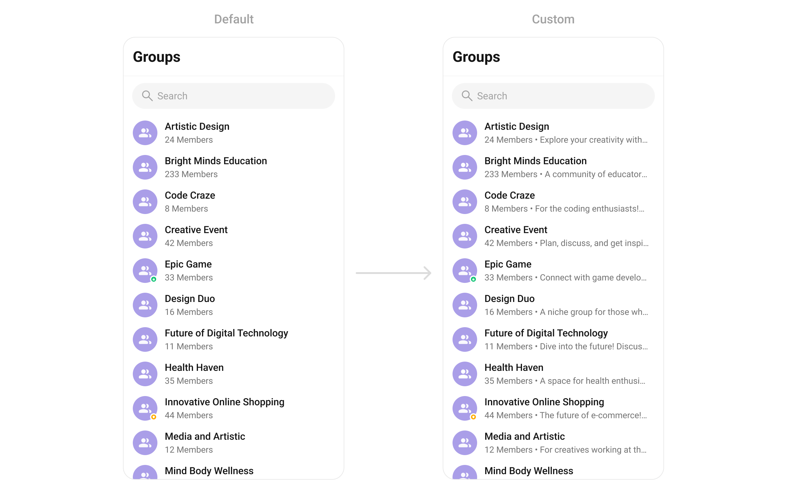
### leadingView
Replace the avatar / left section. Joined status badge example.
```dart theme={null}
CometChatGroups(
leadingView: (context, group) {
return Stack(
children: [
CometChatAvatar(
image: group.icon,
name: group.name,
style: CometChatAvatarStyle(borderRadius: BorderRadius.circular(8)),
),
if (group.hasJoined)
Positioned(
bottom: -2,
left: 0,
right: 0,
child: Container(
padding: EdgeInsets.symmetric(horizontal: 4, vertical: 2),
decoration: BoxDecoration(color: Color(0xFF09C26F)),
child: Text(
"Joined",
textAlign: TextAlign.center,
style: TextStyle(color: Colors.white, fontSize: 8, fontWeight: FontWeight.w600),
),
),
),
],
);
},
)
```
### titleView
Replace the name / title text. Group type badge inline example.
```dart theme={null}
CometChatGroups(
titleView: (context, group) {
return Row(
children: [
Text(
group.name,
style: TextStyle(fontWeight: FontWeight.w500, fontSize: 16),
),
SizedBox(width: 4),
Container(
padding: EdgeInsets.symmetric(horizontal: 4, vertical: 2),
decoration: BoxDecoration(
color: group.type == GroupTypeConstants.public
? Color(0xFF0B7BEA)
: Color(0xFF09C26F),
borderRadius: BorderRadius.circular(7),
),
child: Text(
group.type,
style: TextStyle(color: Colors.white, fontSize: 8, fontWeight: FontWeight.w600),
),
),
],
);
},
)
```
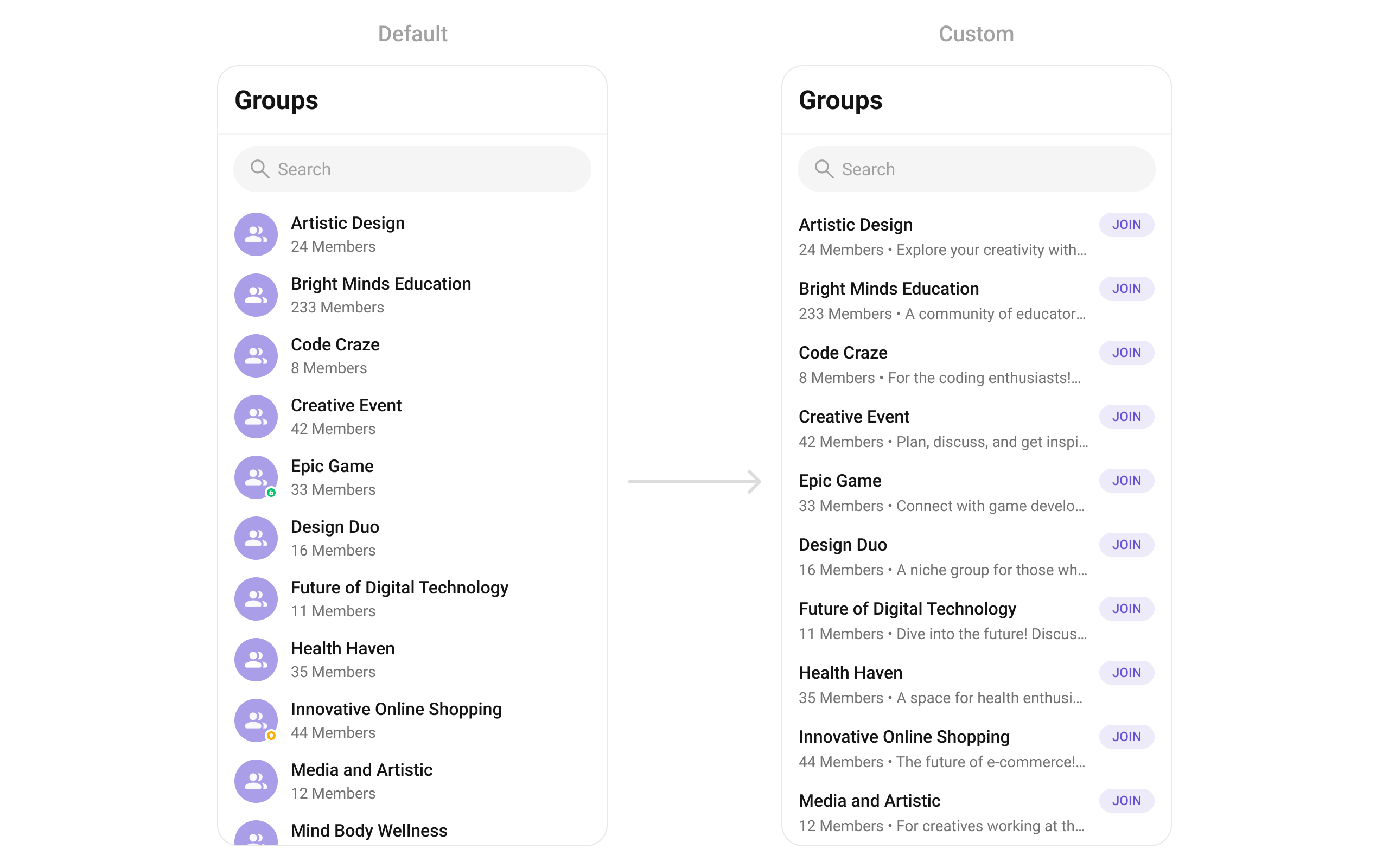
### subtitleView
Replace the member count subtitle text.
```dart theme={null}
CometChatGroups(
listItemView: (group) {
return ListTile(
title: Text(
group.name,
style: TextStyle(fontSize: 16, fontWeight: FontWeight.w500),
),
subtitle: Text(
"${group.membersCount} Members • ${group.description}",
overflow: TextOverflow.ellipsis,
style: TextStyle(fontSize: 14, color: Color(0xFF727272)),
),
trailing: ElevatedButton(
onPressed: () {
CometChat.joinGroup(
group.guid,
group.type,
onSuccess: (group) {
// Handle success
},
onError: (error) {
// Handle error
},
);
},
style: ElevatedButton.styleFrom(
backgroundColor: Color(0xFFEDEAFA),
elevation: 0,
shape: RoundedRectangleBorder(borderRadius: BorderRadius.circular(1000)),
),
child: Text("JOIN", style: TextStyle(color: Color(0xFF6852D6), fontSize: 12)),
),
);
},
)
```
### leadingView
Replace the avatar / left section. Joined status badge example.
```dart theme={null}
CometChatGroups(
leadingView: (context, group) {
return Stack(
children: [
CometChatAvatar(
image: group.icon,
name: group.name,
style: CometChatAvatarStyle(borderRadius: BorderRadius.circular(8)),
),
if (group.hasJoined)
Positioned(
bottom: -2,
left: 0,
right: 0,
child: Container(
padding: EdgeInsets.symmetric(horizontal: 4, vertical: 2),
decoration: BoxDecoration(color: Color(0xFF09C26F)),
child: Text(
"Joined",
textAlign: TextAlign.center,
style: TextStyle(color: Colors.white, fontSize: 8, fontWeight: FontWeight.w600),
),
),
),
],
);
},
)
```
### titleView
Replace the name / title text. Group type badge inline example.
```dart theme={null}
CometChatGroups(
titleView: (context, group) {
return Row(
children: [
Text(
group.name,
style: TextStyle(fontWeight: FontWeight.w500, fontSize: 16),
),
SizedBox(width: 4),
Container(
padding: EdgeInsets.symmetric(horizontal: 4, vertical: 2),
decoration: BoxDecoration(
color: group.type == GroupTypeConstants.public
? Color(0xFF0B7BEA)
: Color(0xFF09C26F),
borderRadius: BorderRadius.circular(7),
),
child: Text(
group.type,
style: TextStyle(color: Colors.white, fontSize: 8, fontWeight: FontWeight.w600),
),
),
],
);
},
)
```
### subtitleView
Replace the member count subtitle text.
 ```dart theme={null}
CometChatGroups(
subtitleView: (context, group) {
return Text(
"${group.membersCount} Members • ${group.description ?? 'No description'}",
overflow: TextOverflow.ellipsis,
style: TextStyle(fontSize: 14, color: Color(0xFF727272)),
);
},
)
```
### trailingView
Replace the right section. Join status button example.
```dart theme={null}
CometChatGroups(
trailingView: (context, group) {
return Container(
padding: EdgeInsets.symmetric(horizontal: 12, vertical: 4),
decoration: BoxDecoration(
color: Color(0xFFEDEAFA),
borderRadius: BorderRadius.circular(1000),
),
child: Text(
group.hasJoined ? "JOINED" : "+ JOIN",
style: TextStyle(color: Color(0xFF6852D6), fontSize: 12, fontWeight: FontWeight.w700),
),
);
},
)
```
### setOptions
Replace the context menu / long-press actions on each group item.
```dart theme={null}
CometChatGroups(
setOptions: (group, controller, context) {
return [
CometChatOption(
id: "leave",
title: "Leave Group",
icon: AssetConstants.close,
onClick: () {
CometChat.leaveGroup(group.guid, onSuccess: (response) {
print("Left group");
}, onError: (error) {
print("Error: $error");
});
},
),
CometChatOption(
id: "view_members",
title: "View Members",
iconWidget: Icon(Icons.people_outline),
onClick: () {
// Navigate to group members
},
),
];
},
)
```
### addOptions
Add to the existing context menu actions without removing defaults.
```dart theme={null}
CometChatGroups(
addOptions: (group, controller, context) {
return [
CometChatOption(
id: "mute",
title: "Mute Notifications",
iconWidget: Icon(Icons.notifications_off_outlined),
onClick: () {
// Mute notifications logic
},
),
CometChatOption(
id: "pin",
title: "Pin Group",
iconWidget: Icon(Icons.push_pin_outlined),
onClick: () {
// Pin group logic
},
),
];
},
)
```
### appBarOptions
Add custom widgets to the app bar.
```dart theme={null}
CometChatGroups(
subtitleView: (context, group) {
return Text(
"${group.membersCount} Members • ${group.description ?? 'No description'}",
overflow: TextOverflow.ellipsis,
style: TextStyle(fontSize: 14, color: Color(0xFF727272)),
);
},
)
```
### trailingView
Replace the right section. Join status button example.
```dart theme={null}
CometChatGroups(
trailingView: (context, group) {
return Container(
padding: EdgeInsets.symmetric(horizontal: 12, vertical: 4),
decoration: BoxDecoration(
color: Color(0xFFEDEAFA),
borderRadius: BorderRadius.circular(1000),
),
child: Text(
group.hasJoined ? "JOINED" : "+ JOIN",
style: TextStyle(color: Color(0xFF6852D6), fontSize: 12, fontWeight: FontWeight.w700),
),
);
},
)
```
### setOptions
Replace the context menu / long-press actions on each group item.
```dart theme={null}
CometChatGroups(
setOptions: (group, controller, context) {
return [
CometChatOption(
id: "leave",
title: "Leave Group",
icon: AssetConstants.close,
onClick: () {
CometChat.leaveGroup(group.guid, onSuccess: (response) {
print("Left group");
}, onError: (error) {
print("Error: $error");
});
},
),
CometChatOption(
id: "view_members",
title: "View Members",
iconWidget: Icon(Icons.people_outline),
onClick: () {
// Navigate to group members
},
),
];
},
)
```
### addOptions
Add to the existing context menu actions without removing defaults.
```dart theme={null}
CometChatGroups(
addOptions: (group, controller, context) {
return [
CometChatOption(
id: "mute",
title: "Mute Notifications",
iconWidget: Icon(Icons.notifications_off_outlined),
onClick: () {
// Mute notifications logic
},
),
CometChatOption(
id: "pin",
title: "Pin Group",
iconWidget: Icon(Icons.push_pin_outlined),
onClick: () {
// Pin group logic
},
),
];
},
)
```
### appBarOptions
Add custom widgets to the app bar.
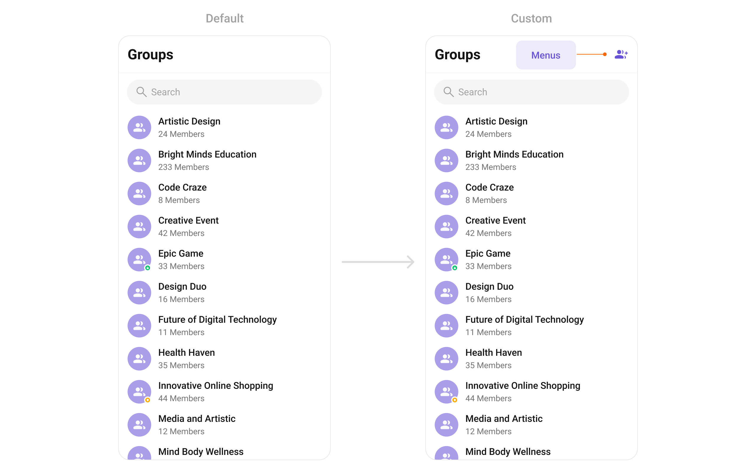 ```dart theme={null}
CometChatGroups(
appBarOptions: (context) => [
IconButton(
onPressed: () {
// Navigate to create group
},
icon: Icon(Icons.group_add, color: Color(0xFF6852D6)),
),
],
)
```
***
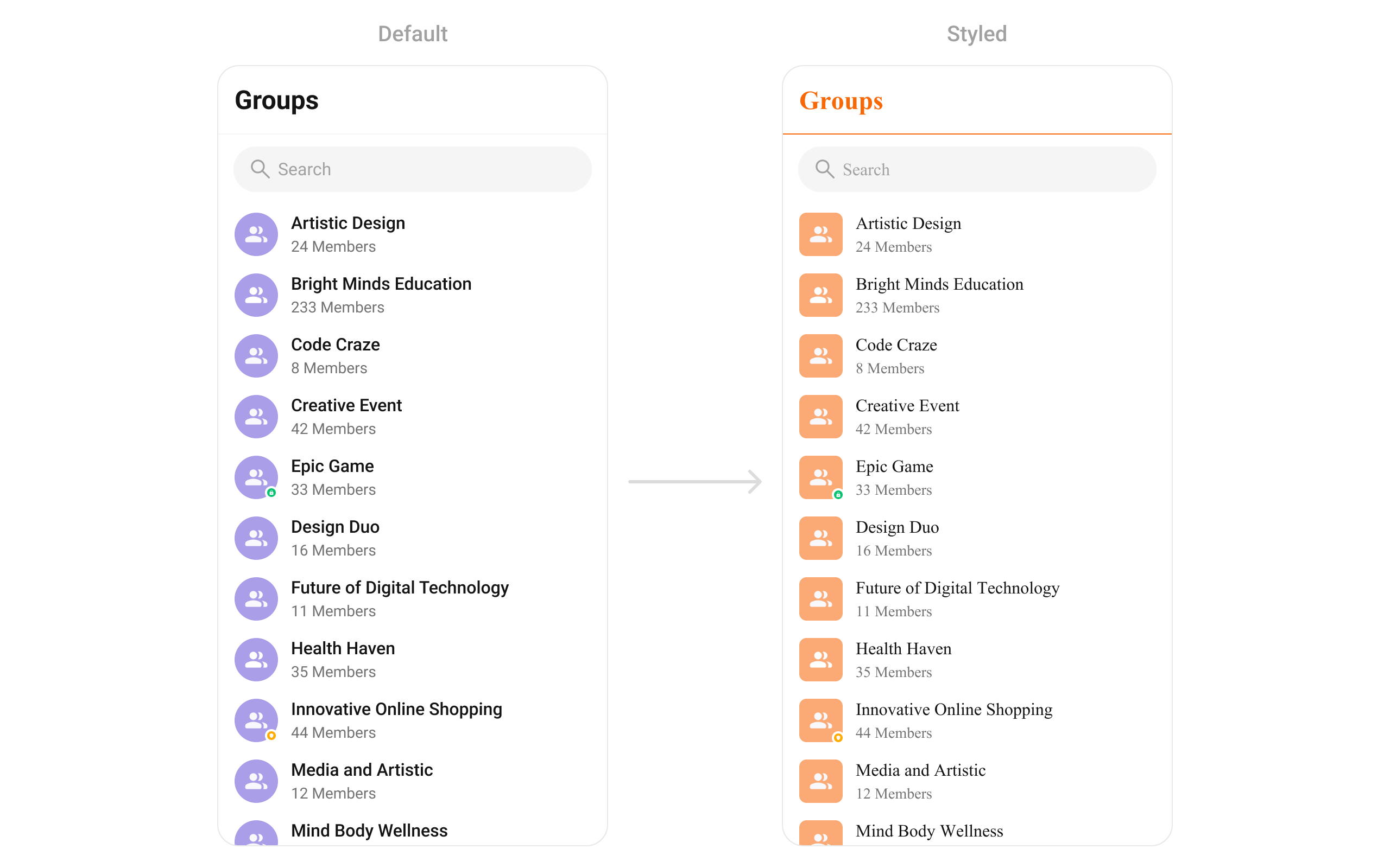
## Styling
Set `CometChatGroupsStyle` to customize the appearance.
```dart theme={null}
CometChatGroups(
groupsStyle: CometChatGroupsStyle(
backgroundColor: Colors.white,
titleTextColor: Color(0xFFF76808),
separatorColor: Color(0xFFF76808),
avatarStyle: CometChatAvatarStyle(
borderRadius: BorderRadius.circular(8),
backgroundColor: Color(0xFFFBAA75),
),
),
)
```
```dart theme={null}
CometChatGroups(
appBarOptions: (context) => [
IconButton(
onPressed: () {
// Navigate to create group
},
icon: Icon(Icons.group_add, color: Color(0xFF6852D6)),
),
],
)
```
***
## Styling
Set `CometChatGroupsStyle` to customize the appearance.
```dart theme={null}
CometChatGroups(
groupsStyle: CometChatGroupsStyle(
backgroundColor: Colors.white,
titleTextColor: Color(0xFFF76808),
separatorColor: Color(0xFFF76808),
avatarStyle: CometChatAvatarStyle(
borderRadius: BorderRadius.circular(8),
backgroundColor: Color(0xFFFBAA75),
),
),
)
```
 ### Style Properties
| Property | Type | Description |
| --------------------------------- | ------------------------------- | ---------------------------------------- |
| `backgroundColor` | `Color` | Background color of the component |
| `border` | `Border` | Border for the widget |
| `borderRadius` | `BorderRadiusGeometry` | Border radius for the widget |
| `titleTextColor` | `Color` | Color of the header title |
| `titleTextStyle` | `TextStyle` | Style for the header title |
| `backIconColor` | `Color` | Back button icon color |
| `searchBackgroundColor` | `Color` | Background color of search box |
| `searchBorder` | `BorderSide` | Border for search box |
| `searchBorderRadius` | `BorderRadius` | Border radius for search box |
| `searchPlaceHolderTextColor` | `Color` | Placeholder text color in search |
| `searchPlaceHolderTextStyle` | `TextStyle` | Placeholder text style in search |
| `searchIconColor` | `Color` | Search icon color |
| `searchInputTextColor` | `Color` | Search input text color |
| `searchInputTextStyle` | `TextStyle` | Search input text style |
| `separatorColor` | `Color` | Color of list item separators |
| `separatorHeight` | `double` | Height of list item separators |
| `itemTitleTextColor` | `Color` | Color of group name in list items |
| `itemTitleTextStyle` | `TextStyle` | Style for group name in list items |
| `itemSubtitleTextColor` | `Color` | Color of member count subtitle |
| `itemSubtitleTextStyle` | `TextStyle` | Style for member count subtitle |
| `listItemSelectedBackgroundColor` | `Color` | Background color for selected items |
| `privateGroupIconBackground` | `Color` | Background color for private group icon |
| `protectedGroupIconBackground` | `Color` | Background color for password group icon |
| `emptyStateTextColor` | `Color` | Text color for empty state title |
| `emptyStateTextStyle` | `TextStyle` | Text style for empty state title |
| `emptyStateSubTitleTextColor` | `Color` | Text color for empty state subtitle |
| `emptyStateSubTitleTextStyle` | `TextStyle` | Text style for empty state subtitle |
| `errorStateTextColor` | `Color` | Text color for error state title |
| `errorStateTextStyle` | `TextStyle` | Text style for error state title |
| `errorStateSubTitleTextColor` | `Color` | Text color for error state subtitle |
| `errorStateSubTitleTextStyle` | `TextStyle` | Text style for error state subtitle |
| `retryButtonBackgroundColor` | `Color` | Background color for retry button |
| `retryButtonBorderRadius` | `BorderRadius` | Border radius for retry button |
| `retryButtonBorder` | `BorderSide` | Border for retry button |
| `retryButtonTextColor` | `Color` | Text color for retry button |
| `retryButtonTextStyle` | `TextStyle` | Text style for retry button |
| `submitIconColor` | `Color` | Color of submit icon in selection mode |
| `checkBoxBackgroundColor` | `Color` | Background color of unchecked checkbox |
| `checkBoxCheckedBackgroundColor` | `Color` | Background color of checked checkbox |
| `checkboxSelectedIconColor` | `Color` | Color of checkmark icon |
| `checkBoxBorderRadius` | `BorderRadius` | Border radius for checkbox |
| `checkBoxBorder` | `BorderSide` | Border for checkbox |
| `avatarStyle` | `CometChatAvatarStyle` | Style for group avatars |
| `statusIndicatorStyle` | `CometChatStatusIndicatorStyle` | Style for group type indicators |
***
## Common Patterns
### Custom empty state with CTA
```dart theme={null}
CometChatGroups(
emptyStateView: (context) {
return Center(
child: Column(
mainAxisAlignment: MainAxisAlignment.center,
children: [
Icon(Icons.group_outlined, size: 64, color: Color(0xFF727272)),
SizedBox(height: 16),
Text("No groups found", style: TextStyle(fontSize: 18, fontWeight: FontWeight.w500)),
SizedBox(height: 8),
ElevatedButton(
onPressed: () {
// Navigate to create group
},
child: Text("Create a Group"),
),
],
),
);
},
)
```
### Joined groups only
```dart theme={null}
CometChatGroups(
groupsRequestBuilder: GroupsRequestBuilder()
..joinedOnly = true,
)
```
### Multi-select with selection callback
```dart theme={null}
CometChatGroups(
selectionMode: SelectionMode.multiple,
activateSelection: ActivateSelection.onClick,
onSelection: (selectedGroups) {
if (selectedGroups != null && selectedGroups.isNotEmpty) {
print("Selected ${selectedGroups.length} groups");
// Perform batch action on selected groups
}
},
)
```
### Hide all chrome — minimal list
```dart theme={null}
CometChatGroups(
hideSearch: true,
hideAppbar: true,
groupTypeVisibility: false,
)
```
***
## Accessibility
The component renders a scrollable list of interactive items. Each group row supports:
* Tap gesture for selection/navigation
* Long-press gesture for context menu actions
* Checkbox selection in multi-select mode with proper touch targets
* Group type indicators (public/private/password) with visual icons
For screen readers:
* Group names are readable as list item titles
* Group type indicators use icons — consider adding `Semantics` widgets via `leadingView` if screen reader descriptions are needed
* Selection state is communicated through checkbox widgets
The component respects system accessibility settings including text scaling and high contrast modes.
***
## Props
All props are optional unless noted.
### activateSelection
Controls when selection mode activates.
| | |
| ------- | ------------------- |
| Type | `ActivateSelection` |
| Default | `null` |
Values: `ActivateSelection.onClick`, `ActivateSelection.onLongClick`
***
### addOptions
Adds additional context menu actions to the default options.
| | |
| ------- | --------------------------------------------------------------------------------- |
| Type | `List? Function(Group, CometChatGroupsController, BuildContext)` |
| Default | `null` |
***
### appBarOptions
Custom widgets to display in the app bar.
| | |
| ------- | --------------------------------------------- |
| Type | `List Function(BuildContext context)` |
| Default | `null` |
***
### backButton
Custom back button widget.
| | |
| ------- | ------------------- |
| Type | `Widget` |
| Default | Built-in back arrow |
***
### controllerTag
Identifier tag for controller management.
| | |
| ------- | -------- |
| Type | `String` |
| Default | `null` |
***
### emptyStateView
Custom view displayed when there are no groups.
| | |
| ------- | -------------------- |
| Type | `WidgetBuilder` |
| Default | Built-in empty state |
***
### errorStateView
Custom view displayed when an error occurs.
| | |
| ------- | -------------------- |
| Type | `WidgetBuilder` |
| Default | Built-in error state |
***
### groupsProtocol
Custom protocol for fetching groups.
| | |
| ------- | ----------------------- |
| Type | `GroupsBuilderProtocol` |
| Default | `null` |
***
### groupsRequestBuilder
Controls which groups load and in what order.
| | |
| ------- | ------------------------- |
| Type | `GroupsRequestBuilder` |
| Default | SDK default (30 per page) |
Pass the builder instance, not the result of `.build()`.
***
### groupsStyle
Styling options for the groups list.
| | |
| ------- | ---------------------- |
| Type | `CometChatGroupsStyle` |
| Default | `null` |
***
### groupTypeVisibility
Shows or hides the group type icon (public/private/password) on group avatars.
| | |
| ------- | ------ |
| Type | `bool` |
| Default | `true` |
***
### height
Height of the widget.
| | |
| ------- | -------- |
| Type | `double` |
| Default | `null` |
***
### hideAppbar
Hides the app bar including title and search.
| | |
| ------- | ------- |
| Type | `bool` |
| Default | `false` |
***
### hideError
Hides the error state view.
| | |
| ------- | ------- |
| Type | `bool` |
| Default | `false` |
***
### hideSearch
Hides the search input box.
| | |
| ------- | ------- |
| Type | `bool` |
| Default | `false` |
***
### leadingView
Custom renderer for the avatar / left section.
| | |
| ------- | ----------------------------------------------------- |
| Type | `Widget? Function(BuildContext context, Group group)` |
| Default | Built-in avatar |
***
### listItemView
Custom renderer for the entire list item row.
| | |
| ------- | ------------------------------ |
| Type | `Widget Function(Group group)` |
| Default | Built-in list item |
***
### loadingStateView
Custom view displayed during loading state.
| | |
| ------- | ---------------- |
| Type | `WidgetBuilder` |
| Default | Built-in shimmer |
***
### onBack
Callback triggered when the back button is pressed.
| | |
| ------- | -------------- |
| Type | `VoidCallback` |
| Default | `null` |
***
### onEmpty
Callback triggered when the group list is empty.
| | |
| ------- | --------- |
| Type | `OnEmpty` |
| Default | `null` |
***
### onError
Callback triggered when an error occurs.
| | |
| ------- | --------- |
| Type | `OnError` |
| Default | `null` |
***
### onItemLongPress
Callback triggered on long press of a group item.
| | |
| ------- | --------------------------------------------- |
| Type | `Function(BuildContext context, Group group)` |
| Default | `null` |
***
### onItemTap
Callback triggered when tapping a group item.
| | |
| ------- | --------------------------------------------- |
| Type | `Function(BuildContext context, Group group)` |
| Default | `null` |
***
### onLoad
Callback triggered when the list is successfully loaded.
| | |
| ------- | --------------- |
| Type | `OnLoad` |
| Default | `null` |
***
### onSelection
Callback triggered when groups are selected. Requires `selectionMode` to be set.
| | |
| ------- | ----------------------------- |
| Type | `Function(List? list)` |
| Default | `null` |
***
### passwordGroupIcon
Custom icon widget for password-protected groups.
| | |
| ------- | ------------------ |
| Type | `Widget` |
| Default | Built-in lock icon |
***
### privateGroupIcon
Custom icon widget for private groups.
| | |
| ------- | -------------------- |
| Type | `Widget` |
| Default | Built-in shield icon |
***
### scrollController
Controller for scrolling the list.
| | |
| ------- | ------------------ |
| Type | `ScrollController` |
| Default | `null` |
***
### searchBoxIcon
Custom search box icon widget.
| | |
| ------- | -------------------- |
| Type | `Widget` |
| Default | Built-in search icon |
***
### searchKeyword
Pre-fills the search and filters the group list.
| | |
| ------- | -------- |
| Type | `String` |
| Default | `null` |
***
### searchPlaceholder
Placeholder text for the search input box.
| | |
| ------- | -------- |
| Type | `String` |
| Default | `null` |
***
### selectionMode
Enables single or multi-select mode.
| | |
| ------- | --------------- |
| Type | `SelectionMode` |
| Default | `null` |
Values: `SelectionMode.single`, `SelectionMode.multiple`, `SelectionMode.none`
***
### setOptions
Replaces the default context menu actions.
| | |
| ------- | --------------------------------------------------------------------------------- |
| Type | `List? Function(Group, CometChatGroupsController, BuildContext)` |
| Default | `null` |
***
### showBackButton
Shows or hides the back button.
| | |
| ------- | ------ |
| Type | `bool` |
| Default | `true` |
***
### stateCallBack
Callback to access controller functions from parent.
| | |
| ------- | ------------------------------------------------ |
| Type | `Function(CometChatGroupsController controller)` |
| Default | `null` |
***
### submitIcon
Custom submit icon widget for selection mode.
| | |
| ------- | ------------------- |
| Type | `Widget` |
| Default | Built-in check icon |
***
### subtitleView
Custom renderer for the member count subtitle.
| | |
| ------- | ----------------------------------------------------- |
| Type | `Widget? Function(BuildContext context, Group group)` |
| Default | Built-in member count |
***
### title
Title text displayed in the app bar.
| | |
| ------- | ---------- |
| Type | `String` |
| Default | `"Groups"` |
***
### titleView
Custom renderer for the name / title text.
| | |
| ------- | ----------------------------------------------------- |
| Type | `Widget? Function(BuildContext context, Group group)` |
| Default | Built-in title |
***
### trailingView
Custom renderer for the right section.
| | |
| ------- | ----------------------------------------------------- |
| Type | `Widget? Function(BuildContext context, Group group)` |
| Default | `null` |
***
### width
Width of the widget.
| | |
| ------- | -------- |
| Type | `double` |
| Default | `null` |
***
## Events
`CometChatGroups` subscribes to `CometChatGroupEvents`:
| Event | Payload | Internal behavior |
| --------------------- | --------------------------------------- | ------------------------------------------ |
| `ccGroupCreated` | `Group` | Adds new group to list |
| `ccGroupDeleted` | `Group` | Removes group from list |
| `ccGroupLeft` | `Action, User, Group` | Removes private group or updates hasJoined |
| `ccGroupMemberJoined` | `User, Group` | Updates group in list |
| `ccGroupMemberAdded` | `List, List, Group, User` | Updates group in list |
| `ccGroupMemberKicked` | `Action, User, User, Group` | Updates group in list |
| `ccGroupMemberBanned` | `Action, User, User, Group` | Updates group in list |
| `ccOwnershipChanged` | `Group, GroupMember` | Updates group in list |
***
## Customization Matrix
| What to change | Where | Property/API | Example |
| -------------------------------------- | --------------- | ----------------------------------------------- | ----------------------------------------------------------------- |
| Override behavior on group interaction | Component props | `on` callbacks | `onItemTap: (ctx, group) => setActive(group)` |
| Filter which groups appear | Component props | `groupsRequestBuilder` | `groupsRequestBuilder: GroupsRequestBuilder()..joinedOnly = true` |
| Toggle visibility of UI elements | Component props | `hide` / `show` boolean props | `hideSearch: true` |
| Replace a section of the list item | Component props | `View` render props | `listItemView: (group) => CustomWidget()` |
| Change colors, fonts, spacing | Component props | `groupsStyle` | `groupsStyle: CometChatGroupsStyle(titleTextColor: Colors.red)` |
***
Display and manage user contacts
Display recent one-on-one and group conversations
Display and manage members of a group
Learn how to customize the look and feel
### Style Properties
| Property | Type | Description |
| --------------------------------- | ------------------------------- | ---------------------------------------- |
| `backgroundColor` | `Color` | Background color of the component |
| `border` | `Border` | Border for the widget |
| `borderRadius` | `BorderRadiusGeometry` | Border radius for the widget |
| `titleTextColor` | `Color` | Color of the header title |
| `titleTextStyle` | `TextStyle` | Style for the header title |
| `backIconColor` | `Color` | Back button icon color |
| `searchBackgroundColor` | `Color` | Background color of search box |
| `searchBorder` | `BorderSide` | Border for search box |
| `searchBorderRadius` | `BorderRadius` | Border radius for search box |
| `searchPlaceHolderTextColor` | `Color` | Placeholder text color in search |
| `searchPlaceHolderTextStyle` | `TextStyle` | Placeholder text style in search |
| `searchIconColor` | `Color` | Search icon color |
| `searchInputTextColor` | `Color` | Search input text color |
| `searchInputTextStyle` | `TextStyle` | Search input text style |
| `separatorColor` | `Color` | Color of list item separators |
| `separatorHeight` | `double` | Height of list item separators |
| `itemTitleTextColor` | `Color` | Color of group name in list items |
| `itemTitleTextStyle` | `TextStyle` | Style for group name in list items |
| `itemSubtitleTextColor` | `Color` | Color of member count subtitle |
| `itemSubtitleTextStyle` | `TextStyle` | Style for member count subtitle |
| `listItemSelectedBackgroundColor` | `Color` | Background color for selected items |
| `privateGroupIconBackground` | `Color` | Background color for private group icon |
| `protectedGroupIconBackground` | `Color` | Background color for password group icon |
| `emptyStateTextColor` | `Color` | Text color for empty state title |
| `emptyStateTextStyle` | `TextStyle` | Text style for empty state title |
| `emptyStateSubTitleTextColor` | `Color` | Text color for empty state subtitle |
| `emptyStateSubTitleTextStyle` | `TextStyle` | Text style for empty state subtitle |
| `errorStateTextColor` | `Color` | Text color for error state title |
| `errorStateTextStyle` | `TextStyle` | Text style for error state title |
| `errorStateSubTitleTextColor` | `Color` | Text color for error state subtitle |
| `errorStateSubTitleTextStyle` | `TextStyle` | Text style for error state subtitle |
| `retryButtonBackgroundColor` | `Color` | Background color for retry button |
| `retryButtonBorderRadius` | `BorderRadius` | Border radius for retry button |
| `retryButtonBorder` | `BorderSide` | Border for retry button |
| `retryButtonTextColor` | `Color` | Text color for retry button |
| `retryButtonTextStyle` | `TextStyle` | Text style for retry button |
| `submitIconColor` | `Color` | Color of submit icon in selection mode |
| `checkBoxBackgroundColor` | `Color` | Background color of unchecked checkbox |
| `checkBoxCheckedBackgroundColor` | `Color` | Background color of checked checkbox |
| `checkboxSelectedIconColor` | `Color` | Color of checkmark icon |
| `checkBoxBorderRadius` | `BorderRadius` | Border radius for checkbox |
| `checkBoxBorder` | `BorderSide` | Border for checkbox |
| `avatarStyle` | `CometChatAvatarStyle` | Style for group avatars |
| `statusIndicatorStyle` | `CometChatStatusIndicatorStyle` | Style for group type indicators |
***
## Common Patterns
### Custom empty state with CTA
```dart theme={null}
CometChatGroups(
emptyStateView: (context) {
return Center(
child: Column(
mainAxisAlignment: MainAxisAlignment.center,
children: [
Icon(Icons.group_outlined, size: 64, color: Color(0xFF727272)),
SizedBox(height: 16),
Text("No groups found", style: TextStyle(fontSize: 18, fontWeight: FontWeight.w500)),
SizedBox(height: 8),
ElevatedButton(
onPressed: () {
// Navigate to create group
},
child: Text("Create a Group"),
),
],
),
);
},
)
```
### Joined groups only
```dart theme={null}
CometChatGroups(
groupsRequestBuilder: GroupsRequestBuilder()
..joinedOnly = true,
)
```
### Multi-select with selection callback
```dart theme={null}
CometChatGroups(
selectionMode: SelectionMode.multiple,
activateSelection: ActivateSelection.onClick,
onSelection: (selectedGroups) {
if (selectedGroups != null && selectedGroups.isNotEmpty) {
print("Selected ${selectedGroups.length} groups");
// Perform batch action on selected groups
}
},
)
```
### Hide all chrome — minimal list
```dart theme={null}
CometChatGroups(
hideSearch: true,
hideAppbar: true,
groupTypeVisibility: false,
)
```
***
## Accessibility
The component renders a scrollable list of interactive items. Each group row supports:
* Tap gesture for selection/navigation
* Long-press gesture for context menu actions
* Checkbox selection in multi-select mode with proper touch targets
* Group type indicators (public/private/password) with visual icons
For screen readers:
* Group names are readable as list item titles
* Group type indicators use icons — consider adding `Semantics` widgets via `leadingView` if screen reader descriptions are needed
* Selection state is communicated through checkbox widgets
The component respects system accessibility settings including text scaling and high contrast modes.
***
## Props
All props are optional unless noted.
### activateSelection
Controls when selection mode activates.
| | |
| ------- | ------------------- |
| Type | `ActivateSelection` |
| Default | `null` |
Values: `ActivateSelection.onClick`, `ActivateSelection.onLongClick`
***
### addOptions
Adds additional context menu actions to the default options.
| | |
| ------- | --------------------------------------------------------------------------------- |
| Type | `List? Function(Group, CometChatGroupsController, BuildContext)` |
| Default | `null` |
***
### appBarOptions
Custom widgets to display in the app bar.
| | |
| ------- | --------------------------------------------- |
| Type | `List Function(BuildContext context)` |
| Default | `null` |
***
### backButton
Custom back button widget.
| | |
| ------- | ------------------- |
| Type | `Widget` |
| Default | Built-in back arrow |
***
### controllerTag
Identifier tag for controller management.
| | |
| ------- | -------- |
| Type | `String` |
| Default | `null` |
***
### emptyStateView
Custom view displayed when there are no groups.
| | |
| ------- | -------------------- |
| Type | `WidgetBuilder` |
| Default | Built-in empty state |
***
### errorStateView
Custom view displayed when an error occurs.
| | |
| ------- | -------------------- |
| Type | `WidgetBuilder` |
| Default | Built-in error state |
***
### groupsProtocol
Custom protocol for fetching groups.
| | |
| ------- | ----------------------- |
| Type | `GroupsBuilderProtocol` |
| Default | `null` |
***
### groupsRequestBuilder
Controls which groups load and in what order.
| | |
| ------- | ------------------------- |
| Type | `GroupsRequestBuilder` |
| Default | SDK default (30 per page) |
Pass the builder instance, not the result of `.build()`.
***
### groupsStyle
Styling options for the groups list.
| | |
| ------- | ---------------------- |
| Type | `CometChatGroupsStyle` |
| Default | `null` |
***
### groupTypeVisibility
Shows or hides the group type icon (public/private/password) on group avatars.
| | |
| ------- | ------ |
| Type | `bool` |
| Default | `true` |
***
### height
Height of the widget.
| | |
| ------- | -------- |
| Type | `double` |
| Default | `null` |
***
### hideAppbar
Hides the app bar including title and search.
| | |
| ------- | ------- |
| Type | `bool` |
| Default | `false` |
***
### hideError
Hides the error state view.
| | |
| ------- | ------- |
| Type | `bool` |
| Default | `false` |
***
### hideSearch
Hides the search input box.
| | |
| ------- | ------- |
| Type | `bool` |
| Default | `false` |
***
### leadingView
Custom renderer for the avatar / left section.
| | |
| ------- | ----------------------------------------------------- |
| Type | `Widget? Function(BuildContext context, Group group)` |
| Default | Built-in avatar |
***
### listItemView
Custom renderer for the entire list item row.
| | |
| ------- | ------------------------------ |
| Type | `Widget Function(Group group)` |
| Default | Built-in list item |
***
### loadingStateView
Custom view displayed during loading state.
| | |
| ------- | ---------------- |
| Type | `WidgetBuilder` |
| Default | Built-in shimmer |
***
### onBack
Callback triggered when the back button is pressed.
| | |
| ------- | -------------- |
| Type | `VoidCallback` |
| Default | `null` |
***
### onEmpty
Callback triggered when the group list is empty.
| | |
| ------- | --------- |
| Type | `OnEmpty` |
| Default | `null` |
***
### onError
Callback triggered when an error occurs.
| | |
| ------- | --------- |
| Type | `OnError` |
| Default | `null` |
***
### onItemLongPress
Callback triggered on long press of a group item.
| | |
| ------- | --------------------------------------------- |
| Type | `Function(BuildContext context, Group group)` |
| Default | `null` |
***
### onItemTap
Callback triggered when tapping a group item.
| | |
| ------- | --------------------------------------------- |
| Type | `Function(BuildContext context, Group group)` |
| Default | `null` |
***
### onLoad
Callback triggered when the list is successfully loaded.
| | |
| ------- | --------------- |
| Type | `OnLoad` |
| Default | `null` |
***
### onSelection
Callback triggered when groups are selected. Requires `selectionMode` to be set.
| | |
| ------- | ----------------------------- |
| Type | `Function(List? list)` |
| Default | `null` |
***
### passwordGroupIcon
Custom icon widget for password-protected groups.
| | |
| ------- | ------------------ |
| Type | `Widget` |
| Default | Built-in lock icon |
***
### privateGroupIcon
Custom icon widget for private groups.
| | |
| ------- | -------------------- |
| Type | `Widget` |
| Default | Built-in shield icon |
***
### scrollController
Controller for scrolling the list.
| | |
| ------- | ------------------ |
| Type | `ScrollController` |
| Default | `null` |
***
### searchBoxIcon
Custom search box icon widget.
| | |
| ------- | -------------------- |
| Type | `Widget` |
| Default | Built-in search icon |
***
### searchKeyword
Pre-fills the search and filters the group list.
| | |
| ------- | -------- |
| Type | `String` |
| Default | `null` |
***
### searchPlaceholder
Placeholder text for the search input box.
| | |
| ------- | -------- |
| Type | `String` |
| Default | `null` |
***
### selectionMode
Enables single or multi-select mode.
| | |
| ------- | --------------- |
| Type | `SelectionMode` |
| Default | `null` |
Values: `SelectionMode.single`, `SelectionMode.multiple`, `SelectionMode.none`
***
### setOptions
Replaces the default context menu actions.
| | |
| ------- | --------------------------------------------------------------------------------- |
| Type | `List? Function(Group, CometChatGroupsController, BuildContext)` |
| Default | `null` |
***
### showBackButton
Shows or hides the back button.
| | |
| ------- | ------ |
| Type | `bool` |
| Default | `true` |
***
### stateCallBack
Callback to access controller functions from parent.
| | |
| ------- | ------------------------------------------------ |
| Type | `Function(CometChatGroupsController controller)` |
| Default | `null` |
***
### submitIcon
Custom submit icon widget for selection mode.
| | |
| ------- | ------------------- |
| Type | `Widget` |
| Default | Built-in check icon |
***
### subtitleView
Custom renderer for the member count subtitle.
| | |
| ------- | ----------------------------------------------------- |
| Type | `Widget? Function(BuildContext context, Group group)` |
| Default | Built-in member count |
***
### title
Title text displayed in the app bar.
| | |
| ------- | ---------- |
| Type | `String` |
| Default | `"Groups"` |
***
### titleView
Custom renderer for the name / title text.
| | |
| ------- | ----------------------------------------------------- |
| Type | `Widget? Function(BuildContext context, Group group)` |
| Default | Built-in title |
***
### trailingView
Custom renderer for the right section.
| | |
| ------- | ----------------------------------------------------- |
| Type | `Widget? Function(BuildContext context, Group group)` |
| Default | `null` |
***
### width
Width of the widget.
| | |
| ------- | -------- |
| Type | `double` |
| Default | `null` |
***
## Events
`CometChatGroups` subscribes to `CometChatGroupEvents`:
| Event | Payload | Internal behavior |
| --------------------- | --------------------------------------- | ------------------------------------------ |
| `ccGroupCreated` | `Group` | Adds new group to list |
| `ccGroupDeleted` | `Group` | Removes group from list |
| `ccGroupLeft` | `Action, User, Group` | Removes private group or updates hasJoined |
| `ccGroupMemberJoined` | `User, Group` | Updates group in list |
| `ccGroupMemberAdded` | `List, List, Group, User` | Updates group in list |
| `ccGroupMemberKicked` | `Action, User, User, Group` | Updates group in list |
| `ccGroupMemberBanned` | `Action, User, User, Group` | Updates group in list |
| `ccOwnershipChanged` | `Group, GroupMember` | Updates group in list |
***
## Customization Matrix
| What to change | Where | Property/API | Example |
| -------------------------------------- | --------------- | ----------------------------------------------- | ----------------------------------------------------------------- |
| Override behavior on group interaction | Component props | `on` callbacks | `onItemTap: (ctx, group) => setActive(group)` |
| Filter which groups appear | Component props | `groupsRequestBuilder` | `groupsRequestBuilder: GroupsRequestBuilder()..joinedOnly = true` |
| Toggle visibility of UI elements | Component props | `hide` / `show` boolean props | `hideSearch: true` |
| Replace a section of the list item | Component props | `View` render props | `listItemView: (group) => CustomWidget()` |
| Change colors, fonts, spacing | Component props | `groupsStyle` | `groupsStyle: CometChatGroupsStyle(titleTextColor: Colors.red)` |
***
Display and manage user contacts
Display recent one-on-one and group conversations
Display and manage members of a group
Learn how to customize the look and feel