 ***
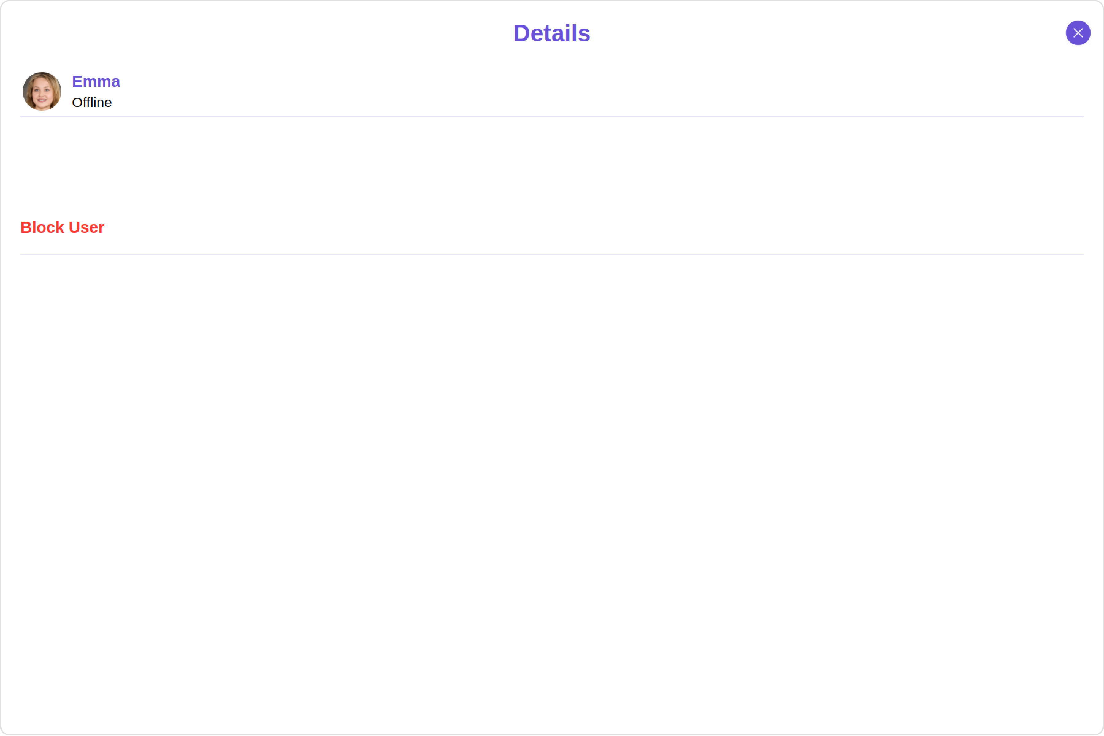
## Usage
### Integration
The following code snippet illustrates how you can directly incorporate the Users component into your Application.
***
## Usage
### Integration
The following code snippet illustrates how you can directly incorporate the Users component into your Application.
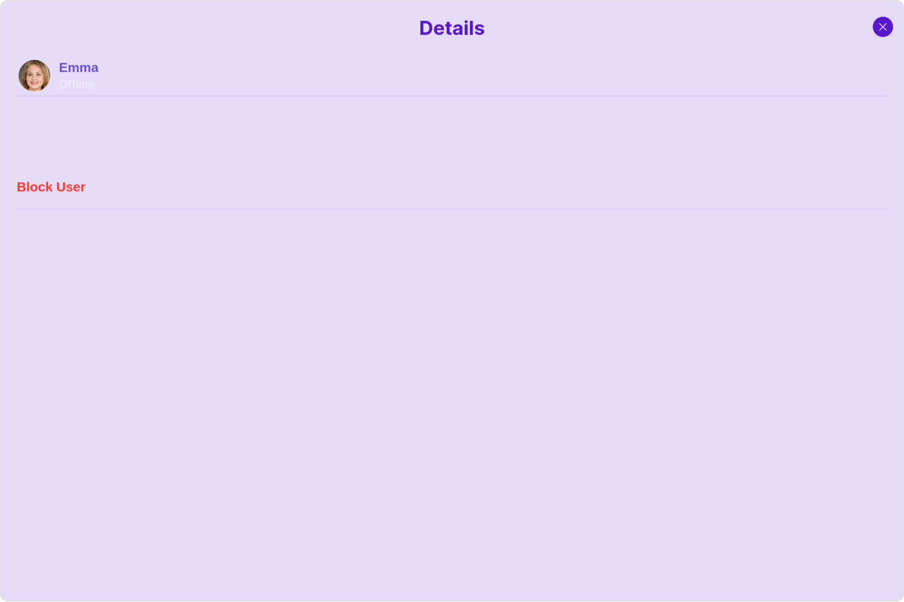
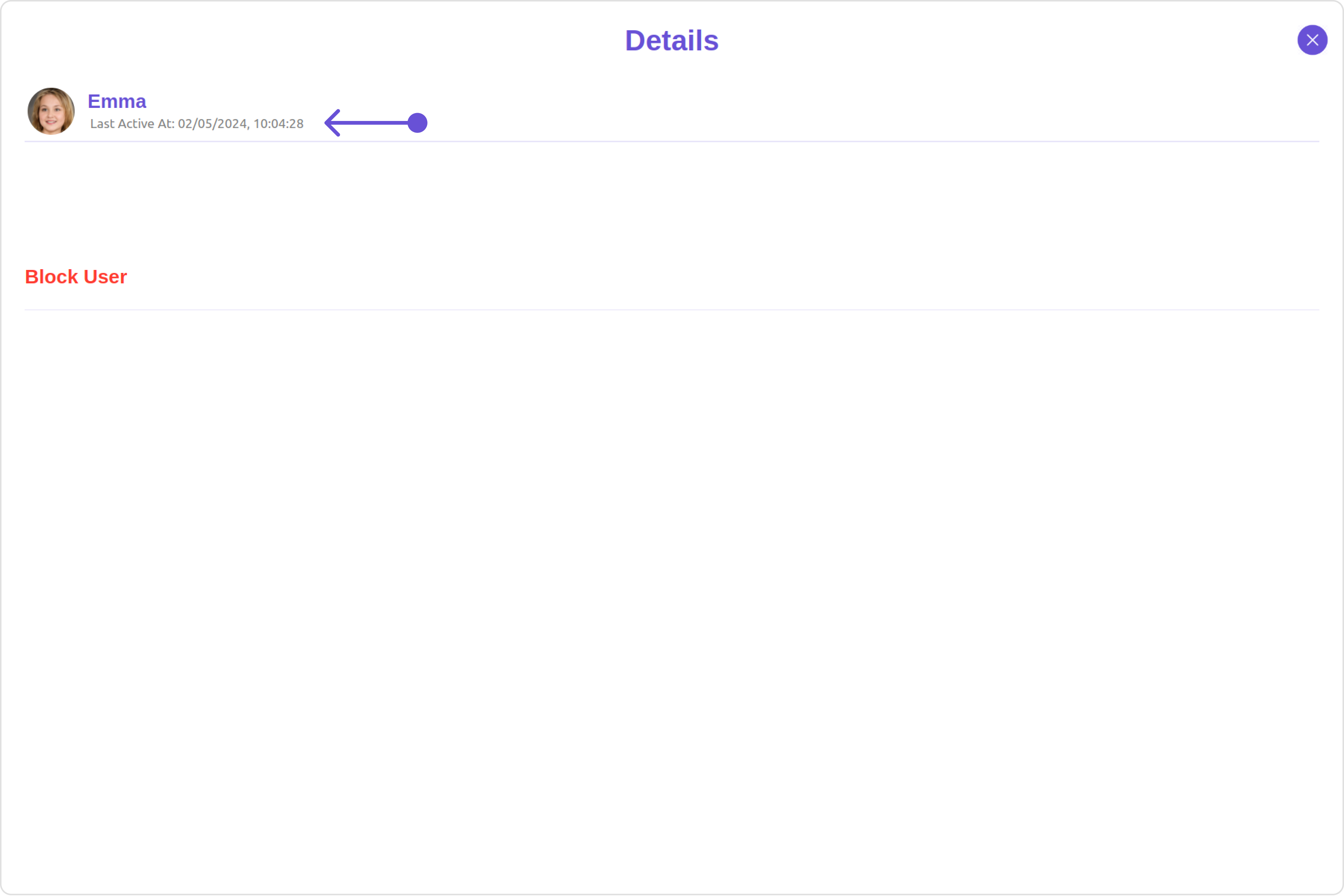
 Custom:
 Below is a list of customizations along with corresponding code snippets
| Property | Description | Code |
| --------------------------------------------------- | -------------------------------------------------------------------- | ----------------------------------------- |
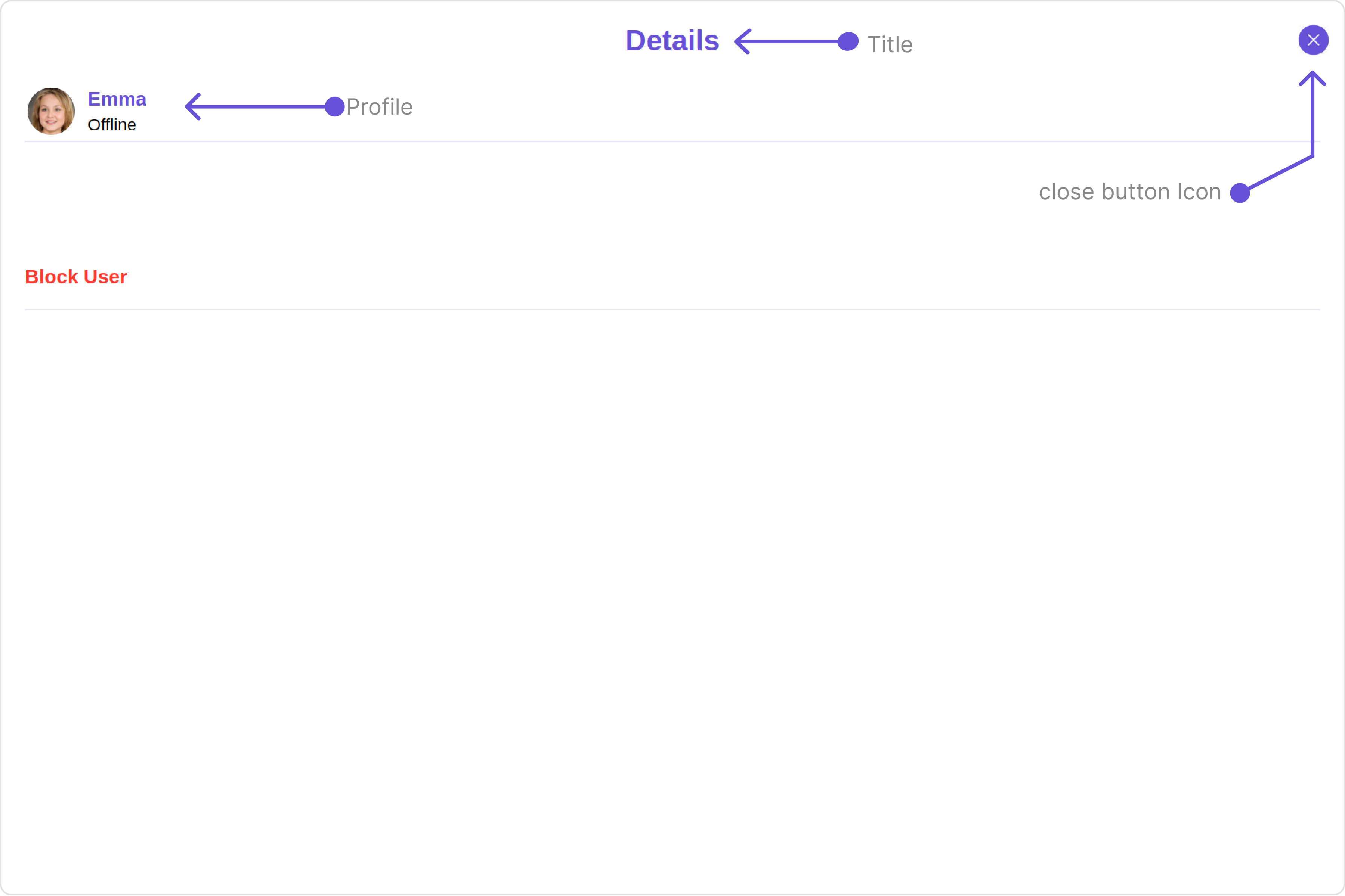
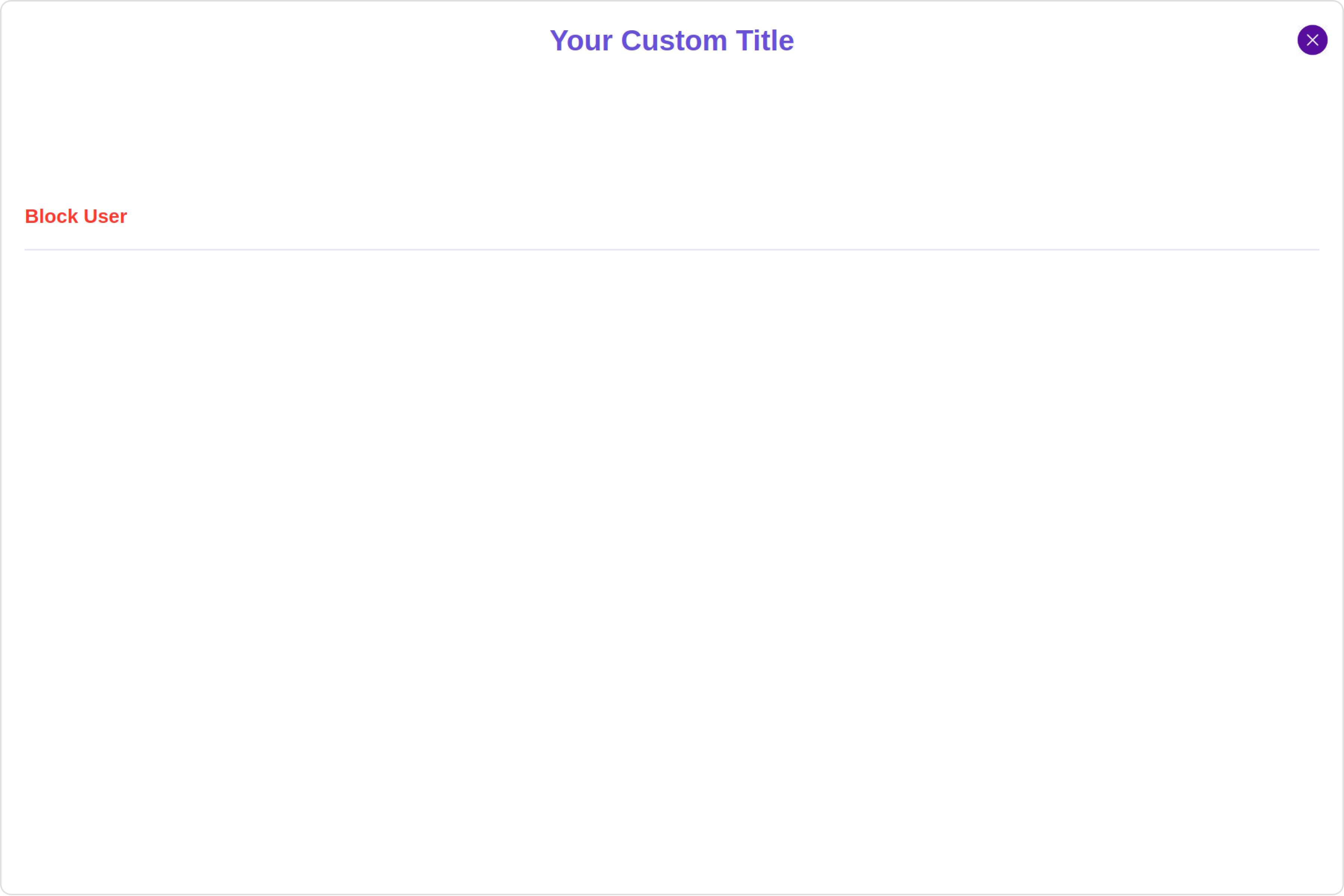
| **title**
Below is a list of customizations along with corresponding code snippets
| Property | Description | Code |
| --------------------------------------------------- | -------------------------------------------------------------------- | ----------------------------------------- |
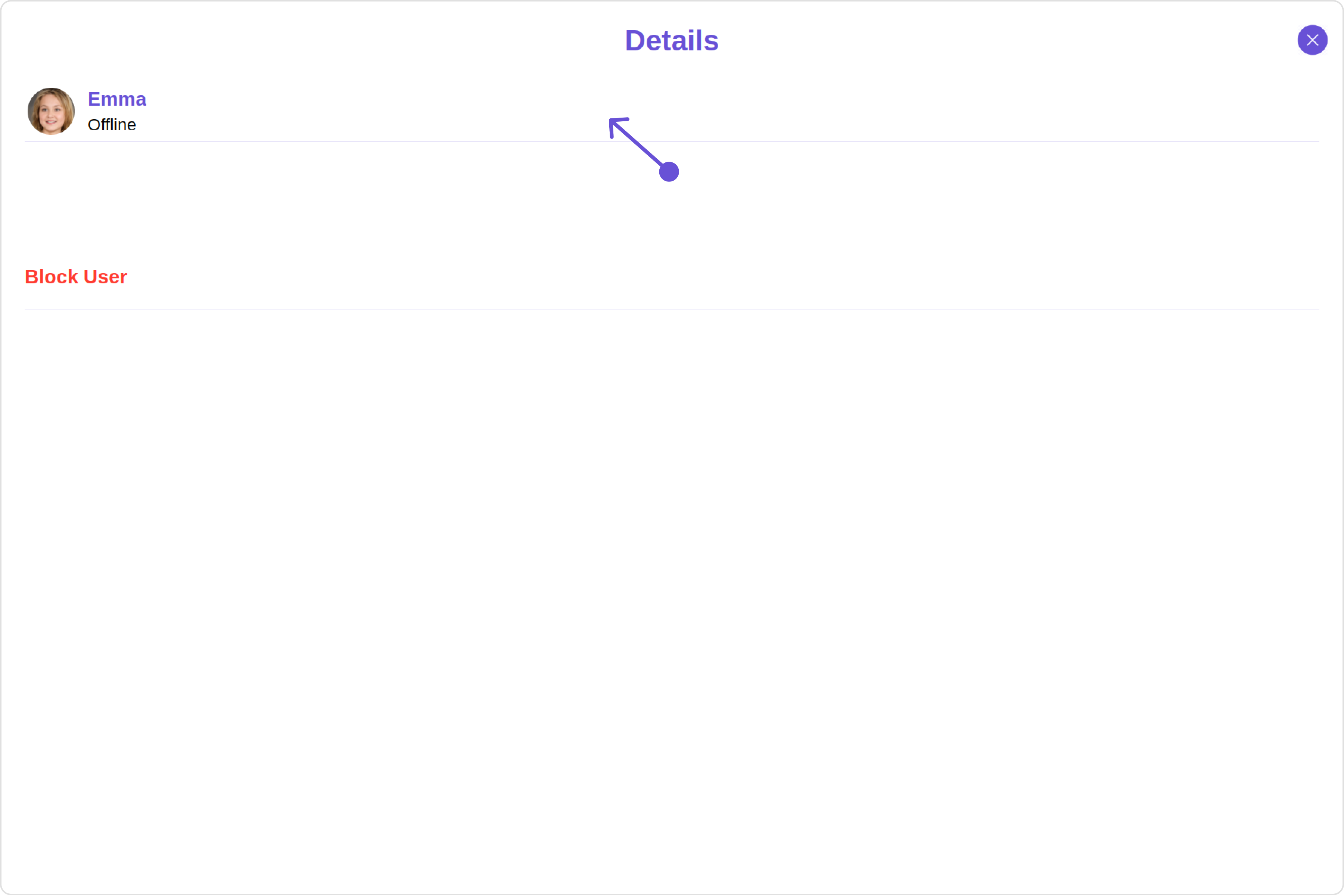
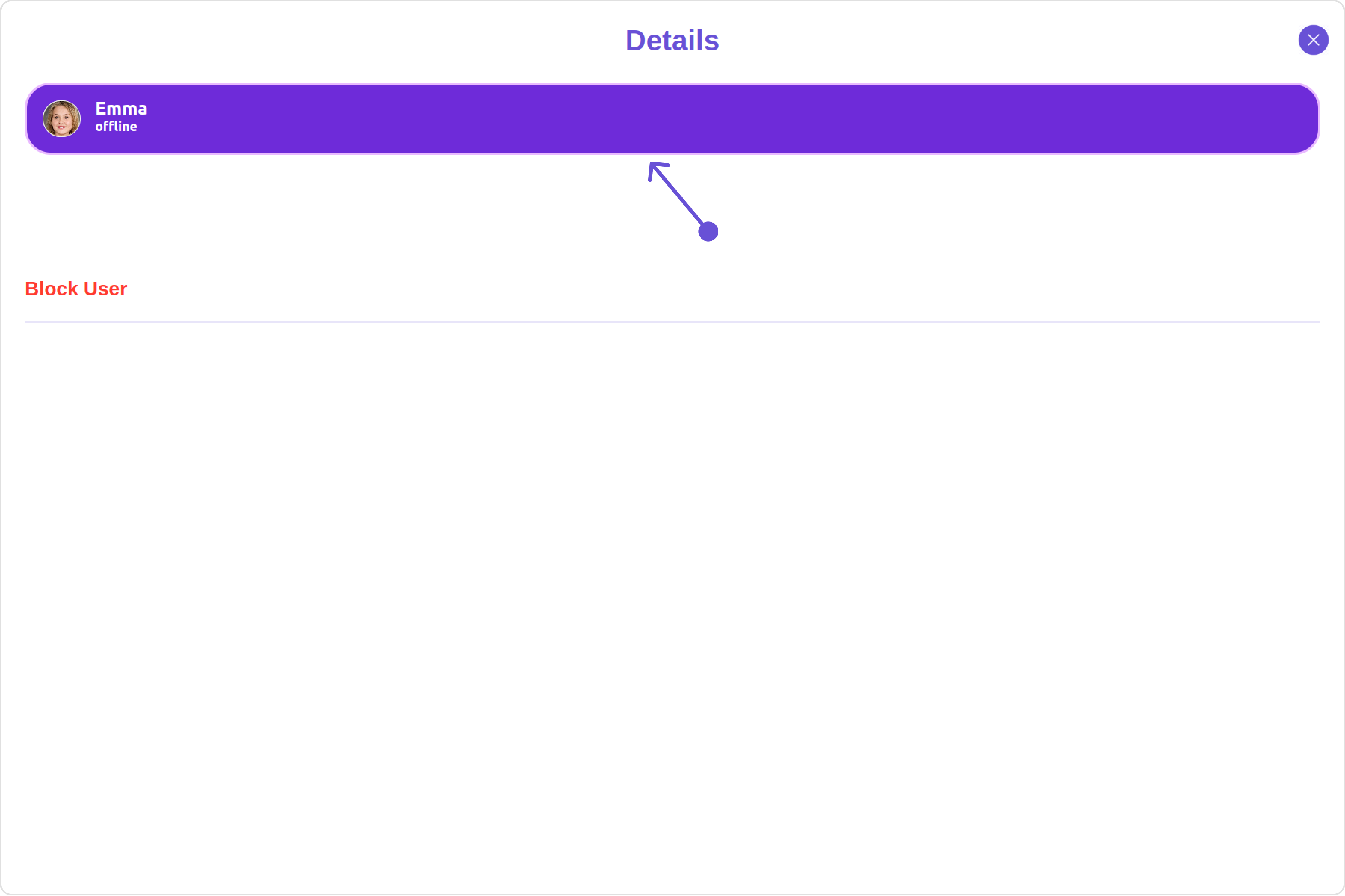
| **title** 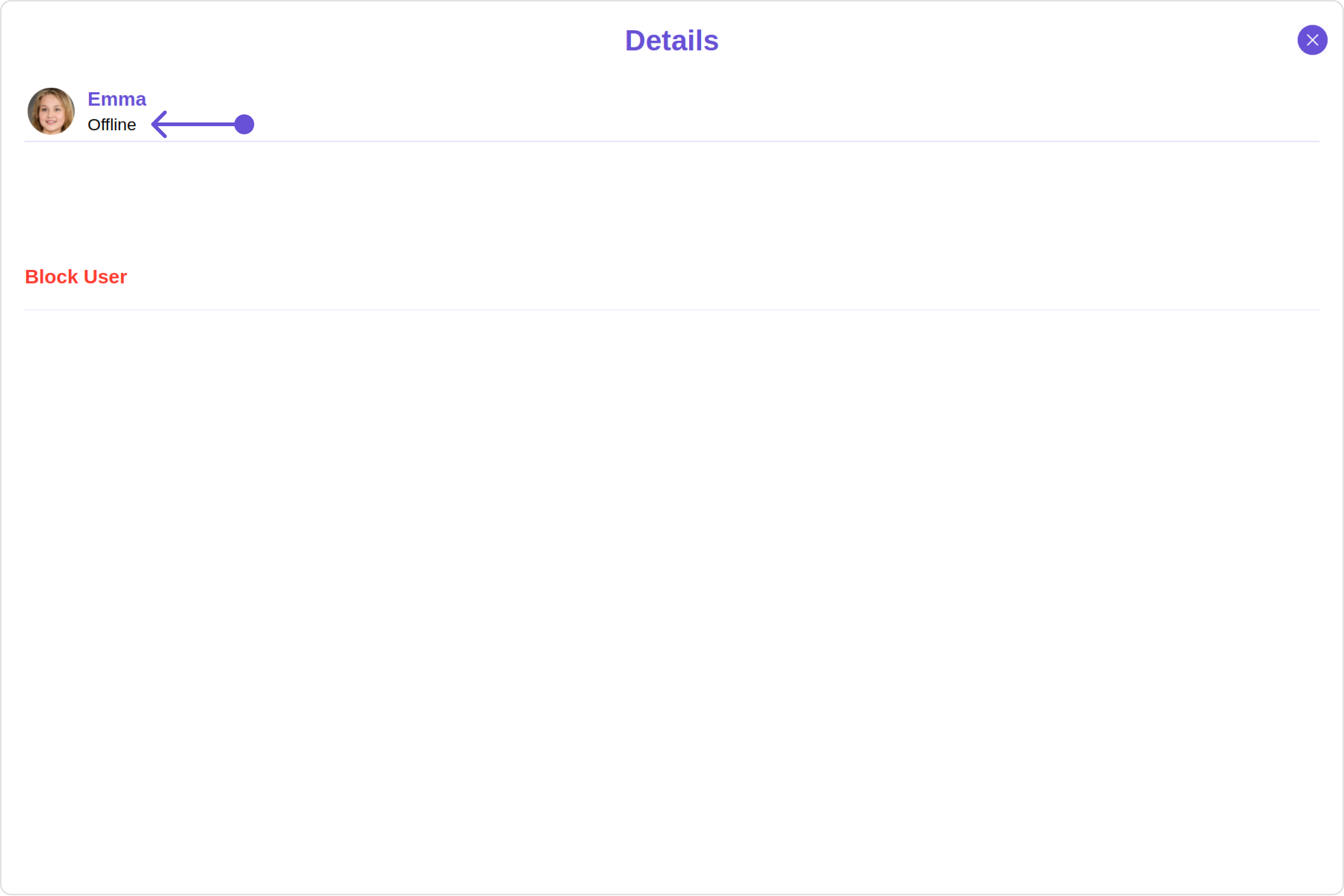 Custom:
 Custom:
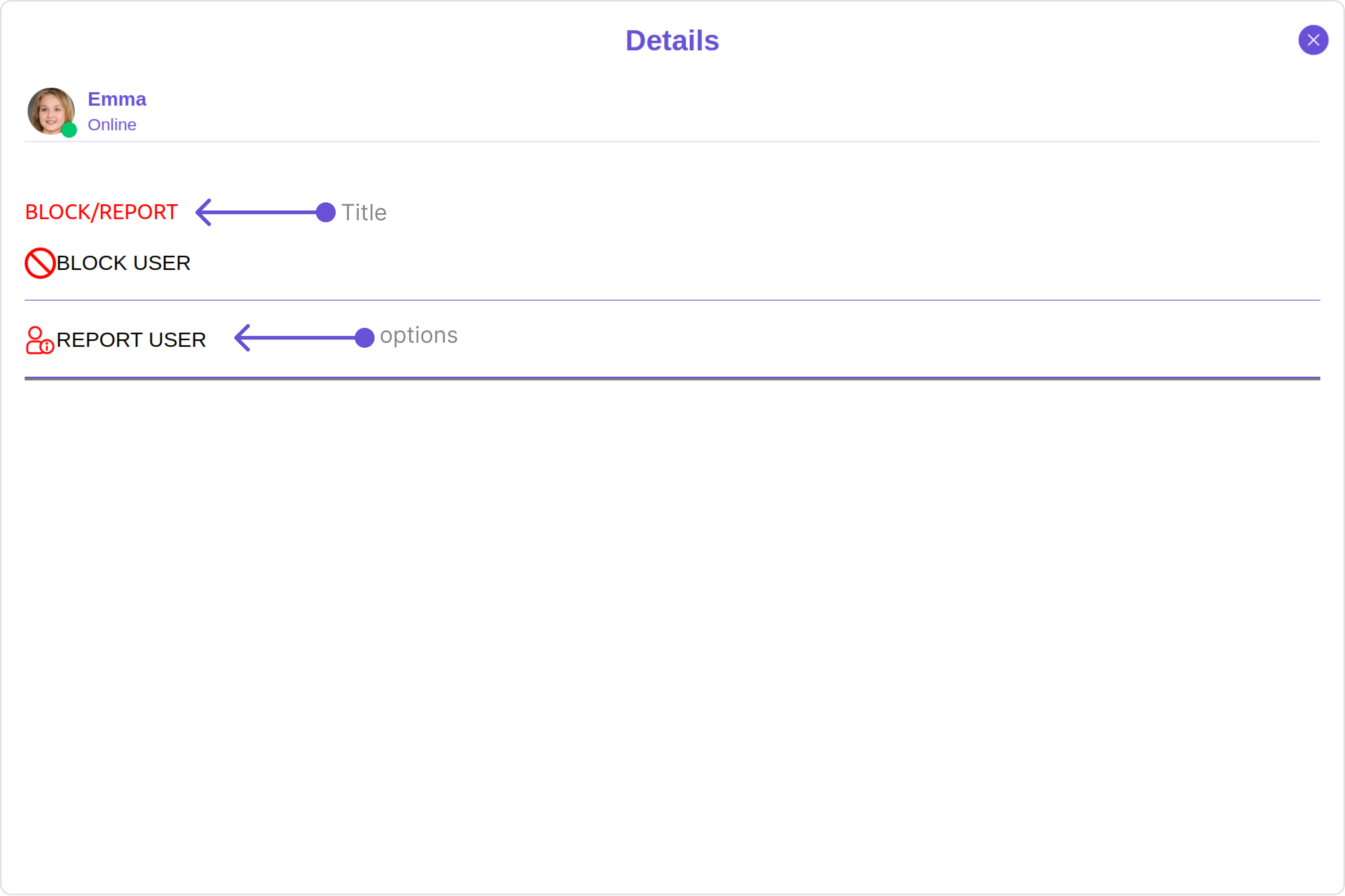 This defines the structure of template data for the details component.
| Name | Type | Description |
| ------------------------- | ---------------------------------------------------------------------------------------------------------------------------------------------------------- | --------------------------------------------------------------------- |
| **id** | String | Identifier for the template |
| **title** | String | Heading text for the template |
| **titleFont** | String | Sets all the different properties of font for the title text |
| **titleColor** | String | Sets the foreground color of title text |
| **itemSeparatorColor** | String | Sets the color of the template's option separator |
| **hideItemSeparator** | Boolean | When set to true, hides the separator under each option in a template |
| **sectionSeparatorColor** | String | Sets the color of the template separator |
| **hideSectionSeparator** | Boolean | When set to true, hides the separator for the template |
| **options** | CometChatDetailsTemplate.options?: ((loggedInUser: User \| null, group: Group \| null, section: string) => CometChatDetailsOption\[]) \| null \| undefined | defines the structure for individual options |
#### DetailsOption
The `DetailsOption` defines the structure for individual options within the CometChat details component, facilitating customization and functionality for user interactions.
This defines the structure of each option for a template in the details component.
| Name | Type | Description |
| ------------------- | ------------------------------------------------------------ | --------------------------------------------------------------------------------------- |
| **id** | String | Identifier for the template option |
| **title** | String | Heading text for the template option |
| **tail** | any | User-defined UI component to customise the trailing view for each option in a template. |
| **customView** | any | User-defined UI component to override the default view for the option. |
| **onClick** | ((item: CometChat.User \| CometChat.Group) => void) \| null; | Function invoked when user clicks on the option. |
| **titleFont** | String | Sets all the different properties of font for the title text |
| **titleColor** | String | Sets the foreground colour of title text |
| **iconURL** | String | Image url for the icon to symbolise an option |
| **iconTint** | String | Color applied to the icon of the option |
| **backgroundColor** | String | Color applied to the background of the option |
This defines the structure of template data for the details component.
| Name | Type | Description |
| ------------------------- | ---------------------------------------------------------------------------------------------------------------------------------------------------------- | --------------------------------------------------------------------- |
| **id** | String | Identifier for the template |
| **title** | String | Heading text for the template |
| **titleFont** | String | Sets all the different properties of font for the title text |
| **titleColor** | String | Sets the foreground color of title text |
| **itemSeparatorColor** | String | Sets the color of the template's option separator |
| **hideItemSeparator** | Boolean | When set to true, hides the separator under each option in a template |
| **sectionSeparatorColor** | String | Sets the color of the template separator |
| **hideSectionSeparator** | Boolean | When set to true, hides the separator for the template |
| **options** | CometChatDetailsTemplate.options?: ((loggedInUser: User \| null, group: Group \| null, section: string) => CometChatDetailsOption\[]) \| null \| undefined | defines the structure for individual options |
#### DetailsOption
The `DetailsOption` defines the structure for individual options within the CometChat details component, facilitating customization and functionality for user interactions.
This defines the structure of each option for a template in the details component.
| Name | Type | Description |
| ------------------- | ------------------------------------------------------------ | --------------------------------------------------------------------------------------- |
| **id** | String | Identifier for the template option |
| **title** | String | Heading text for the template option |
| **tail** | any | User-defined UI component to customise the trailing view for each option in a template. |
| **customView** | any | User-defined UI component to override the default view for the option. |
| **onClick** | ((item: CometChat.User \| CometChat.Group) => void) \| null; | Function invoked when user clicks on the option. |
| **titleFont** | String | Sets all the different properties of font for the title text |
| **titleColor** | String | Sets the foreground colour of title text |
| **iconURL** | String | Image url for the icon to symbolise an option |
| **iconTint** | String | Color applied to the icon of the option |
| **backgroundColor** | String | Color applied to the background of the option |