 ***
## Usage
### Integration
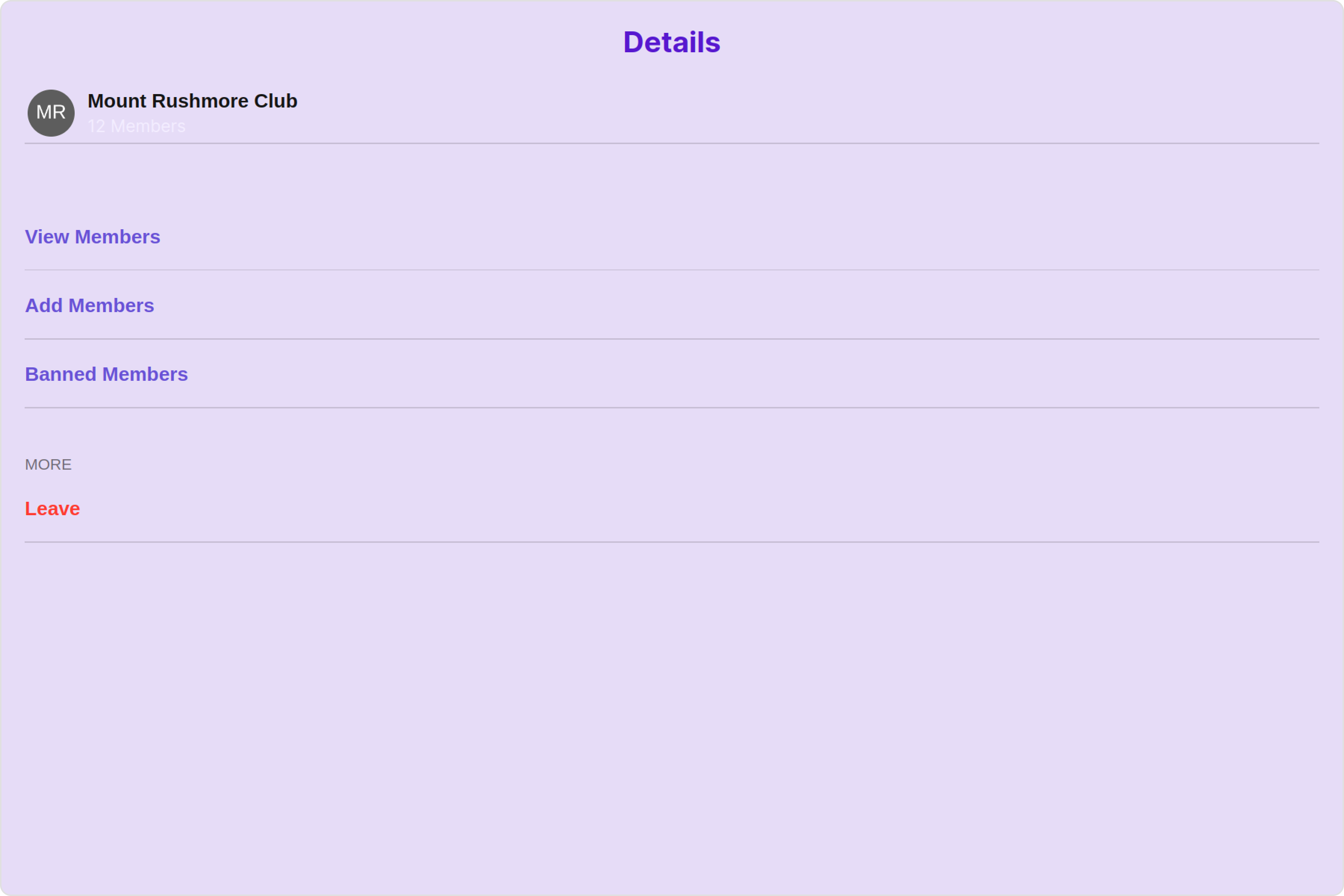
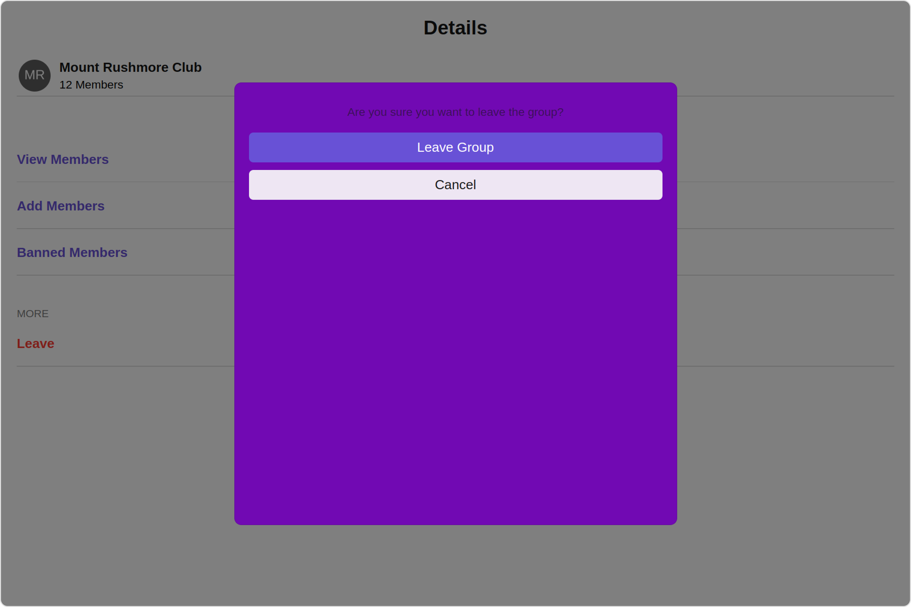
The following code snippet illustrates how you can directly incorporate the Details component into your Application.
***
## Usage
### Integration
The following code snippet illustrates how you can directly incorporate the Details component into your Application.
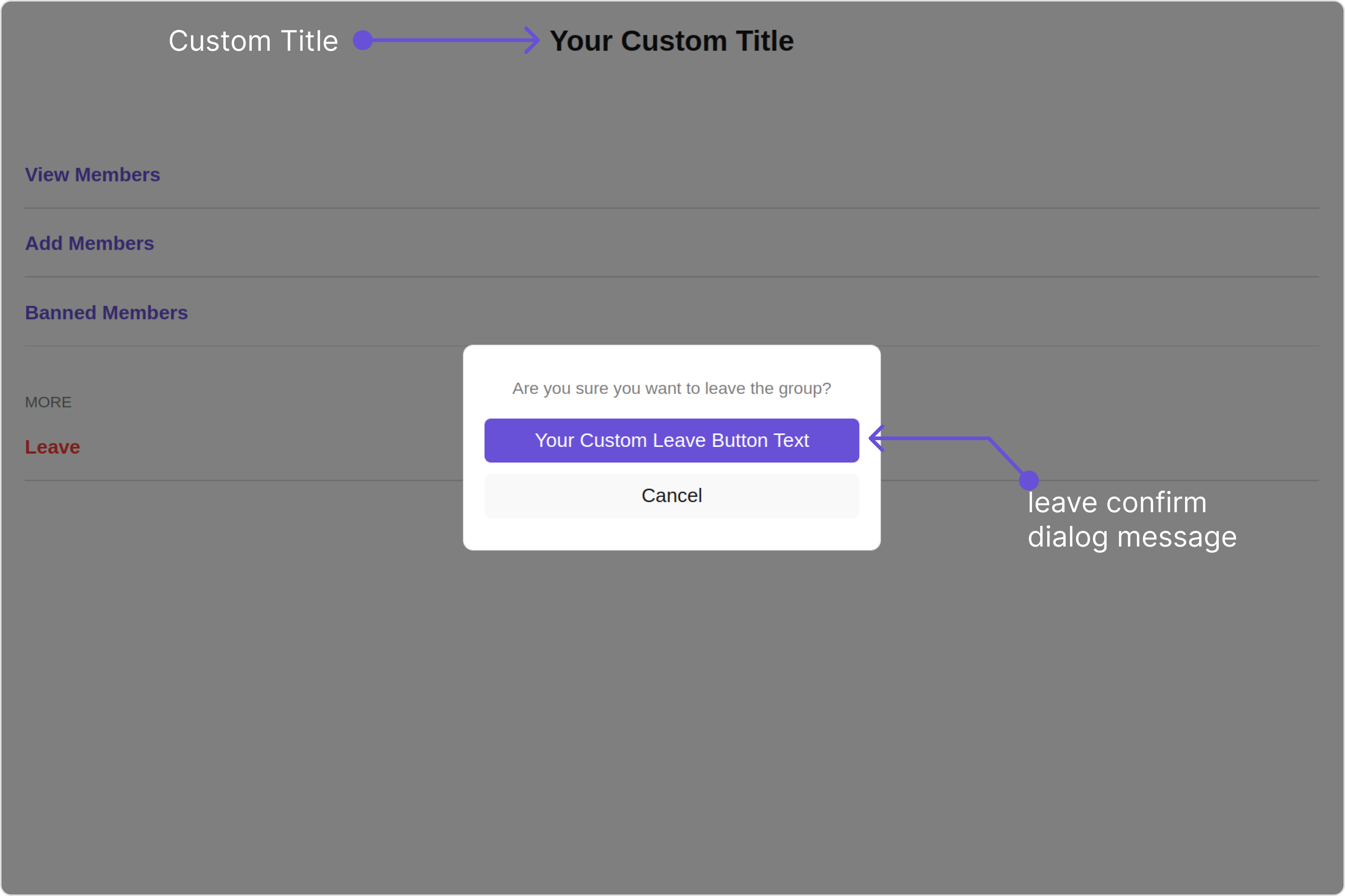
 Custom:
 Below is a list of customizations along with corresponding code snippets
| Property | Description | Code |
| -------------------------------------------------------------------------- | ------------------------------------------------------------ | ---------------------------------------------------------------------------------------------------------- |
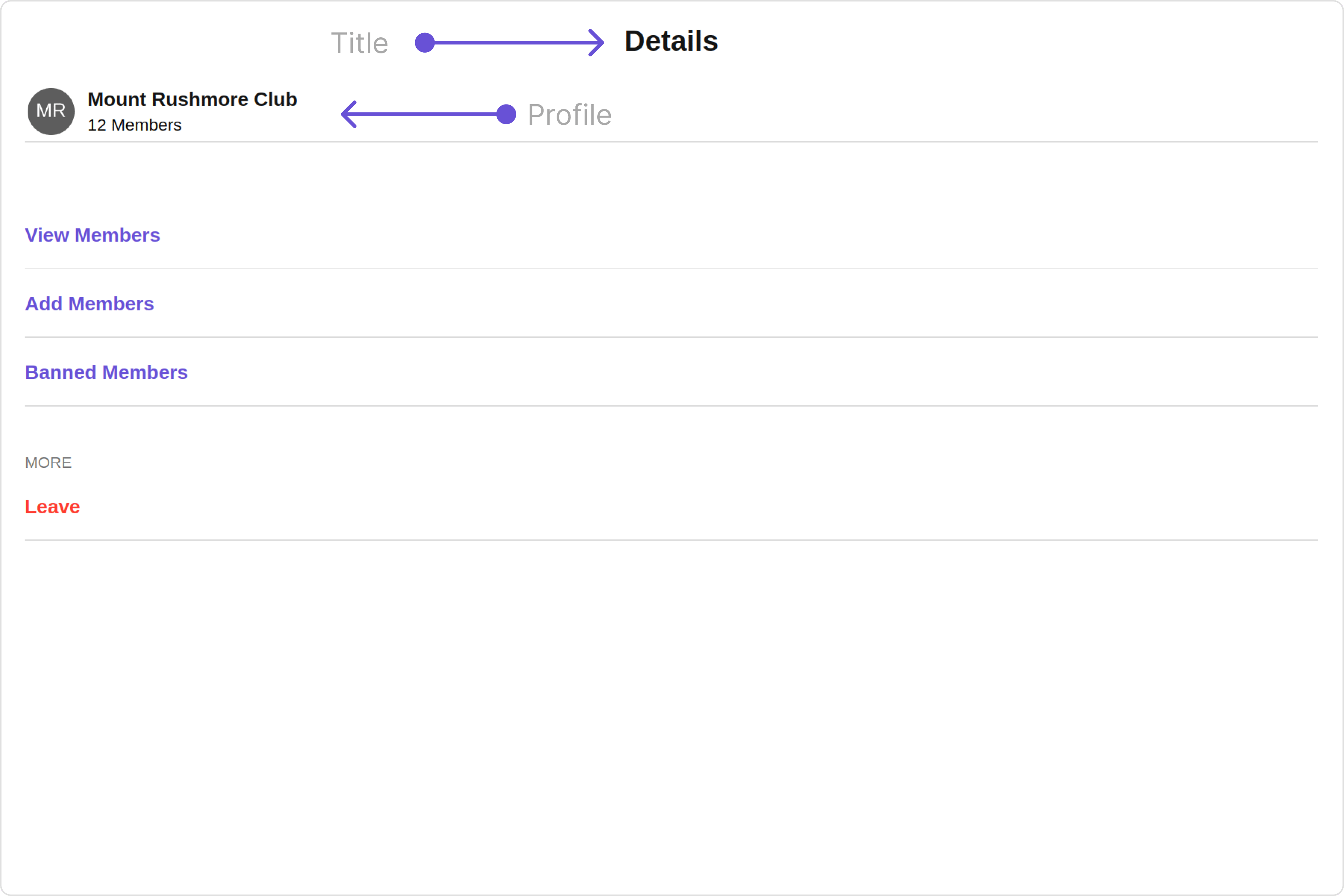
| **title**
Below is a list of customizations along with corresponding code snippets
| Property | Description | Code |
| -------------------------------------------------------------------------- | ------------------------------------------------------------ | ---------------------------------------------------------------------------------------------------------- |
| **title** 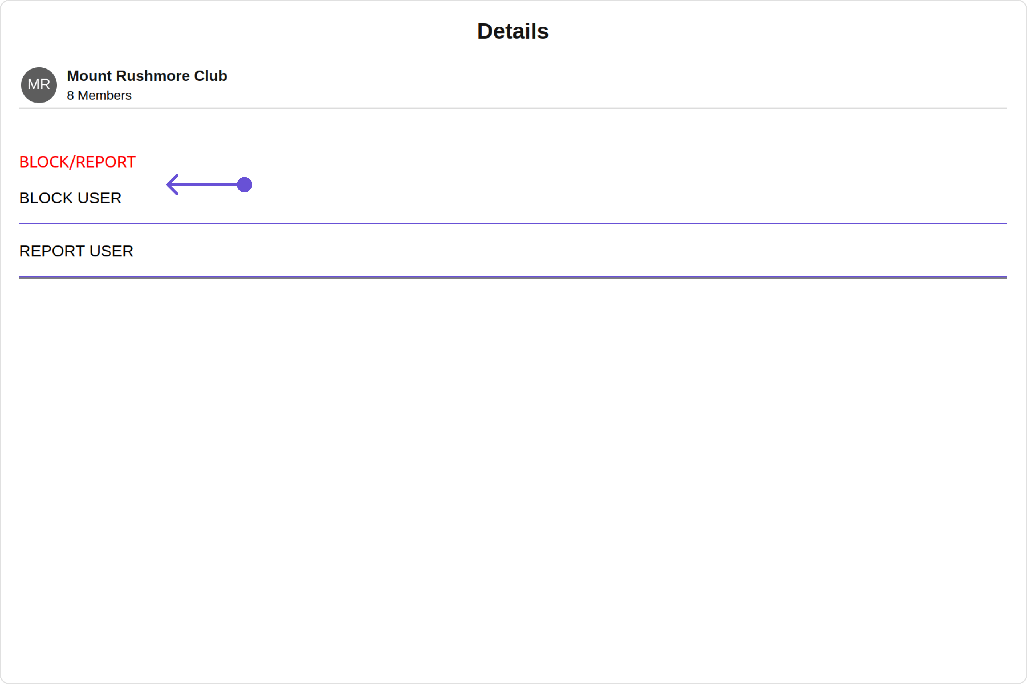 This defines the structure of template data for the details component.
| Name | Type | Description |
| ------------------------- | ---------------------------------------------------------------------------------------------------------------------------------------------------------- | --------------------------------------------------------------------- |
| **id** | String | Identifier for the template |
| **title** | String | Heading text for the template |
| **titleFont** | String | Sets all the different properties of font for the title text |
| **titleColor** | String | Sets the foreground color of title text |
| **itemSeparatorColor** | String | Sets the color of the template's option separator |
| **hideItemSeparator** | Boolean | When set to true, hides the separator under each option in a template |
| **sectionSeparatorColor** | String | Sets the color of the template separator |
| **hideSectionSeparator** | Boolean | When set to true, hides the separator for the template |
| **options** | CometChatDetailsTemplate.options?: ((loggedInUser: User \| null, group: Group \| null, section: string) => CometChatDetailsOption\[]) \| null \| undefined | defines the structure for individual options |
#### DetailsOption
The `DetailsOption` defines the structure for individual options within the CometChat details component, facilitating customization and functionality for user interactions.
This defines the structure of each option for a template in the details component.
| Name | Type | Description |
| ------------------- | ------------------------------------------------------------ | --------------------------------------------------------------------------------------- |
| **id** | String | Identifier for the template option |
| **title** | String | Heading text for the template option |
| **tail** | any | User-defined UI component to customise the trailing view for each option in a template. |
| **customView** | any | User-defined UI component to override the default view for the option. |
| **onClick** | ((item: CometChat.User \| CometChat.Group) => void) \| null; | Function invoked when user clicks on the option. |
| **titleFont** | String | Sets all the different properties of font for the title text |
| **titleColor** | String | Sets the foreground colour of title text |
| **iconURL** | String | Image url for the icon to symbolise an option |
| **iconTint** | String | Color applied to the icon of the option |
| **backgroundColor** | String | Color applied to the background of the option |
## Configurations
[Configurations](/ui-kit/angular/components-overview#configurations) offer the ability to customize the properties of each component within a Composite Component.
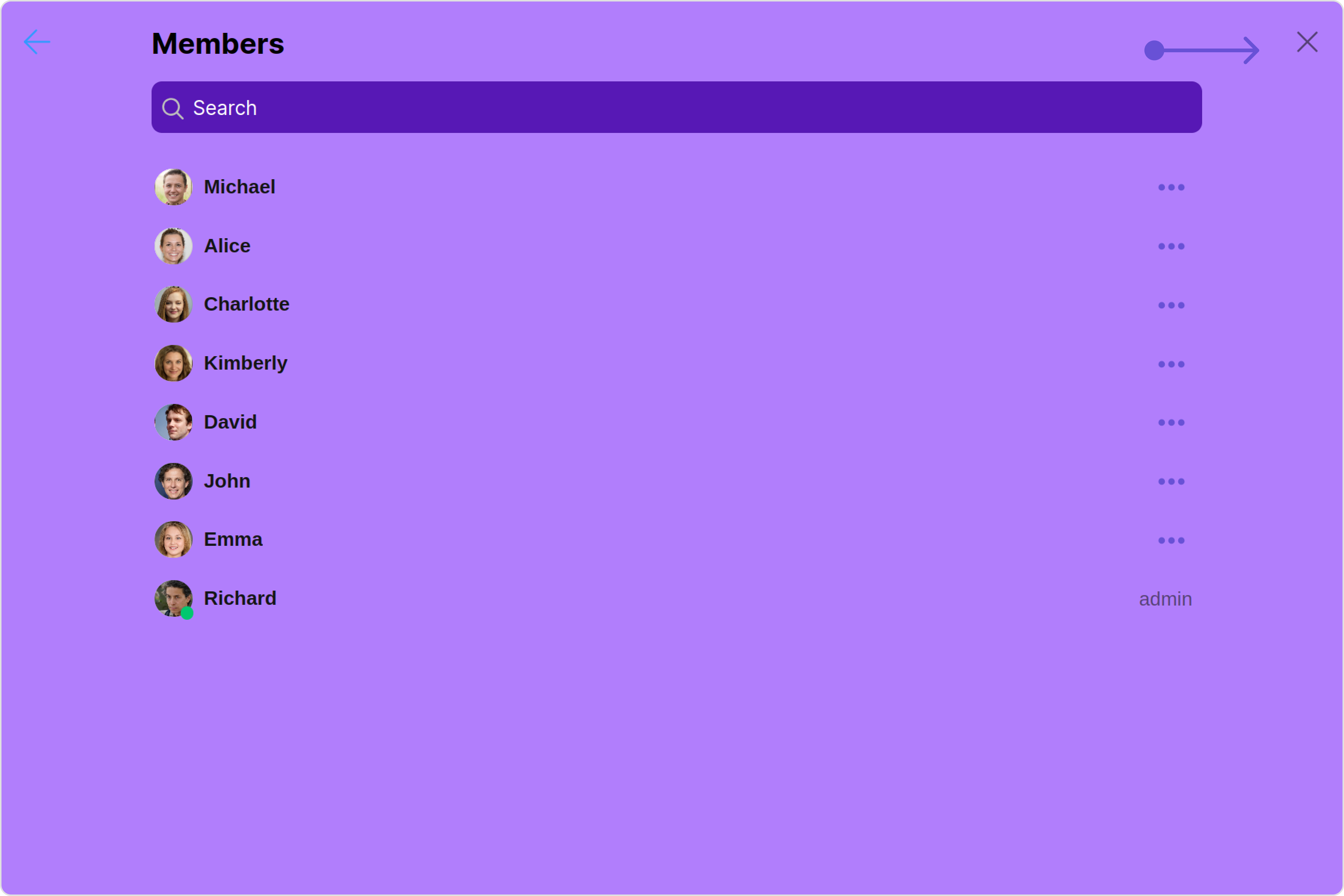
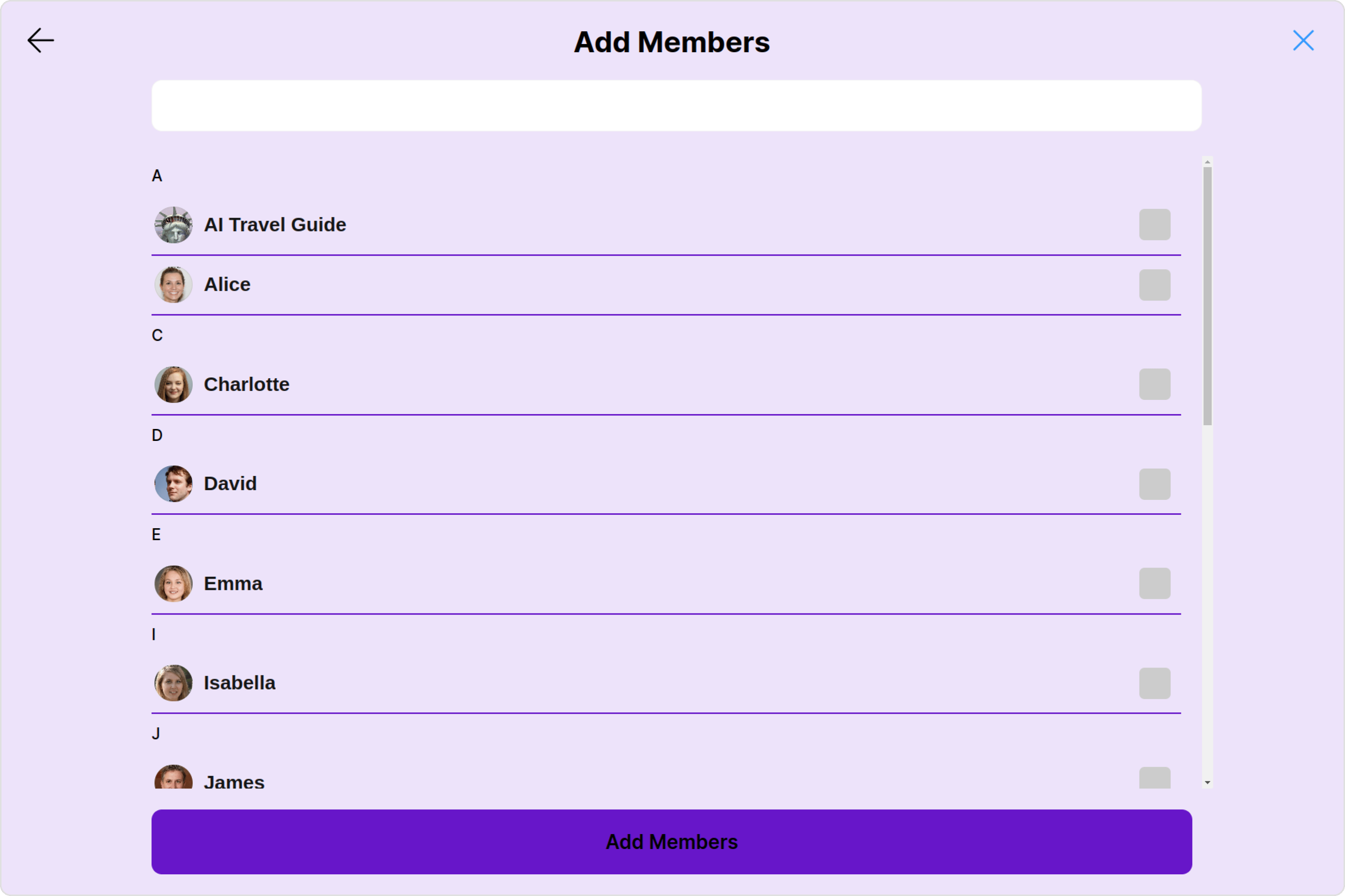
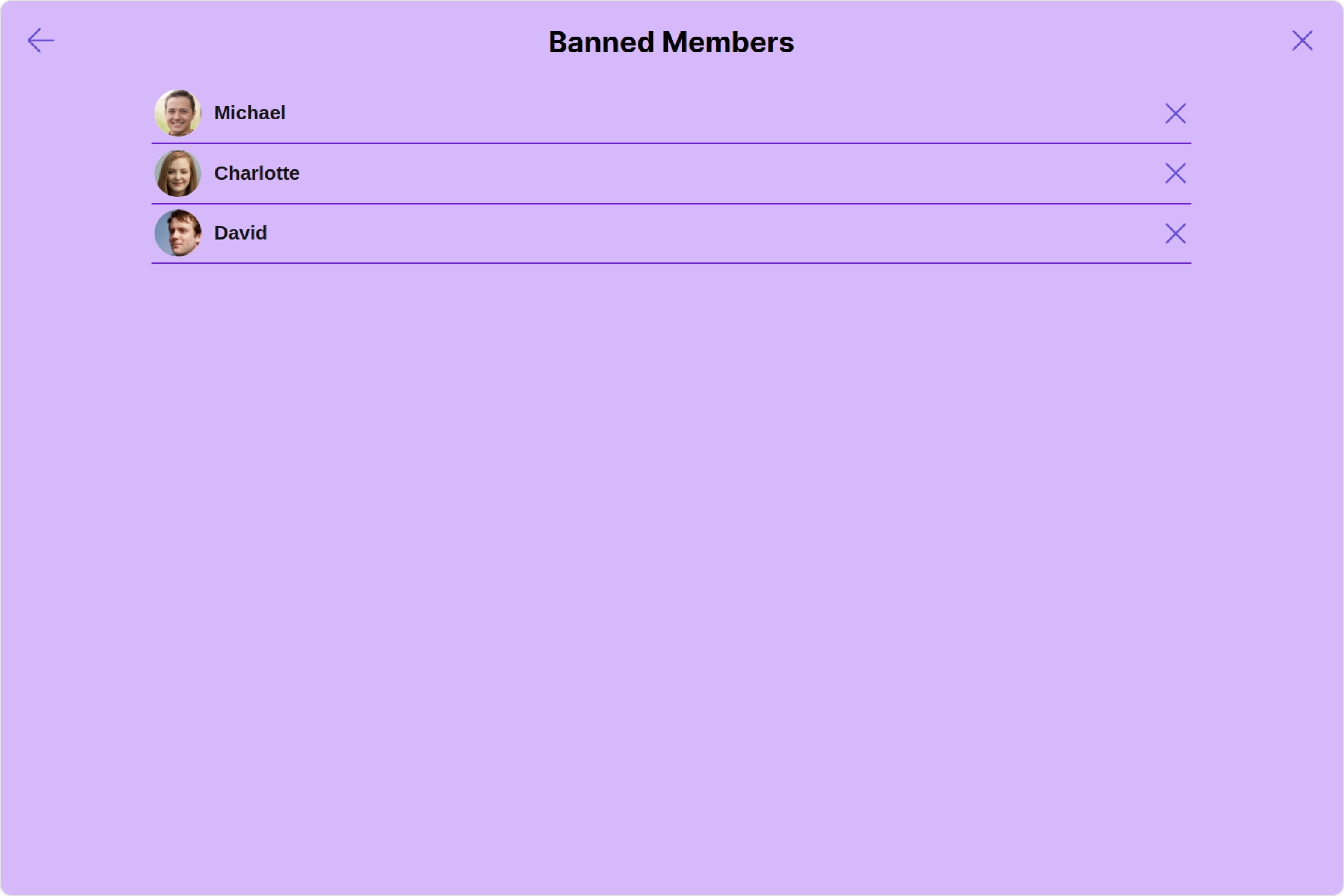
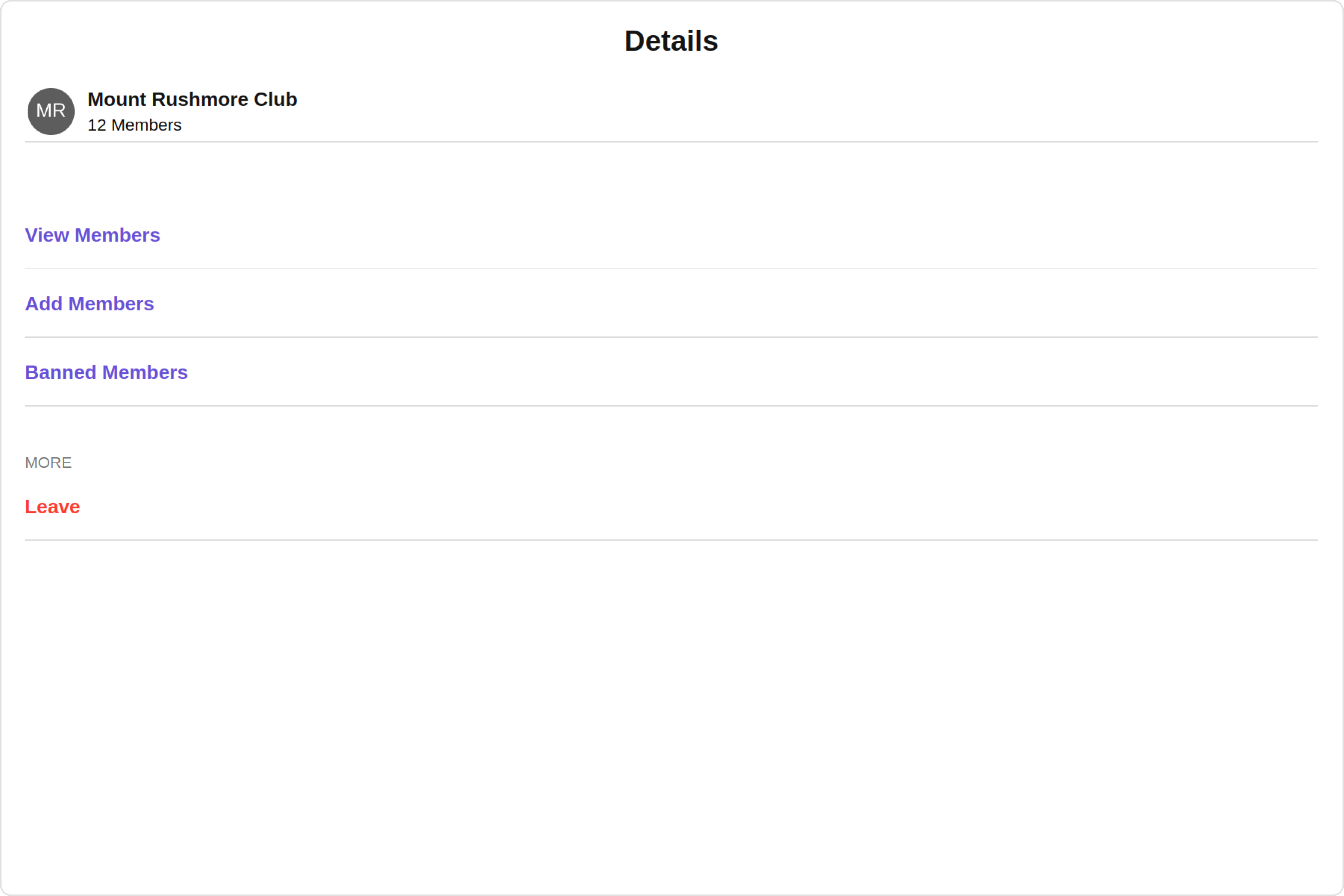
CometChatDetails has `Add Members`, `Banned Members`, `Transfer Ownership` and `Group Members` component. Hence, each of these components will have its individual \`Configuration\`\`.
* `Configurations` expose properties that are available in its individual components.
#### Group Members
You can customize the properties of the Group Members component by making use of the `groupMembersConfiguration`. You can accomplish this by employing the `groupMembersConfiguration` props as demonstrated below:
All exposed properties of `GroupMembersConfiguration` can be found under [Group Members](/ui-kit/angular/group-members#functionality). Properties marked with the 🛑 symbol are not accessible within the Configuration Object.
**Example**
Let's say you want to change the style of the Group Member subcomponent and, in addition, you only want to hide separator and left allign the title.
You can modify the style using the `groupMembersStyle` property, hide the separator using `hideSeparator` property and allign the title using `titleAlignment` property.
This defines the structure of template data for the details component.
| Name | Type | Description |
| ------------------------- | ---------------------------------------------------------------------------------------------------------------------------------------------------------- | --------------------------------------------------------------------- |
| **id** | String | Identifier for the template |
| **title** | String | Heading text for the template |
| **titleFont** | String | Sets all the different properties of font for the title text |
| **titleColor** | String | Sets the foreground color of title text |
| **itemSeparatorColor** | String | Sets the color of the template's option separator |
| **hideItemSeparator** | Boolean | When set to true, hides the separator under each option in a template |
| **sectionSeparatorColor** | String | Sets the color of the template separator |
| **hideSectionSeparator** | Boolean | When set to true, hides the separator for the template |
| **options** | CometChatDetailsTemplate.options?: ((loggedInUser: User \| null, group: Group \| null, section: string) => CometChatDetailsOption\[]) \| null \| undefined | defines the structure for individual options |
#### DetailsOption
The `DetailsOption` defines the structure for individual options within the CometChat details component, facilitating customization and functionality for user interactions.
This defines the structure of each option for a template in the details component.
| Name | Type | Description |
| ------------------- | ------------------------------------------------------------ | --------------------------------------------------------------------------------------- |
| **id** | String | Identifier for the template option |
| **title** | String | Heading text for the template option |
| **tail** | any | User-defined UI component to customise the trailing view for each option in a template. |
| **customView** | any | User-defined UI component to override the default view for the option. |
| **onClick** | ((item: CometChat.User \| CometChat.Group) => void) \| null; | Function invoked when user clicks on the option. |
| **titleFont** | String | Sets all the different properties of font for the title text |
| **titleColor** | String | Sets the foreground colour of title text |
| **iconURL** | String | Image url for the icon to symbolise an option |
| **iconTint** | String | Color applied to the icon of the option |
| **backgroundColor** | String | Color applied to the background of the option |
## Configurations
[Configurations](/ui-kit/angular/components-overview#configurations) offer the ability to customize the properties of each component within a Composite Component.
CometChatDetails has `Add Members`, `Banned Members`, `Transfer Ownership` and `Group Members` component. Hence, each of these components will have its individual \`Configuration\`\`.
* `Configurations` expose properties that are available in its individual components.
#### Group Members
You can customize the properties of the Group Members component by making use of the `groupMembersConfiguration`. You can accomplish this by employing the `groupMembersConfiguration` props as demonstrated below:
All exposed properties of `GroupMembersConfiguration` can be found under [Group Members](/ui-kit/angular/group-members#functionality). Properties marked with the 🛑 symbol are not accessible within the Configuration Object.
**Example**
Let's say you want to change the style of the Group Member subcomponent and, in addition, you only want to hide separator and left allign the title.
You can modify the style using the `groupMembersStyle` property, hide the separator using `hideSeparator` property and allign the title using `titleAlignment` property.