> ## Documentation Index
> Fetch the complete documentation index at: https://cometchat-22654f5b-docs-rn-guide-message-privately.mintlify.site/llms.txt
> Use this file to discover all available pages before exploring further.
# Introduction
> Create and apply a global CometChat UI Kit theme to match your brand across light and dark modes.
| Field | Value |
| ---------------- | --------------------------------------------------------------------------------------------------------------------------------------------- |
| Kotlin XML Views | Override XML theme attributes in `themes.xml` extending `CometChatTheme.DayNight`, or use `CometChatTheme.setPrimaryColor()` programmatically |
| Jetpack Compose | Wrap content in `CometChatTheme {}` composable, customize via `CometChatColorScheme`, `CometChatTypography`, and `Shapes` |
| Key color tokens | `primary`, `backgroundColor1`, `backgroundColor2`, `textColorPrimary`, `textColorSecondary`, `strokeColorDefault` |
| Dark mode | Kotlin: `values-night/themes.xml` overrides. Compose: provide a different `CometChatColorScheme` based on `isSystemInDarkTheme()` |
Create and apply a global CometChat UI Kit theme that matches your brand across light and dark modes.
## When to use this
* You want a single UI Kit theme that matches your app branding.
* You need light and dark mode support with consistent colors.
* You want to customize primary, background, or text colors across all UI Kit components.
## Prerequisites
* CometChat UI Kit is installed and initialized.
* You've completed the [Kotlin Integration](/ui-kit/android/v6/getting-started-kotlin) or [Jetpack Compose Integration](/ui-kit/android/v6/getting-started-jetpack).
***
## Core Concepts
The Kotlin XML UI Kit uses Android's theme attribute system. All components read colors, typography, and fonts from XML theme attributes prefixed with `cometchat`.
* `CometChatTheme.DayNight` — base theme built on `Theme.MaterialComponents.DayNight.NoActionBar`
* Theme attributes like `cometchatPrimaryColor`, `cometchatBackgroundColor1`, etc. are defined in your `themes.xml`
* Programmatic access via `CometChatTheme.getPrimaryColor(context)` and `CometChatTheme.setPrimaryColor(color)`
* Dark mode via `values-night/themes.xml` overrides
**Precedence:**
1. Programmatic overrides via `CometChatTheme.set*()` (highest)
2. Activity-level theme
3. Application-level theme
4. `CometChatTheme.DayNight` defaults (lowest)
The Compose UI Kit uses a `CometChatTheme` composable that provides colors, typography, and shapes via `CompositionLocalProvider`.
* `CometChatTheme {}` — wraps your content and provides theme values
* `CometChatTheme.colorScheme` — access colors like `CometChatTheme.colorScheme.primary`
* `CometChatTheme.typography` — access text styles like `CometChatTheme.typography.titleMedium`
* `CometChatTheme.shapes` — access shape definitions
* Dark mode by providing a different `CometChatColorScheme` based on system theme
***
## Quick Start
In `app/src/main/res/values/themes.xml`, extend `CometChatTheme.DayNight`:
```xml themes.xml lines theme={null}
```
In `AndroidManifest.xml`, set the theme on your application:
```xml AndroidManifest.xml lines theme={null}
```
Run the app and confirm UI Kit screens use your theme in both light and dark mode.
Wrap your composable content with `CometChatTheme`:
```kotlin lines theme={null}
import com.cometchat.uikit.compose.theme.CometChatTheme
CometChatTheme {
// Your CometChat UI Kit composables here
CometChatConversations(...)
}
```
Run the app and confirm UI Kit screens render with the default CometChat theme.
***
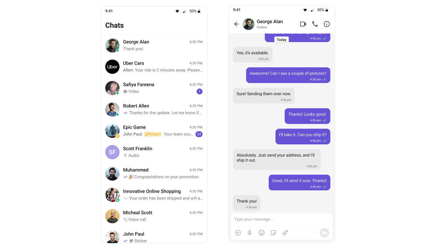
## Change the Primary Color
Override `cometchatPrimaryColor` in your theme:
```xml themes.xml lines theme={null}
```
Or set it programmatically:
```kotlin lines theme={null}
CometChatTheme.setPrimaryColor(Color.parseColor("#F76808"))
```
Provide a custom `CometChatColorScheme`:
```kotlin lines theme={null}
val customColors = CometChatColorScheme.light().copy(
primary = Color(0xFFF76808)
)
CometChatTheme(colorScheme = customColors) {
// Your content
}
```
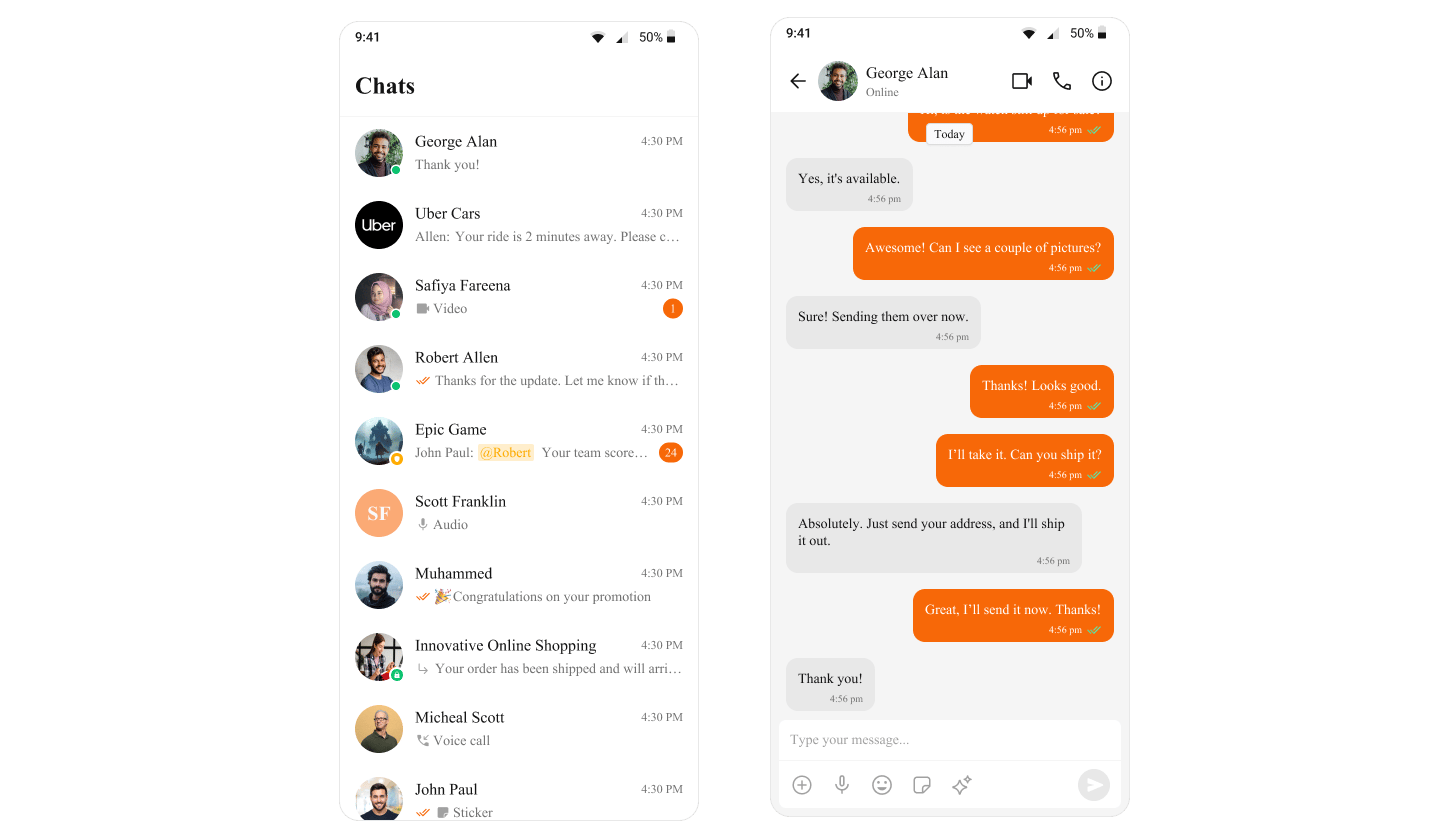 ***
## Customize Common Theme Attributes
```xml themes.xml lines theme={null}
```
Or programmatically:
```kotlin lines theme={null}
CometChatTheme.setPrimaryColor(Color.parseColor("#6851D6"))
CometChatTheme.setBackgroundColor1(Color.parseColor("#FFFFFF"))
CometChatTheme.setBackgroundColor2(Color.parseColor("#F5F5F5"))
CometChatTheme.setTextColorPrimary(Color.parseColor("#000000"))
CometChatTheme.setTextColorSecondary(Color.parseColor("#666666"))
CometChatTheme.setStrokeColorDefault(Color.parseColor("#E0E0E0"))
```
```kotlin lines theme={null}
val customColors = CometChatColorScheme.light().copy(
primary = Color(0xFF6851D6),
backgroundColor1 = Color(0xFFFFFFFF),
backgroundColor2 = Color(0xFFF5F5F5),
textColorPrimary = Color(0xFF000000),
textColorSecondary = Color(0xFF666666),
strokeColorDefault = Color(0xFFE0E0E0)
)
CometChatTheme(colorScheme = customColors) {
// Your content
}
```
***
## Add Dark Mode Support
Create `app/src/main/res/values-night/themes.xml` and override attributes for dark mode:
```xml values-night/themes.xml lines theme={null}
```
Android automatically applies `values-night` overrides when the system uses dark mode.
Provide different color schemes based on system theme:
```kotlin lines theme={null}
val isDark = isSystemInDarkTheme()
val colorScheme = if (isDark) {
CometChatColorScheme.dark().copy(
primary = Color(0xFF8B7FFF),
backgroundColor1 = Color(0xFF1A1A1A),
textColorPrimary = Color(0xFFFFFFFF)
)
} else {
CometChatColorScheme.light().copy(
primary = Color(0xFF6851D6)
)
}
CometChatTheme(colorScheme = colorScheme) {
// Your content
}
```
***
## Apply a Theme to a Specific Activity
Set `android:theme` on a specific `` in `AndroidManifest.xml`:
```xml AndroidManifest.xml lines theme={null}
```
Activity-level themes override the application-level theme.
Wrap a specific screen with a different `CometChatTheme`:
```kotlin lines theme={null}
// Default theme for most screens
CometChatTheme {
MainScreen()
}
// Custom theme for a specific screen
CometChatTheme(colorScheme = chatScreenColors) {
MessageScreen(user = user, onBack = { })
}
```
***
## Color Token Reference
| Token | Description |
| -------------------- | ----------------------------------------- |
| `primary` | Buttons, highlights, interactive elements |
| `backgroundColor1` | Main surface/panel background |
| `backgroundColor2` | Secondary surface background |
| `backgroundColor3` | Tertiary surface background |
| `backgroundColor4` | Quaternary surface background |
| `textColorPrimary` | Primary text |
| `textColorSecondary` | Secondary/subtitle text |
| `textColorTertiary` | Tertiary/hint text |
| `textColorHighlight` | Highlighted/linked text |
| `strokeColorDefault` | Default borders and dividers |
| `strokeColorLight` | Light borders |
| `strokeColorDark` | Dark borders |
| `successColor` | Success indicators |
| `errorColor` | Error indicators |
| `warningColor` | Warning indicators |
| `infoColor` | Info indicators |
***
## Customize Common Theme Attributes
```xml themes.xml lines theme={null}
```
Or programmatically:
```kotlin lines theme={null}
CometChatTheme.setPrimaryColor(Color.parseColor("#6851D6"))
CometChatTheme.setBackgroundColor1(Color.parseColor("#FFFFFF"))
CometChatTheme.setBackgroundColor2(Color.parseColor("#F5F5F5"))
CometChatTheme.setTextColorPrimary(Color.parseColor("#000000"))
CometChatTheme.setTextColorSecondary(Color.parseColor("#666666"))
CometChatTheme.setStrokeColorDefault(Color.parseColor("#E0E0E0"))
```
```kotlin lines theme={null}
val customColors = CometChatColorScheme.light().copy(
primary = Color(0xFF6851D6),
backgroundColor1 = Color(0xFFFFFFFF),
backgroundColor2 = Color(0xFFF5F5F5),
textColorPrimary = Color(0xFF000000),
textColorSecondary = Color(0xFF666666),
strokeColorDefault = Color(0xFFE0E0E0)
)
CometChatTheme(colorScheme = customColors) {
// Your content
}
```
***
## Add Dark Mode Support
Create `app/src/main/res/values-night/themes.xml` and override attributes for dark mode:
```xml values-night/themes.xml lines theme={null}
```
Android automatically applies `values-night` overrides when the system uses dark mode.
Provide different color schemes based on system theme:
```kotlin lines theme={null}
val isDark = isSystemInDarkTheme()
val colorScheme = if (isDark) {
CometChatColorScheme.dark().copy(
primary = Color(0xFF8B7FFF),
backgroundColor1 = Color(0xFF1A1A1A),
textColorPrimary = Color(0xFFFFFFFF)
)
} else {
CometChatColorScheme.light().copy(
primary = Color(0xFF6851D6)
)
}
CometChatTheme(colorScheme = colorScheme) {
// Your content
}
```
***
## Apply a Theme to a Specific Activity
Set `android:theme` on a specific `` in `AndroidManifest.xml`:
```xml AndroidManifest.xml lines theme={null}
```
Activity-level themes override the application-level theme.
Wrap a specific screen with a different `CometChatTheme`:
```kotlin lines theme={null}
// Default theme for most screens
CometChatTheme {
MainScreen()
}
// Custom theme for a specific screen
CometChatTheme(colorScheme = chatScreenColors) {
MessageScreen(user = user, onBack = { })
}
```
***
## Color Token Reference
| Token | Description |
| -------------------- | ----------------------------------------- |
| `primary` | Buttons, highlights, interactive elements |
| `backgroundColor1` | Main surface/panel background |
| `backgroundColor2` | Secondary surface background |
| `backgroundColor3` | Tertiary surface background |
| `backgroundColor4` | Quaternary surface background |
| `textColorPrimary` | Primary text |
| `textColorSecondary` | Secondary/subtitle text |
| `textColorTertiary` | Tertiary/hint text |
| `textColorHighlight` | Highlighted/linked text |
| `strokeColorDefault` | Default borders and dividers |
| `strokeColorLight` | Light borders |
| `strokeColorDark` | Dark borders |
| `successColor` | Success indicators |
| `errorColor` | Error indicators |
| `warningColor` | Warning indicators |
| `infoColor` | Info indicators |